The Typography and Graphic Communication department is introducing a FAB Lab (Fabrication lab), dedicating a designated area in the T3 studio to different machines to aid students in design projects; the FAB Lab currently consists of a Cricut maker, laser cutter and toner foiler, although is open to adding more machines in the future. By placing these machines together in an accessible and organised area, the goal is to encourage and increase the use of these machines through promotion in the department building and its Instagram, as well as direct and easy access to vital information and instructions regarding the use of said machines through QR codes. The instructions for the machines are written through a collaboration of both students and staff of the department to ensure level understanding of all users and optimum accuracy.
Brief
We were tasked with creating a brand for our department’s making kit to encourage and educate students and staff to use the machines safely and to their full potential. The original brief included introduction panels, user guides, and promotion within the department. However, we expanded this to include a promotional leaflet, Instagram templates and QR code stickers as additional deliverables as we felt these would play a vital part in educating and ultimately pushing this equipment as a brand. We were provided with copy, images and videos but our client gave us full freedom when it came to the branding.
Deliverables
- 3 informative posters about how to use each piece of equipment
- 1 promotional poster for FAB lab
- 3 multi-page online documents using diagrams to explain how to use each piece of equipment
- Launch Instagram post
- Hand-out including brief explanation and QR codes
- Campaign plan to promote the equipment on Instagram
- 3 stickers of QR codes made using the machine they relate to
This report discusses the first five deliverables as the campaign plan and QR code stickers are still under development.
Branding
Our clients did not have specific requests for the branding of the design deliverables, they just asked for the branding to be consistent and impactful enough for each machine poster in terms of poster layout, colours and typography so that can be it can be translated across the handouts and promotional materials too. Initially, our branding consisted of only using pastel colours assigned to each machine, illustrations of the actual machines and background patterns (Figure 1). However, after developing our trifold handout with Memphis shapes, we decided it would make our branding stronger if the shapes were used on all deliverables (Figure 2). This branding reflects the creativity and fun the machines allow you to have.

Figure 1: example of original branding
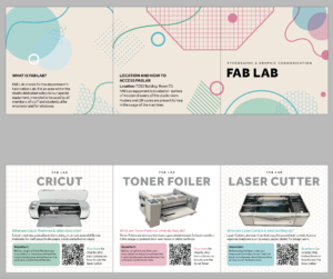
Figure 2: example of final branding
Audience
We identified our audience as students of the Typography and Graphic Communication department, both undergraduate and postgraduate. This was advantageous to us in our design process as we are undergraduate students working with a postgraduate student, allowing us to immerse ourselves in an audience perspective and easily gain feedback from other students, a vital part in the process of editing our copy. We ensured our information was easy to understand from a non-designer perspective for students without previous experience, as well as users from other departments that may have an interest in the FAB Lab.
Research and ideation
When approaching this project, we decided it would be beneficial to research posters, instructional materials, and online document design. Regarding posters, we identified that distinct separated sections seemed most efficient to display information clearly, colourful colour palettes and varying shapes gather interest, and clear visual hierarchy between text and illustration are vital (Figure 3). The main thing we found out about online documents that we wanted to take forward was large numbers that indicate the step readers are on allow for enhanced user navigation and engagement (Figure 4). After researching instructional materials, it became clear that complementary images for most, if not all instructions would be useful for users who are unfamiliar with the machines. Additionally, overviews and summaries are effective as instructions can be long, as these FAB Lab instructions are (Figure 5).
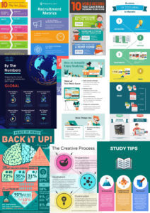
Figure 3: Poster research
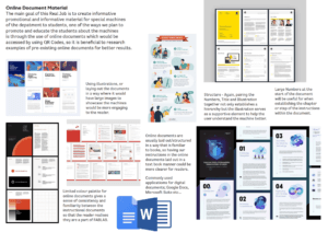
figure 4: Online document research
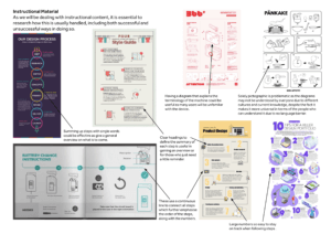
figure 5: Instructional Material Research
Creative direction
Based on our research, we decided to take an illustrative and visual approach, incorporating drawings of the machines themselves to enhance their recognition by students and staff. Additionally, we needed to establish a clear typographic hierarchy and structure for each deliverable to ensure that the department could access the information with ease.
Design development
Informative machine posters
We initially decided to create these posters at banner paper scale (Figure 6). However, this changed as we decided that not all copy on it was relevant for the poster and could be more useful on the instructions. After evaluating the designated wall space, we changed our poster scale to A3.
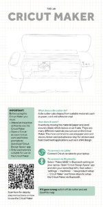
figure 6 – Cricut Maker poster v1
We decided early on that we wanted an illustration of each machine to be the focal point of the informative posters; this would add visual interest whilst creating a clear link between poster and machine without using a photograph, repeating what the user is seeing.
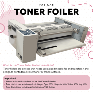
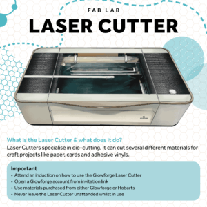
To further give each poster its own identity, we implemented geometric backgrounds to reflect each machine; a square grid to mirror the Cricut’s grid mat and a hexagonal grid to mimic the laser cutter’s honeycomb grid. There was no significant shape from the toner foiler and so we chose a dotted pattern for its poster background. These patterns were added in an off-white colour to ensure visibility without sacrificing legibility of text. As well as ensuring the shapes did not affect readability, we also had to make sure that the shapes were of similar size to each other to establish consistency in visual appearance across all posters. This became especially apparent in the creation of the poster for the Toner Foiler. Its background dots were too big and prominent in comparison to the other posters’ background shapes (Figure 7), especially apparent when printed, and therefore were sized down accordingly (Figure 8).
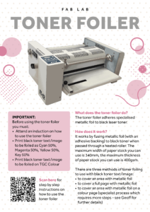
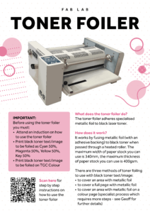
Figure 7 – Toner foiler poster with larger dot pattern
figure 8 – toner foiler poster with smaller dot pattern
We also gave each machine a designated colour for clear differentiation between the three machines, which allowed us to establish consistency in our colour palette for other deliverables. The Cricut machine’s colour was taken from the Cricut logo, the laser cutter was taken from its brand’s logo (Glowforge) and we allocated the toner foiler with a suitable pink shade, as its brand had no specific colour we could replicate. These colours were used at different tints for typographic hierarchy and other design elements throughout our different design outputs as well, where we had to ensure the same tint was used correctly throughout our outputs.
We chose the typeface ‘Effra’, as it is commonly used by the University, enabling familiarity and comfort in reading and ensuring clear legibility through its effective letterform design.
For each poster’s title, we initially decided to create them as products of the machines themselves e.g. cutting out the letters using the Cricut Maker, however realised this could be a problem in maintenance, in the case they get damaged. We later decided to take this idea forward for the branding of the designated FAB Lab wall itself and instead chose bold, black letters, initially grey as placeholders, for the poster titles to ensure clarity (Figure 9 and 10).
Figure 9 – Toner foiler poster title v1
Figure 10 – toner foiler poster title v2
The final design component of these posters was the addition of Memphis shapes created in the hand-out leaflet to establish a connection between all design outputs, effectively creating a FAB Lab branding style. Adding to this branding, we placed a ‘FAB Lab’ label at the top of each poster to further establish identity, allowing consistency in the case of future machine and poster additions.
Promotional poster
The promotional poster was designed to be at banner paper scale to adhere to our copy size and hold high visual value on the walls of the department. This allows for FAB Lab to be effectively advertised, especially considering other features that may also be on the walls. Using the already established colour palette and existing components, the promotional poster was created effectively with ease, being visually engaging whilst maintaining the brand’s design identity.
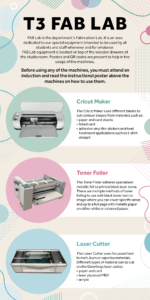
figure 11 – promotional poster that will be placed around department
Online documents
This deliverable brought some challenges as there was a lot of copy to handle. We tested the original copy provided to us by the client and made edits accordingly, including creating diagrams on how to use the laser cutter software in a similar style to the Cricut instructions for consistency. Another round of testing was completed and further edits were made. At this point, we were advised to add another section, that was not included in the original copy, to the foiler instructions to guide students who wanted to foil on top of a coloured background or image. This required us to spend time with Geoff learning about this process, taking our own photographs, and writing the instructions in the same language and manner as the ones written by the client. This was challenging as due to the technicality of this process, the instructions had to be detailed which therefore did not directly reflect the writing style of the client.
Initially, the documents were designed on InDesign (Figure 12, 13 and 14). These designs obviously reflect the FAB Lab branding due to colour and patterns, and are easy to follow due to the large numbers. A negative about these are the format as it is not suitable for online use on phones as it would not scroll well. It was then later discussed that it would be beneficial if these online instructions were hosted on typography.network as a blog post. This platform limited the creativity of the design, however, these three featured images were created to ensure the branding was apparent within these instructions (Figure 15, 16 and 17). We made use of the different set paragraph styles in WordPress as they are long documents so require a tool to help users with navigation.
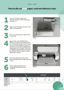
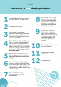
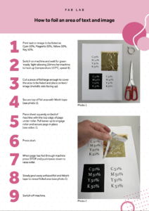
Figure 12 – Cricut Maker online document v1
figure 13 – Laser Cutter online document v1
figure 14 – toner foiler online document v1
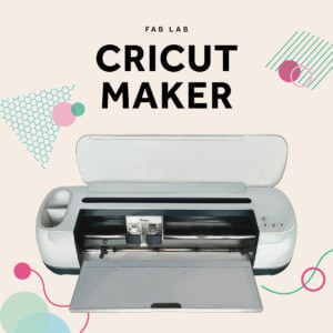
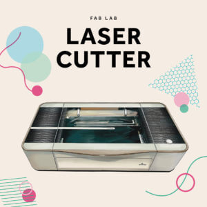
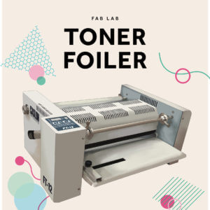
Figure 15 – featured image for Cricut Maker online document
figure 16 – featured image for Laser Cutter online document
figure 17 – featured imaged for toner foiler online document
Hand-out leaflet
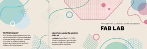
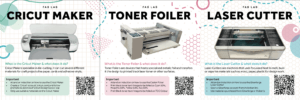
The purpose of the hand-out leaflets was to convey information about the department’s machines in a quick and concise way to encourage staff and students to use them more. We researched various formats of leaflet such as two and three-page leaflets, square trifold formats, and booklet formats. After careful consideration, we decided to use the square trifold format as it offered ample space to showcase all the essential components of the leaflet. Although we attempted to sketch out some designs, none of them were suitable or approved by the group (Figure 18). Therefore, we took the time to explore different art styles that would help us come up with a new design solution.
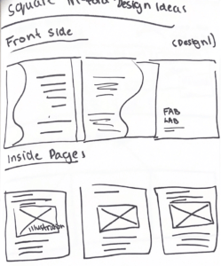
Figure 18: Sketch of Handout leaflet
It is here where we found Memphis shapes and decided to use it on our handouts. Memphis design is a post-modern movement and aesthetic that uses vibrant colours, geometric shapes and bold patterns based on art-deco. So, we took the style of Memphis and implemented it into our work, the shapes and lines were drawn in a way that echoed the equipment’s characteristics (e.g. grid for Cricut maker, hexagon for Laser Cutter etc) while also maintaining the aesthetics of Memphis. To keep it consistent we used the same colour palette and also kept similar components such as the QR codes, typographic hierarchy, and layout. We showed it to our client for feedback – they liked the direction that the handout was moving towards but requested some adjustments to the structure of the inside pages, and the body copy. We took these into consideration and worked together to make appropriate changes for the leaflet.
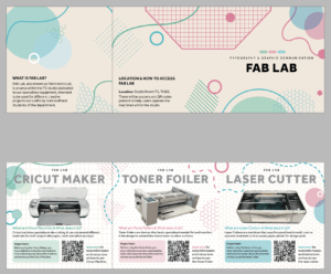
Figure 19: Handout leaflet v1
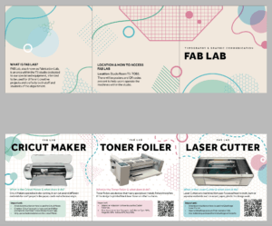
Figure 20: Handout leaflet v2
Instagram post
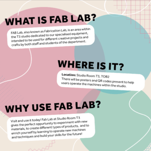
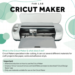
The social media launch post was created to promote FAB Lab through the department’s Instagram. The decision was made to maintain similar content as the handouts with some variations to ensure they were suitable for promotional purposes on social media.
We made the “why, what, where” of FAB Lab more detailed as those learning about FAB Lab through Instagram, as opposed to in department, would not be able to go straight to T3 to see what it is about. Similar to other deliverables, we also added machine illustrations, a summary of their functions, and key facts to remember when operating them. The post had similar typographic hierarchy, Memphis shapes, colours, patterns, and background as the leaflet, but with minor differences in placement. We made some final changes to the shapes, colours, illustrations, textbox placement, and body copy before finalising the post.
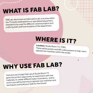

Figure 21 – explanation Social Media Template v1
figure 22 – explanation social media template v2
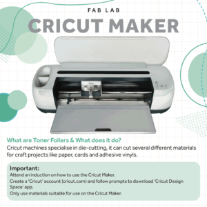
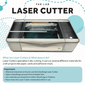
Figure 23 – machine Social Media template v1
Figure 24 – machine social media template v2
Proposed exhibition space
Although this part of the project is yet to be finished, I made a sketch for a proposed exhibition space (Figure 25). It outlines where the informative machine posters would sit in relation to the machines, as well as how the wall could be branded so that area was evidentially the ‘FAB Lab’. The intention behind the ‘FAB LAB’ lettering in the sketch is that each letter would be made using one of the machines and the shapes on the wall would be vinyl stickers.
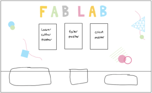
figure 25 – sketch of exhibition space
QR code stickers
We came up with the idea of this deliverable when we first were brainstorming about the project as a group. Having had conversations with the client, we discovered the idea of creating stickers for each machine using the relevant machine was feasible. So, each sticker would have a QR code on that would lead users to the online instructions. The laser cutter sticker would be made out of acrylic, and the QR code would be shaded in so it was scannable. The toner foiler sticker would have a foiled QR code, and the Cricut Maker sticker would be made out of vinyl.
Final deliverables
Informative posters
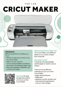
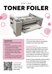
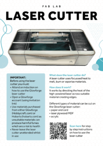
Promotional poster

Online instructions
Link to online instructions for Cricut Maker
Link to online instructions for Laser Cutter
Link to online instructions for Toner Foiler
Hand-out leaflet
Social media post

Personal reflection
I have learnt and improved on lots of skills throughout this project which I will be able to take forward and build on in future projects. I was given the role of project manager which brought challenges whereby I was working with designers who had not done a real job before so I had the opportunity to guide them through it. Additionally, I led meetings both with designers and clients, as well as taking minutes and adding them to an ongoing document. We learnt to collaborate effectively by identifying each other’s strengths and using them to our advantage to efficiently create these deliverables. This job brought about my first experience dealing with clients within our department, but it was a very positive one as we worked well with them due to frequent contact and honesty from both clients and designers. Another skill I have had the opportunity to improve is how to present work in a professional manner to the clients. As we were working for clients in department, we were able to show our work in person every time and verbally go through the reasonings behind design decisions, meaning the client could understand the justification and edits we made. Additionally, regarding file management, we had a shared folder that contained everything we created and needed for the project which ensured for a coherent experience when designing collaboratively. Due to the nature of this project, I gained a deeper understanding of all of the equipment, mainly through having to test and edit the step-by-step instructions myself. This in turn has led me to being able to enhance the finishes on my personal projects. It helped that we as designers were often communicating with one another as well. One thing we could have improved on was time management as we did not stick to the schedule in the end.


