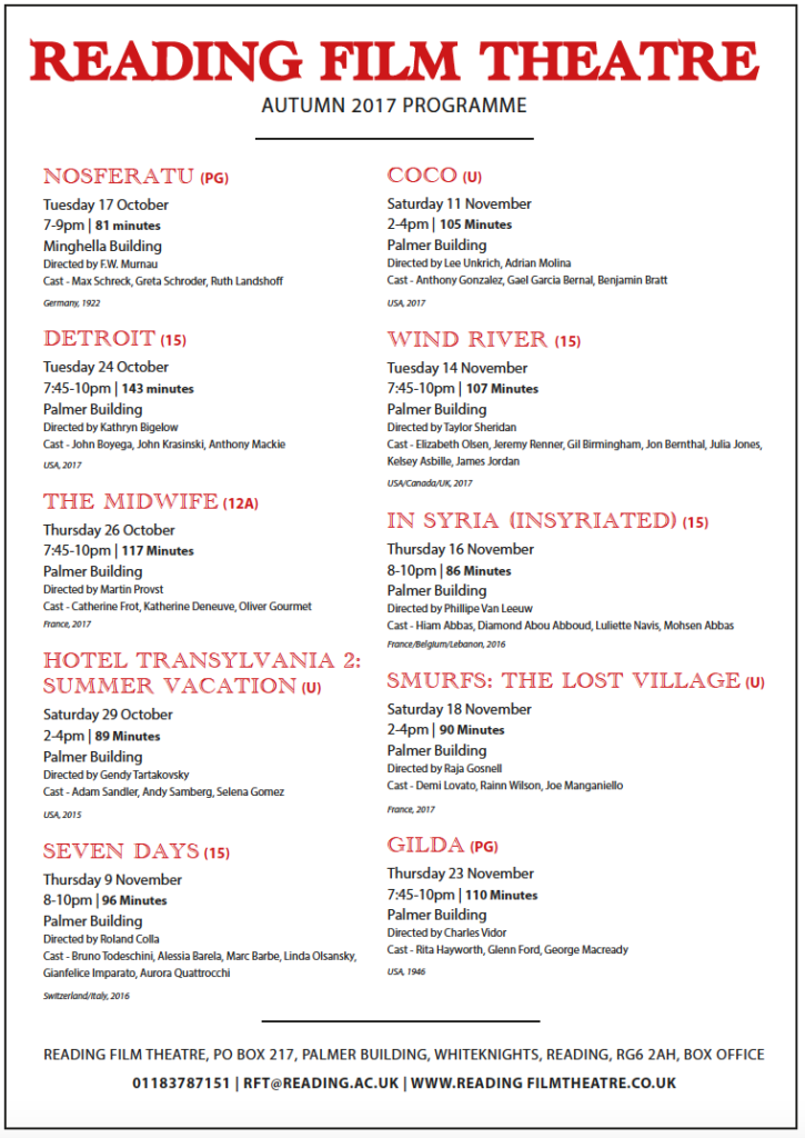
I have designed a film listing for Reading Film Theatres Autumn 2017 programme with my chosen user being a father with two children both under the age of 10. To accompany my choice of user, I have chosen a hierarchy which stands out in order of importance, in this case which is the age rating next to the title as the most significant, followed by the date, location and time along with how long the film is in bold which is another extremely important factor for this specific user. At the end of each film listing, I have incorporated the director and actors which I believe is the least significant pieces of information for this particular audience. I have used the colours red and black upon white which compliment each other well and is clear to understand, with both a serif and sans serif typefaces.

