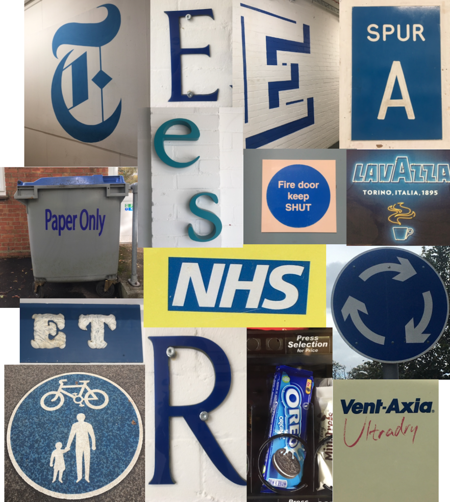
For this brief we had to look at different letterforms around campus with a running theme. For my theme I chose colour, my chosen colour was blue.
Each of the letterforms had a different function, ranging from instructing such as the ‘paper only’ bin and the blue roundabout sign. I also looked at different perspectives, thinking about how each sign is viewed. For example, for the pedestrian and cycle pass sign I angled the camera down and head on along with the Oreos in the vending machine. Whereas, for the big E and T on the wall in the typography department, I changed the perspective as this is how these letterforms are seen as people walk past.


