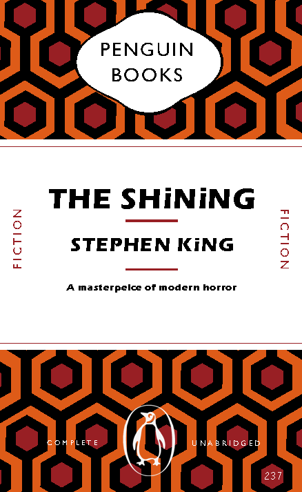
For my second design, I decided to base my approach around ‘The Shining’ and because of this I have added many nods to the Stephen King novel. I started by recreating the famous carpet that is seen in the hotel, this process was a lot easier than I initially thought it would be. I made the first initial shape and once that was made it was simply a process of copying the pattern. The font used for the title, author and the brief description is a very similar to the one that was used throughout the posters and book covers for the original. Room 237 has also been included. Although there are many nods to The Shining, I have also kept many of the Penguin book cover conventions. The ‘cartouche’ still remains and the original page layout has also been kept the same. I decided to change the penguin logo, on this cover the logo is white making it slightly more legible to the reader but I still feel like this could be improved upon.