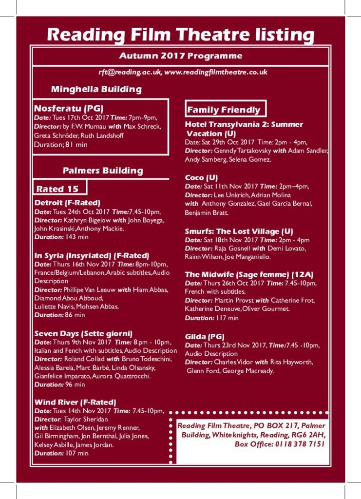
The project was to design a Reading movie leaflet for an International audience and family.
It was difficult to try and put all the information in (2) two columns at the same time make it legible and readable for the target audience but over some time I was able to overcome this difficulty.
I originally wanted to follow the University of Reading logo colour red as my background colour but was told from the peers feedback that it was not ‘aesthetically pleasing or easy on the eye’ for a movie leaflet so I choose a darker shade (maroon) as my background colour so that is can have a better contract with the white text.
I use a basic layout of the border around the edge with a white box at the bottom with a maroon colour text so the information would not blend in with the movie listing information and give it a bit of a hierarchy. The result made the text easier to read and stands out the most. Overall, it was effective.
When printing this work I found out I made a lot of little mistakes that I could not notice on the screen such as some spacing issues, line lengths and cutting someone’s name in half. I Should try to make sure to keep a consistent layout and make sure to pay close attention to the detail. Overall, I think I did really good work.

