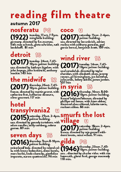
For this project we were tasked with arranging information about 2017 showings at the university cinema onto an A5 sheet with two columns. This was a really fun task and was good for developing my skills on indesign which at the moment are pretty limited. I tried to arrange the information in a way i thought made sense with the title of the films being the most eye catching however during peer assessment someone pointed out the rest of the information sort of merges into one.
For my flyer I wanted to incorporate some styles we have been studying in the history of graphic communications module. Last week Rob was talking about Swiss graphic design so I’ve tried to make my outcome visually similar to the movement. Swiss graphic design, like modernism, uses black and red colours and sanserif fonts.


