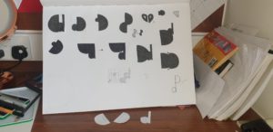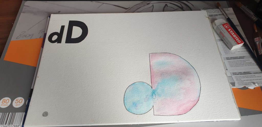
This project involved reducing my initials to basic geometric shapes or silhouettes and merging them in different ways. My initials are the same letter, so I used both capital and lowercase to gain some variation between round and sharp edges. In my final transmogrification, I used watercolour as a medium to emphasise the theme of fluidity.
A useful time-saving technique that I will take from this task was cutting out my initials to trial different combinations of positions and letter casing without needing to draw them out.

