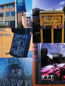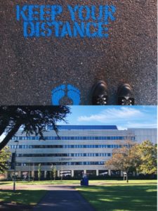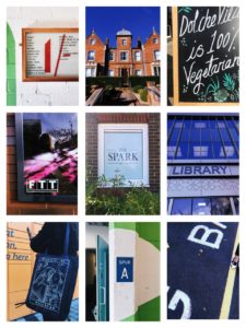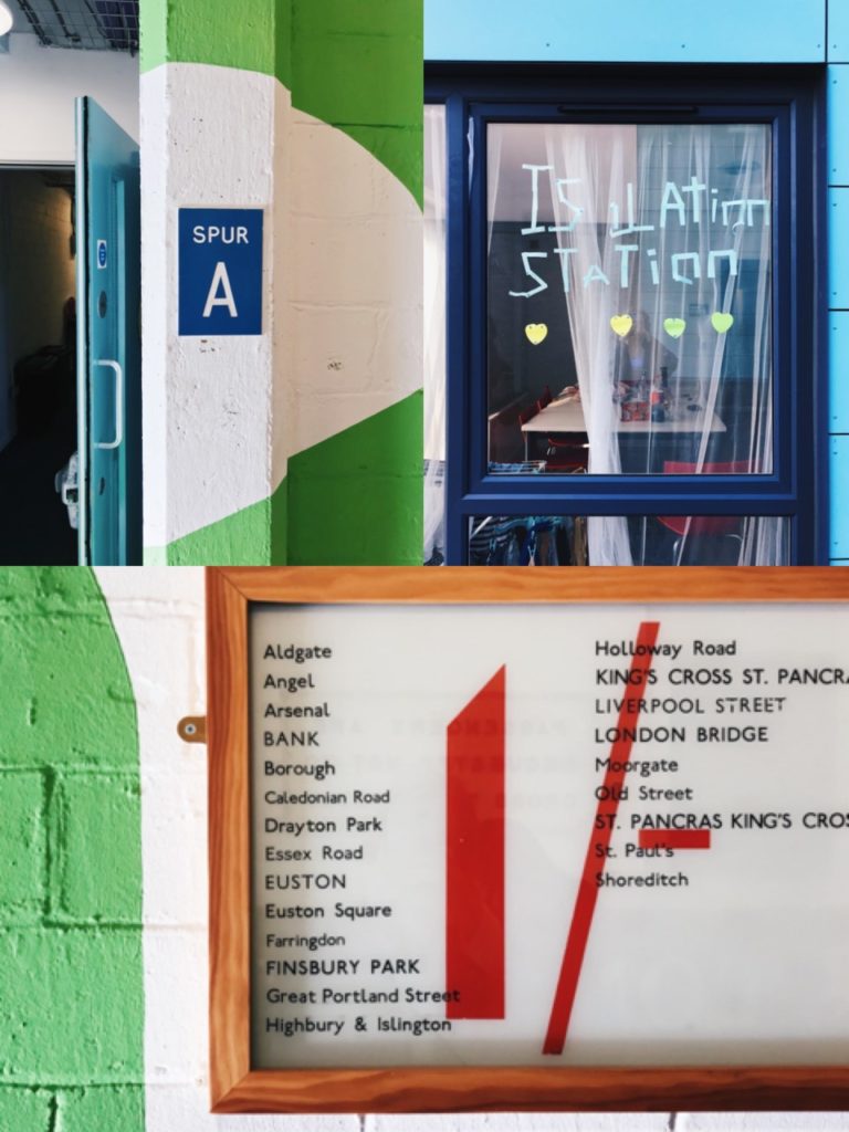

For Eric’s lesson on Monday we had to find lettering in our environment, eg around campus.
We got lucky with the weather being very sunny, and clear blue skies, as this meant a lot of light in our photographs, and a bright sky that on occasion helped add to the photo. I found signs, graffiti and stickers posted about campus. I also took a couple photos of the lettering in the typography department, however kept my focus to signs outside.
When it came to grouping our photos together and finding a common theme in them, my photos in honesty didn’t have much in common, when it came to font, topic, wording, or even colours. So I did create a collage of some of my favourites, editing them to have a common ground with yellow, blues and greens. And one similarity I did find between a couple photos was framing, where the type had been framed by a certain material, to be the centre of focus, such as, a window, wooden frame, or created on board and centred on a thin wall, giving it a frame.
After this project I will make an effort to look for more lettering in the environment, why it is used, and how communication varies from a sign being instruction (stop, slow down, caution. In bold capitals with bright warning colours). To creative welcoming advertising, for cafes or restaurants that use blues, or black and white for a professional sleek look.


