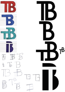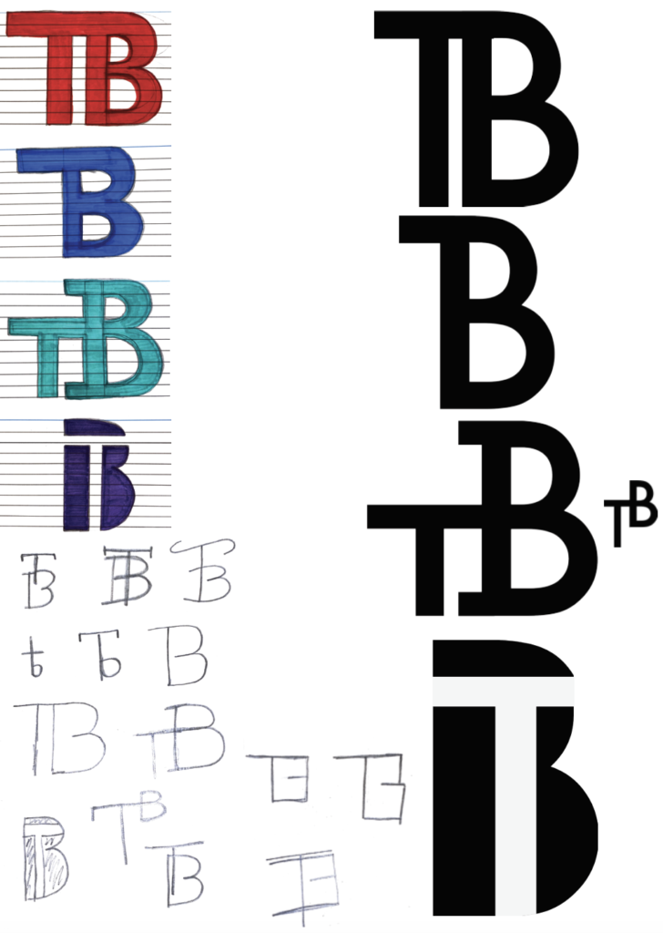
While studying the future font during today’s lesson, i perceived the style and design as very geometric and fluid in its connection. Therefore I experimented with connected and straight lines throughout the design process. with this, the designs that I imagined are very rectangular and geometric in shape when it came down to the final few iterations presented on the right-hand side the of page. With this, I did also experiment with a more ‘Centeria Script’ esque design in one drawn iteration with more wavey and elegant lines but ultimately went with a more structured and geometric design instead. In terms of my final design, I personally prefer either the T connecting the the B’s crossbar design and or the T integrated into the interior of the B’s salute.

