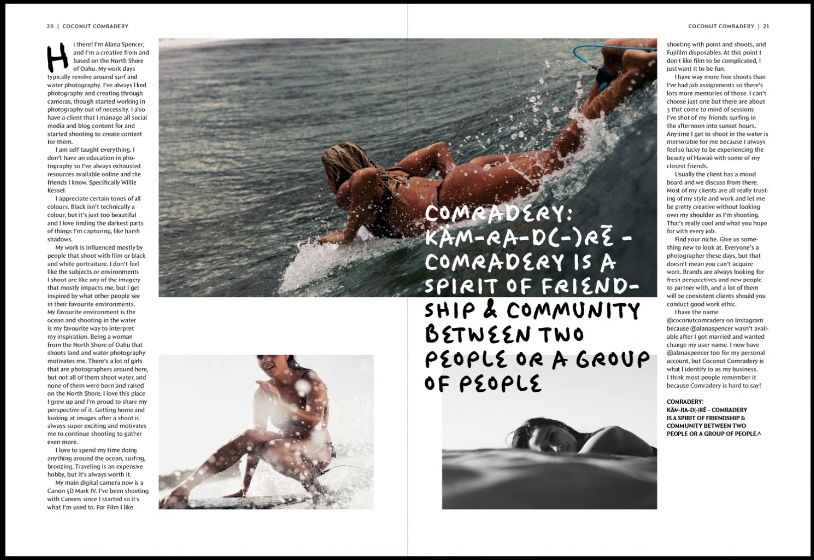
Working as part of the Baseline Shift team prior to this job, we knew we wanted to connect more with the guests we have and understand more about their career and experiences to allow ourselves the best insight into future design paths. We knew we wanted to take on board the Pixel Party job as not only did it link to Baseline Shift and build on the communication element but would also allow us to experiment with the deliverables that would help build our portfolios, for example Mia working on motion graphics and Habibah on branding. The freedom of this job would enable us both to incorporate our current strengths within design as well as build on those we are interested in.
About
Week 2 of the Autumn Term kicked off with a whole day with Toshi Omagari returning to the department! The day consisted of an afternoon and evening full of typography fun starting with a Baseline Shift Talk also hosted and organised by ourselves followed by a Post-it note and Lego letterpress workshop, ending the day with a department party including food, drink, music and most importantly games.
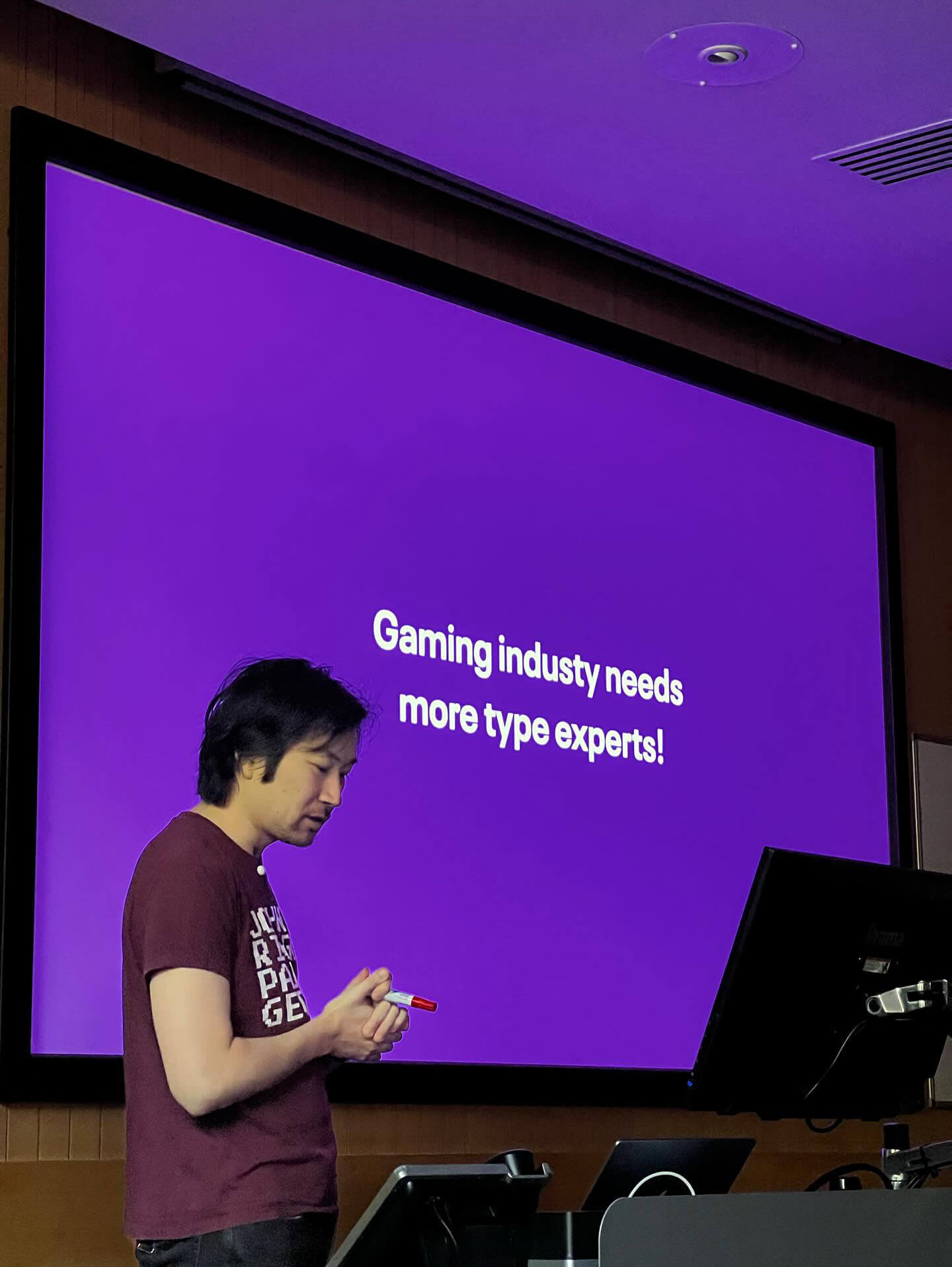
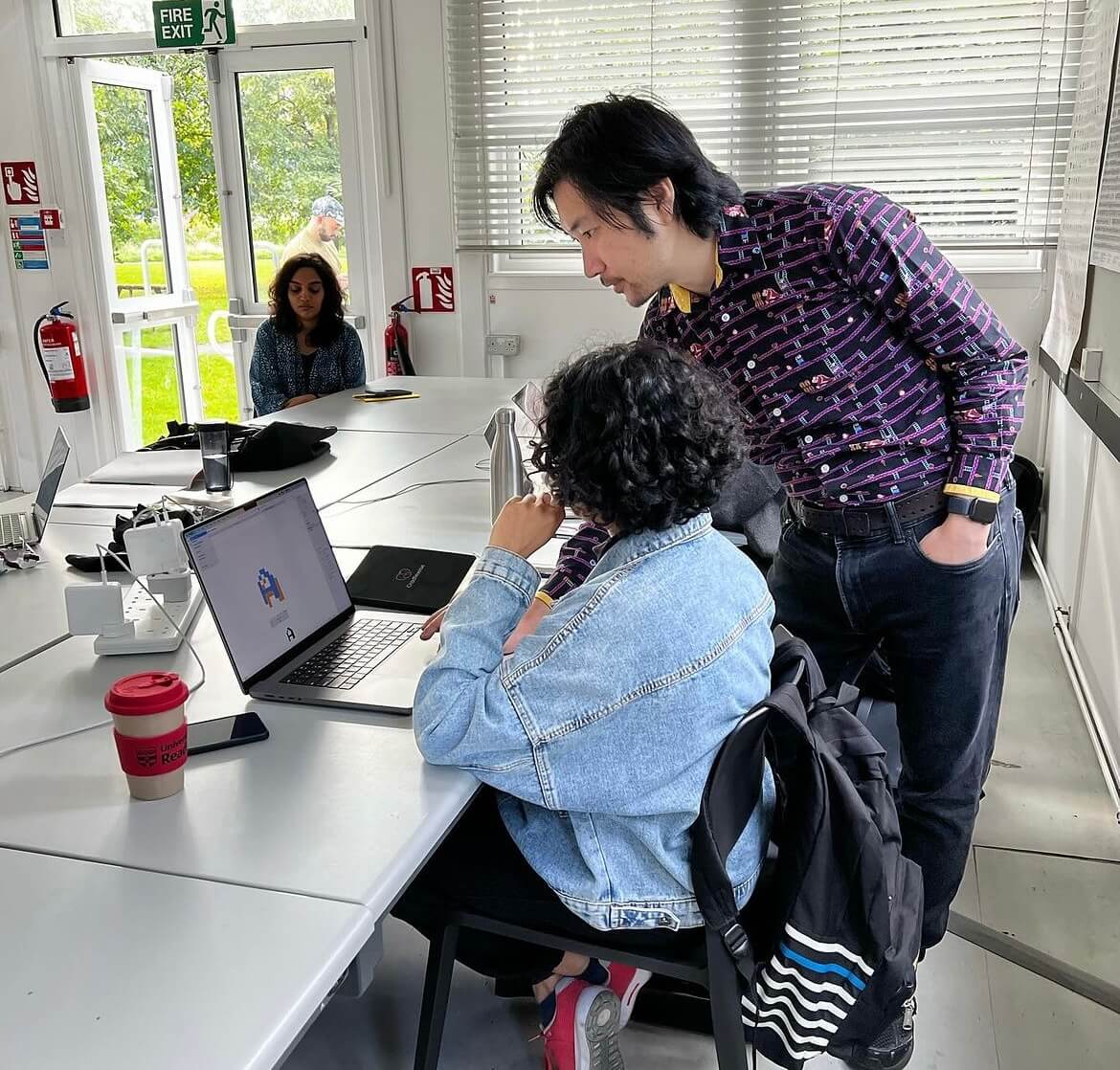
Toshi Omagari is a typeface designer specialising in arcade game typography and alumni of the MA Typeface Design course at the University of Reading. His book, ‘Arcade Typography, focusses on pixel-fonts used in arcade games between the 70s and 90s and is available in the department. His passion for games is truly inspiring and the work he does within this field is profound.
Due to unforeseen circumstances, the original set date for the event was rescheduled from February to October. This gave us more time to work on furthering our deliverables and added a Post-it note storage system to our outputs.
Toshi’s talk
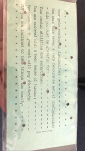
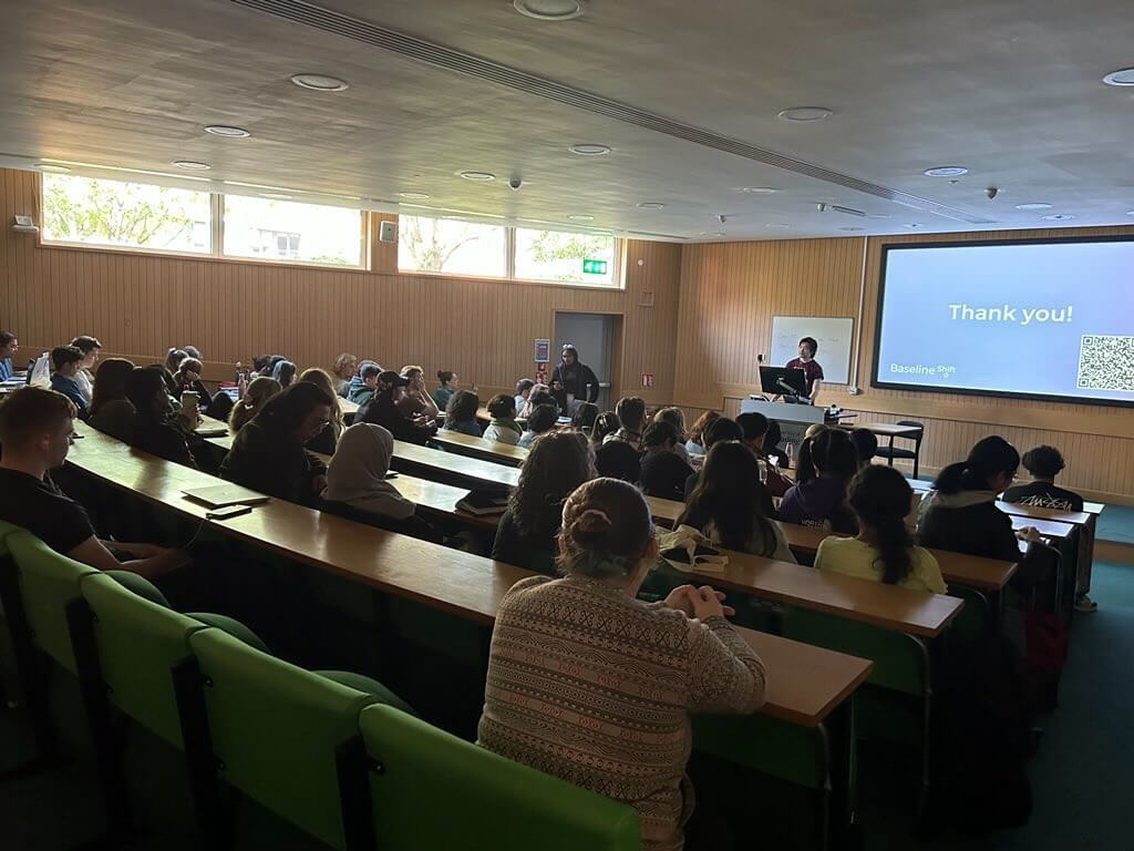
We started the day with Toshi’s Baseline Shift session, exploring his career in type design to both undergraduates, postgraduates as well as staff here in the department. He presented his in-depth research on arcade game typography and how they have developed over the years, specifically focussing on the characteristics of glyphs. It was very interesting to see the evolution of arcade typography from black and white to colour to the introduction of elements such as drop shadows and gradients. He also spoke about life after Reading and different fields in which he explored initially before finding his current passion. The very inspirational talk left many students feeling motivated with Part 1 student Ethan saying:
“It was an enthralling talk that really showed the lineage of digital fonts throughout video games – One of the best talks!”
Workshops
Following the talk, Toshi hosted a Master’s session on type design, and then assisted us in hosting a Pixel Post-It note and Lego Letterpress workshop for the students. This session consisted of creating glyphs using both Post-Its and Lego using colours to create depth and shadows, much like arcade typography.
The Post-it note workshop decided to work as a group to create an entire alphabet of pixel font letters. The posters used an 8×8 grid to format the letters, which students created based on fonts in the Arcade Typography book, however one student: Emma from Part 1 was recognised and awarded with a prize for the best designed letter!
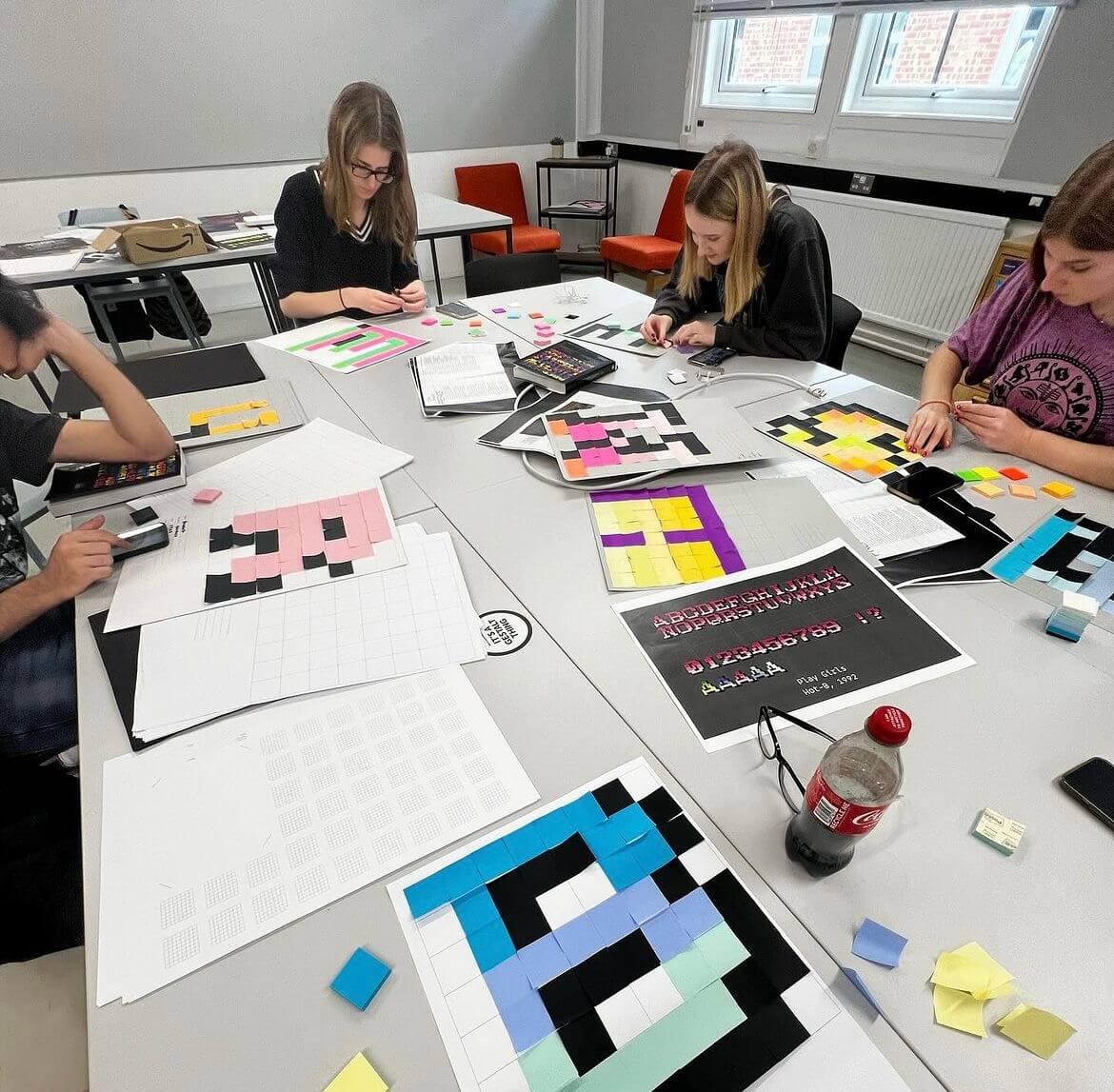
The Lego letterpress workshop invited students to design 8×8 Lego plates to print their letters. As the only colours available were green, blue, purple and pink, some students chose to layer the available four inks to create a dynamic printed letter.
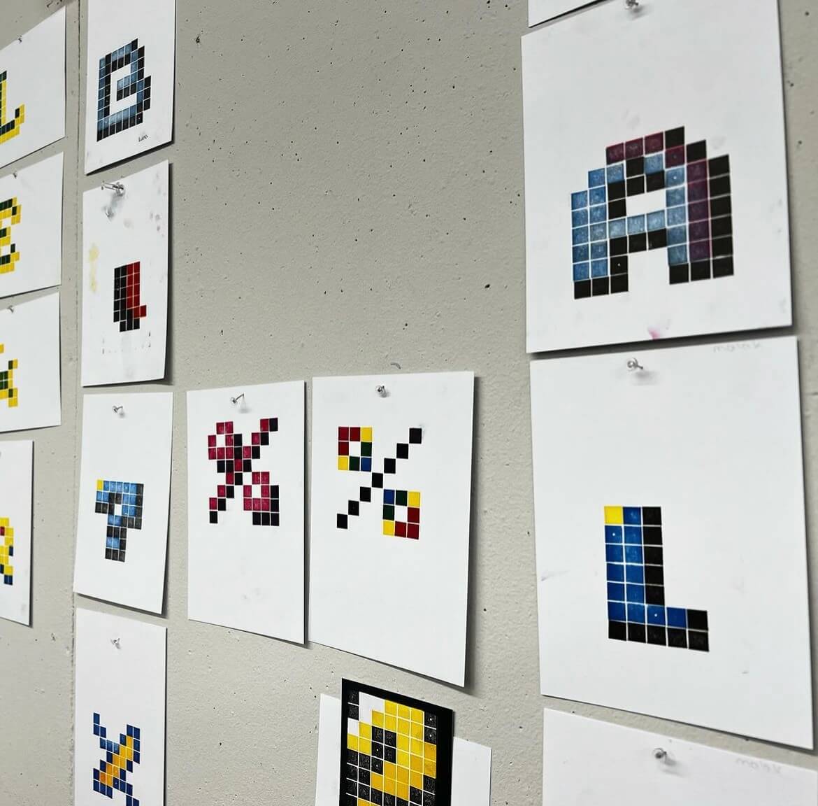
These letters were then handed over to Toshi during the evening to announce a winner, Lydia from Part 3 taking the trophy home and saying:
“I thoroughly enjoyed the pixel font workshop, not only was it an interesting challenge, it was a perfect excuse to use the letterpress equipment! A massive thank you to those who organised it!”
Arcade evening
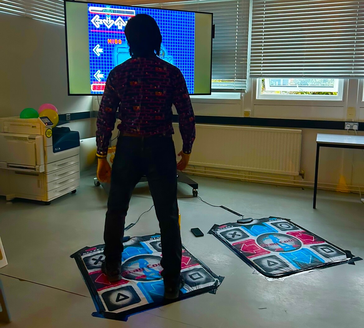
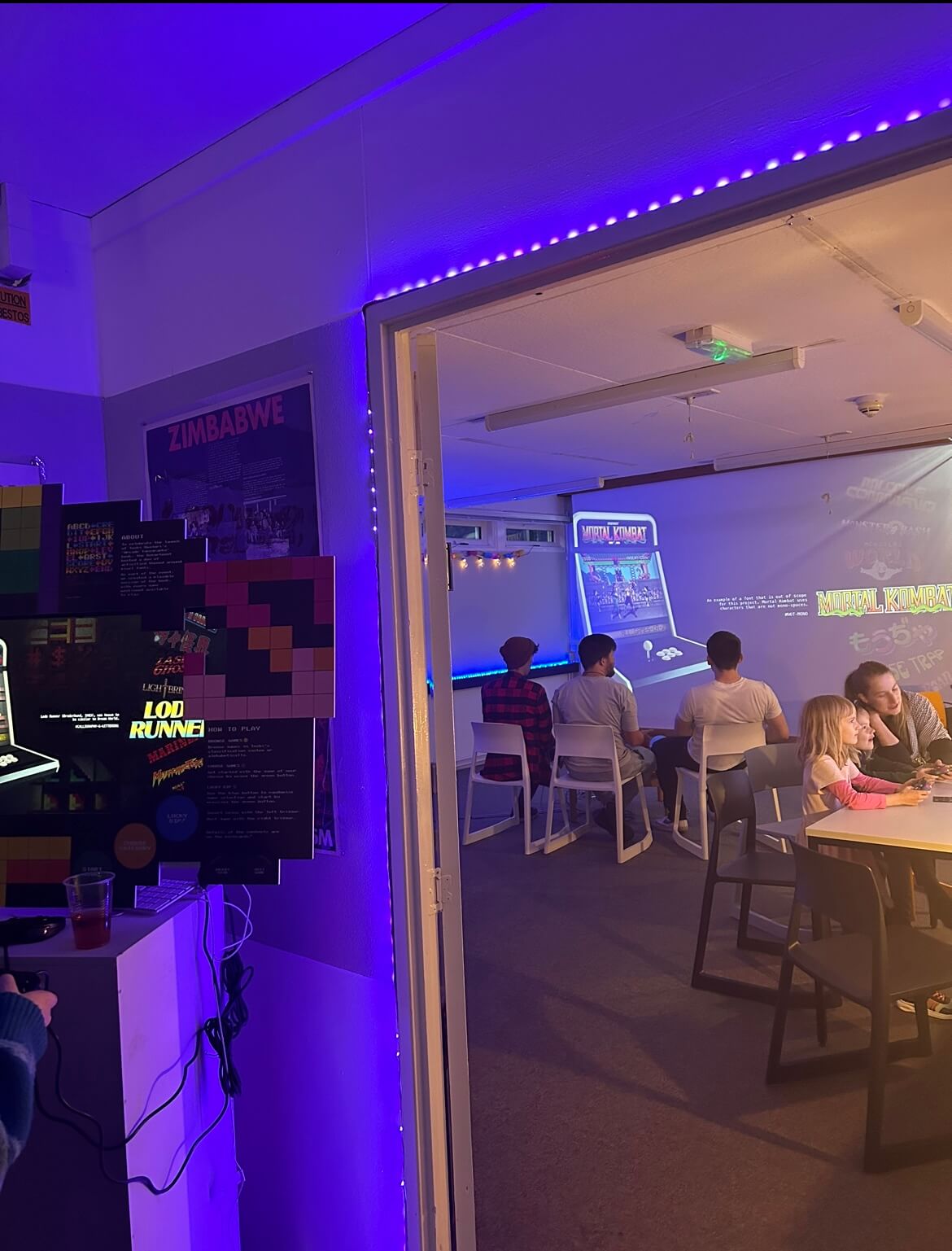
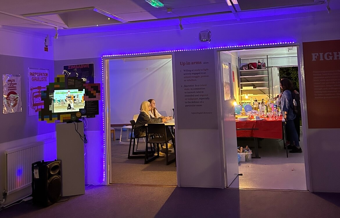
To round out the day, we hosted an arcade themed department social attended by students of the BA, MA and PHD design courses, as well as staff and friends. The attendees enjoyed the carefully curated arcade theme playlist, as well as the games, food, and drinks.
The event was a great opportunity to bring the department together and welcome the new Part 1 students of the BA course. We’d like to thank Toshi and everyone who attended for the awesome turnout!
Post-it notes storage unit
With the additional deliverable added as the deadline extended, we created prototypes to accommodate the hundreds of Post-it’s the departments holds. This began by measuring and counting stock and finding a way that we could display this in an aesthetic way.
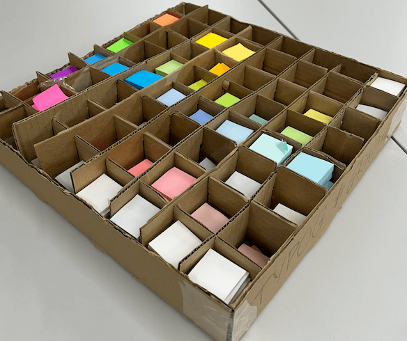

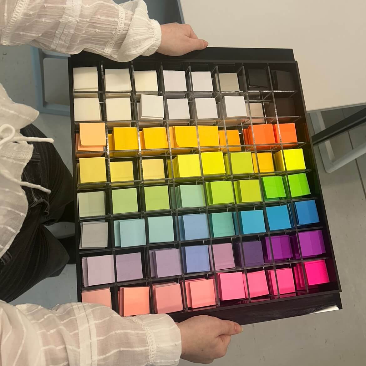
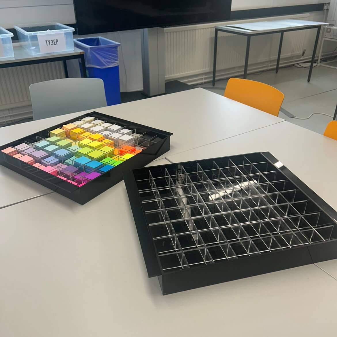
We chose to create a box, with 8×8 slots joining to create boxes for individual colours and found this worked well, so proceeded with materials involving acrylic and designing this complimenting existing branding. Experimenting with placement, we decided that organising the colours by hue and shade would be the best option for easy recognition and access of different variations.
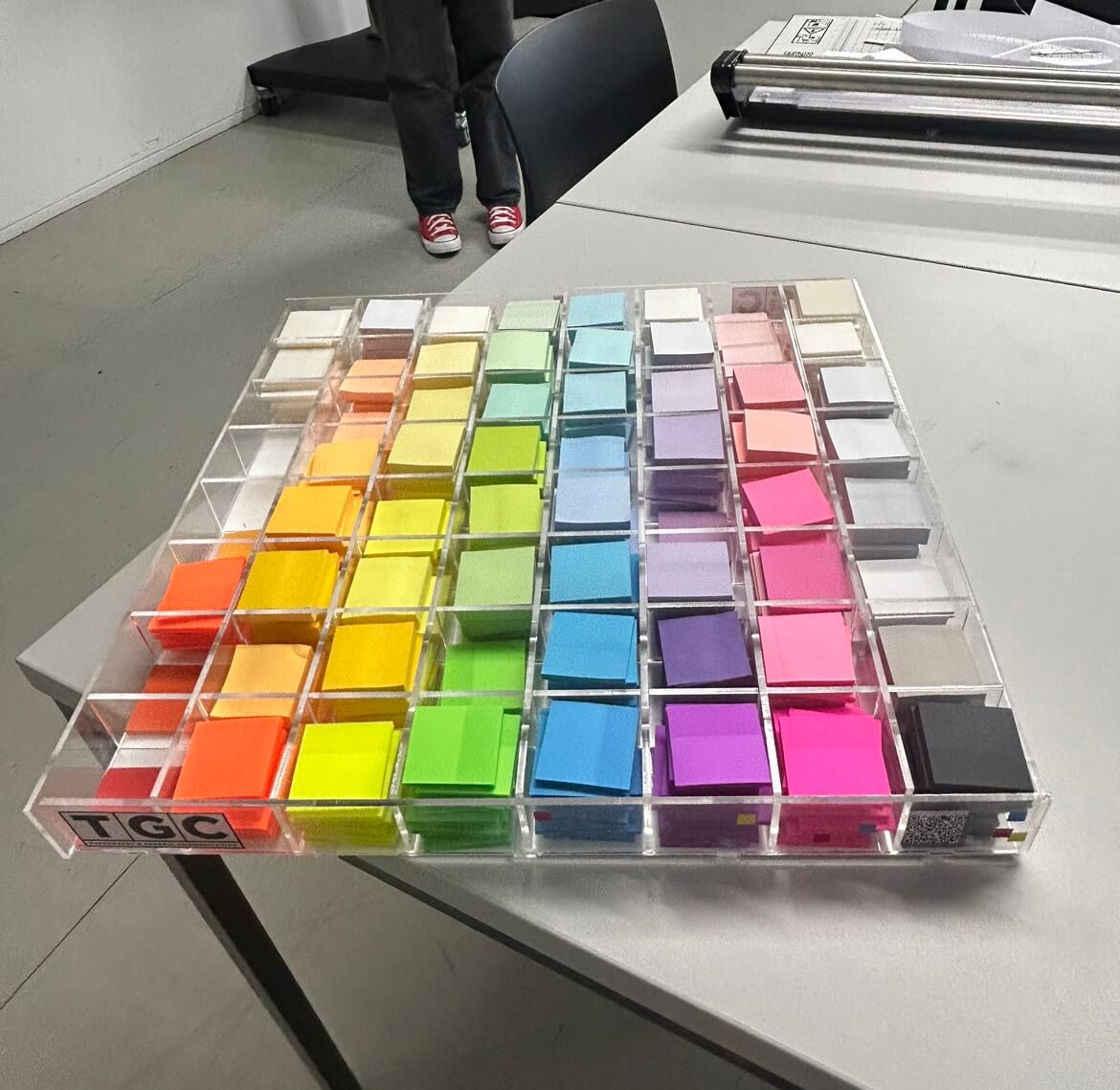
Considering feedback and testing, we opted to order external acrylic boxes to house our grid in. Doing so allowed for a more stable unit, which is entirely square and the edges are flush. One issue we had building this using the laser printer was having to use multiple sheets of acrylic to build the base, which felt unstable. The glue used to attach elements also broke away after use, which showed we needed a stronger frame to hold the Post-it notes.
We chose to use a black acrylic for the external elements as it contrasted the colours of the paper and fit the branding of the event. This created a sleek appearance, which we decided did not need additional branding or decoration.
We made an additional unit for department displays and activities, recycling materials where possible from the prototypes. These units are stronger, and have handles to hold the weight more comfortably and manoeuvre more easily.
Posters
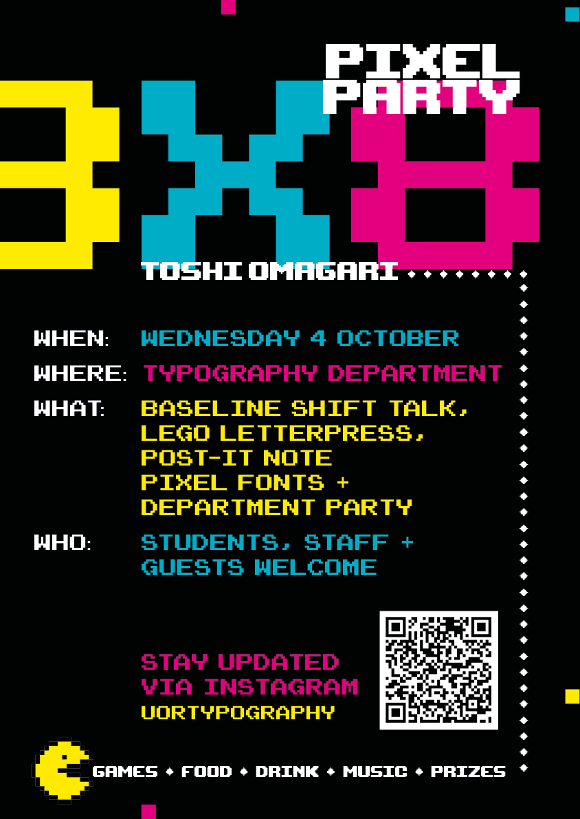
We designed the posters using relevant typography and decided on a black background with the colours of yellow, cyan, and pink. We based the design off of classic arcade games, and used Pac Man to attract students who were not overly familiar with arcade gaming. The box Pac Man follows groups the core information, with the main event title and decorative pixels aiming to show movement on the ‘screen’.
Animation
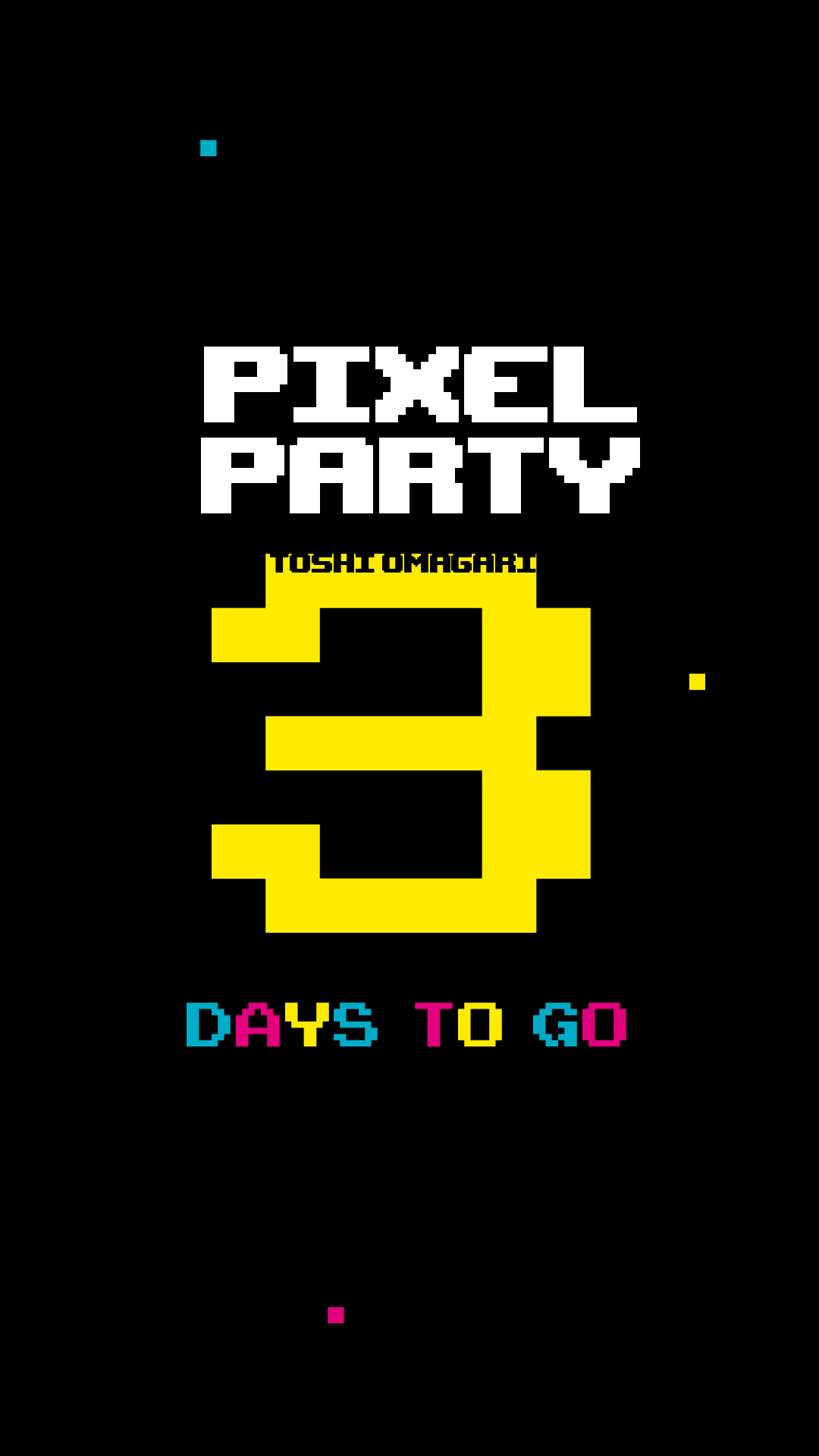
The animation featured on the department Instagram and Facebook. Social Media posts which are motion tend to increase engagement, which we wanted to take advantage of in promoting the event. The glitch and bounce mimic the movement of arcade games and served as a punchy teaser to build anticipation before the event.
Screens
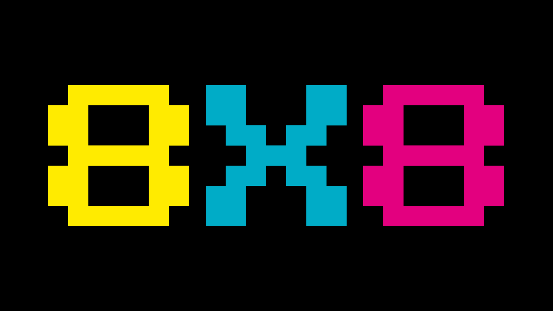
The main screen at the department featured the 8X8 logo, to remind students and staff of the upcoming event.
Social posts
Social media was the primary method of marketing, as the department Instagram is the most frequented point of contact for the BA students. These were shared on Instagram and our Facebook groups, as well as a daily countdown on the stories to further build anticipation and act as a reminder. Social media and email marketed the sign-up form for the workshops, which were fully booked for the day of the event. You can see the day unfold on our department Instagram story, where we documented the events @uortypography where the highlights are still available.
Playlist
Researching into arcade inspired music and games using ‘chip-tunes’, we carefully curated a playlist representative of this to be played throughout the night during the department social. As well as this, we additionally added some songs popular in the noughties party scene to cater for our young audience and create a livelier atmosphere.
Here is a link to have a listen!
https://open.spotify.com/playlist/4luy20bYOQF57xwMuTw8oO?si=ace0935cd36f45e5
Food and drink
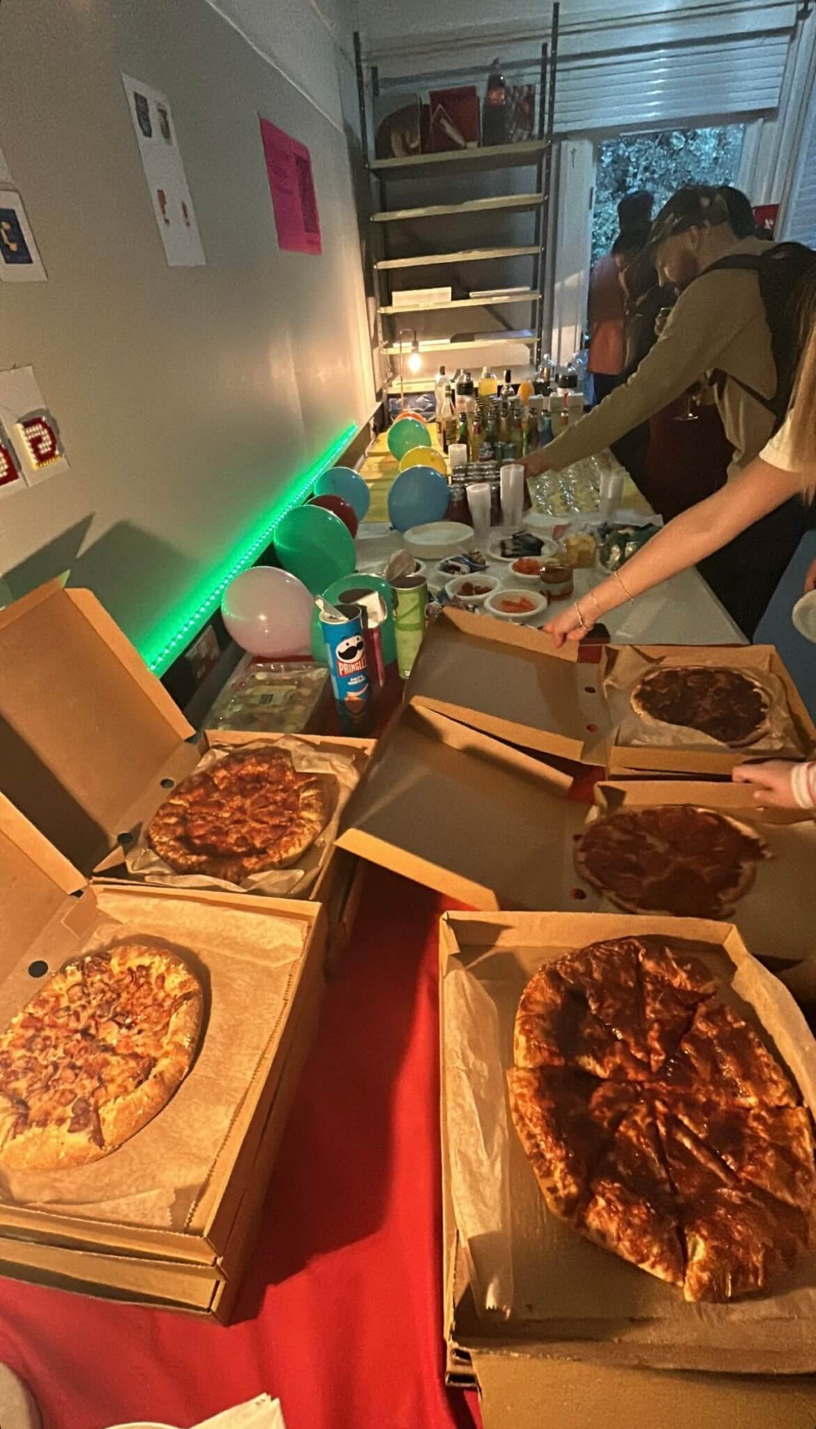
We concluded that the food served throughout the party should reflect the theme so bought things served as shapes such as circles or squares and involving colour. Our shopping list involved pizza, marshmallows, and brightly coloured drinks, both alcoholic and non-alcoholic as well as many more.
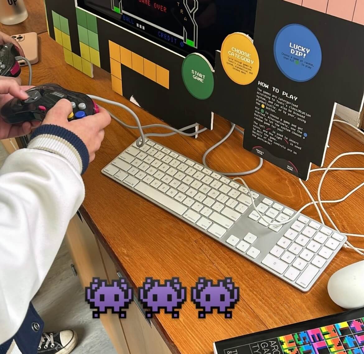
Games Organisation
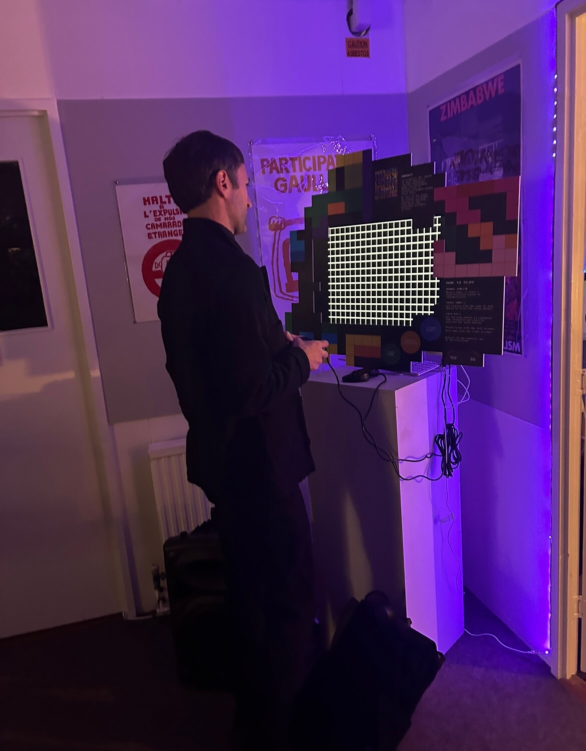
The games were a popular feature, with dance mats and arcade video games within two of the largest rooms in the department. To frame the iMac screens, we designed a foam board consisting of instructions on how to operate the controller and promote the branding for the vent further.
Decoration
Finally, the last part of planning was organising decoration to revamp our standard department to something special for the night. We did this with paper chains and balloons representative of our colour scheme as well as lanterns, LED and fairy lights to create a arcade vibe.

Conclusion
We both had a lot of fun planning this and seeing our ideas come to life with an amazing turnout. After overcoming organisational obstacles, it was all worthwhile and we thoroughly enjoyed connecting with everyone in the department more. As team leaders for Baseline Shift, it was valuable to take on another role more closely linked with the people we host, to build connections, network and prepare us for the future. It not only taught us event and time management, but how to collaborate with different people as well as develop our design skills along the way. We each were able to apply our existing knowledge in areas we were confident in (Habibah, branding and Mia motion graphics) and were open to learning new things, making the whole process a lot smoother.
For events like this in the future, we would find a longer run-up to the event useful. Unfortunately with only 2 weeks to promote, we felt numbers could have been higher but overall the turnout was good considering this. We would have also liked to encourage attendance across the year groups face-to-face or using printed material ourselves . Our supervisor helped us get the attention of the whole course through emails and verbal promotion, which we believe encouraged Part 1s to be particularly involved and present.
We struggled with time dedication and motivation to produce our storage deliverable. Without experience in product design, the novelty of this process was often challenging and tedious. Despite this, we did eventually find it rewarding to have a physical item alongside the iMac frames to show our hard work.
Thank you for everyone who attended, and we hope you have been inspired by the events of the day. Another massive thank you to Toshi, for doing this. It wouldn’t have been possible without you!
– Habibah Begum and Mia Bryan, 2024