
Real Job by Natalie Tang and Ajoke Cardoso
Subtle variation in typeface
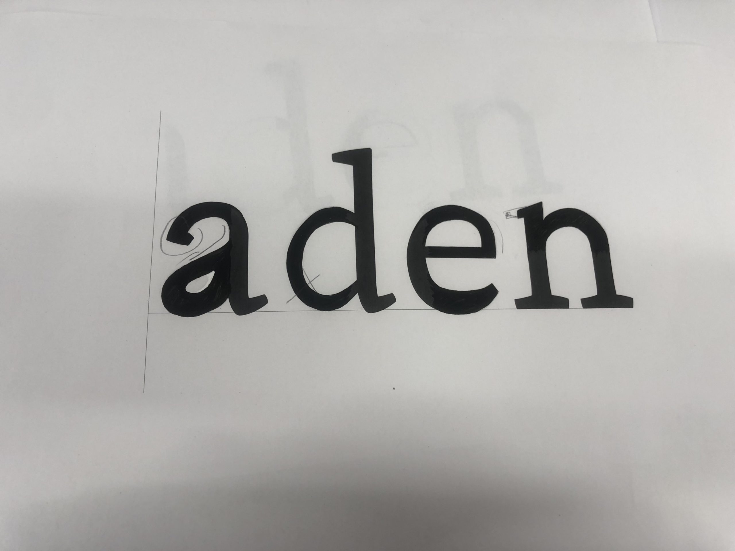
Task 1
For the first task of filling in missing part in the word ‘aden’, I was able to learn that individual letter have difference structure and characteristic. For example, different features include stroke contrast, x height and many other aspects varies to specialise a typeface. While sketching the word ‘aden’ in serif font, I have messed up with the aperture and serif in lowercase ‘a’, which I thought it would be better if I emphasis in the negative spaces by the next task.
Task 2
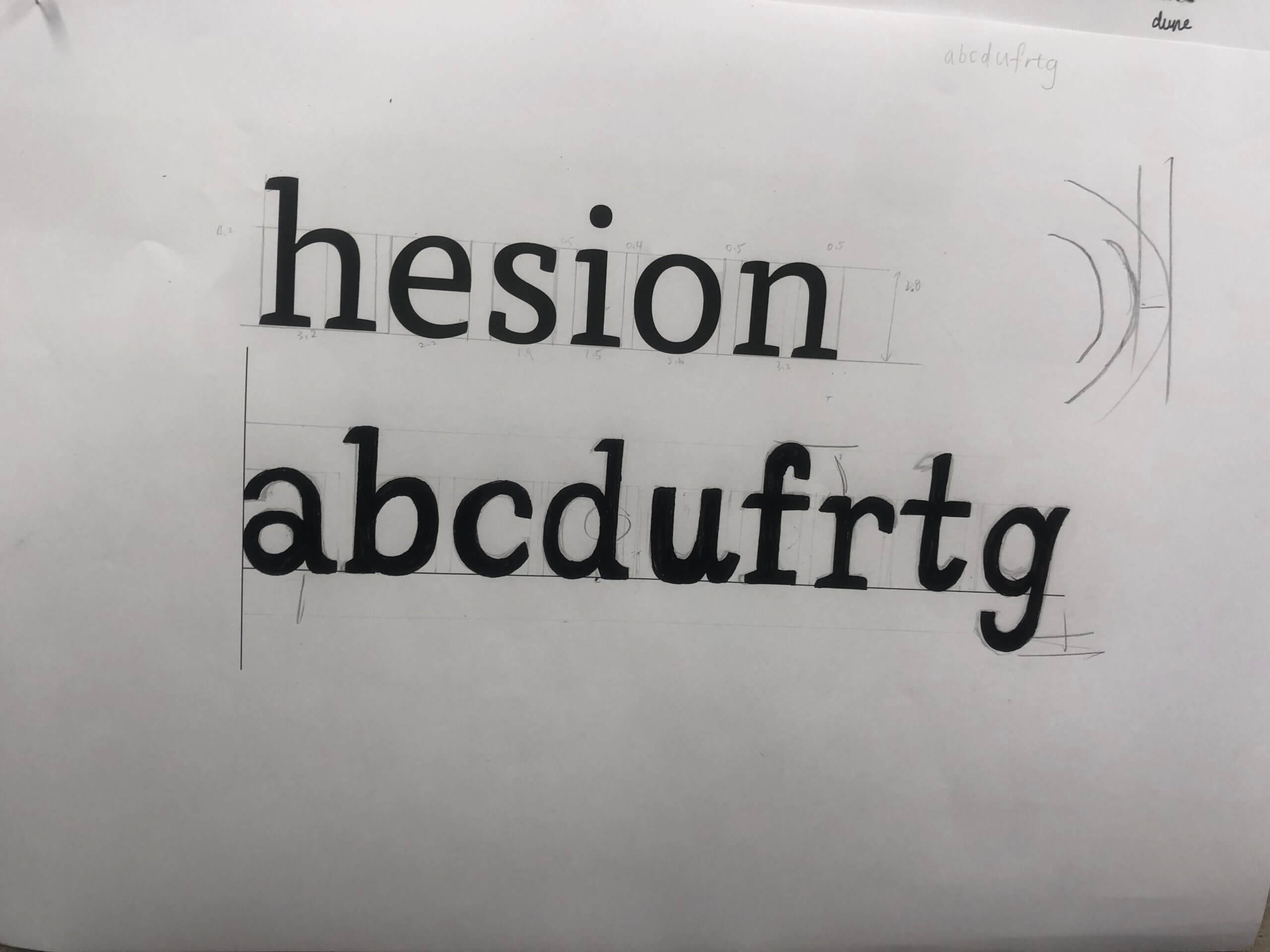
In the second task , we were told to write random letters ‘abcdufrtg’ in given font . It is more challenging to me, as I was using a brush pen rather than a calligraphy, which affect the stability in strokes. It is also important to further determine in each letter’s spacing as well as characteristic in structure and shape.
Reflection
By reflecting my sketching in letters, I can improve by paying attention in contrasting stroke, and accurate proportion to the serif. While sketching out and guessing the type shape, Gerry suggested us to recall how we write letters while we was a child. As designs may mimicking natural handwriting within typeface, such as the letter ‘u’ with serif in the ending. In these tasks, I realised that it is a complicated and long process to design a typeface. It was an useful practice for me to understand what typography elements a typeface designer need to determine and reserach while designing a typeface.
Autumn Film Festival
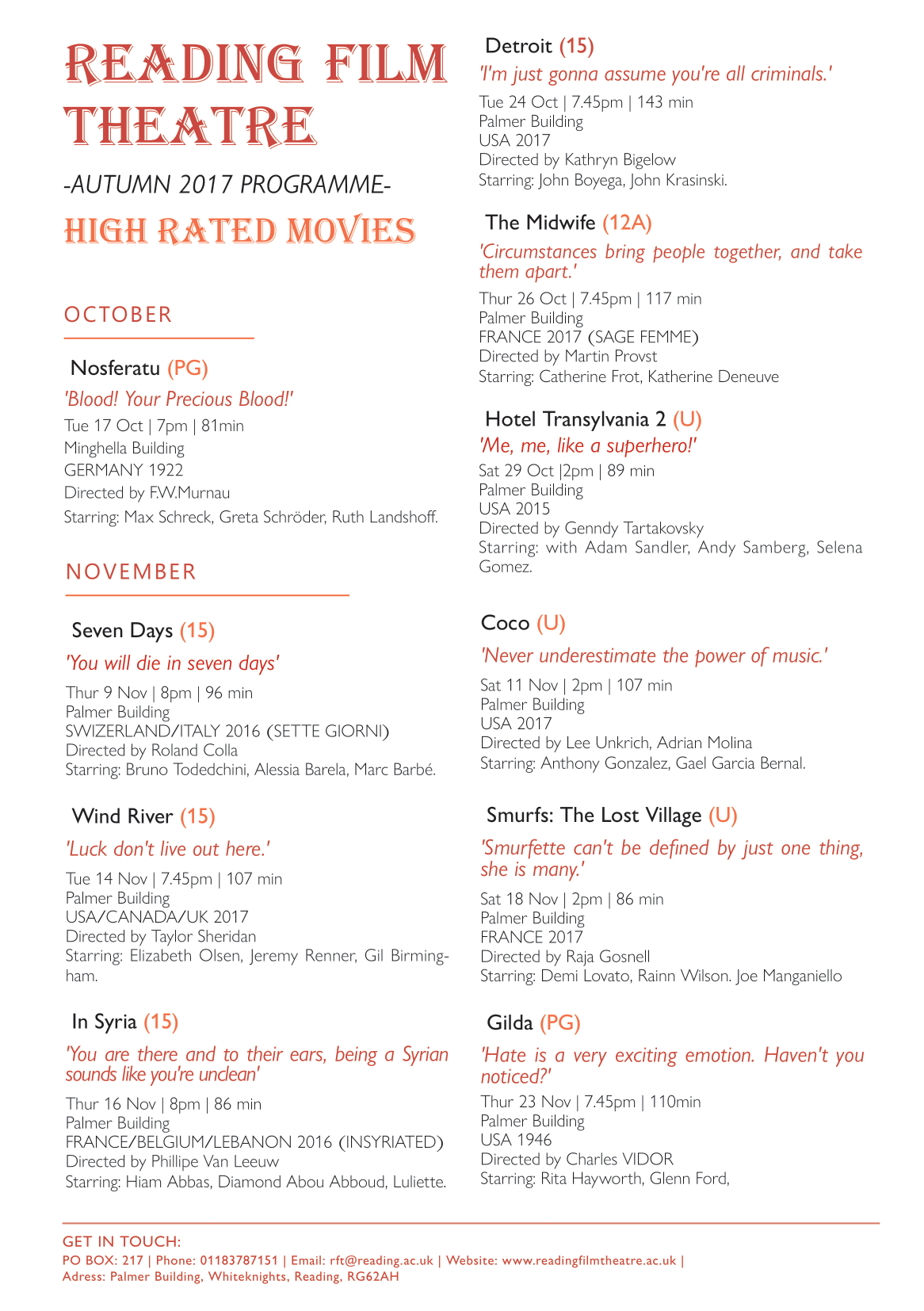
- Draft 1: traditional (for retired people with old Hollywood passion)
The first draft is design for retired people who have free time to watch film. By grouping films according to month and date, they won’t miss any filming date in schedule. Besides, retired people or someone who have passion for old Hollywood would extra focus on the context of the film, so I add a quote below each film name to attract these audience and priority their interest to the film. I also use a traditional and decorative font to the title of Reading Film Theatre and add text of High rated movies, so as to suit their characteristic and appeal my audience.
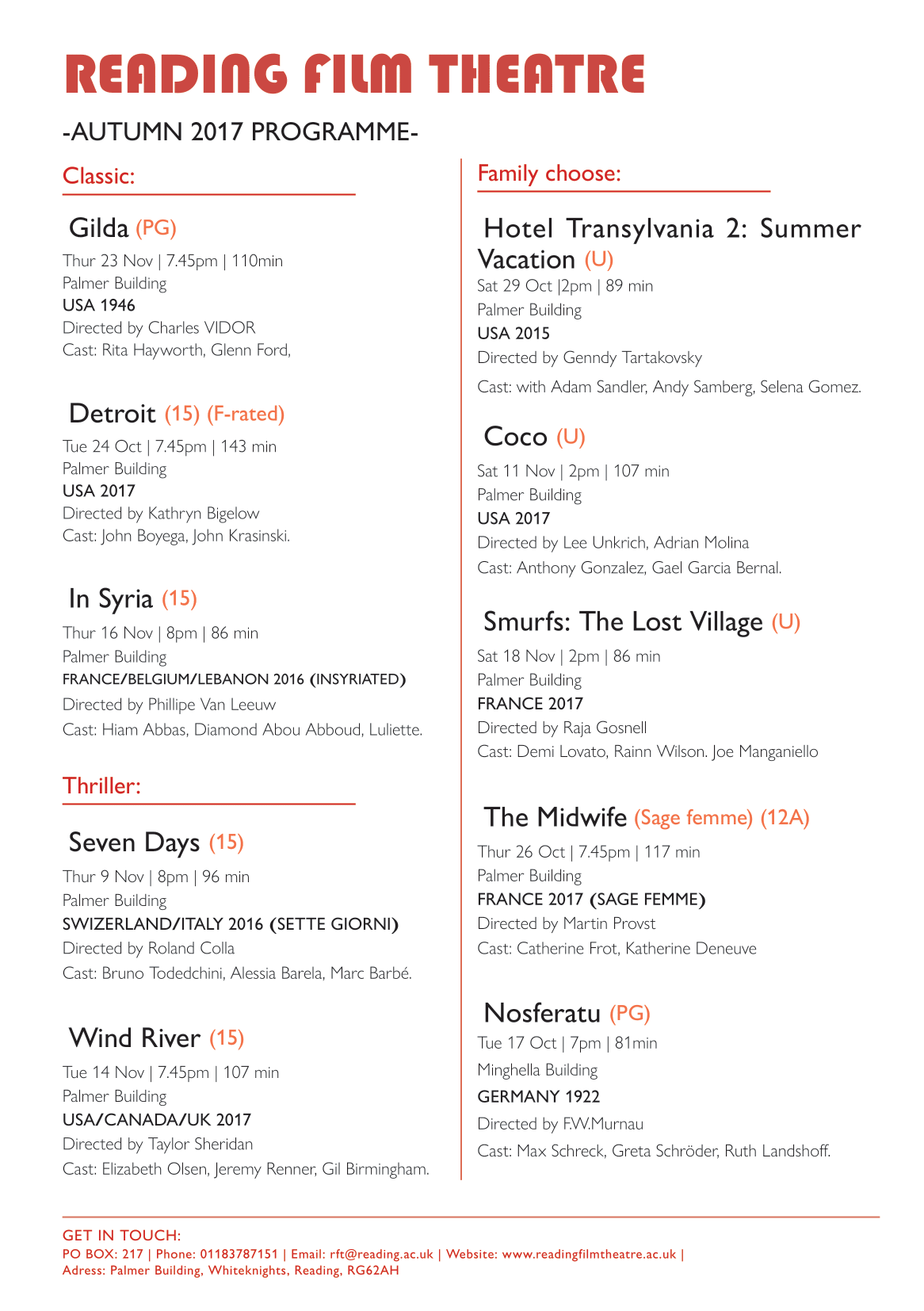
- Draft 2: mordernist (for international / busy people/ families)
The second draft is a more modernist design. As I would like to focus on the target audience of international and busy people, so I designed the flyer to be clearer and simplicity. Rather than grouping the movies by months, I distinguish them according to the film genre include classic, thriller and family friendly movie, which makes it easier to choose specific genre and relevant information for first prioritise, correspond with their own interests and to have a faster decision.
- Peers feedback
From the peer’s feedback, there are many typing and structure mistic that I can’t found by my own, such as wrong punctuation, type spacing, force line break to respect the cast, and repeated information found, which will be a serious mistake in real life situation, so I should be more aware on it for alternative designs.
Final decision
After adjusting the typing mistakes, I decided to combining the two designs above in mordernist way, as I reckon that it is better to benefit a wider range of target audiences, include retired people, families, internationals and people who have Hollywood passion,ect. I abandoned the month grouping version as the date is actually easily to find. I remain the film quote as to introduce the film little more and appeal different audiences.
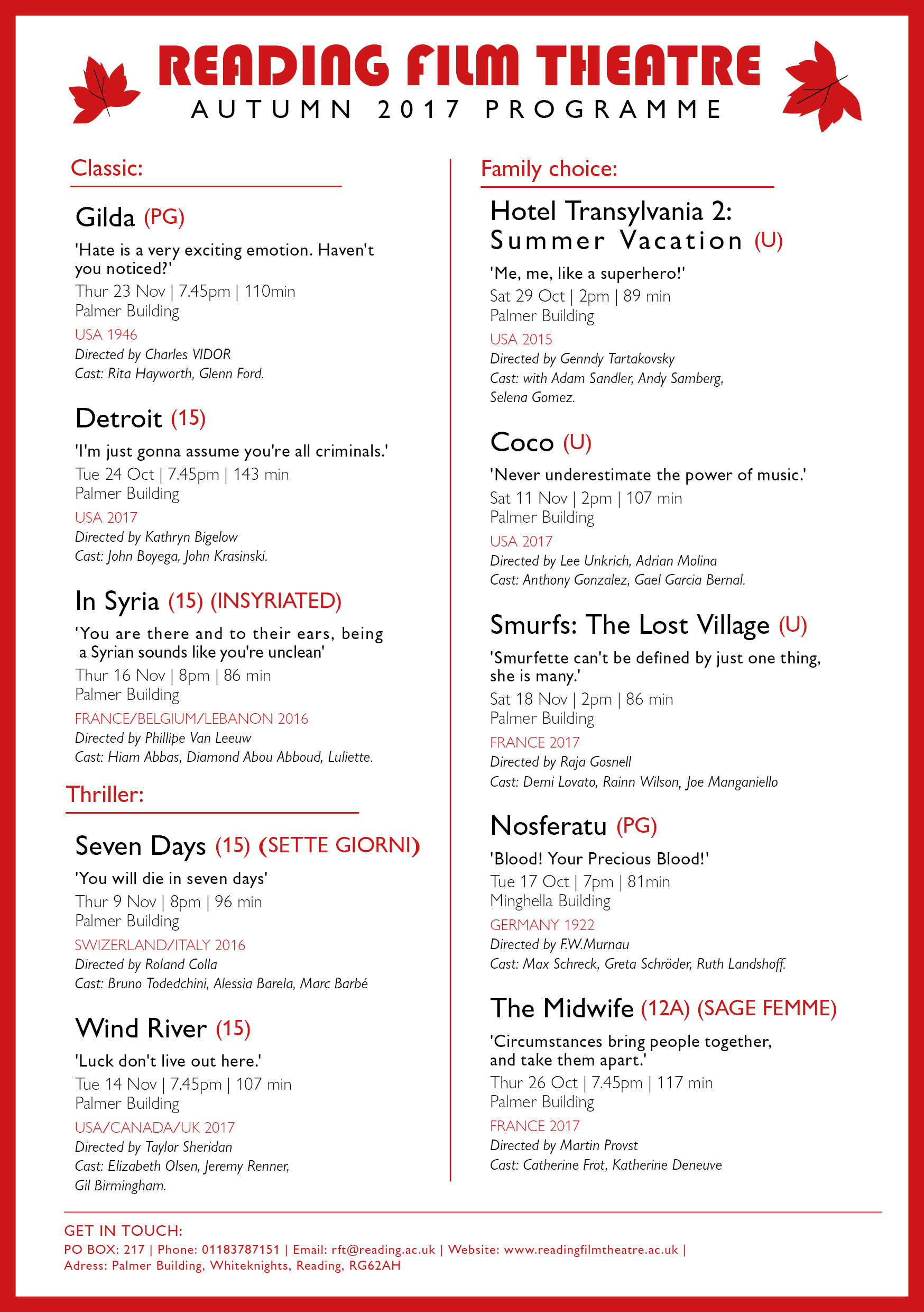
As to let my audiences choose what information they prioritize to look at, I haven’t particularly emphasis on a single title or information. However, I group the text by intrinsic and extrinsic information, as well as slightly change in font colour, weight and style to separate different information, so it will be easier to read. For example, I use red font in country which helpful for international user, bold text for the quote to have emphasize effect,ect. Lastly, modern font are used, also a red frame is added to create focus point to the information in middle.
By reflecting on my flyer design, I think I can improve in the informational grouping and idea of structuring the layout design in terms of hierarchy. It is a bit vague to read and boring for now, as it better to have featured layout style for an appealling first impression. I can look at peers work in achieving a more stylish flyer later.
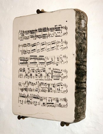
1870s Vintage Sheet Music
Background information
The collection I chosen was a sheet music cover from Frank Laughlin: The Orphan, illustrated by T. W. Lee, and published by Chappell & Co Ltd (New Bond Street, 50 – London) in 1870.
Illustration: Cat and sheet music in 19th century
The reason I choose this sheet music is that I was appeal by the drawing of the kitten, which is realistic and cute. From the picture, we can see a woman that put on noble clothes and accessory was holding a wretched and little kitten by whole hand, which correspond with the title ‘The Orphan’ above. The picture creates a sense of sadness and helpless of the kitten, which I assume the target audience may be upper class woman, and the illustration arouse their sympathy and appeal them to listen the music. Besides, the text is in different typography style, which is decorative.
In 19th century’s sheet music cover, there are quite a lot illustrations found using cat as object. It is said that animals were often used in advertising caught on in Victorian times, as using anthropomorphized animals in human activities more clearly demonstrates to the viewer an aspect of the character’s personality, thereby making the consumer more sympathetic with the animal in question.
Printing technique: Lithographic
(An example of lithographic stone for printing music. The music is written backwards on the stone.)
Lithography is invented by Alois Senefelder in 1796, and was first used to print music in 1796 and the earliest music sheets to be illustrated by lithography were produced in this country in about 1820 and were coloured by hand.
According to the video on lithographic process and website of music printing history, the process involved drawing an image or text on a smooth piece of limestone with an oil-based ink. Then, acid was poured onto the stone to burn the image onto the surface. A water soluble solution was then applied, sticking only to the non-oily surface and sealing it. For printing, the water adhered to the gum arabic. The oily ink, however, repelled the water, thereby allowing for the printing of the images.
Overall, I have learnt the complicated printing process in lithography, the asthetic of vintage 19th century sheet music, and how illustrator attract the audience by animals in sheet music cover and advertisment. These advance me a lot in the history of printing and future album covers design.
The Great Gatsby

Through the online class, I have learnt the fundamental skills using Indesign. One of the techniques I found MOST vital is to create paragraph style to the text while making different adjustment like tracking and leading in one panel. I have also learnt loads of useful shortcuts that will be useful to adapt in future designs, like holding shift to achieve perfect move and scale objects proportionally, as well as shift+alt to copy an image.
The hardest part will be working on the cartouche that at the top and using shapes to crop it out, but the pen tool help me a lot with it at last. Overall, it’s such a great practice copying traditional book design and step in using Indesign.
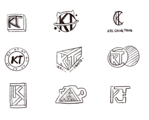
My 90s Logo
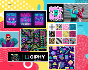
I was inspired by the 90s graphic designs that was full of abstract graphic elements and patterns influenced by fashion and the colorful 80s. It is appealling to me with its combination of colour palette and geometric shapes. Therefore, I create a mood board that shown above, in which I want my logo to have an energetic and colourful effects and adapt them in my final logo design.
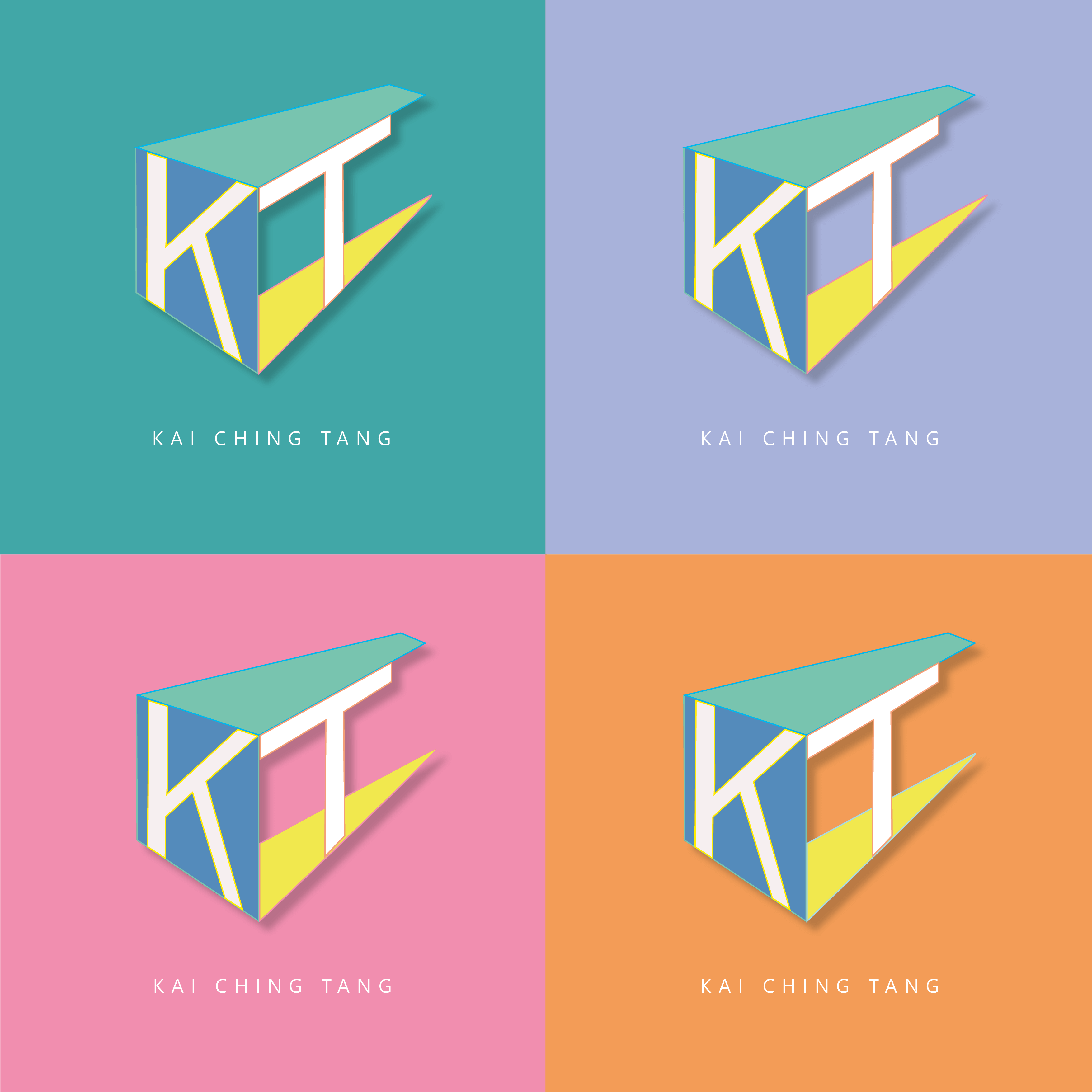
- Vibrant colors with bright yellow, pink, cerulean blue, etc, as to achieve a bold and eye-catching effect
- Abstract shapes with bold, abstract, geometric shapes
- Making the logo three dimension by dropping shadow behind.
Besides with the 90s style inspirations, I also tested out different combinations to my logo of my initials ‘KT’, and I finally choose the one which is more geometrical and recognizable.
The Little Prince

Inspired by the penguin book cover, I create my messed up version for the famous fiction storybook ‘The Little Prince’. I did quite a lot changes from the penguin book to make it more mordernism, but still remain the basic font and elements. There are few insprations and variations compare to original penguin book in my design:
- same font of Gill Sans Nova and paragraph style are adapted, while the headings are in wider tracking to fit with the childlike story, also used italic words in the book descriptions to emphazise the sentences
- changing position between the author name and book title, so as to try emphasize the both maybe
- illustrations of the little prince and fox are added to make it more appealling and visualize the story plot
- the logos of penguin book are put in the right hand corner as it can grab less attension and let audience focus on others main elements
To review my book design, I could make it better by showing more influences from the penguin book, as it now looks a bit different from the original one. For example, making funny variations to the penguin logo by adding the crown from the little prince, etc.
In these mini Indesign tasks, I realized that designing a simple book cover is much harder then normals expected, as there are so much to decision and progress go through with the layouting of text, as well as graphic to best communicate ideas. It is easy to mess up by making it looks too empty or complicated, and lot much to be considered. For now, I felt more respectful for the book designers and still have a long journey ahead to design like a pro.
Signs Observation
By capturing all the signs found around the typography department, I have been more aware of the environment around that I usually not pay attention to. In these days, variety of signs, logos and numerals were designed to make our life full of convenient unknowingly. More signs are designed. For example, instruction signs designed to remain our behavior of social distancing and washing hands due to virus.
I categorized all the images according to their colors with particular functions. Primary colors that match with black and white letters have contrast effects, as well as use sharp paint to grab people attention.
- PROHIBITION signs mainly in red
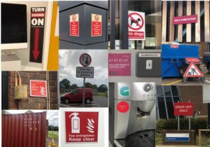
- WARNING signs mainly in yellow
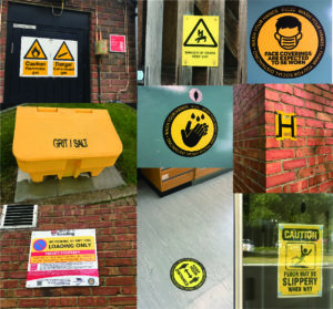
- SAFETY signs are in green; MANDATORY signs are in blue with positive instruction
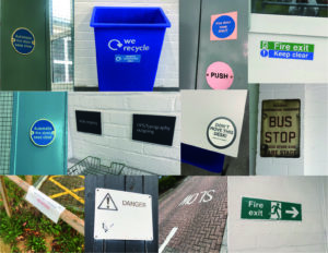
Besides the function of colors, similarities of signs are that it designed as simple as it can by linguistic and symbolic lettering, we can always get the message behind the signs in less than three seconds without hesitation. I compare them with tiny observations:
- Simple geometric shapes using in outshape of signs, and common symbols within signs are arrows, banning circle, exclamation triangle and recycling sign.
- Font of Sans serif are used in almost every sign due to its readability.
- Material and placing position are different between indoor and outdoor signs: Indoor signs are mainly placed on the wall with eye levels and using removable materials like binding metals or stickers, while outdoor signs are mostly bigger in size and use weather-resistant materials, as they are mainly designed for pedestrian and drivers.
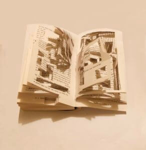
Infinite Labyrinth
The story of Labyrinth is about a family that trapped inside their new house with unexpected spatial characteristics. They start a journey to find the front door. My initial idea is to create a pop up book with structured pages like a labyrinth.
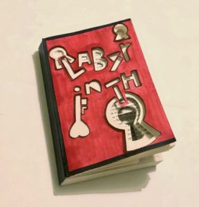
To represent the story and my idea visually, I designed both for the book cover and inside pages:
- The word of ‘Labyrinth’ are cutted out asymmetrically as the book title, which symbolize the shifting rooms.
- Symbols of keyhole added to features infinite doors to pass through.
- Colour scheme: Red and black are used to represent the mysterious story plot and anger of the family getting lost.
- Book pages: Geometric rectangles are cutted out randomly and create a sense of confusion. It also visualises their journey of finding the front door in the house of labyrinth.
Overall, I have experimented with drawing and cutting techniques on the book materials and played with the structure of the book. Although the result is not that well as I expected, I have gained experience of communicating and representing an idea through design but not just emphazise on its aesthetic.
Music box lamp
The first mini project in design practice 1 module, to design an ideal gift to our partner base on three of their fun facts.
As my partner is a k-pop, anime and art lover, I first come up with the idea of designing a spieldose (music box) with moving anime characters. Fortunately, this idea is adopted and developed further into my final design.
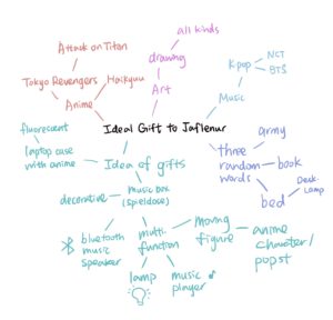
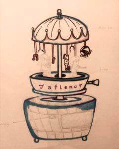
In the developing stage, I have given three random words of ‘Army’, ‘Books’ and ‘Bed’. Nevertheless, I only chose ‘Bed’ as it is associated with an extended idea of a multi-functional desk lamp slash Bluetooth music player, which fitted with modern design, also best to play as a ‘Bedtime Toy’. By connecting her favourite k-pop music, switching on the aesthetic moving machine with anime characters, as well as a desk lamp for lighting purposes, it becomes her ideal gift.
Although the gift has multi-functions that suit her fun facts, the model may be too complicated in manufacturing. On the whole, some adjustments with the colour scheme and simplify modelling will be needed if it turns into an actual product.