Author: Hanorah Murphy

Labyrinth

Labyrinth: a family moves into a house with unexpected spatial characteristics. The rooms keep shifting position every time a door is opened. The family members are trapped inside the house and start a journey to find the front door. While they keep moving from one room to the next, they discover that they are not the only ones lost in the impossibly infinite labyrinth of the house.

I shaped first half of the book in the outline of a house which can be seen to have a door and a variety of stairs to create the labyrinth affect in the background. I felt that my front page in the first page to the story and is a good way of visualising telling the story.

Here the inside of my book can be seen, on the left is this idea of stairs created out of the books pages, all being connected to a single door. Representing the idea of once the door closes another room appears on the other side. In a way the door represents a portal.

on the right hand page Is the outline of a door getting smaller and smaller as you go though the pages, representing the never ending of this house. I burned the stairs on this page to show them disappearing as you go through the each door.


The H in my name deserves the hierarchy

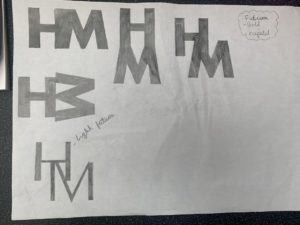
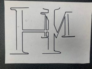
At first I did a couple of sketches to see which type face I preferred and the different ways I could create a monogram.

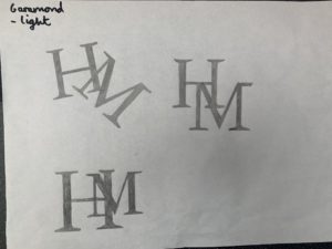
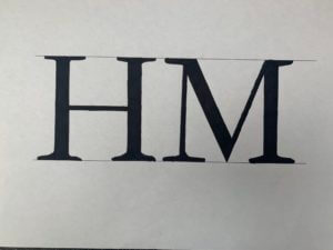
I went with Garamond font as I liked the the flow of the letters more. I decided to take my bottom left sketch further as I liked the idea of having my first name Initial as the more dominant lettering, with my surname in the background. I thought it was ironic as in the name your last name is your family name whereas your first name is you.

I then draw it out as a line drawing and as a whole. I preferred the full type so took it further.

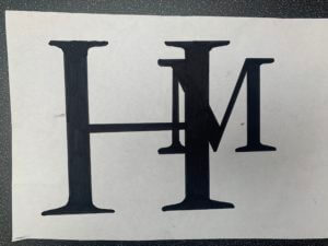
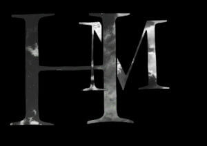
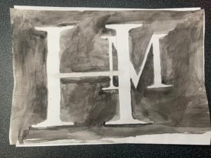
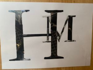
I played around with different media, from digital, collage to watercolour paint.

I researched some famous monograms and found that they consisted of 1 to 2 colours max, mainly black and white. which lead me to my final outcome.

Lettering in the Environment

Mini project – Lettering in the environment – Eric Kindel

For this project I focused on trying to get as much variety of lettering as I could. I started off by walking around campus, then I ventured into Reading Town Centre.

Once I had all my photos, the next step was to categorise them. I displayed my photos into a collage form with the topics of; ‘Warning’, ‘Branding’, ‘Advertisement & marketing’, and lastly ‘Signage’.   These can be seen below.

  Warning 

Lettering in the environment

I used Adobe Photoshop to edit each collage. I decided to remove the colour as I found it heightens the danger in these signs. Also it gave me a different perspective to examine the lettering. I found the type to be similar and all consisting of a san-serif font. I looked into this further to see what the reason behind this was and I found it was simply because they are easier to read.

Below, the rest of my collage’s can be found.

Branding

Advertising & Marketing

Signage