
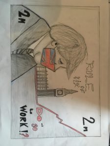
 With the design brief , Britain in mind, I thought , as opposed to depicting Britain in a traditional sense, such as with big red buses and telephone boxes, i would display Britain in its current climate during the coronavirus pandemic. This image is a recreation of the British £5 note , with a covid 19 era Boris in place as the key figure on display , using a Great Britain facemask. As a famous landmark, always featured on notes , Big Ben can be seen , this is also to further familiarise the audience with its setting on Britain .The base on Big Ben transitions into the chart for infections on the rise. Further alterations to the original £5 design are the , 2m instead of £5 , in referance to how people had to keep a 2 metre distance from each other during lockdown. The rule of six text replaces, the Bank of England.The final element of text ‘ DOnt go to work ‘ has colour to emphaise how the quote can mean either do or do not go to work , a reflection of the confiusion caused by the Prime ministers speeches.Colour i used sparingly as a display of the dark times we are living in , however, some colour shows that there is still hope . A final addition i wished to have made was to feature a map of Britain in the background behind Boris and Big Ben in the upper half of the note .
Author: Adam Powell
AP
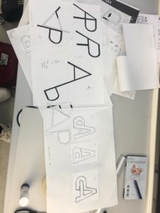
Using the Futura typeface, both medium and bold, I experimented with how the 2 letters – A and P could be incorporated together as a single unit, motif or symbol. I began by merging the letters next to each other, however it seemed that it could easily be misread as a letter R. Therefore, I explored flipping one of the letters upside down, leading to my 7th and final design solution, where the cross bar of the A merges into the the counter of the P. This creates an interesting ‘impossible staircase’ type aesthetic. I would like to further explore with colour .