
Overview
Every year the Department of Typography & Graphic Communication at the University of Reading hosts a showcase to display and celebrate the work of their graduating class of undergraduates. This event consists of work carried out across the students’ time on the three-year course, with each student designing a display of their best work. It is an opportunity for graduating students to introduce themselves into the professional world of graphic design, as they wish to be seen. We invite industry professionals to celebrate the achievements of our students and to publicise their work with the people that inspire them the most. Oftentimes our guests discover fresh talent they want to invest in, offering internships, or even employment.
This year, the graduating class warmly invites you to Flux2023!
A team of third year students undertakes the branding and promotion of the event. The following short blog describes how the team has put together this year’s show.
Flux 2023
We searched for a theme which represented and celebrated students and their ability to adapt. Contemporary issues around the development of AI means the world of graphic design finds itself in a state of flux. This year’s show celebrates our design graduates emerging into this changing environment. We chose the name ‘Flux’ to represent this concept.
Experimenting with modular systems
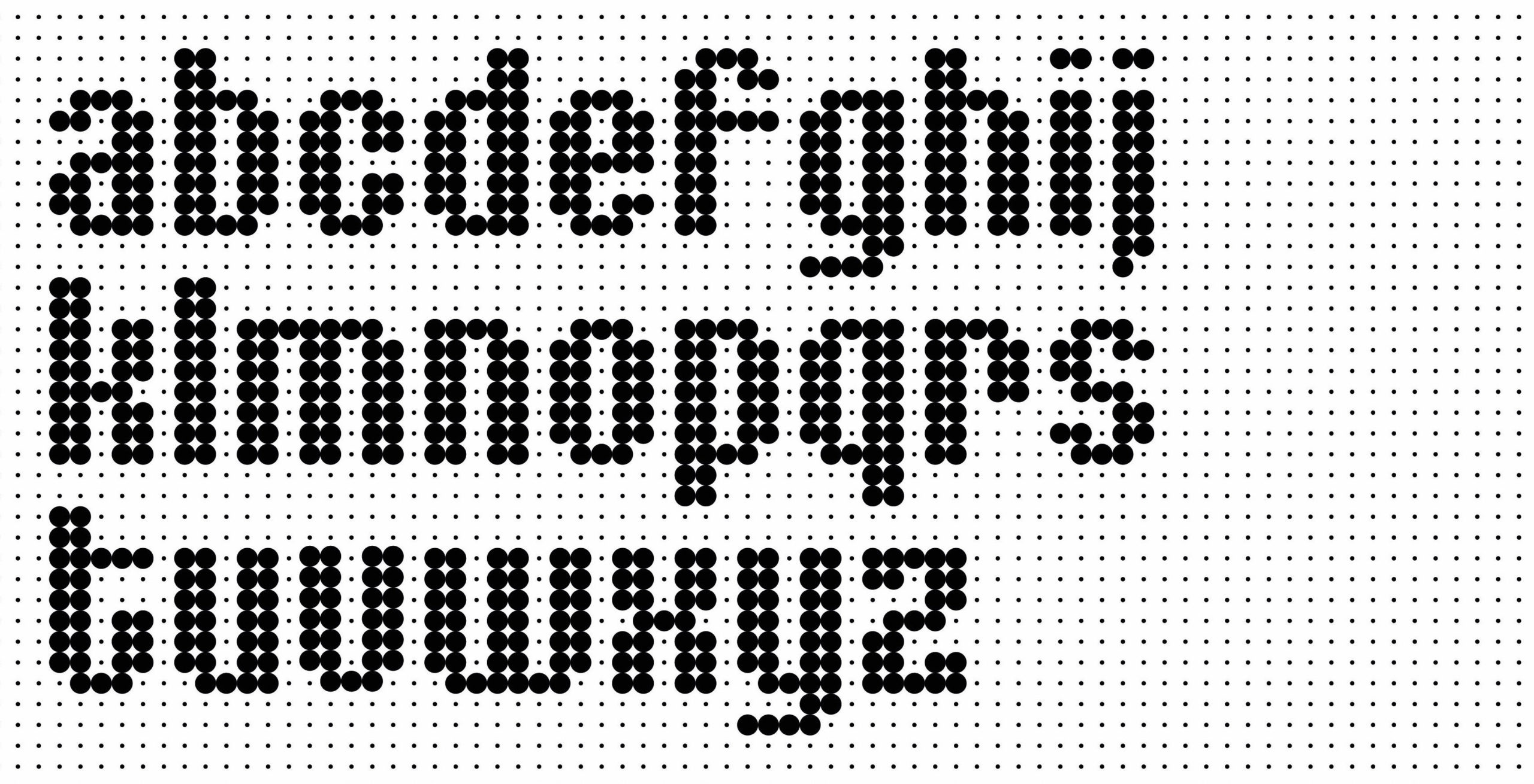
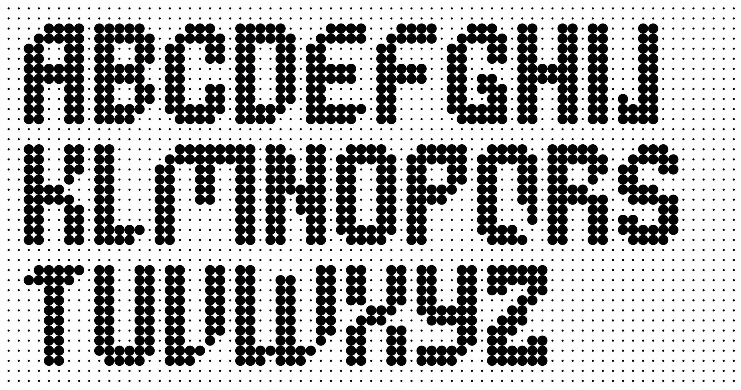
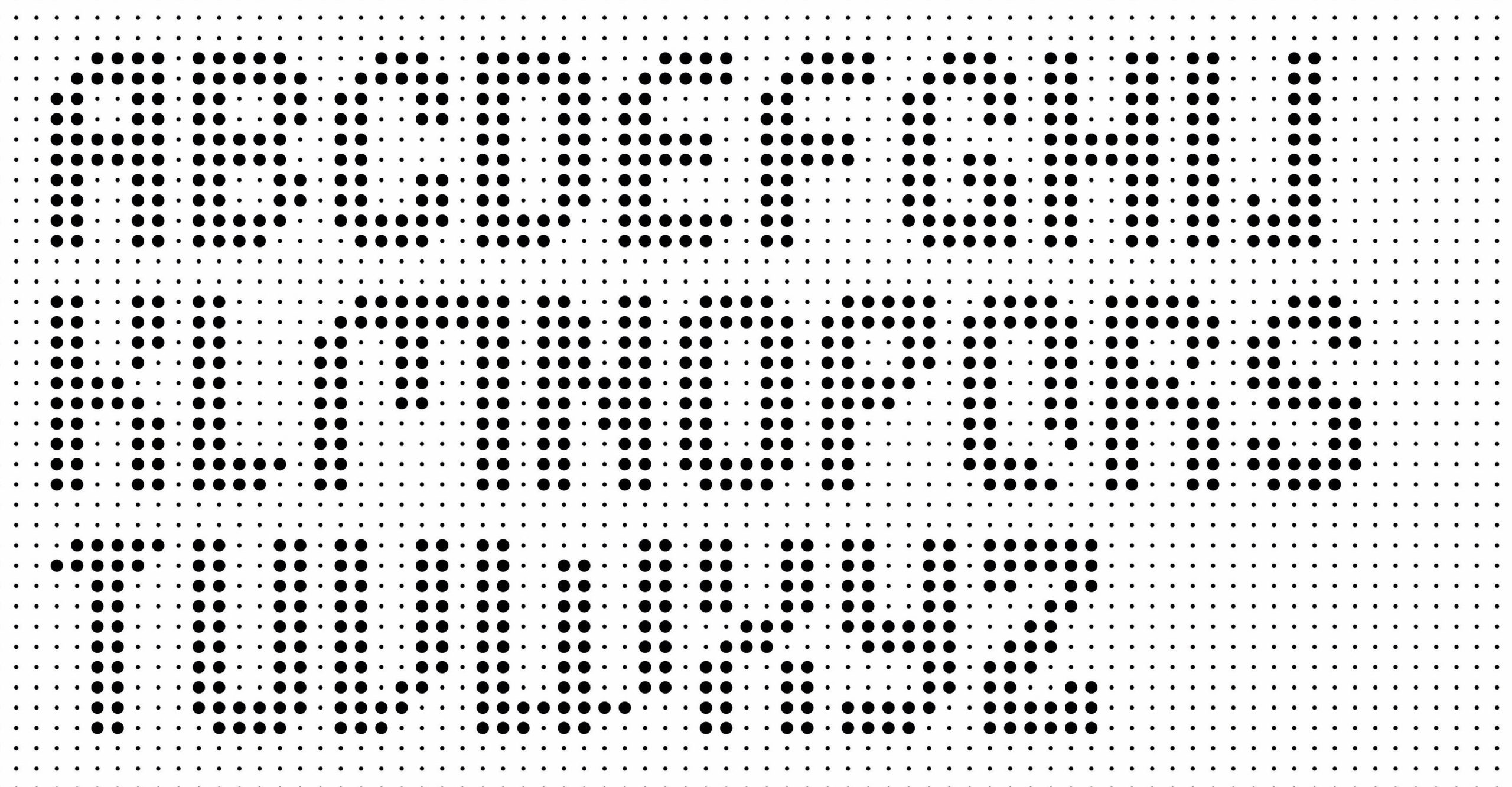
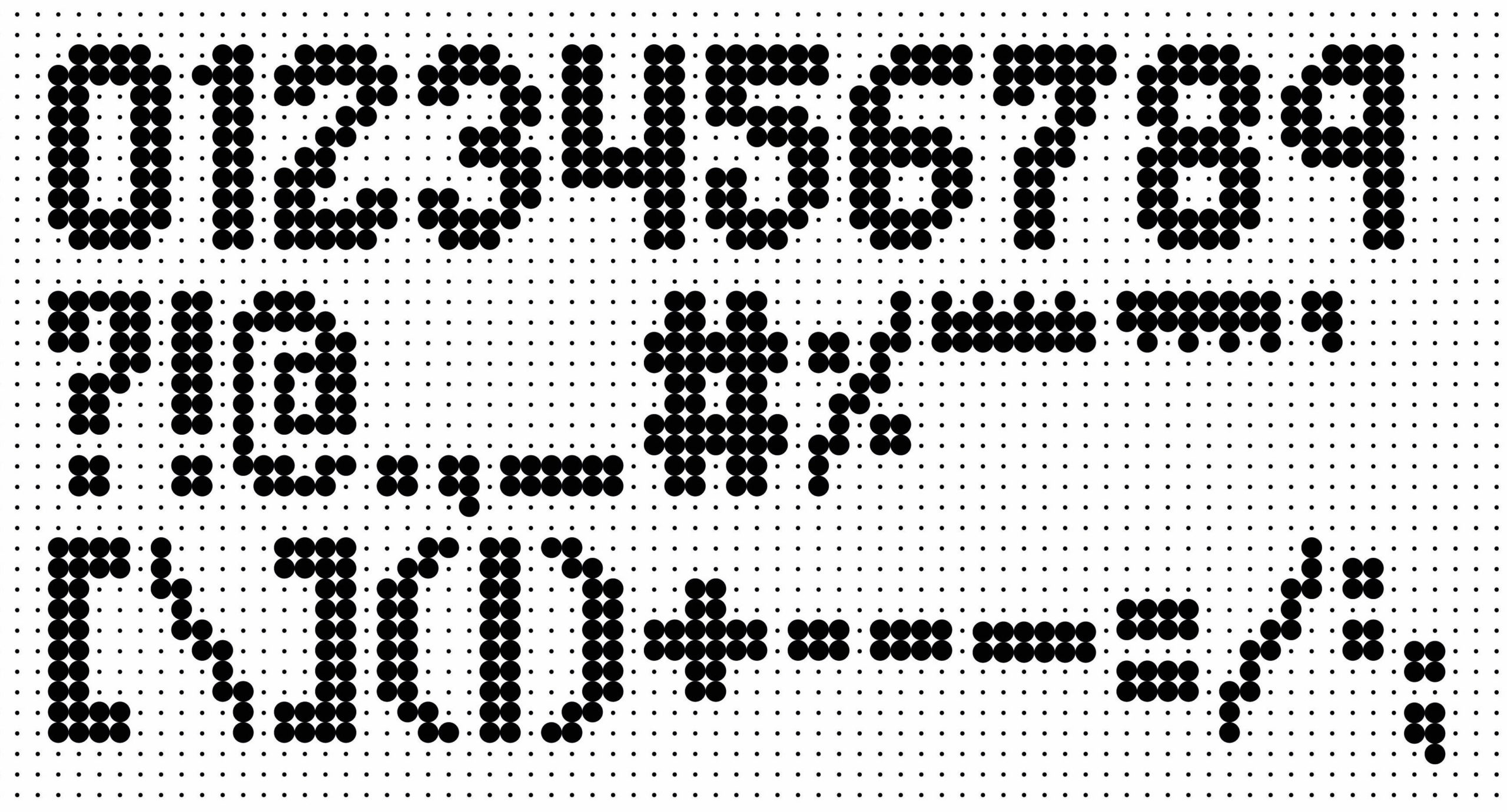
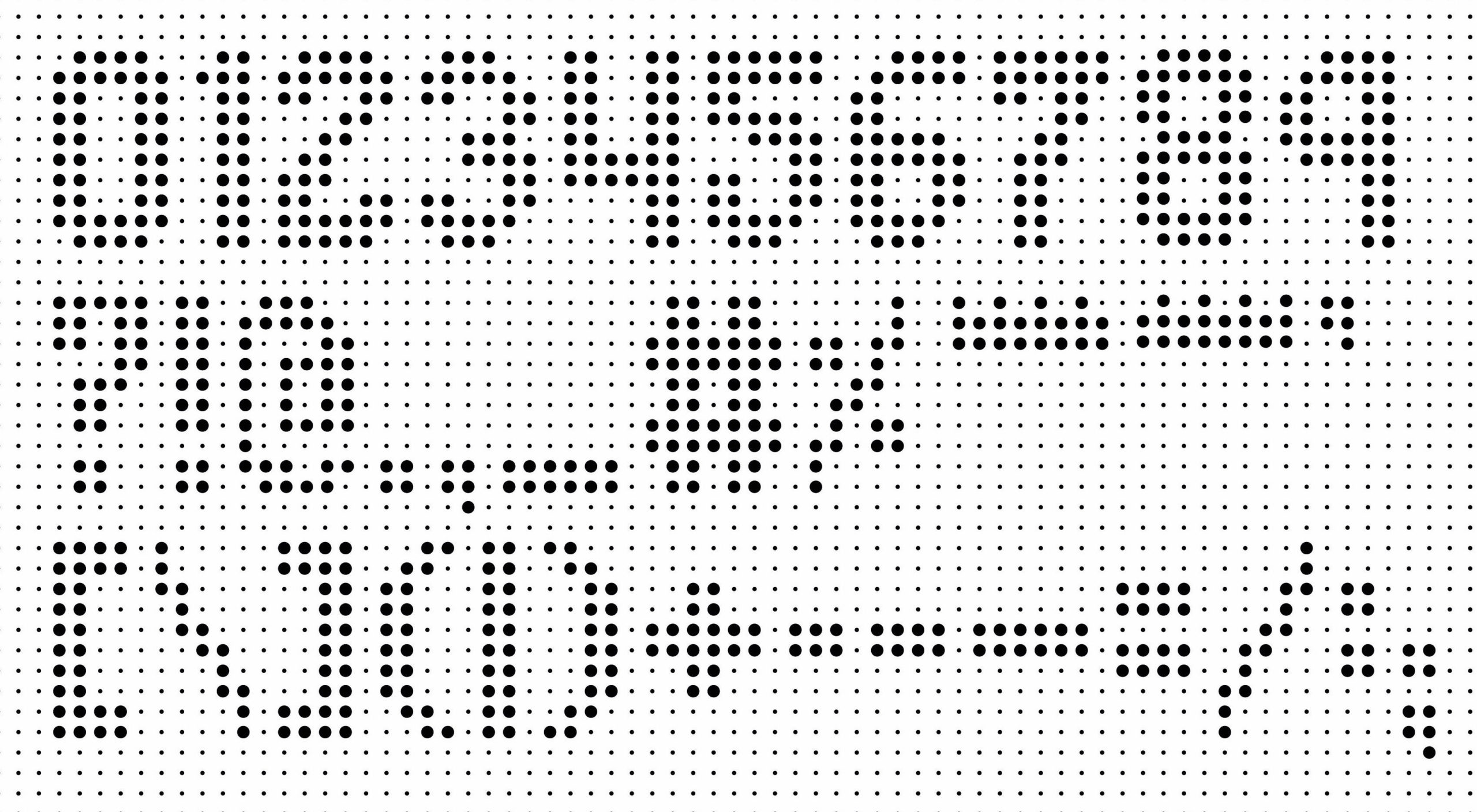
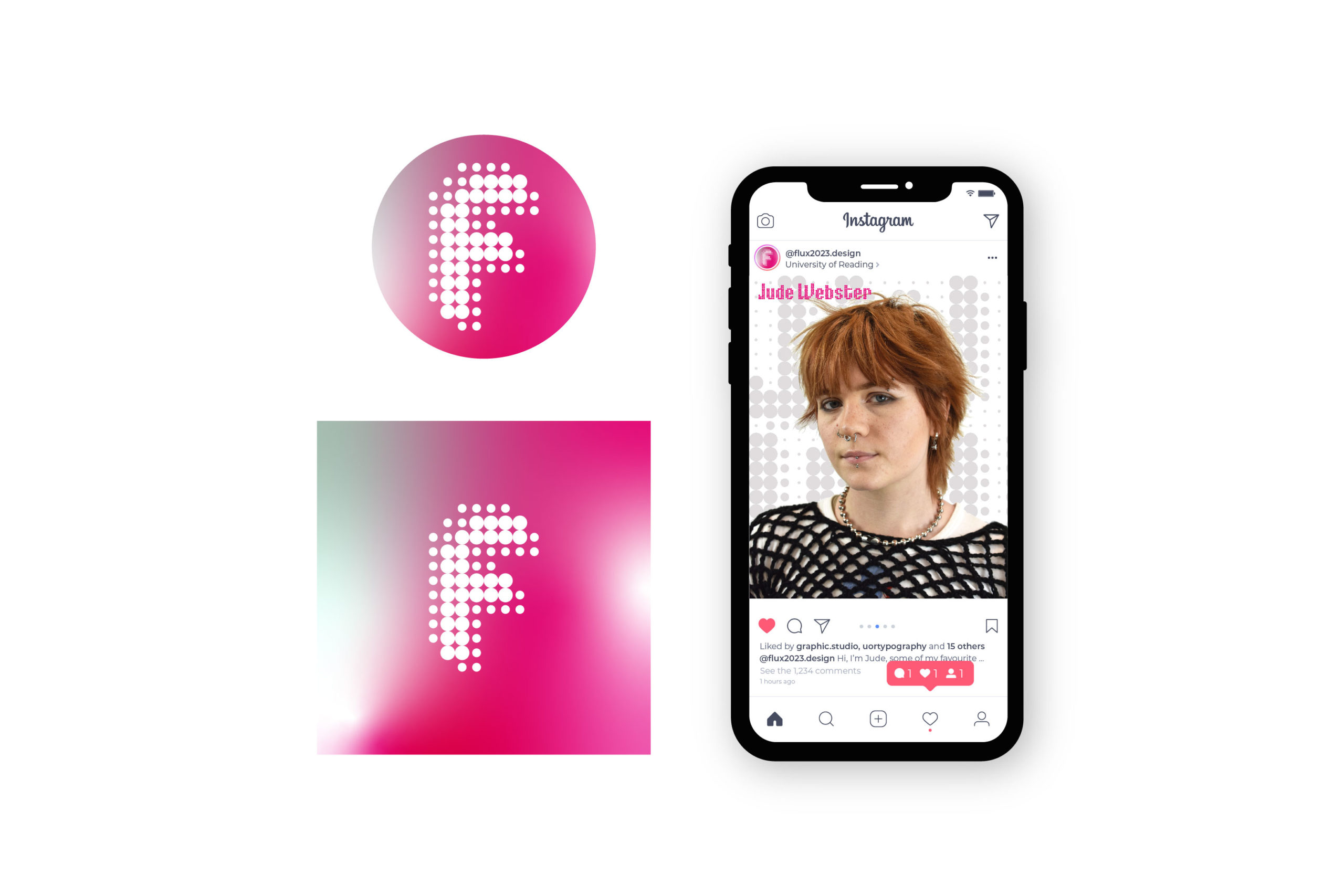
We were inspired by modular design. The team explored ideas of a modular typeface that could react within a grid and have a sense of motion whilst being visually exciting. Three layers of a grid were constructed, all proportionally scaled up from the primary layer on which the type was structured and created. Since the type was derived from the grid, it could be scaled up to sit at different sizes of these grids in a variety of formats.
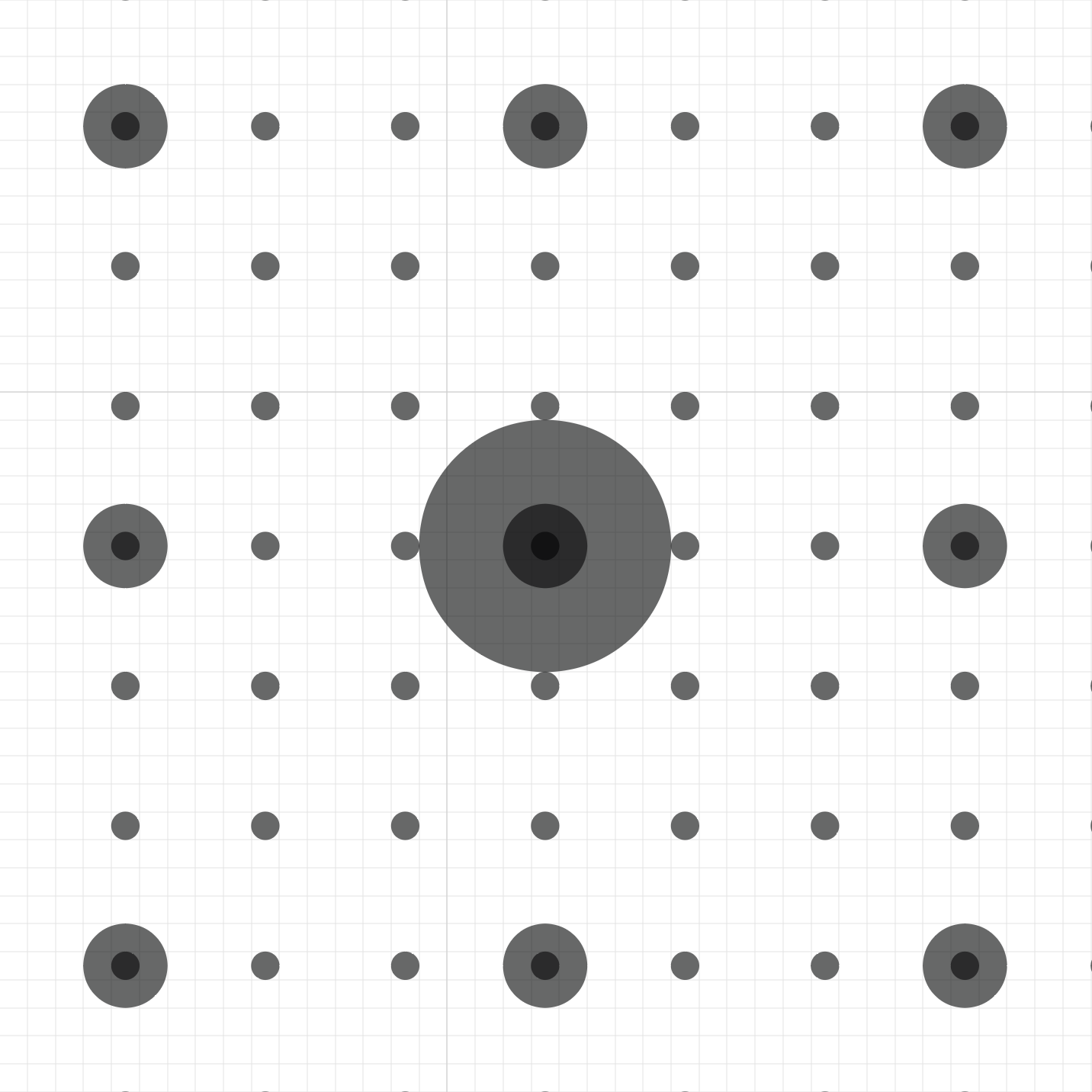
We started exploring spacing and sizes of modules on a paper format to see what felt most visually diverse and appealing in its most reduced form. A lowercase modular typeface proposal by Jurriaan Schrofer inspired the lowercase. The Uppercase and glyphs were then constructed based on the ascender height, but had wider internal spacing and more consistent weights, giving the type forms more texture and contrast. Both upper and lowercase were derived from the smallest module grid, which meant they were compatible when offset, and offered an interesting sense of movement.
Branding
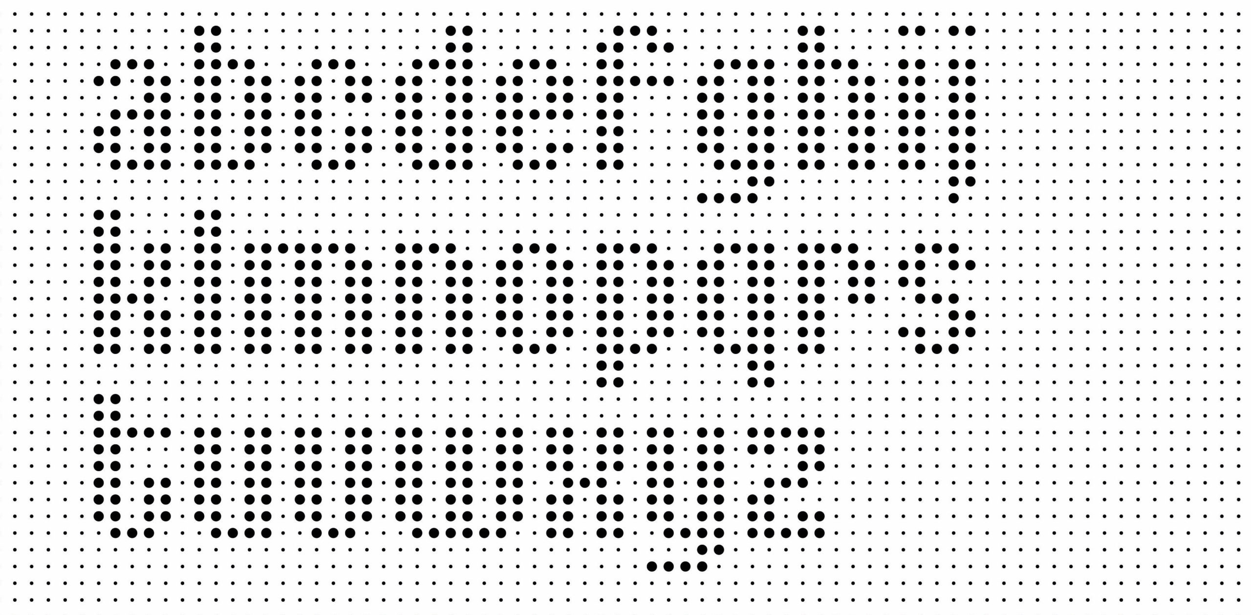
Initially exploring in black and white to test legibility, we developed our brand to include strong colours inspired by letterpress inks. Further developments introduced greater fluidity and texture with the introduction of a gradient. The turbulence of the gradient background allows for more blending options between type and grid. Our Flux typeface can be overlayed on both the grid and the gradient in a range of structures and layouts to enable a dynamic event brand, applicable across a range of print and digital assets.
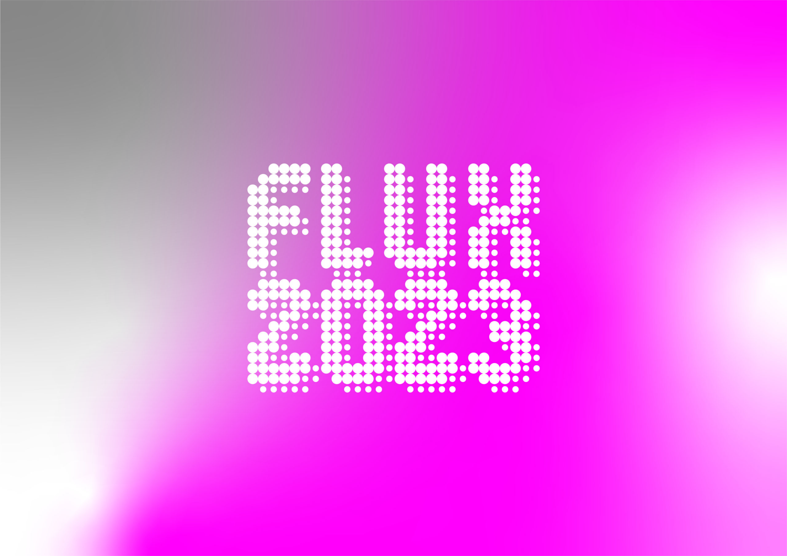
The system will be applied to printed items and wayfinding for the event, as well as on our website and our social media channels.
Follow us on Instagram @flux2023.design
Conclusion
The degree show represents the students’ adaptability and willingness to keep pushing their knowledge and skills. Flux 2023 is the culmination of our students’ work, revealing their identities as designers, rooted in theory, and intertwined with excellent typographic practice.
We would be delighted if you would join us to celebrate the achievements of this years’ students at the private view on 08 June, 5–8pm. Please register your interest here.
If you can’t make the private view, the exhibition will be open for public view, 12–17 June, 10am–5pm.