
Following the Thursday interactive session from Gerry Leonidas, I have come to recognise and acknowledge the details in typography as well as overall design.
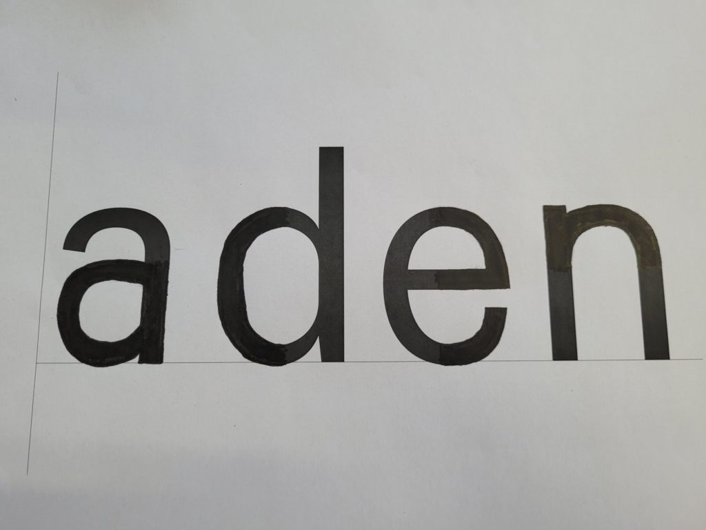
The session had us draw letters of a particular typeface that was only in small parts that were pre-drawn; and from that reference we had to draw the rest of what remained of the text. I believed this exercise was to test our knowledge of not just typefaces, but to see if we could guess the following style through little information.
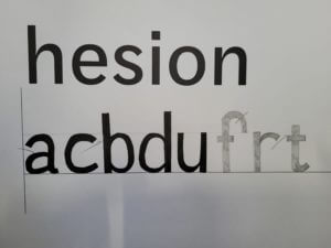
The picture on the right of the page illustrates an example of my drawn work that shows how I continued with the pre-drawn typeface. Compared to the original, it was fairly accurate, however the “a” and “e” required more curvature, after being given 4 words, the task moved onto doing more without a starting reference on what we had to draw. Very similar to the first example I had drawn, they were mostly accurate other than the curvature of the lines on certain letters. In future projects, I will need to improve my skills of refining and recognising fine details, especially when it is related to text or fonts. These drawing skills will help reintroduce me into sketching for future assignments as well as improving my confidence in refinement.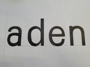
To conclude, the session helped me understand the foundations of what future analysis of designs/typefaces will require. Additionally, as I have not drawn for a while, it was always helpful to regain my confidence into drawing more again.