
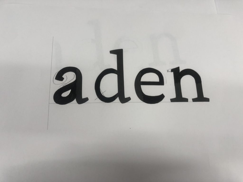
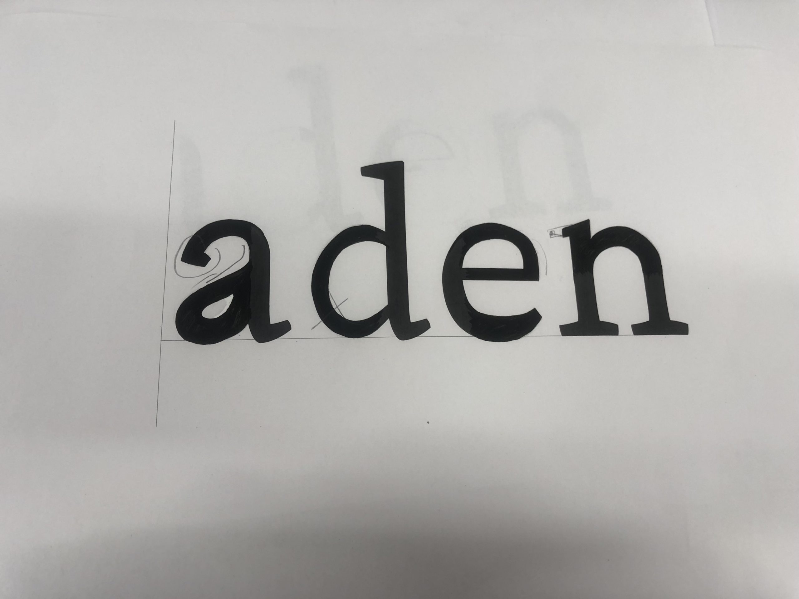
Task 1
For the first task of filling in missing part in the word ‘aden’, I was able to learn that individual letter have difference structure and characteristic. For example, different features include stroke contrast, x height and many other aspects varies to specialise a typeface. While sketching the word ‘aden’ in serif font, I have messed up with the aperture and serif in lowercase ‘a’, which I thought it would be better if I emphasis in the negative spaces by the next task.
Task 2
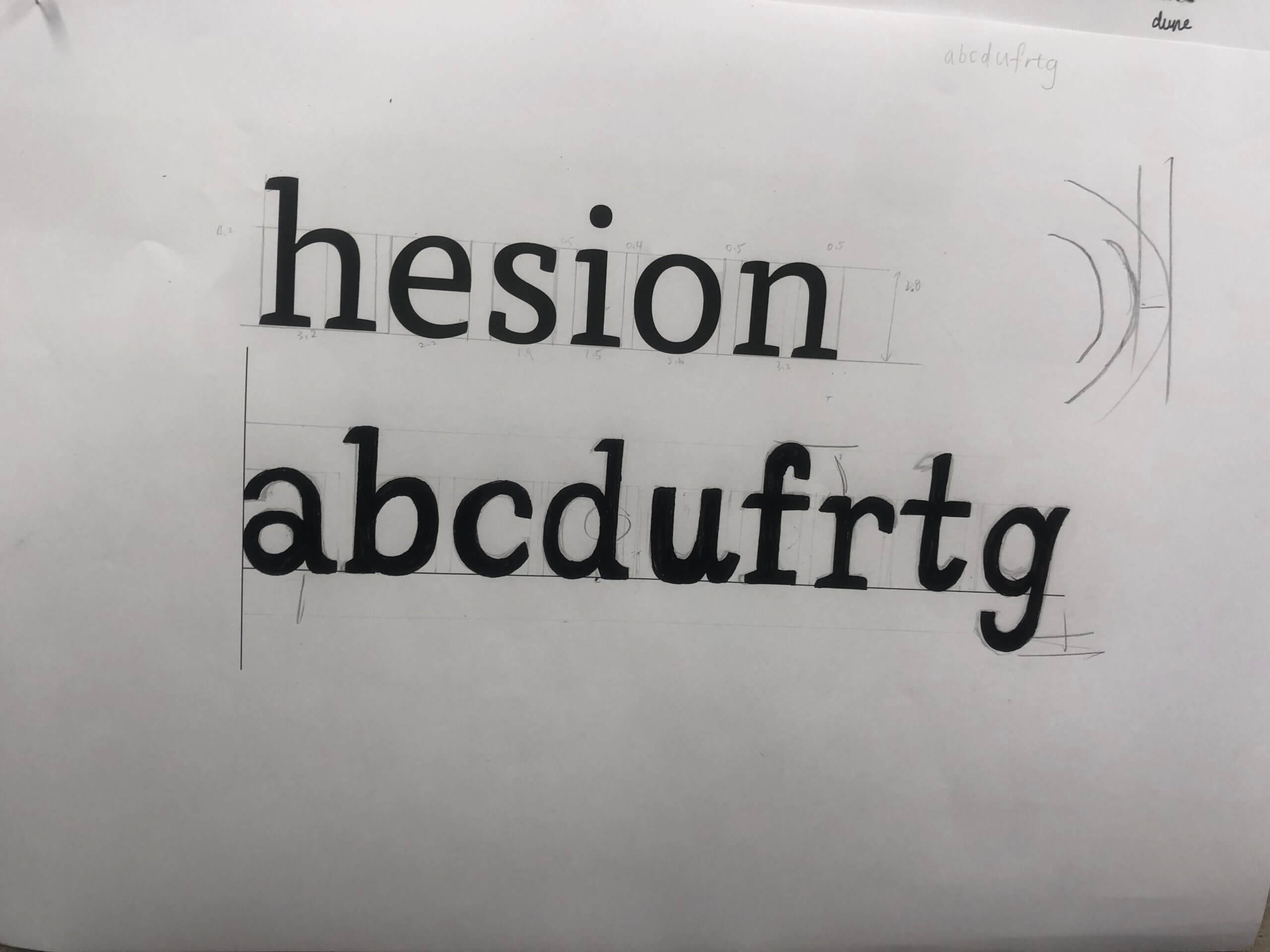
In the second task , we were told to write random letters ‘abcdufrtg’ in given font . It is more challenging to me, as I was using a brush pen rather than a calligraphy, which affect the stability in strokes. It is also important to further determine in each letter’s spacing as well as characteristic in structure and shape.
Reflection
By reflecting my sketching in letters, I can improve by paying attention in contrasting stroke, and accurate proportion to the serif. While sketching out and guessing the type shape, Gerry suggested us to recall how we write letters while we was a child. As designs may mimicking natural handwriting within typeface, such as the letter ‘u’ with serif in the ending. In these tasks, I realised that it is a complicated and long process to design a typeface. It was an useful practice for me to understand what typography elements a typeface designer need to determine and reserach while designing a typeface.