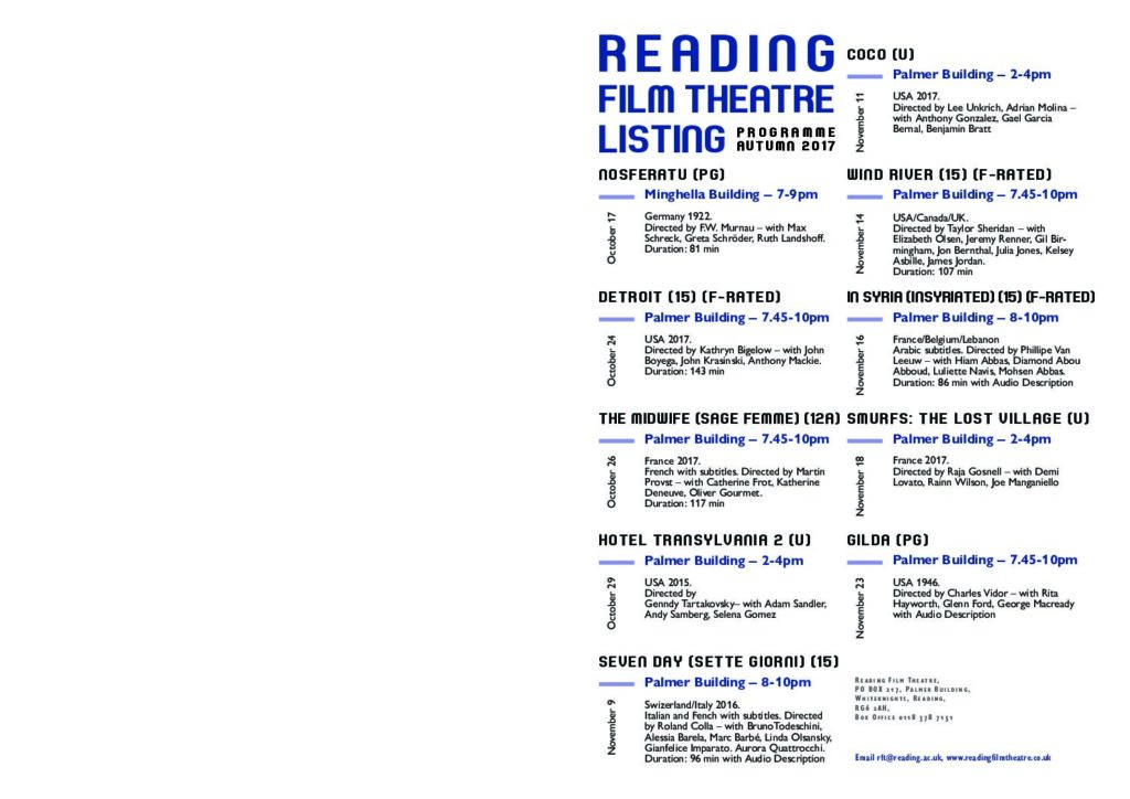
I started this project with some experimentations in indesign. I did some trials in the margins and columns as I tried to do landscape mode with 2 rows to fit the paper. I learned how to do the table in indesign so I could arrange the text equally along the page. I began my search on past cinema listings and was inspired by many of them. I noticed how each listing has a different type of font that made the audience feel like they’re in the cinema. Then, I searched for fonts on google that fit well the movies theme and chose “Joyful Theatre” as my main font. I wanted a color that could be strong and independent above the white background so I chose black and dark blue. I tried playing around with the tint in some places too. Next, I added as many paragraph styles as I can in order to practice using them when there are many texts. I aligned the texts together and added a ruler guide for each line so every text would be aligned perfectly. I used Gill Sans Nova font to state the movie’s description, location, and date. I added paragraph rules below the movie title in order to align the date and location of the movie in a designed way. I tried to make the list easy for the eye to read so every age can be attracted to it. I believe I can use many of these stuff I learned in the book design project, especially the paragraph styles and ruler guides.