Initial Ideation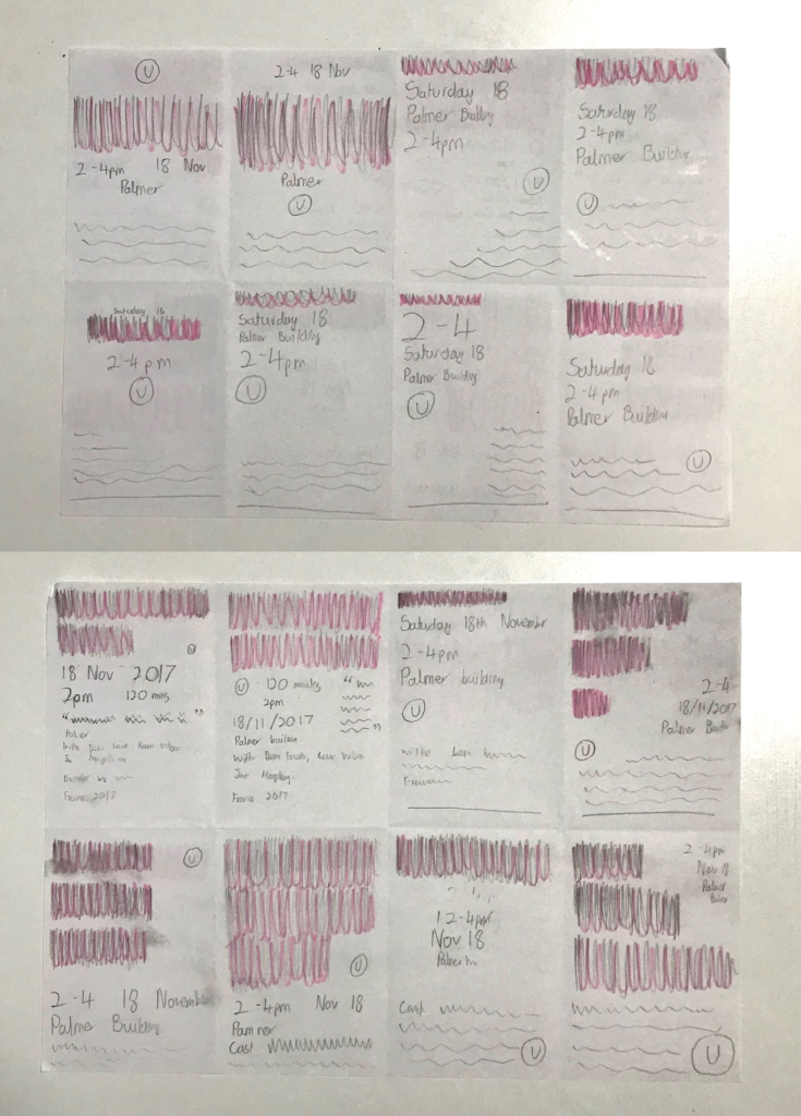
Following the brief being set, I began by quickly sketching designs. It is important to note that my target audience was a father with two young children, so many design choices were influenced by this. I used blocks in place of the main title, writing only the other information to see it in context. This was a purely experimental process intending to generate a range of ideas relatively quickly.
I trialed different positionings of the title mostly, which I shaded in pink for simplicity. The larger texts, while optimal for a typography-based poster, would likely not work in the context of a cinema listing, which must be a vehicle for information. The A5 size limit means that text must be carefully balanced to ensure hierarchy and optimal readability.
Alternatively, when made smaller, the title loses its dominance over the other information. While there are other factors likely more important to a father, such as whether the timing of the film works with the family’s schedule, the conventions of a cinema listing and other users also have to be considered. The film title is typically the largest element in each individual listing, allowing other users to quickly identify a film that interests them.
After reflecting on these ideas, I concluded that the bottom right image on the first page and the top right image on the second page were the two most suitable. These two ideas appeared well-balanced but will be refined in later development.
Idea Refinement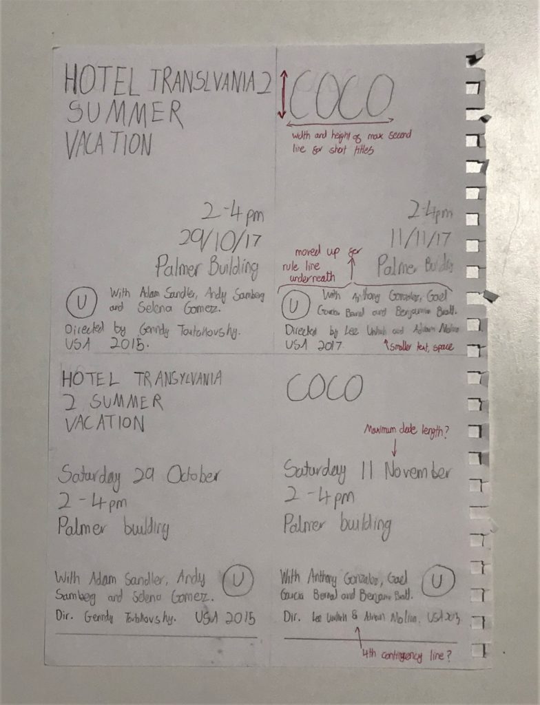
Having decided on the two concepts, I drew these out to a larger scale, now writing the full title out. Although this is more in line with the final piece, the actual refinement would take place within InDesign, so this is simply refining the concept.
I drew the ideas twice, once with the longest title and once with the shortest, allowing me to see the extreme differences this element will need to have, in turn being able to adapt the design to these requirements.
Having done this, I used a red pen to write on notes and adjustments to make when in InDesign. At this point, I decided that shorter, single-line titles could span the height of two lines, believing that this would make the design look more balanced.
I also concluded that, while spacing was important and should be tweaked and adjusted when suitable, a larger font would be optimal. This would make the final printed product clearer, allowing it to be better at its purpose, to communicate information to a potential customer of the cinema.
Having concluded that these ideas would be suitable and refined them slightly on paper, I then had to use InDesign to begin the digital creation of the ideas.
Digital Creation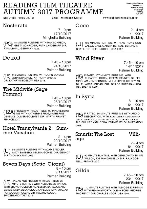
I began with black text, creating a single entry in the structure of my first sketch, using style sheets in order to regulate and standardize the sections. I found this stage complicated and difficult to construct, trying to tweak the paragraph styles to create a successful result. After watching a tutorial video on Drop Caps, I had finished the first entry and was able to quickly apply these styles to the remaining text. I then added the remaining information, including the titles and contact details, which I placed at the top of the page. I adjusted the sizes of these, making the title significantly larger while making the other information smaller, semantically spaced, and arranged to create visually balanced spacing by controlling the negative space around these elements. I realised that smaller titles could not be in a larger font as initially planned, as this made the design look incongruous and visually imbalanced.
Having completed this, I reflected on the design. I decided that the spacing needed work, with the blocks seemingly blending into one. To combat this, I adjusted the spacing more and added rule lines underneath each listing. This helped to define each block of information as separate, differentiating the data and allowing the design to be more visually balanced.
 Having created this design, I then added a coloured box to the top of the design. I selected a dark blue, allowing the text to all use the same colours (because, at the time, I thought that white counted as one of the two allocated colours). To allow the text within to be visible, I changed the colour to be white. This created a visual hierarchy, the white text standing out from the thick block of colour.
Completing a basic format, I then printed the design out to scale in black and white. This was a helpful stage within the process, allowing me to better understand and gauge the sizes of the various elements. Looking closely at this printed example, I was able to correct scaling and spacing issues that came up. For example, the smaller metadata was still too big in this example and more spacing would allow the design to seem more clear and visually appealing. I was also able to add more space between the upper listings and the coloured box, balancing the overall look better.
Having made these changes, I was happy with the design. I checked the use of punctuations and hyphens before resaving the design with a new name, allowing me to simply adjust the style sheets on the duplicated document instead of starting from scratch.
Second Design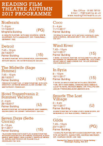
Having stripped this duplicated file back to the basics, I was then able to make adjustments to make the alternate design. I began by adjusting the layouts of each listing, with this being the most important factor to the user. Although other stylistic choices were also necessary, such as changing the typefaces and colour used, I wanted to ensure the concept was visually effective and appropriate at communicating the desired messages. Being able to use the same size font as the previous design was a reassuring sign that this design would be similarly readable and clear to a potential customer.
I think that this listing layout, while still somewhat successful for shorter length films, works considerably better on films with longer titles. For example, in the working document on the left, entries like ‘Wind River’ and ‘Nosferatu’ look visually more appealing than ‘Detroit’ and ‘Coco’. This came down to the contrast of line length, with the bigger title standing out more and filling a larger amount of the negative space when the title is longer. Due to this, I increased the kerning of the titles, attempting to increase the horizontal size of these shorter titles, making them more appealing as individual listings.
The dark orange shade I selected for this design was incredibly effective, with both the body text, titles and colour blocks with white inner text looking visually appealing and inviting. Although the previous design’s dark blue was functional, I think that this colour conveys more character and personality, with the blue making the programme feel uninteresting and overly informative. For the target audience, this inviting design is more likely to appear to the children, while remaining clean and sharp in order to be a useful programme of information to the father.
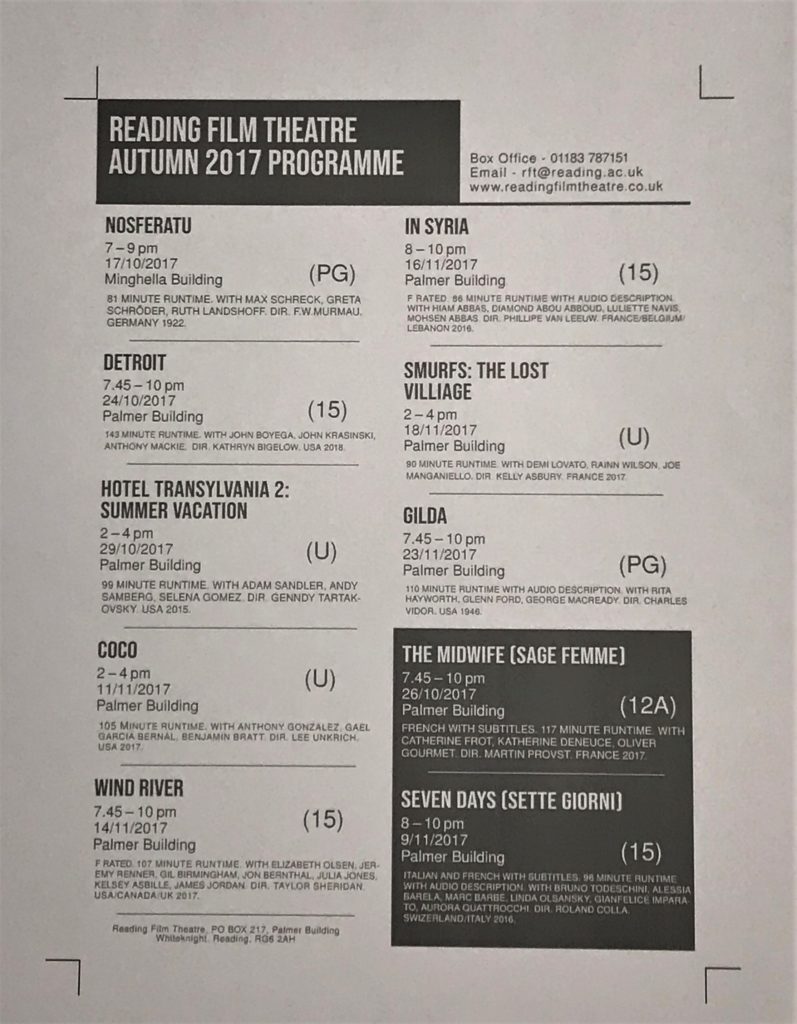 Having got the layout to something I was happy with, I left the design for 10 minutes before returning to reflect on it with a fresh, more objective viewpoint. I concluded that more visual contrast was needed and, upon seeing the two non-English films, I decided to balance the design better. I did this by moving these two entries to the end of the list, putting a matching coloured box around them and changing the colour to white. With the large block of colour in the top left of the design, which was needed to highlight the products aims and format as a programme, this second box created balance and contrast without interfering with the hierarchy. This also helped to separate films of different languages, assisting clarity and benefiting the user experience.
Having completed this, I again printed the design off in black and white. I was then able to see the design to scale and in context as a printed document. While more changes and tweaks were exposed by this process, I was able to make these amendments at this non-essential stage. I then printed a full-colour copy of the design, bringing it into class for peer assessment.
Peer Assessment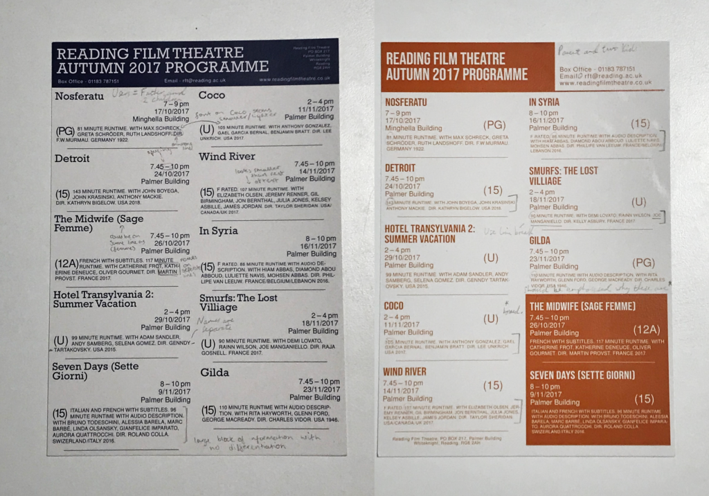
My two programmes were printed on thick paper, almost card like in structure, but with a relatively smooth texture. Although a typical cinema listing would be on glossy paper, I decided that this wouldn’t work for my target audience. For a father with two young children, it is likely that they would want to hold and read this programme, so the final product would need to be somewhat robust to withstand anything that may happen to it.
Having shared this with peers, I had feedback written over the designs. This was a useful process, as I received information and feedback on aspects I hadn’t considered, such as the respect of putting actors’ and directors’ names on a single line.
With this information, I then went back to the last saved files of my respective designs, making necessary adjustments to adhere to this advice. For example, on the first design, the spacing between the dashes when writing times were highlighted as an area for refinement. I was able to alter this, changing the sixth spaces to hair spaces, making the text and the design as a whole look more visually effective, likely helping its purpose as a product to convey information.
Final Designs
Looking at the final designs, I am very happy with the overall outcomes. I think that the dark orange design looks visually better, with the colouring, typefaces and layouts helping this. The box in the bottom right helps to balance the product visually, creating a design that would be successful at communicating this information to the target audience, a father with two young children.