
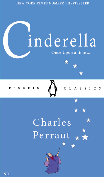
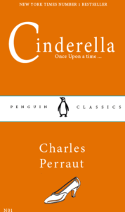
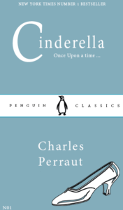
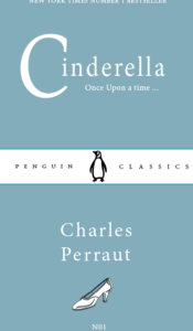

I decided to take a different approach to designing my second penguin book cover, instead I was inspired by the ‘Pocket Penguin’ collection. I chose this collection because the simplicity of the design was a good base to work from and adapt. I firstly used the classic penguin orange, inspired by the original classic covers. I moved away from the ‘pocket book’ and placed the title at the top half of the book because we read from the top to the bottom of a page and I wanted readers to see the name of the novel first. For the title itself, I made the C larger to create that magical affect usually seen on fairy tale novels, almost looking like a moon. I tested out different typefaces to also convey this so I chose the Serif font ‘Minion Pro’ as it looks both elegant and simple. I wanted to add a feature image to appeal more to the children reading it, I then changed the size of the silver slipper but it became too distracting and stood out more than the title and author. I then wanted to replicate the use of vibrant colours used by the classic covers, as the vibrant colours represented their genre.