
By capturing all the signs found around the typography department, I have been more aware of the environment around that I usually not pay attention to. In these days, variety of signs, logos and numerals were designed to make our life full of convenient unknowingly. More signs are designed. For example, instruction signs designed to remain our behavior of social distancing and washing hands due to virus.
I categorized all the images according to their colors with particular functions. Primary colors that match with black and white letters have contrast effects, as well as use sharp paint to grab people attention.
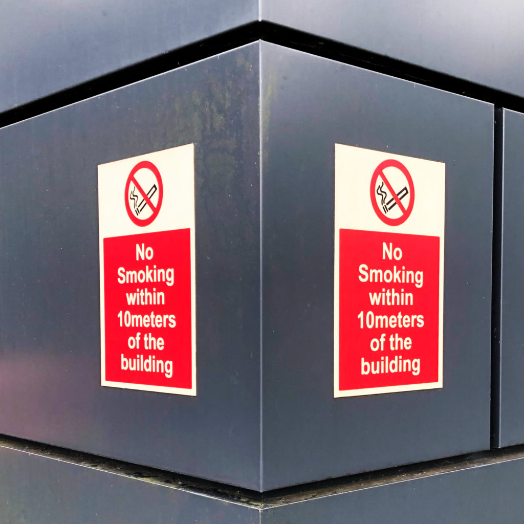
- PROHIBITION signs mainly in red
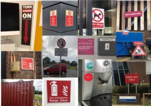
- WARNING signs mainly in yellow
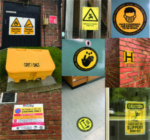
- SAFETY signs are in green; MANDATORY signs are in blue with positive instruction
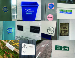
Besides the function of colors, similarities of signs are that it designed as simple as it can by linguistic and symbolic lettering, we can always get the message behind the signs in less than three seconds without hesitation. I compare them with tiny observations:
- Simple geometric shapes using in outshape of signs, and common symbols within signs are arrows, banning circle, exclamation triangle and recycling sign.
- Font of Sans serif are used in almost every sign due to its readability.
- Material and placing position are different between indoor and outdoor signs: Indoor signs are mainly placed on the wall with eye levels and using removable materials like binding metals or stickers, while outdoor signs are mostly bigger in size and use weather-resistant materials, as they are mainly designed for pedestrian and drivers.