
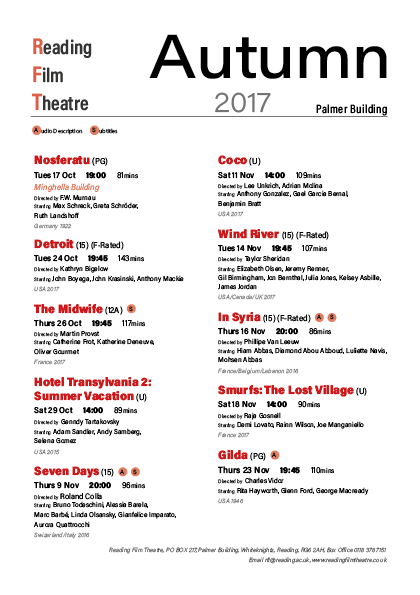
For this project, we had to use Adobe Indesign to create a cinema brochure for the Reading Film Theatre. I wanted my design to be clean and contemporary, using red as the accent colour, to put emphasis on certain elements of text. To continue with this simplistic look, I only used one typeface, but used intrinsic valuables, such as size and weight of the text. This will hopefully allow the viewer to see a distinction between the different elements of the brochure. For example, I put the contact information for the theatre in italic and made it smaller than the main body of text.
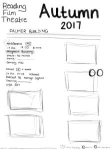
Here you can see my initial design sketch:
Here is my first brochure design:
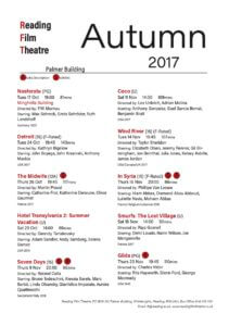
After a blackboard feedback session, it was highlighted that the lack of colour variation removes the importance of the highlights of red. It was suggested to use the tint tool on Indesign and create varying shades of red to allow the largest emphasis to be on the titles of the movies. I also used this tool to add some grey tones into my design to add further contrast. Continuing with this idea, I also incorporated more variation within the main body of text, allowing a clearer hierarchy of information. Finally the alignment of the title in my first design was pointed out as being a little confusing. As a result, I took some steps to try and make this more logical and more visually appealing. Finally, we had a peer review session in class where we were able to give feedback on each other’s brochures. Taking this advice on board as well, I refined my design.
My final outcome can be seen below.

I really enjoyed this project as it allowed me to explore Indesign and put my new knowledge about typography into practice. I also found the feedback sessions extremely useful and I am very grateful for all the advice I was given from both other students and tutors.