This week’s Baseline shift session provided students from all years with a chance to get informal feedback on their work from a variety of tutors – Rob Banham, Matthew Lickiss and James Lloyd – and to share their thoughts with each other.
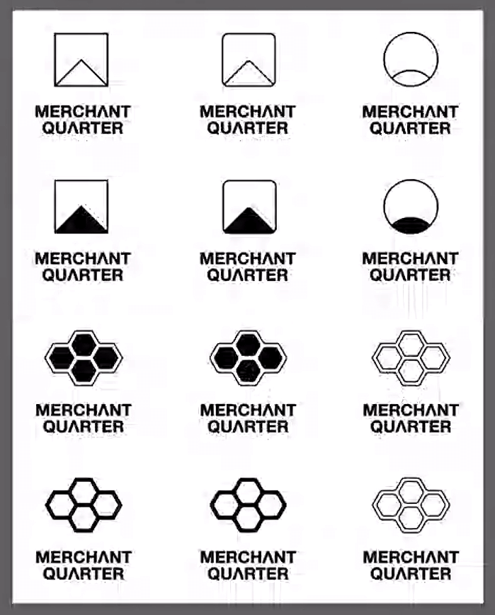
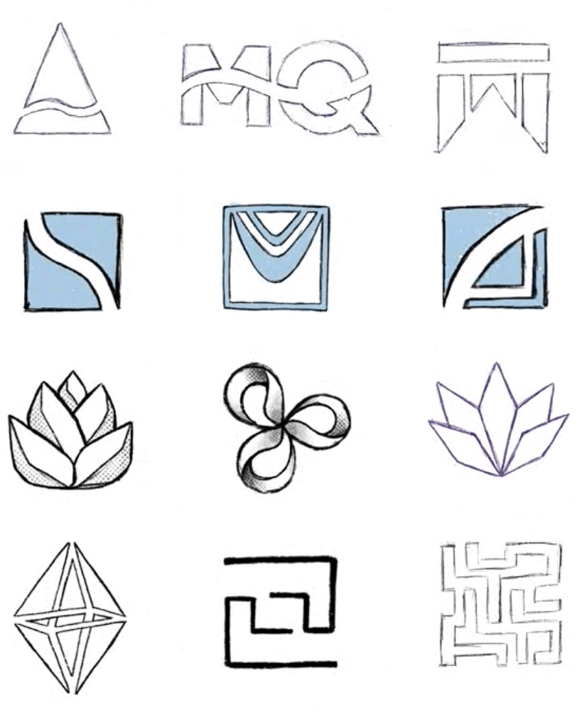
A student shared their Part 2 practical work for feedback – logo concepts to eventually fulfil the brief of branding and selling a new development of shared accommodation named ‘Merchant Quarter’. Primarily, their concepts were all symmetrical and centred; the icon and type aligned horizontally. Centred design quickly became the topic of discussion; if you’re designing a bunch of centred things, consider why. It’s a good idea to try non-centred solutions too, as these can feel more energetic.
‘The problem with centred design is that it’s really static. It prevents you from doing something else.’ – Rob
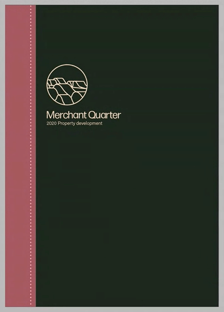
In relation to the brochure designs for the project, the student in question had proposed that the logo should sit central on the cover. Matthew pointed out that just because the logo was a symmetrical and centred design, that it did not have to be placed centrally on the page. By placing it centrally, you immediately limit your design options. Of course, symmetry may turn out to be the most suitable solution.

Another thing to mention would be the importance of having a rationale behind your logo. In order to convince the client that the design is suitable, a strong rationale is key. For example, think about your client’s values in relation to the shapes which you are using. Are the semiotic values which your logo presents fitting? In this case, James pointed out that the student’s logo resembled the building; this was something that the student had not yet realised themselves. It’s OK for the rationale to come after the design however.
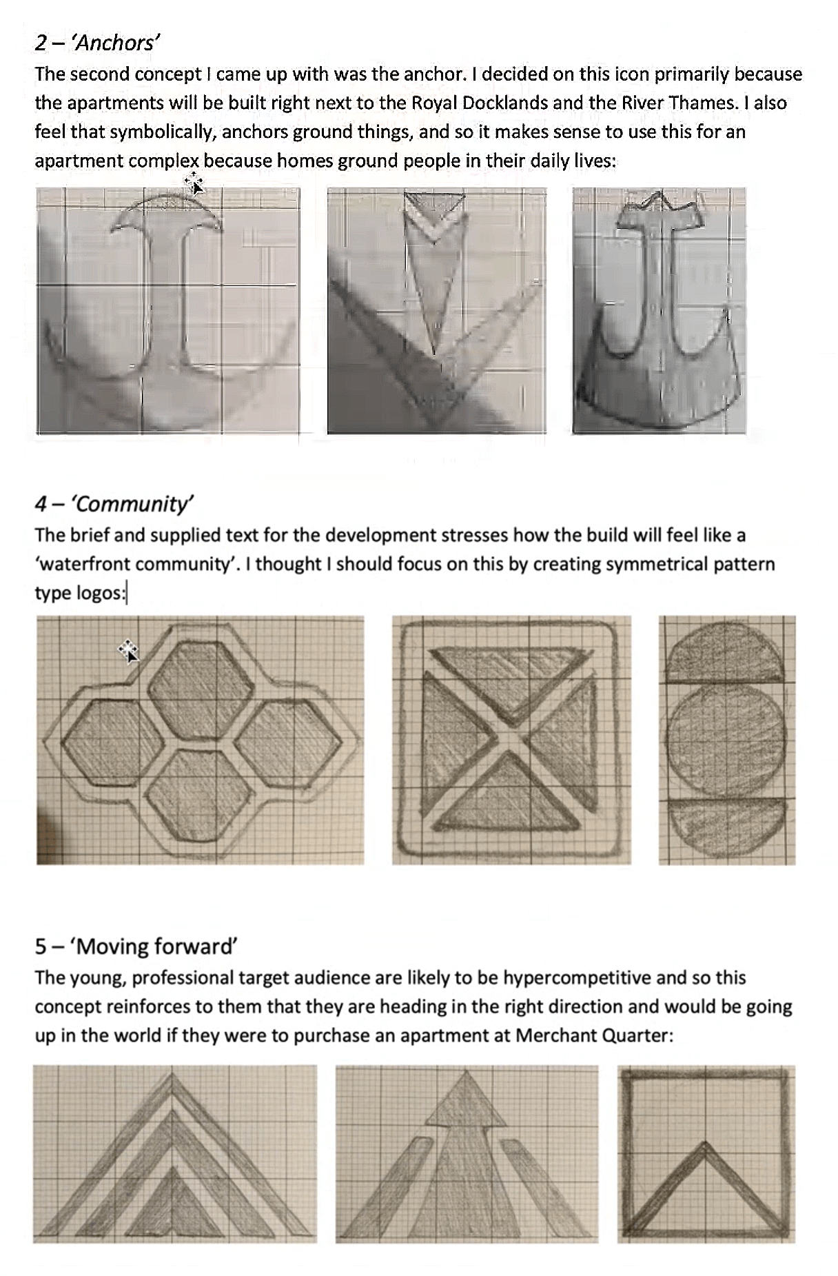
‘There are lots of ways of drawing an arrow. Why does yours look like this?’ – James

‘Lots of good design happens by accident.’ – Rob
Another Part 2 student, working on the same project, felt stuck, unsatisfied with their work and didn’t know how to progress. Rob asked the room what they thought was the best thing to do in such a situation; a suggestion was to try a drastically different approach. James recommends changing both your working method and the environment which you are in, as these can boost your creativity. Although it can be efficient, don’t just keep copying and pasting your work and adapting it. Don’t settle for the default: it may leave your work cold and clinical.
However, Rob reminds us that in TY2DP2 and in all projects in Part 3, we have the option to resubmit our work. Whilst it’s optimal to stay on schedule – something we all try our best to do – it’s OK to not quite be there with your design for the first submission. Crucially, whilst we love to aim high, in reality our work will likely not meet the standard of real world professional design until later in our career; this is simply down to experience.
‘I guess it’s just hard to force myself to take the risk and go back and rethink.’ – Part 2 student
‘It’s better to take the risk now rather than later. Take risks and explore early.’ – Matthew
The other thing to do when you’re stuck with your work is to ask other people. James suggested that we make use of the online classrooms we have this year to speak to each other from home and share your work. Alternatively you can book space in the Department to collaborate and give each other feedback face-to-face.
The room was shown more logo design, as one Part 3 shared their work for an external project, sparking the following thought. When designing a logo, consider the context in which it will be used. Is the client based primarily online or not? Logos will always find themselves having to work within the bounds of a square whether it be on social media, in a list of sponsors, etc.; as such, designing your logo to work well in these circumstances is a good idea. A really short and wide logo will not make the best use of space within the bounds of a square.
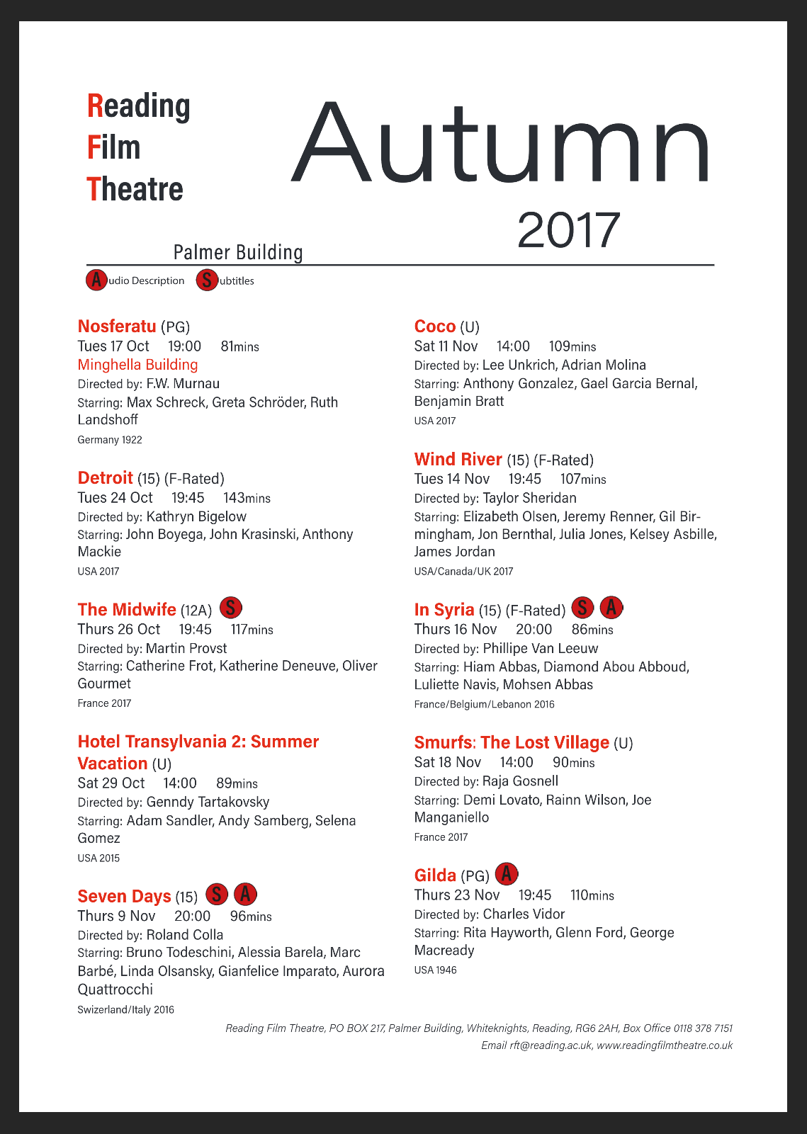
A Part 1 student stepped up for feedback on their Reading Film Theatre flyer design, unsure whether the hierarchy was yet successful. Rob, Matthew and James all encouraged the student to push the typographic differentiation further; the information could be made more easy to scan. Some key pointers for achieving strong hierarchy, as outlined by our tutors, are: space, size, weight, colour and typeface. In this case, most of the differentiation was created via size. Don’t forget to consider all of these different variables in relation to type in order to make your hierarchy clear and obvious. You may be able to reduce the number of line breaks you need if you do this successfully.
Avoid limiting yourself from the start to using 1 typeface, despite how easy and sometimes effective this can be. And, if you’re short of ideas, take a look at how other designers have differentiated information in documents such as dictionaries. On this particular project, students are limited to the use of 2 colours. When limited in your use of colour, don’t forget that you can utilise tints and patterns. However, the best starting point for variation remains the weight and styling of your text.
Reflection
Listening to other students’ feedback opens up our minds, and is equally valuable to being given feedback ourselves. Feedback is not a one way thing but a dialogue; it is not just students that benefit from it, but also tutors. Matthew pointed out that he learns the most about graphic design now by teaching Part 1s, as it enables him to see through the eyes of people who haven’t been so exposed to the industry.
This session provided us with tips for successful logo design, typographic hierarchy, and what to do when we feel we lack the ability to progress. One key takeaway would be to always question: why? Why are you doing the things you are doing? Why does your design look the way it does? As emphasised by Matthew and Rob, it’s really important to evaluate the problem that you’re trying to solve. When you are given a brief by a client, question it. Don’t just ask them what they want, but why, and what they want to achieve.
Thank you to everyone in attendance, and particularly to those who contributed and shared their work. Another feedback jam is coming up later this term, and we hope to run more of these sessions moving forwards.
Students’ thoughts
‘It’s always interesting to see how other students handled the same projects that you have done in the past. Also great to see that tutors are always willing to give you extra feedback.’ – Robin Smith, Part 3
‘I valued getting feedback from different people with different experiences, and the chance to show the tutors the work I wanted feedback on but might not have shown otherwise.’ – Kate, Part 2
‘I valued hearing feedback for other people’s projects including from other years. It was really useful getting advice and feedback on my own projects!’ – Part 1 student

