
01/10/2020
I first started with 3 letters for my initials using fonts that I used in my previous monog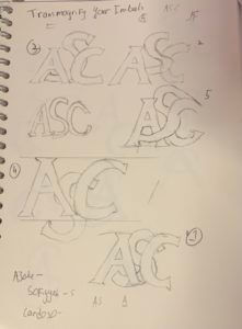 ram serif but later advised by Kim that 2 letters would be better and faster.
Process
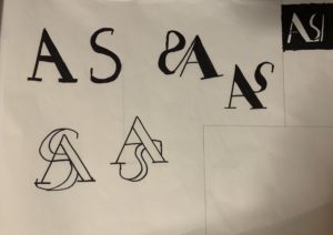
I Used Garamond as I am particularly instead in Serif typeface. I started to sketch and Explore which letter i would use with ‘A’ for my design process I chose ‘S’ cause I liked the swirl around the Letter ‘A’
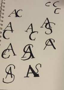
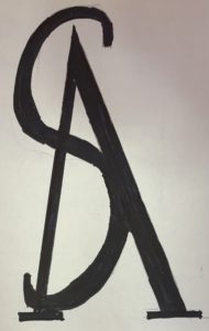
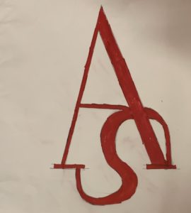
The Stages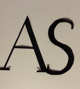
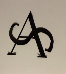
 Final Work
Conclusion
I am quite happy that I took Kim advised as I like the simplicity of the 2 letters. after comparing my work with that of my mates I regret not exploring more with the forms and layout of my letters.