
Background
Every year the typography department holds an end of year degree showcasing work produced by finalists of the BA and MA degree classification. The degree show publicity is a student-led project, run by a team of nine third-year Typography students at University of Reading. The team has been divided into four teams and this post highlights the process of developing the website of the degree show. Given the recent events of the Covid-19 outbreak, the physical degree show has been cancelled and shifted to an online presence. Therefore our role is to create a website that accentuates a virtual degree show and presents the best of our students’ work.
Deliverables
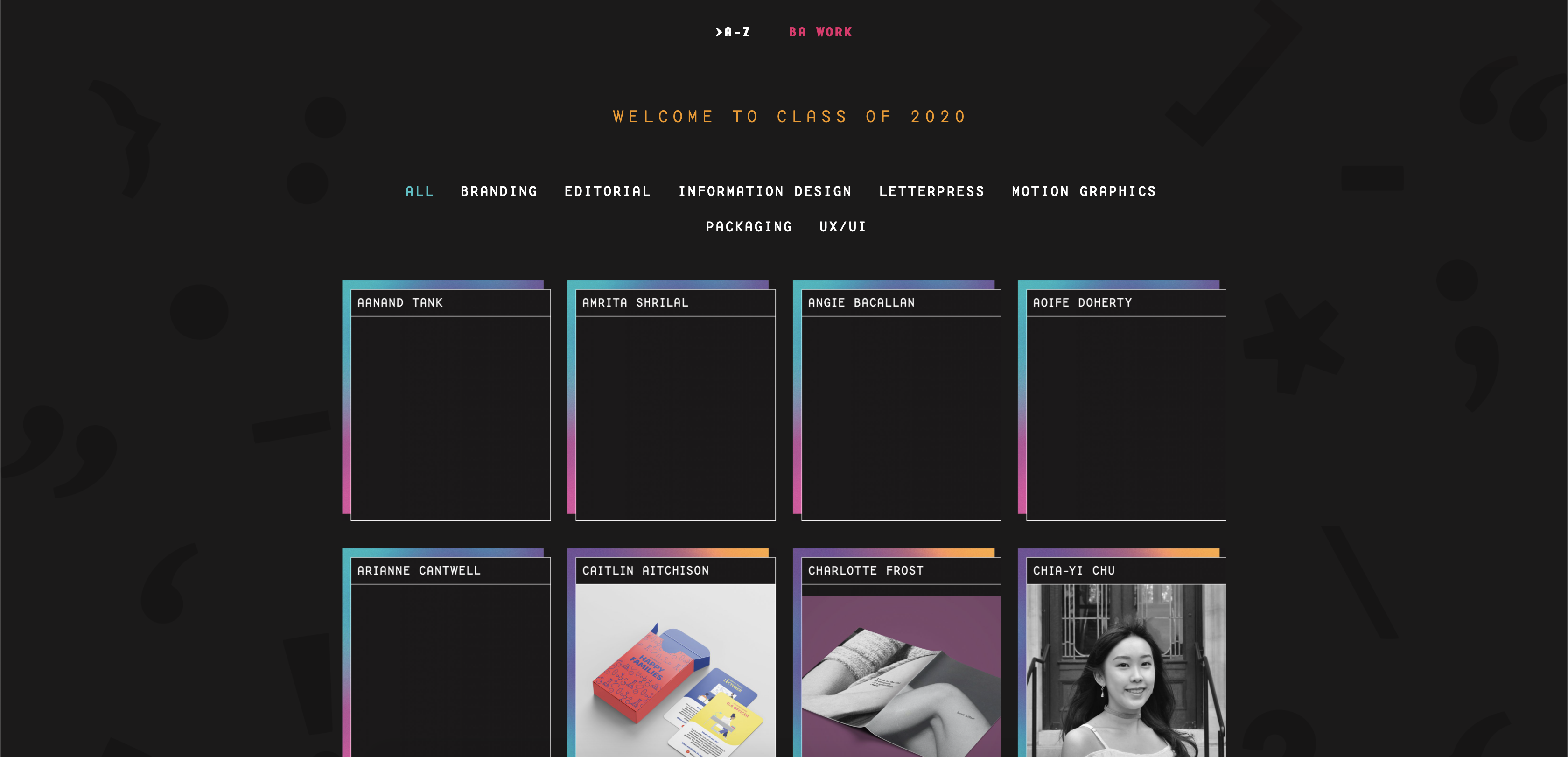
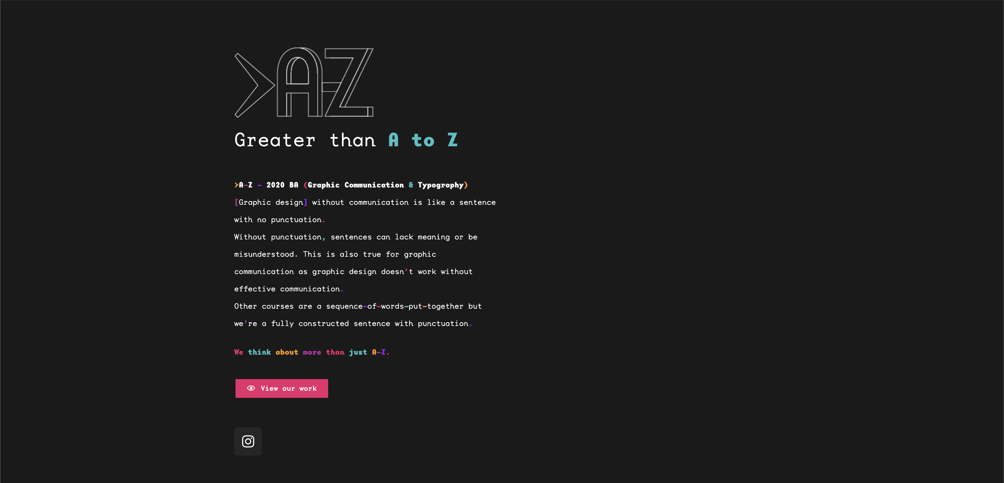
The key deliverable for this project was the WordPress website – the website will showcase students’ work in detail and can be accessible by various people. The aim of the website is to highlight the degree show theme: >A-Z and to see our finalists work. The launch for the website is set for the 11th of June, 2020.
Collaboration
Our team consisted of two members – Amrita and Chia-Yi. Amrita was in charge of the visual style of web assets and characteristics as well as the technical and animation aspects of the website. Chia-yi was in charge of the copyediting, developing of the assets and wire-framing of the website. However, at times we exchanged roles and helped each other build pages and solidified the theme for our degree show for the social and invite team. Alongside that, we continuously had the support of the IT department and James for site-related problems that we often faced.
Research & Ideation
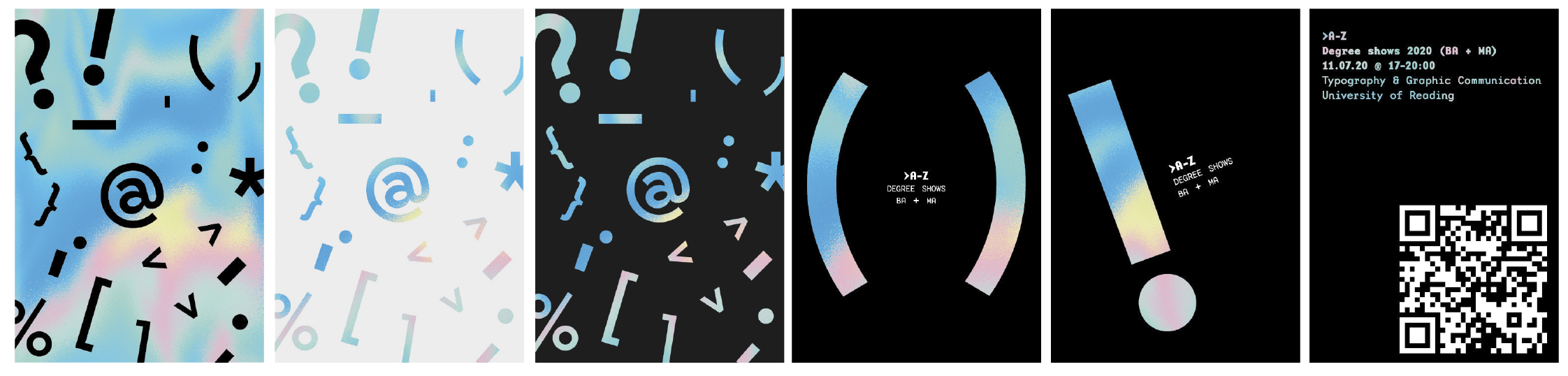
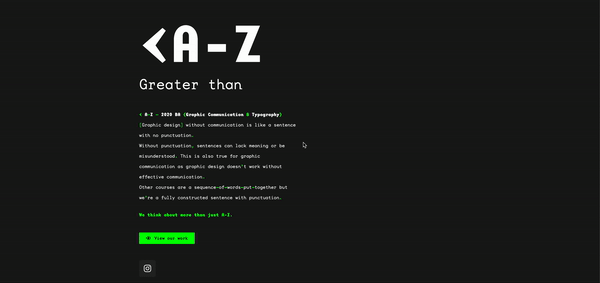
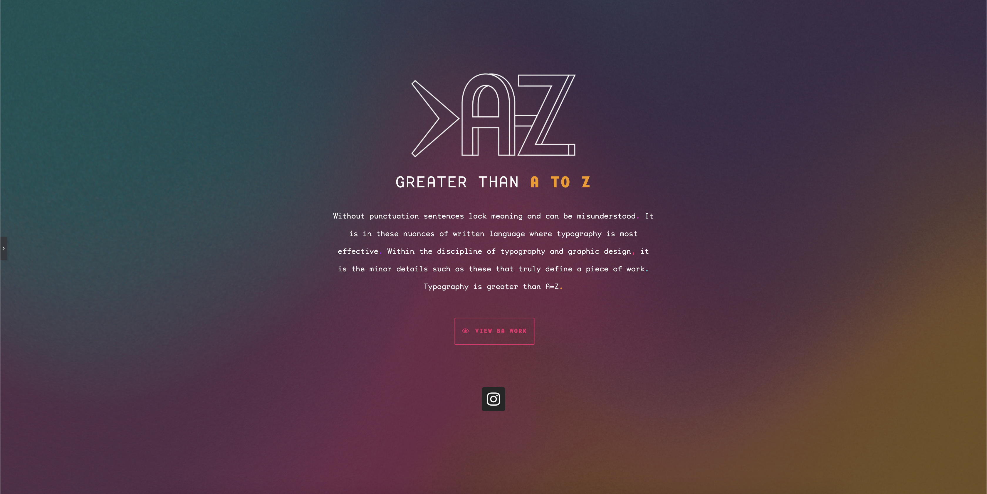
In the beginning of the project, everyone within our wider team generated potential concepts for the degree show. Eventually we decided to go with the theme of >A-Z (Greater than A to Z) which focuses on the use of symbols and punctuation marks has helped us form designs and refine our writing (bringing attention to the research side of our course). Nonetheless, the web and social team helped develop a visual concept for the invite theme that we thought would work well on the social media platform and on the website. We exaggerated the size and the rotation of symbols and marks to create more prominence.
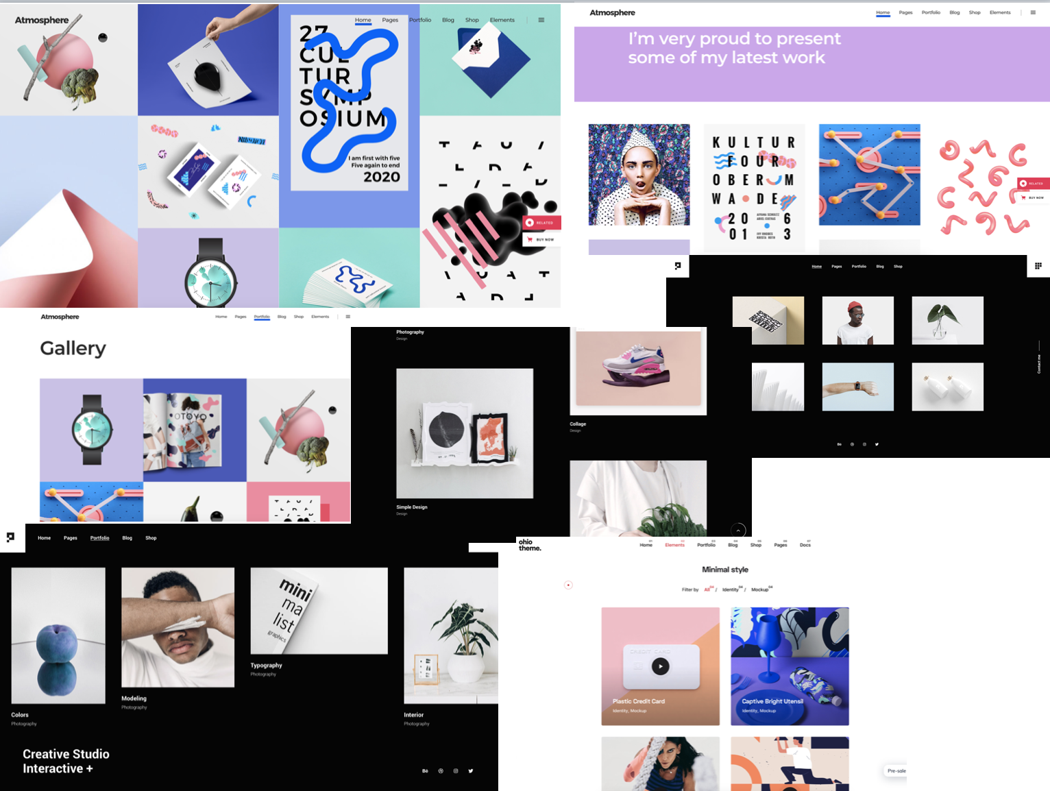
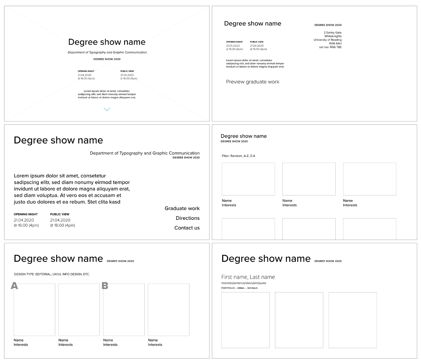
In terms of the research for the visual style of the website, we explored existing degree show websites and templates as well as the functions of WordPress. In our research, we discovered WordPress offers limited flexibility of designing web elements and to showcase our work creatively. Therefore we adopted Elementor, a free editing plugin on WordPress that does not require the use of extensive coding and offers responsive features. Once we identified where we will be designing the degree show we created initial wireframes.
Domain
After researching several domain hosting services, we decided to purchase a custom domain through Google domains. However, both of us did not know how to link our custom domain with our WordPress site. Therefore we communicated with the IT department and did our own research to find a solution which required us to change the DNS (Domain Name System) settings of our custom domain. However, upon connecting our WordPress site to our custom domain we were faced with another challenge where we could not edit content of our pages unless we changed back our domain. This affected the invitation team as they were required to send an invitation with a link to our website showcasing the coming soon page.
Design development
In terms of the visual style, we created assets that match with the visual style of the instagram posts to create a sense of coherence and familiarity amongst our audience. We decided to assign different coloured templates to students that share the same initial letter of their name which was similarly done on the social media posts. We adopted this template to showcase all the students in the graduating year and mimic a visual style of multiple ‘files’ being shown on screen.
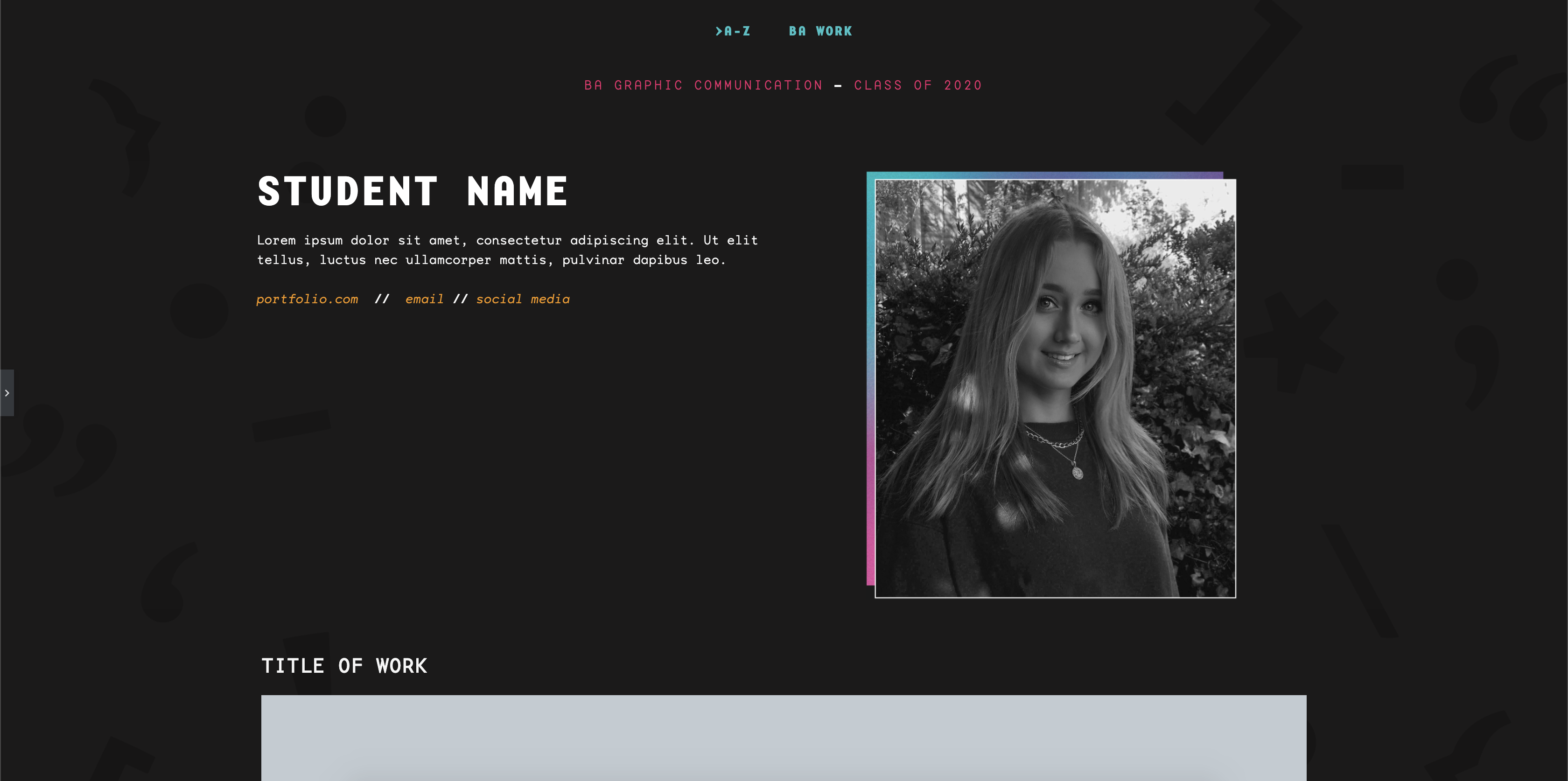
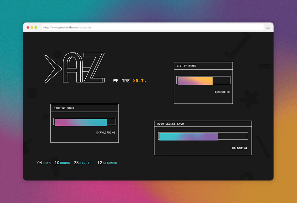
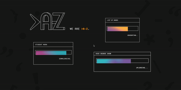
In terms of the coming soon page, we utilised animations and developed a sense of visual style of assets appearing like files being downloaded, installed or updated to accentuate the ‘code’ and use of ‘symbol’ aspect of our degree show theme. The animations initially showcase symbols and change to words to showcase a glitch effect and prioritisation that we are >A-Z. As for the landing page, we wanted to create a sense of ‘unlocking’ or entering a site feeling therefore we adopted a central alignment and the use of coloured symbols to depict visuals related to modern code editor documents.
Lessons and reflection
Through this Real Job, we faced many challenges but also learnt new skills. Some of the crucial challenges we faced was dealing with the IT related issues which took a while to be fixed and would often run into other minor problems which led to a lot of back and forth communication. However, through this we learnt to have serious technical related conversations which has helped us understand complex terminologies and technicalities which will prepare us when we work in professional environments. Another crucial issue we faced was requesting artworks and assets from our peers which would take a while to gather and often required updating frequently. However, given the nature of the global situation, it is expected for various delays in gathering work. Through working in a wider group we learnt creating a discipline for organising content through shared folders and the use of spreadsheets to help us monitor our progress.
Nonetheless, the website we created aims to showcase our peer’s best work to potential employers and visitors of the site. Despite the challenges, we contributed greatly to developing a core visual design style for our theme this year. This enabled us to generate the visual style of the website effectively as we utilise the same typeface, colour palette and presentation of images.
If you would like to view our work, the website will be live on 11th June 2020 through the url: http://www.greater-than-a-to-z.co.uk .
“Communication has been the foundation of our development as designers. At Reading, we have built our design skills in many areas. In everything we have done, punctuation – graphic and typographic – has helped form our designing and refine our writing, bringing meaning, nuance and communication. Attention to detail defines our work: it is more than just A–Z.”
– Class of 2020