Background
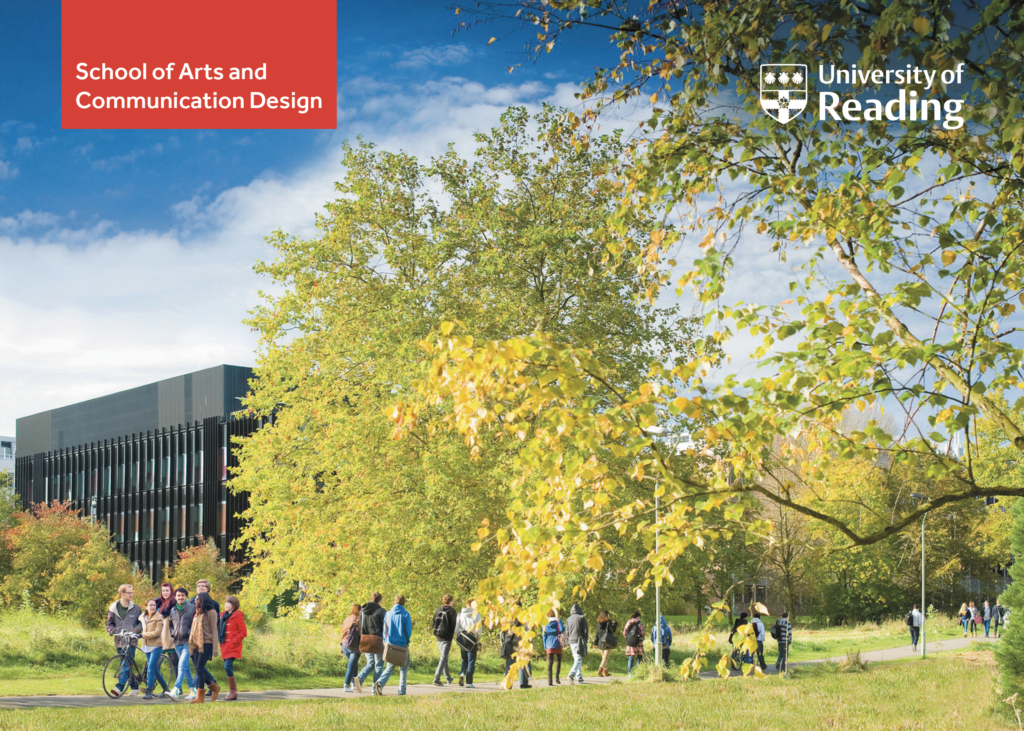
The University of Reading had a stand at the Create Your Future UCAS Fair, representing our School of Art and Communication Design. The fairs took place in London on 30 September, and Manchester on the 26 November. In previous years the stall had not had sufficient funds or time invested, and so the result lacked personality and was uninspiring. This year we secured a 6m x 6m stand with a shell wall. Thus, our job as a design team was to create this stand from scratch and stand out to applicants in the hope of gaining more prospective students. It was important for the stand to unite the school as well as separate departments, and to consider the university branding carefully. Despite wanting to maintain the University’s identity, it was important to consider how we could stand out to an audience that had perhaps not yet considered the University as an option for their degree. Therefore, the aim was to create something which captured the attention of those attending the fair and to create more of an impression than previous years.
Our goals
The primary aim of the stand was to promote design, art, film and theatre as a united school as well as separate departments. The stand also needed to compete against established Art/Design Universities, and so may have required a level of rebranding to put us on the map where we would have previously been overlooked. This would be possible through a theme and vibrant colour palette. A main priority for the stand was to include a range of student work, an area that we lacked in previous years. This would include interactive elements, such as digital and physical work. We also needed to ensure we maintained the audience’s interest beyond the fair such as through a giveaway item. Another aim for the stand was to ensure we had a good range of students from each department and a number of staff available to answer questions, as in previous years this was a problem.
Deliverables
When the job was allocated to us, we thought about specific outputs or key deliverables that would help us to achieve the goals above. These included:
- Backdrop (shell wall)
- AV
- Carefully considered branding for the School.
- 3D components e.g giveaways, sculptures, stand brochure, leaflets.
- Overall branding for stand – more unique than just Reading colour scheme.
- Slogan or headline to accompany the exhibit that fits in with the message of the school.
Initial Contact with Supervisor
During our first meeting with our supervisor, James, we discussed the brief for the real job and the format or measurements of the stand which we had been provided with. We discussed the importance of the real job in terms of creating an impression as a school, as well as representing the university on a larger scale. We looked at recent work for inspiration, including an animation on boundary spanning, a zine publication on diversity in design, as well as Siobhan’s event planning work for the Environment Agency. In the meeting, we created an agenda, including questions or areas which we would address in the first stakeholder meeting. The meeting allowed us to agree on the aim for having three themes as a focus and to gain insight into what the departments and school wanted to communicate to prospective students. Therefore, this first meeting was crucial for outlining the goals of the project, as well as preparing for the first stakeholder meeting. On reflection, the meeting was useful in order to prepare for the stakeholder meeting, however it would have been better if we could all have attended, which was not possible due to attendance out of term time. Therefore, communication was important in order to update the whole team.
Restated Brief
After the supervisor meeting, we gathered the information which we had discussed in conjunction with our own research and ideas. This led to the development of the restated brief. It was important that the brief discussed the context of the job, as well as key aspects to consider, such as specific design outputs, roles and responsibilities as well as an effective measure of the deliverables. We also devised a schedule which included the main deadline for the job and a meeting with the stakeholders of the school to discuss ideas. This meeting was then scheduled for the 9 July 2019, inviting all stakeholders from the school of art and communication to attend and express their ideas. Reflecting on the initial restated brief, we needed to be more specific in terms of context by adding in the specific dates of the UCAS fairs. We also needed to add an aspect of measuring the success of the deliverables, for example, by the responses we receive from applicants and the information we gathered from the data scanners. Therefore, we amended the brief according to this feedback.
Initial Stakeholder Meeting
James and Siobhan co-chaired the meeting, following an agenda that they had written together. The aims of the meeting included discussion of staff and student recruitment and training for the UCAS fairs, inviting discussion for the overall theme, presenting inspirational projects to promote thought, and showing mood boards of previous stands. We also confirmed the deliverable components and target audience. Chairing and planning this meeting and proposing ideas to head of the school, John Gibbs, required confidence and good communication skills in order to lead the discussion. One of the challenges of this stakeholder meeting was making sure that every stakeholder was heard in terms of their ideas and goals for the stand. It was also a challenge in the way that we had to juggle different opinions and manage these effectively and positively.
Feedback and Conclusions
The feedback from this meeting was very positive. Important aspects of the stand were confirmed, such as the size of the design area (6m x 6m with a shell wall) as well as key aims. University brand guidelines were also mentioned such as the sizing of the logo and coloured versions which were suitable. We also established from the meeting that the design could use any colour palette, not just the one specific to the university. However, we discussed that it would be suitable to use the university typeface, Effra, so that applicants would recognise the look and feel of the university in relation to the information they received via email and from the prospectus or website. We also confirmed the possible themes for the design which included: words, environment, diversity and connections. These themes were specifically linked to our university ethos as well as the school. We wanted to express the sustainable campus that we work on, the importance of theory and practice within our subjects and the diversity of our community. We could then delve into these areas to come up with visuals and strap lines for the stand. Reflecting on this step of the process, we were confident in our ideas and the information that we needed to gather from the stakeholders before hand, however we could have been more confident within the meeting to put forward our point of view and challenge other views constructively. This is something that we could take forward and put into practice in future jobs.
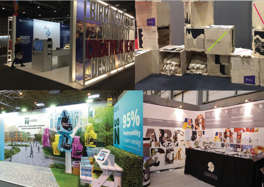
Previous UCAS Stand and competitors
Before moving forward with the project, it was fundamental that we understood what had been going wrong in the past. Previously the stand had little time or money put into it, resulting in something grey and uninspiring. We were very fortunate to have the support of Philippa Lane, who recently graduated from the department. Not only was her support and experience helpful, but she had also previously written a report analysing the Schools presence at UCAS events, and the issues that should be addressed next time around. We also spent time looking through other stands previously found at UCAS events. Understanding the competition helped us ensure ours would stand out whilst remaining professional and appropriate to the event. It quickly became clear to us that previously our stand was too small to achieve the impact we were looking for, requesting more space was quickly a priority for the project. On reflection, the report from Philippa was very useful as neither of us had attended or worked at a UCAS fair before. Therefore, this was important for providing context and improvements that we could work on. However, we should have used this report more consistently throughout the project, to refer to and make notes once we had covered an aspect from it.
Initial Research and Design Concepts
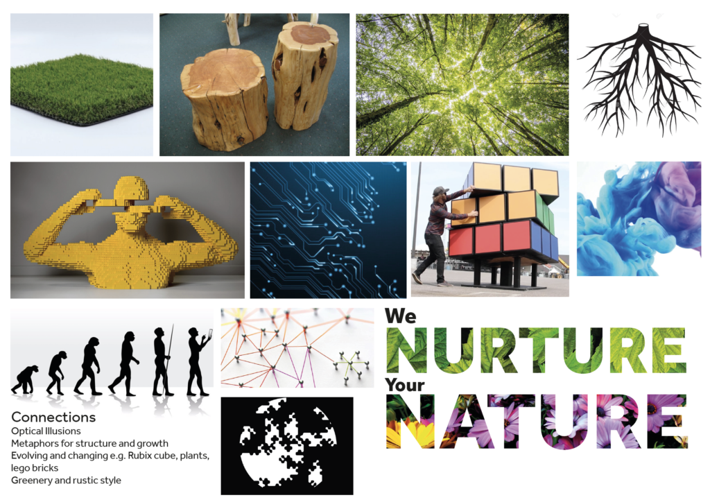
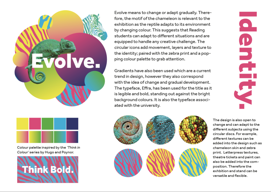
Our initial research began with ensuring we fully understood our client base, the market and competitors. Perhaps the key point from this was the need to appeal to both students and parents/teachers. Ensuring our stand was attractive from all angles of interest was considered throughout the project. As we progressed with our research and planning, it was important that we chose a central theme for the stand. From here we would be making design decisions and ensure the various elements were unified as a whole. Through mood boards, mind maps and general visual references we began exploring various concepts, as well as exploring how themes could be combined. After feedback and much deliberation we decided on a neon/nature theme. The neon representing vibrance, energy and creativity, with the nature highlighting our green campus and work environment.
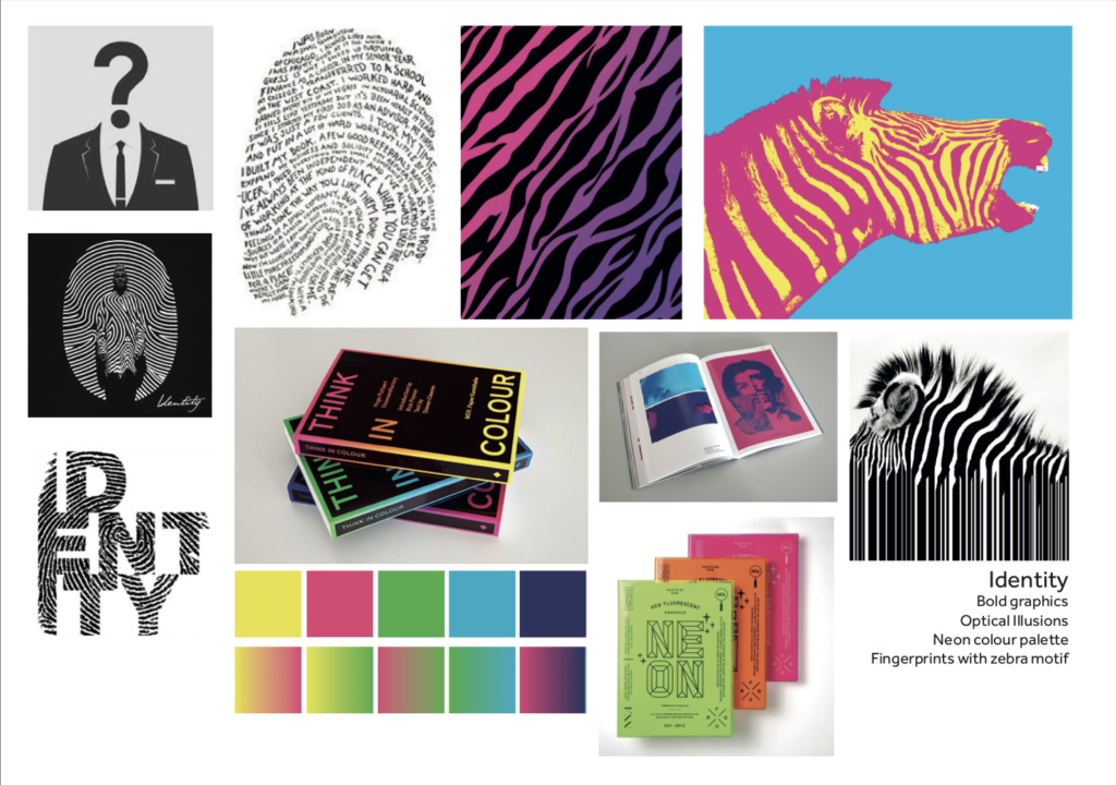
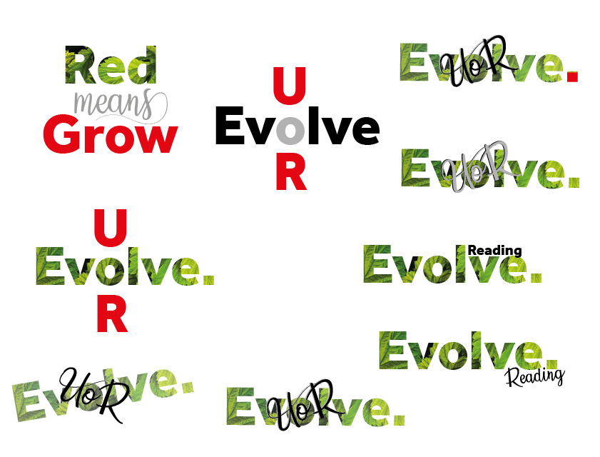
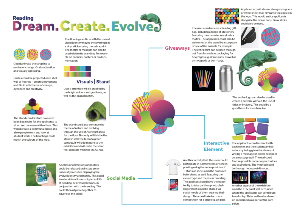
Leading on from this we began exploring some strap lines to represent the overall message of our stand. This began as mind maps of key words and developed into logos and graphic pieces. Feedback at this stage suggested we should slow down as too much emphasis was being placed on the visuals rather than the message. Our supervisor also suggested that the designs felt too much like logos and emphasised the fact that we already had a logo and a brand; what we needed was a visual message. We agreed and took a step back. After further consideration we went with the strap line ‘Think, Create, Evolve’, think linking to theory, and create linking to practice, both of which were fundamentals for the school. This slogan highlighted the journey students make at the university. Alongside the neon/nature theme we had a clear steer and base for the next step of the design process. In the future, this has taught us to not race ahead in terms of initial designs but to think about thinks methodically and refer to the brief more specifically. For example, the key aspect at first should have been the message that we were portraying, rather than the visual content. Thus we will be able to correct that order next time.
Mood boards and Inspiration
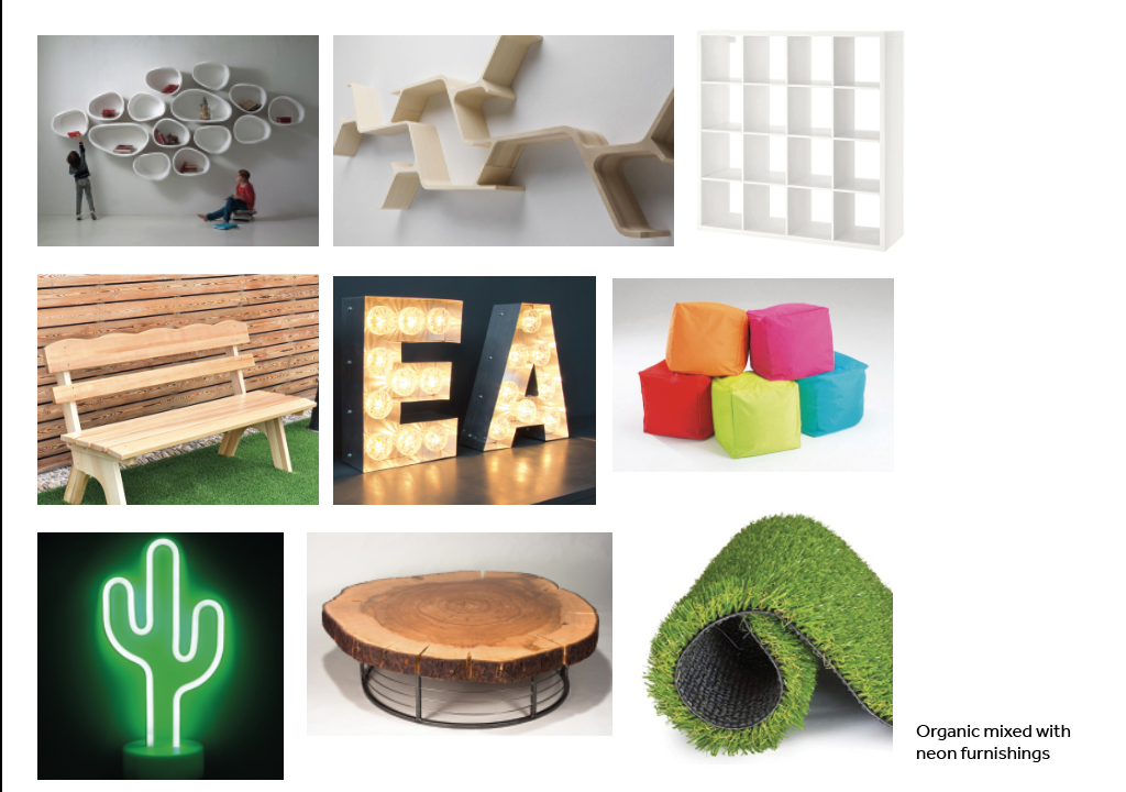
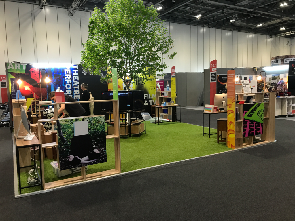
After selecting the theme of neon and nature, this allowed us to think about the stand design in its physicality. This involved creating mood boards for inspiration. We gathered images of furniture and furnishings including lighting and bookshelves, which met the desired look and feel. Initial examples included colourful beanbags, wooden furniture, string lights, neon letters and astroturf grass. We aimed to make the stand inviting rather than extremely corporate, and therefore we had to strike the balance of professionalism and personality.
Stand Layouts and Concepts
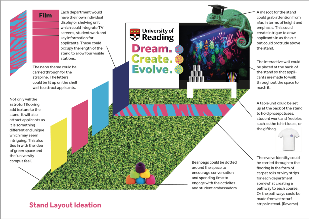
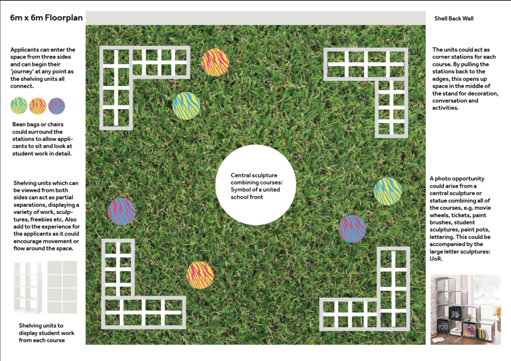
Once we had a rough idea of the furniture that we required, we began to sketch layouts of the stand and positioned these furnishings within the space. The main concept for the stand relied on the idea of creating a united school front, yet making the separate departments clear to the applicants. Therefore, the use of four stations became apparent. This would allow Typography, Art, Film and TV, and Theatre and Performance to have their own base or hub at which applicants could converse with ambassadors. The overall concept of the stand needed to be a relaxed environment which showcased student work. Our sketches involved these four stations in various combinations, featuring ways to incorporate student work. For example, one showed four bookcases, one for each course, at the left-hand side of the stand. Although this did the job of displaying each course, it would form too many strict queues within the space, and this is something that we wanted to avoid. Therefore, we created other sketches which showed the stations at each corner of the stand. Each corner would consist of two bookshelves in an ‘L’ shaped arrangement. This would leave three main entrances into the space, and therefore three access points for the flow of applicants.
As we wanted to display digital student work as well as physical, there was a need for a TV or projector option. We wanted to show film footage and animations for example. To do this, we thought about a central carousel area which consisted of a number of TVs. After some deliberation with stakeholders, we decided to go for four TVs which would sit facing out to each course corner. In combination with this, we also wanted to incorporate a projector into the space, projecting film footage, especially of our green campus, onto the back wall. This is something that we experimented with and we took our own footage of the campus environment, as well as students working with technology, to show the balance of the two. We needed to figure out how to add the projector into the space and use the correct angles to hit the back wall. On reflection, this idea may have been more successful if we had done more research into it or practiced earlier on. However, the initial idea we had was exciting, we could have executed it differently if we had known the timeframes of ordering hardware and gathering footage prior to this.
Purchasing Furniture
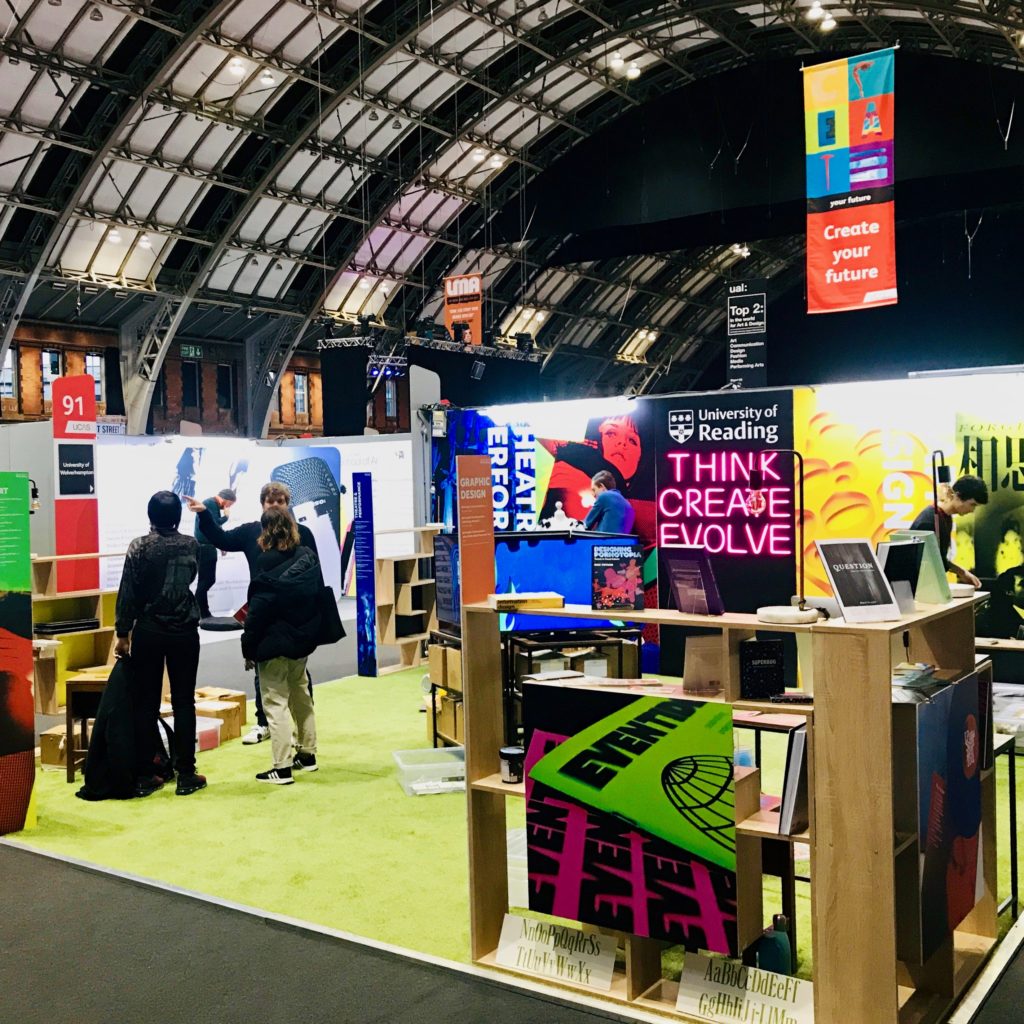
After meetings with stakeholders and receiving feedback from them on the furniture options which we supplied in a document via email, we were able to see the most favoured choices. This led to the confirmation of lighting choices, including neon letter lights that would spell out our strap line, hardware such as the bookshelves, console tables and TVs, as well as our main ‘green’ component the astroturf grass. We felt that this element of the stand would really bring something unique and exciting, and lift the stand out of the corporate setting. This would definitely make us stand out from our competitors and enhance the concept of our green campus.
As we needed to showcase student work, we thought that a variety of book shelf heights would allow us to do this. We liked the look of bookcases that looked quirky or creative. For example, a specific model that we found on Wayfair, appeared to look like a maze. We thought this would be a unique way of displaying books and physical work and would look intriguing from a distance. In line with our neon wood theme, we had an initial idea of splattering the bookshelves with neon paint. Therefore, when looking at colour options for the furniture, we thought that black would enhance this neon aesthetic and provide contrast, just like the central black panel on the back wall. However, when we went to purchase the bookshelves, which was during the Summer, we ran into the problem of a low stock issue. Therefore the black shelves that we wanted, were not available. Therefore, we had to think on our feet and change our decision to fit the natural aesthetic of oak wood instead. As deadlines for purchasing the furniture were so tight, we had to move quickly. Therefore, we decided not to paint the bookshelves and to stick with the natural wood aesthetic. This shows that the first option or desire may not always be available and therefore a compromise has to take place in order to move forward. In the future, we could have created a schedule or deadline for ourselves to order specific furniture as towards the end, we were fighting with lead times and stock numbers.
Back wall Concept and Design
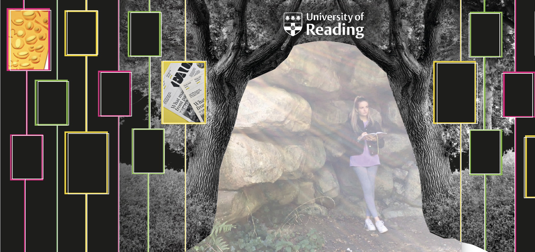
In order to incorporate the projection feature into the back wall, we needed to think about this in terms of the design of the panels. This required us to experiment with different layouts and compositions and how we could incorporate student work into this. One of our initial designs featured the university logo at the top of the wall, and an image of a tree tunnel which spread across the width of the panels. This was to show the campus environment and to look intriguing to the applicants. In the centre of the wall, we would leave a tunnel-like space blank in which we would project the video footage. This required some experimentation with two projectors to achieve a bright enough image. Again, problem solving here was a big aspect of the job. Once we had put the footage into the back wall composition, we were happy with the results and were excited to show this design to the stakeholders. We also looked at different compositions for the back wall and incorporated neon frames onto a black background which were joined by lines or connections. These ideas had student work as the focus but were still in line with our theme.
We invited the stakeholders to see the space which we had set up in the art department, along with some of the furniture that had arrived. A couple of stakeholders attended, which was good in order to receive feedback on our work. Once we had set up the projectors and talked the stakeholders through our ideas and design options, we showed them the projection.
The Turning Point
However, this was a major turning point for us. One of the stakeholders did not like the designs or concept at all and had real concerns about the projector working on the day as well as it being overshadowed by people walking through it. They also felt that the back wall designs were too busy and complicated and suggested that we use the back panels in a more simple way. We tried to persuade as a team and remained calm even when the discussion felt like it was not going our way. Although this was very discouraging, as we had put so much thought and effort into the design, we composed ourselves and remained professional when trying to convince the stakeholders. On the other hand, we discussed it between ourselves further and decided that it would be best to take this feedback on board and rethink the design. Reflecting on this aspect of the project, we were successful in our professional practice as we handled the opinions of the stakeholders really well and did not show our frustration. We also worked as a team in order to present our views and ultimately were professional in the way that we took on board the feedback and client needs.
Design Changes
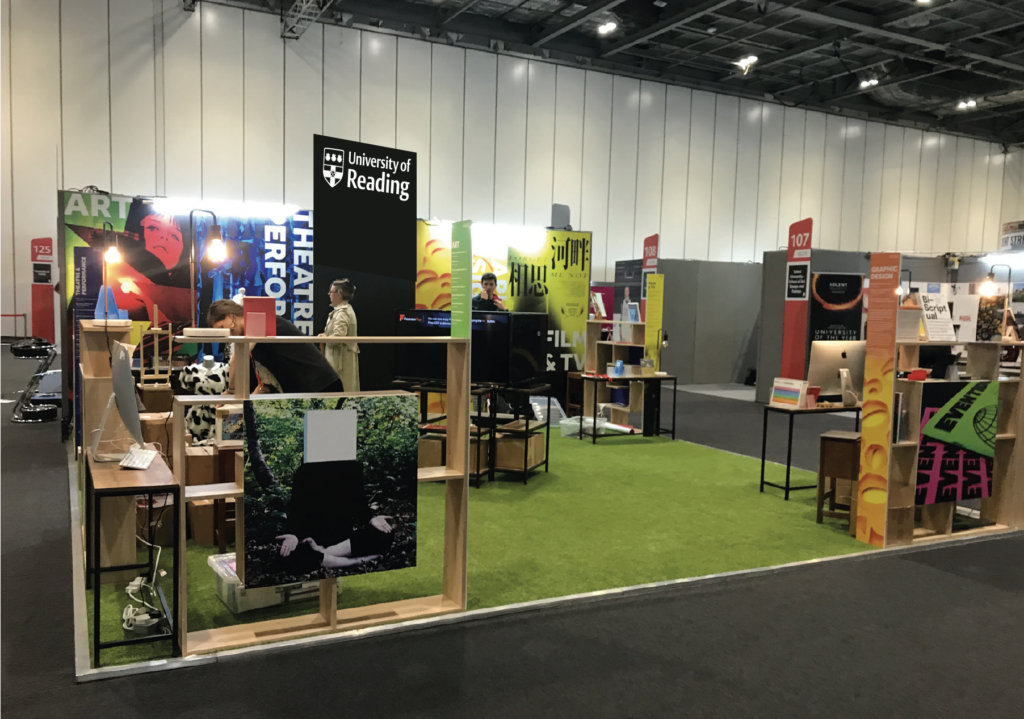
After this meeting, we went away to come up with a better solution to the problem. We decided to disregard the projector as stakeholders were not onboard with this idea and instead, pushed the concept of the TV carousel. We took the stakeholders advice with regards to the back wall. We began to source student work and images from the university image bank as well as requesting work from the departments directly. We would select one image to represent each course, leaving the central panel black with the university logo in white. This central panel would display the neon letters of our strap line. We also experimented with the use of the course titles on each image to aid applicants, again using Effra. Thus, we put together a range of these layouts to email to stakeholders.
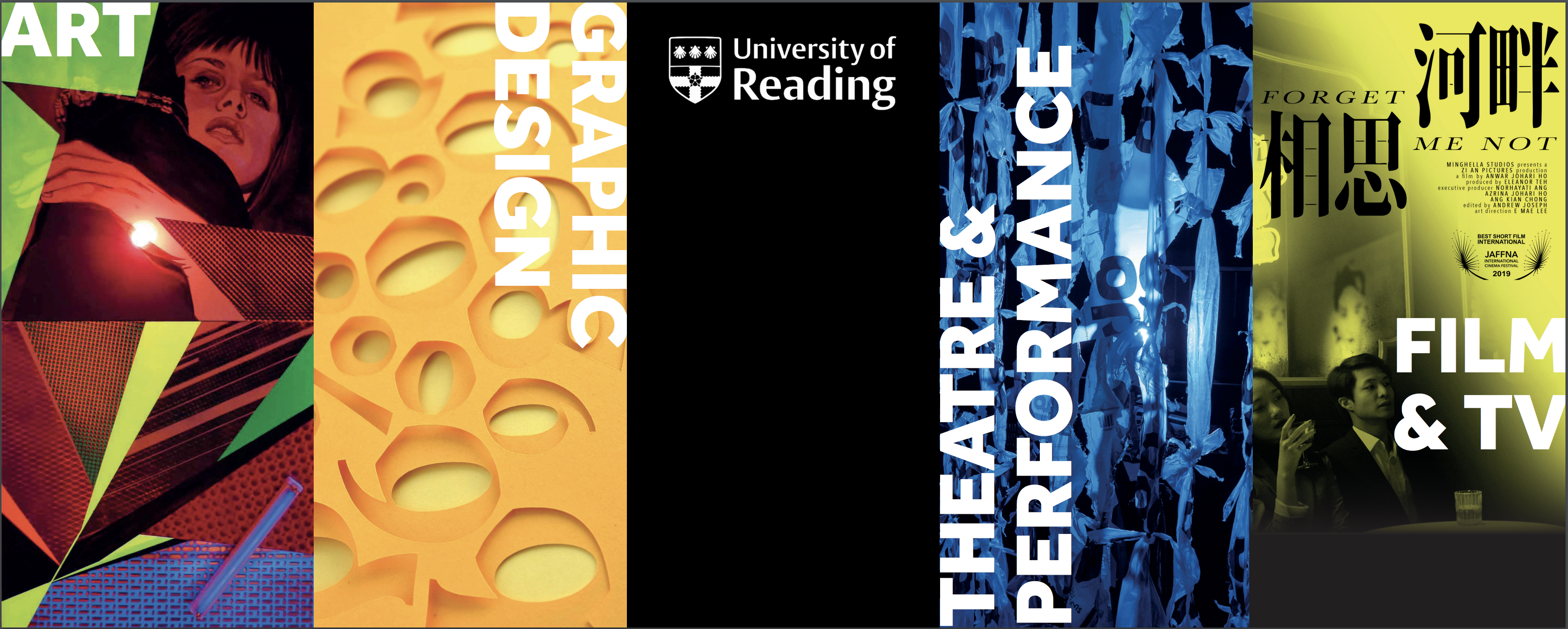
The majority of the stakeholders liked this new design, however some of them felt we should incorporate images of students working into the design. This time however, we experimented with this idea but felt that the design became too corporate and didn’t fit with our vision or brief. Therefore, we expressed this concern to the stakeholders as well as showing them the versions they had asked for. After that, the stakeholders agreed with our point of view and allowed us to take charge with the design. In response to the element of students working however, we suggested that separate boards be produced to feature on the backs of each bookshelf. This would add an extra element to the stand and would draw applicants into the space through colour and photography. In addition to this, we created boards which would be attached to the ‘entrance’ or opening of each course corner and displayed information such as course titles and codes. These finishing touches added depth to the design.
Later Developments
Having amazing material to present on the stand was fundamental for its success overall. What better way to demonstrate the high quality work achieved by our students than to have it on display, drawing them in. This was an element of the stand that was partly out of our control; whilst we could request material and send reminders, it was largely up to the individual departments to select the work they wanted to present. Understandably this was a time consuming task for the departments to take on; in order to support this process we asked for a list of books from each department and had them ordered, this was a great feature to have on the stand. As well as this we visited a couple of the departments and asked to use some of their open day exhibits, which was a successful strategy.
Another extra element for the stand was the giveaway element. Again, this was a feature that needed to be handled by individual departments. For Typography, we decided to offer out type specimens. They were perfect for highlighting the unique selling point of the course, and were far more interesting than a pen or bag! The student could select a typeface beginning with their name, we would then add a note with a welcoming personalised message. We also had a collection of booklets, books and other material to hand out wherever relevant. These little touches really personalised the experience for the audience. Since we were students it was vital we demonstrated a friendly, welcoming attitude, representing the community feel of the course.
Final Preparation Before London
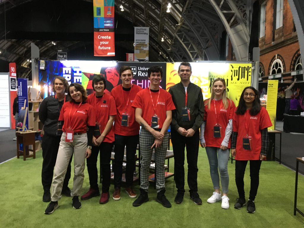
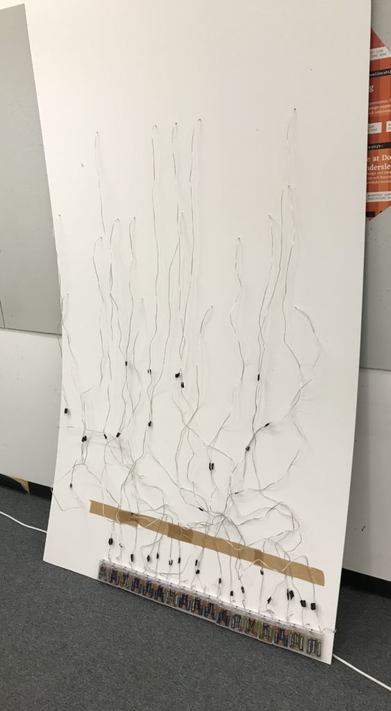
In the final run up to the London UCAS Fair, there were some last minute jobs to be completed. Unfortunately the neon lights failed to arrive on time, despite us paying extra for fast delivery. Whilst this was disappointing, we were confident that we could have them up and running in time for Manchester. This highlighted that whilst you may prepare for something, there is still a chance it won’t go to plan. Perhaps in the future we should try harder to allow even more time for deliveries. We also spent time making refinements on our giveaways, handouts and stand content. Our attention then turned to our plan on approaching the audience at the fair, and preparing what to say. We wanted communication to feel natural and welcoming, however it was important that everyone was clear on the key points to put across. As a team we discussed the areas to mention, and gave a briefing to the other helpers on the morning of the fair. We continued to develop and refine our approaches throughout the day, learning the best strategies for bringing the audience in, and smoothly directing them to the department relevant for them.
London Fair Review
The London UCAS Fair was a huge success, we had brilliant feedback from both the audience and other stands at the event. Despite this we knew there would be room for improvement, and we were keen to refine a couple of elements before Manchester. In order to target these, we arranged a meeting to review the London stand, and to propose some changes. Some of these changes included:
- Incorporating a tree into the middle of the stand to promote the nature, green feel of the campus. This was well received by the clients, they thought it looked great and would really make the stand rise above the rest. Despite this the logistics were complex, and it was agreed to hold off the idea for now, and potentially re-visit the concept in the future.
Central tree mock up - We were concerned about how clear the University branding was on the stand, as we had a number of students ask who we were! We had suggestions for combating this issue, such as adding the logo as a banner beneath the TVs, or a welcome mat on the floor. It was decided that for Manchester we would have the staff wearing official Reading t-shirts, and the other suggestions would be considered for future events.
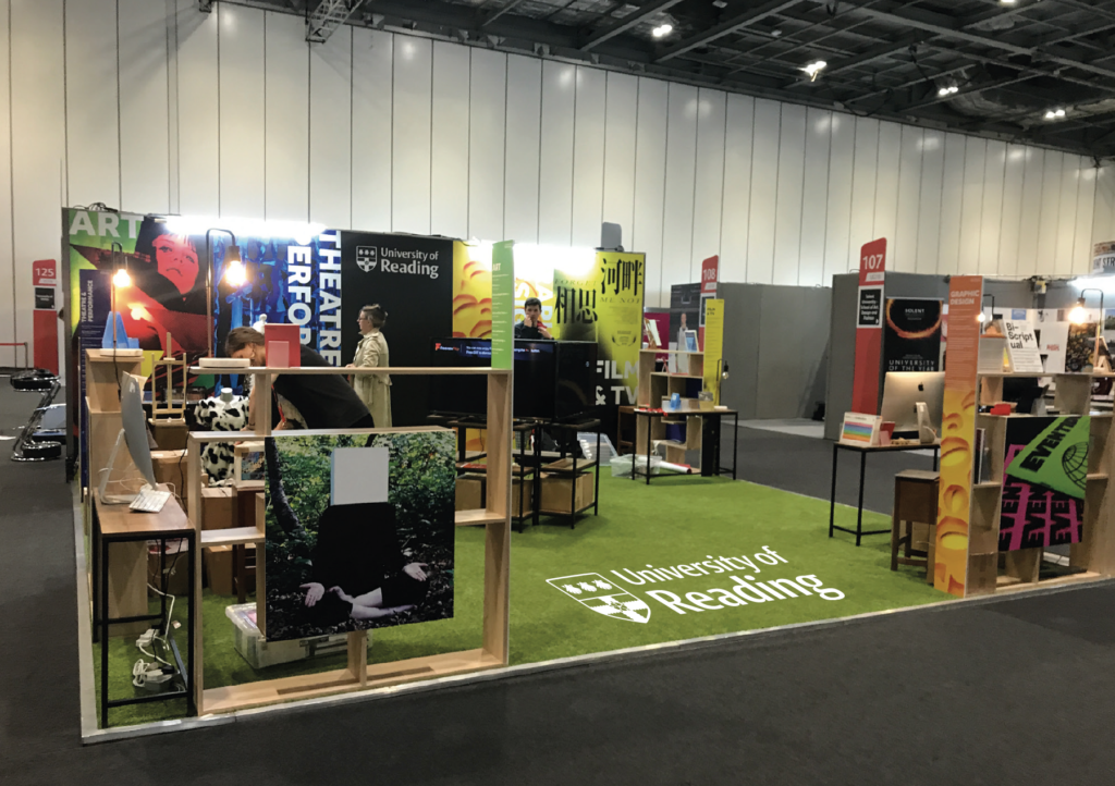
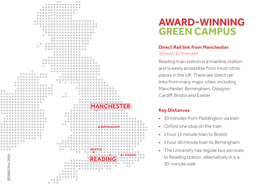
University branding mock ups - Another issue we noticed was that many students did not know where Reading was located. This is an important factor when deciding on a University, and a waste since we have such a good location near to London. We knew that with Manchester being further away, this issue would only grow. In order to solve this we decided to create some postcard sized maps, including key distances and information regarding travel. These were ready to be handed out when relevant to the audience.
Fortunately the neon lights did arrive in time for Manchester. There was some problem solving required since they had large battery packs, and needed to be fitted to a large board. In order to solve this issue, we rewired all of the lights and spent time carefully arranging them on the board. This was very time consuming but worth it as the final push to really bring the stand together. We had some issues with rewiring the lights in a safe way to avoid short circuiting which posed a threat to safety, however we managed to fix this. Upon reflection we made a small error with the kerning of ‘think’ which was hugely frustrating. We have certainly learnt from this and will not make the same mistake in the future. Overall the lights were very successful and added impact and vibrance to the stand as a whole.
Manchester Fair Review
With these final adjustments and additions in place we were excited for the finale of the UCAS fair at Manchester. On arrival, the neon lights really added value to the stand and many of our own students and staff who were working on the day were very impressed by the new feature. The lights worked well in engaging applicants and also to direct attention to that central panel which featured the main university logo. This really helped to combat the branding issue, in combination with the ambassador t-shirts. This central panel seemed to attract applicants to the stand and in some cases we even had students asking to take photos of the strap line. We also incorporated this feature into our marketing posts on the typography Instagram page. Overall, the lights completed our vision of the stand, enhancing the neon and nature theme.
The addition of the new postcard maps was also successful. As we were in Manchester, these were crucial in many conversations with applicants who were concerned about the distance from their home to the University of Reading. Therefore, these small postcards added clarity and reassurance to applicants. Due to this, we felt the postcards were very effective in resolving the ‘where is Reading?’ problem which we encountered at the London fair, and anticipated even more at the Manchester fair. We only had 200 postcards printed as we expected only to hand them out on a few occasions. Therefore we divided them up into the separate departments. At the end of the fair, we only had a couple of postcards left and therefore this showed the effectiveness of them as a takeaway for the applicants. For future UCAS fairs, we know that this is something to be continued and therefore more could be printed.
Conclusion
In the future, we would make sure that we work more quickly to meet deadlines, for example when purchasing the hardware for the stand, however we have learnt about lead times and the importance of having a second option, as the first may not always go to plan. We would also make sure that we tested options out earlier in order to make changes and face problems at an earlier stage in order to resolve them more quickly. In addition, this was also relevant in terms of the changes that we made for the Manchester fair. We feel that we could have been quicker to respond to changes for the Manchester fair such as experimenting with the lights, as this was a big problem to solve in terms of hardware; however, we feel that making those changes was rewarding in terms of the responses that we received at the second fair.
With regards to the way that we worked as a team on this job, we feel that we really pulled together in order to meet deadlines and solve problems, especially with the rewiring of the neon lights. We feel that we bounced ideas off of each other successfully and were grateful for the support that Philippa offered us at the beginning of the project. In terms of negotiating with stakeholders and the head of the school, we acted in a professional manner and invited discussion within meetings. This has improved our confidence when dealing with a range of roles and responsibilities, as well as our negotiation skills.
Reflecting on our actual performance at the fairs, we feel that we showed a friendly and welcoming, yet professional attitude. We promoted the school in an enthusiastic way. Looking back on the way that we spoke to prospective students, we gained confidence after the first few conversations, and found that a good tactic was to go out and bring people into the space by asking them about their subject area of interest. For future fairs, it may be useful to produce a few starting sentences or advice for ambassadors on the stand, as this would help them with their first experience.
Overall, this project has been extremely insightful into working with a range of different stakeholders and their opinions. We have also learnt about the importance of lead times and testing things out in order to solve problems early on. Additionally, we have gained confidence and skills such as leadership and communication in order to propose our vision and make an impact on prospective students.