
Due to popular demand, now on until 20 July 2018
We’re pleased to announce the continuation of our exhibition, ‘Letterpress: possibilities & practice’, until Friday 20 July 2018. Stop by to see a range of innovative letterpress practices and possibilities. To tempt you, two practices in the exhibition are featured below. Read on!
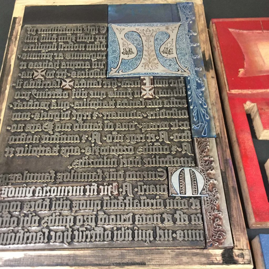
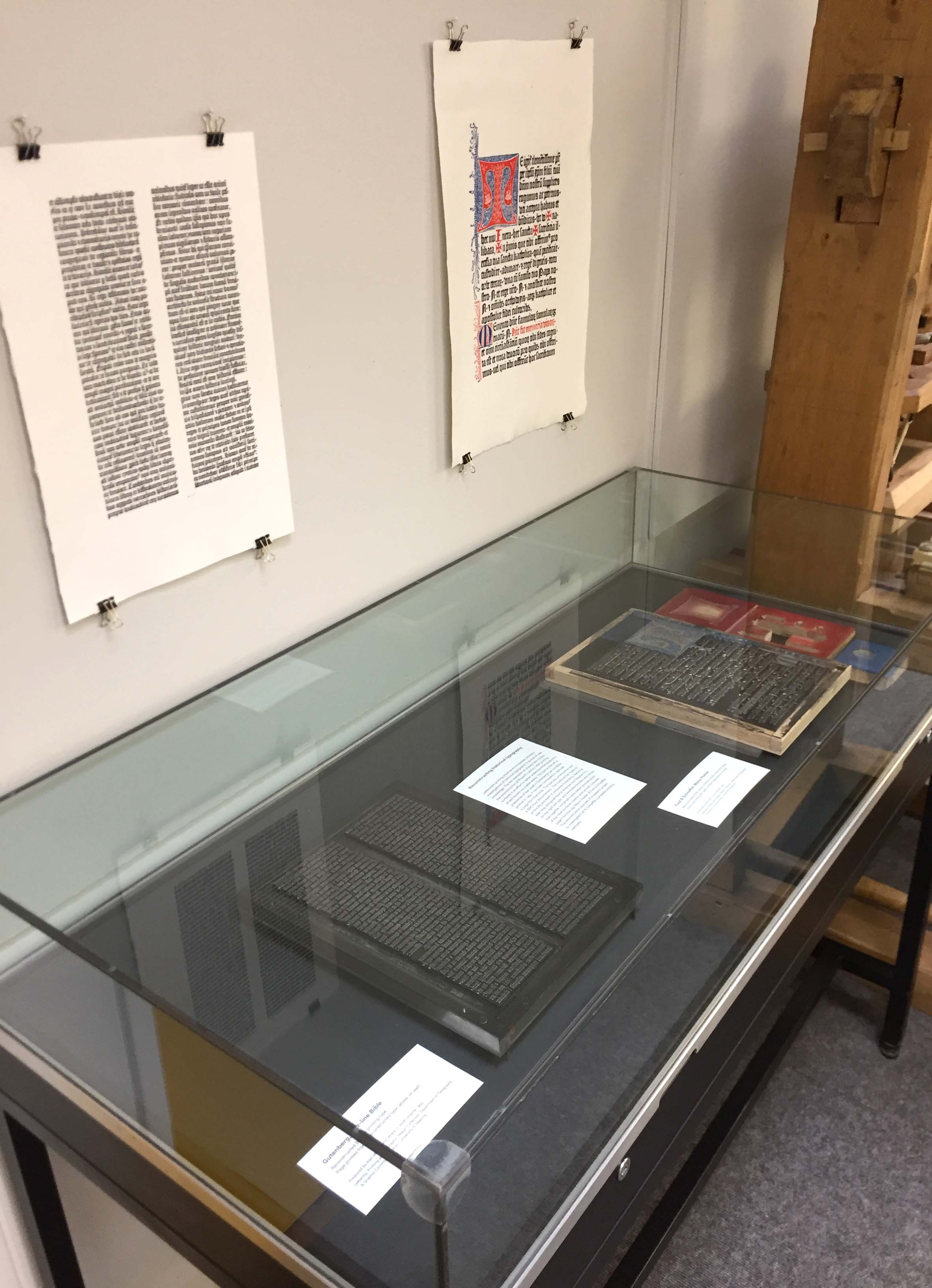
Reconstructing historical typography
Letterpress printing practice encompasses scholarly investigations of historical typography in pursuit of new knowledge. The two examples on display here involve the reconstruction of fifteenth-century relief printing surfaces in an effort to better understand the production of well known incunable works. The type on the left (in the image, below) is a facsimile of that used in Gutenberg’s 42-line Bible, printed in 1455. It has been composed to replicate a page from that book. The type was produced as part a BBC Four documentary, ‘The machine that made us’, on the life and work of Johannes Gutenberg, featuring Alan May alongside Martin Andrews and Stephen Fry. On the right are type and decorated borders and initials that together comprise a speculative reconstruction of the relief surfaces used to print a multi-coloured page from the 1457 Mainz Psalter of Fust & Schoeffer. The reconstruction was part of a research project to investigate Fust & Schoeffer’s probable working methods.


Re-invention of historical technique
This work has been created by the Leipzig designer, Pierre Pané-Farré. It takes its inspiration from compound-plate printing, a nineteenth-century technique that exploited multiple interlocking printing surfaces. Inked separately (in different colours) and then combined, a single impression would be taken from the interlocking surfaces, resulting in precisely aligned multicolour printed images. Pané-Farré has revisited the technique using laser-cut MDF printing surfaces, which produced the various sets of interlocking components displayed here. Ink was applied to each component in the set, either as ‘flat’ colour or in graduated hues. The set was then printed in a single impression to produce the polychromatic prints. The project was accompanied by the publication of Die polychrome Druckerei (Leipzig: Institut für Buchkunst, 2014), which reproduces the prints in four-colour offset lithography. Pané-Farré cites Michael Twyman’s book, Printing 1770–1970 (1970), and Maureen Greenland’s doctoral thesis, ‘Compound-plate printing: a study of a nineteenth-century colour printing process’ (University of Reading, 1996), as starting points for his work.

