Category: students and graduates

2013 Monotype Studentship goes to Slovenian student

This year’s Monotype Studentship, awarded to an incoming MA student through the generosity of Monotype Imaging Ltd, has been awarded to Slovenian student Teja Smrekar, who will study Typeface Design. Teja receieved her first degree in Fine Arts from the University of Maribor, where her dissertation topic was ‘The socially engaged poster’. Teja has developed an interest in typeface design and attended workshops run by Gerry Leonidas and Reading alumna Veronika Burian. In her professional practice she has designed poetry books, an identity for the Association of Slovenian Artists, and has exhibited her work at EDUZGRAF in Zagreb, Croatia.

Dan Rhatigan, Type Director at Monotype, said ‘We selected Teja because of her overall enthusiasm and particularly her research interests in the Cambodian Khmer script. It’s always our hope that the Monotype Studentship will encourage the student who benefits from the opportunity and enable them to contribute to the wider body of typographic knowledge.’

Paul Luna, Head of Department, said ‘The support of industry partners is vital to allowing students from all over the world to study at Reading, and we are very grateful to Monotype for this continuing generous contribution to design education.’

Photo of Teja Smrekar
Teja Smrekar

Vincent Ma winner 2013

Photo of Kate Goudsmit
Kate Goudsmit, Vincent Ma winner 2013

Kate Goudsmit, who as a Part 2 student was a winner in the Vincent Ma awards run by Design Portfolio Marketing Services, has been interviewed on their blog. Design Portfolio have been generously supporting students in the Department through prizes for achievement and opportunities for work experience in their busy London studios for several years, in memory of former employee and Reading alumnus Vincent Ma.

A new Papal Inscription in Westminster Cathedral

Finished floor

Typography alumna, Caroline Webb, has designed and installed a new Papal inscription for Westminster Cathedral, to commemorate the visit of Pope Benedict in 2010.

The 7 foot long inscription is made of one piece of Carrara Marble inlayed with letters of green and red Porphery and lies in the main entrance to the Cathedral.

The marble inlay was done by Pietra Dura craftsman Thomas Greenaway.The inscription took 2 years to design and produce, and a week to fix in the floor. The commission was technically challenging in every way; Caroline will be writing a full article to document its creation.

Sanguinis 3 lines copy Quod copy  3 copy

50% chance of rain

UROP students Silchester
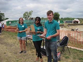
Left to right, Rachel Bartlett, Shyamali Abraham and Matt Standage, questionnaires at the ready
Public at Silchester
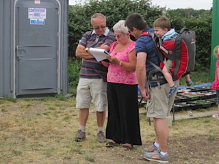
Many members of the public took time off from the dig to give us their input

Typography & Graphic Communication student, Matt Standage, has been working together with Meteorology student, Rachel Bartlett and Psychology student, Shyamali Abraham on a joint project between the University’s Meteorology Department, Centre for Information Design Research and Psychology Department on the communication of probabilistic weather forecasts. These are forecasts that show the chance of rain as a percentage – often used in American weather forecasts but less typical in the UK. In this study we are looking at people’s response to percentages presented as numbers, words (likely, unlikely etc.) and through graphic representation.

The project is part of the University’s Undergraduate Research Opportunities (UROP) scheme. In the picture (top) you see the UROP team poised to hand out questionnaires to members of the public visiting the Archeology Department’s open day at Silchester last Saturday.

The republic responded generously by taking time to complete our questionnaires, indicating what types of information they typically use to make weather-based decisions and how they prefer to see information about the chance of rain in forecasts. Some 250+ questionnaires later we’re very grateful to the Silchester team for hosting us, to all who kindly allowed themselves to be distracted from their visit to the dig to respond to the questionnaire and also to the many people in Reading town centre who also took part in the research.

Non-Latin festival in Bangkok

Granshan 2013

The University of Reading is a partner in the 2013 Granshan: Design and Identity conference in Bangkok, currently under way. The  Department is contributing with a special version of the “From hot-metal to OpenType” exhibition, which opened to the public yesterday in the library of Chulalongkorn University.

Speakers include Typography staff Gerard Unger and Gerry Leonidas, and graduates Paul Hunt and Ben Mitchell.


Reading at ICTVC 5, Nicosia

Reading at ICTVC 5, Nicosia

ICTVC 5

Reading staff and graduates have returned from the fifth International Conference on Typography & Visual Communication, hosted by the University of Nicosia. ICTVC is the brainchild of Dr Klimis Mastoridis (a Reading alumnus) who, since the first event in 2002, has given the conference a distinct character that sets it apart from most such events. Amongst typography-orientated events, ICTVC is probably the most diverse in the range of academics and practitioners it brings together. And, even in this smallest of its iterations, it attracted speakers and delegates from four continents.

The combination of research and practice makes ICTVC a very good fit for Typography, and it was no surprise to see the Department represented well. The speaker lineup included staff members Mary Dyson, Gerry Leonidas, and Sue Walker, and current PhD candidates Sallie Morris and Niki Sioki. PhD alumni Petra Cerne Oven, Sue Perks, Karel van der Waarde, and MA alumni Julián Moncada, Elena Papassissa, Vaibhav Singh, and Adi Stern also presented papers.

For a general report on the conference, head over to Mark Barratt’s post on the Eye magazine blog.

Reading in Berlin

The annual TypoBerlin conference is a major fixture on the European design calendar, bringing together over 1,500 attendees in the Haus der Kulturen der Welt in Berlin. Erstwhile staff member Ken Garland opened this year’s conference with a talk on the theme of “touch”, taking the audience on a journey through senses and ideas, culminating with a very personal and touching – pun intended – story. Department  graduates Paul Barnes and Marian Misiak talked on making typefaces from Cornish vernacular lettering, and Polish type design heritage from the Communist era respectively. Gerry Leonidas spoke on the emergence of typeface design as α professional discipline with global reach. Slanted magazine have  been reporting on their blog on Ken, Paul, Marian, and Gerry.


Wayne Hart is Golden

Wayne Hart letters

Wayne Hart, a Department alumnus and visiting instructor for letter cutting, has just been awarded Gold Award & Overall Winner and Maker of the Year Award in the annual Craft & Design competition. The specialist media judge, Medeia Cohan-Petrolino, summed up Wayne’s work:

Wayne Hart’s work offers a unique juxtaposition – upholding traditional letter-carving methods while simultaneously being contemporary and innovative. His passion for his craft and meticulous manner come across in every aspect of the work that he produces. Wayne’s craftsmanship and creativity are already at an impressive stage and his plans to continue pushing forward with his practice and technical development will surely make him one to watch.

Wayne has already been awarded a number of prestigious scholarships from the Queen Elizabeth Scholarship Trust, the Worshipful Company of Masons, the National Association of Decorative and Fine Arts Societies, the Finn Family Fund, the Bishop of Norwich and a number of smaller charities. His work is increasingly recognised, and can also be seen in the base of the clock tower in the University’s London Road campus.

Another contribution to the Venice Biennale

Adobe Thai, a typeface designed by Fiona Ross and Tim Holloway, features in this visual project by Zurich-based artist Dafi Kühne – 40 posters in 34 languages – presented at the Biennale in 2012. You can watch the production process on Vimeo:

You can read the artist’s documentation, where he thanks Fiona, research student Titus Nemeth, and MA graduate Toshi Omagari for the help with the non-Latin typeface layouts.