Category: awards

Fiona Ross is awarded the SoTA Award

Fiona Ross receives the SoTA Award

In a room bursting with applause and cheerful congratulations, Fiona Ross was awarded the prestigious SoTA Typography Award for her design and teaching work, during the TypeCon conference in Washington DC. The event began with prerecorded messages by graduates sending their congratulations from many countries holding up warm messages in some of the many scripts Fiona has supervised, followed by salutations by John Hudson and Gerry Leonidas.

Fiona’s first career in type design started when she took the job of coordinator for non-Latin typefaces at Linotype in 1978. John Hudson reminded the audience that “Over the following decade at Linotype, Fiona would build the non-Latin design department into the most technically and aesthetically creative team of its kind, employing designers, draughting staff and computer programmers selected by her. At a time when other companies were busy converting their old metal and photo types to the new digital technologies, Fiona undertook an extensive programme of innovative new typeface design for Indian, Arabic and Southeast Asian scripts, often working closely with the newspaper publishers and editors who were Linotype’s biggest customers.”

Hudson continued: “In addition to developing new designs for Indian scripts at this pivotal moment of technological change, Fiona also pioneered the use of phonetic keyboard input, using software to drive the visual display of characters, rather than requiring the typesetter to enter text in visual order. This model, in which phonetic character strings and visual glyph strings are separated—the now familiar separation of content and display—, influenced both ISCII, the Indian national standard for computing, and the Unicode Standard.”

Hudson outlined the many collaborations between Tiro Typeworks and Fiona as an independent consultant, starting with their collaboration, with Tim Holloway, on the redesign of the Yakout Arabic newspaper typeface: “…the first of many collaborations, each of which has been a wonderful adventure for me and a fascinating education. Together, we have made new types for Adobe, Microsoft and Linotype, in a range of scripts including Arabic, Bengali, Devanagari, Tamil, Telugu, and Thai. In the past two years we have been honoured to create custom types for the publishing of the Murty Classical Library of India by Harvard University Press.”

Fiona’s research focuses on the relationship of technology and typeface design, and has led to texts such as her book on the history of Bengali type, a key reference for the script. Her texts offer an exemplary model for the integration of research into typeface design, and are central to the building of a global reference library for non-Latin typeface design.

Through her teaching and supervision in the Department of Typography over the last 15 years, Fiona has helped establish the methodology for research-informed typeface design that is central to the MA Typeface Design programme, and a key element in a range of PhD projects. Important research projects on Arabic, Tibetan, and several Indian scripts, bear the mark of her approach. Far beyond the supervision within the Department, Fiona’s sharing and nurturing attitude to researchers and designers from around the world fosters an attitude of collaboration and learning that defines non-Latin typeface design today.

Reading group(Photographs by Laurence Penney)

Michael Twyman awarded Sir Misha Black Medal

We are delighted to announce that Professor Michael Twyman has been awarded the 2014 Sir Misha Black Medal for his contribution to design education.

Professor Sue Walker recalls:

‘Writing about ‘Typography as a university subject’ in 1970, Michael identified four ‘basic beliefs’ that governed the structure of the Reading course:

  • the visual form of typography should relate closely to the language used and its organisation reflect and reinforce its meaning;
  • typographic designers should understand the technical means at their disposal;
  • the reader must be respected;
  • typographic design is planning in relation to the above three, usually in the context of a client, an organisation, a budget and a deadline.

These statements are still relevant today, and have influenced the approach to design taken by our students.’

Recent student awards

We are very pleased to note recent awards to students in Typography & Graphic Communication.

Chancellor’s Awards

Undergraduates Kate Goudsmit and Rob Lowe, currently in their final year of study, together with Ryan Lee and Peter Loveland, in their second year, all received the Chancellor’s Award for their overall performance in the academic year 2012–13. Sir David Bell hosted the award ceremony on Monday (25 November) and commended their high achievement. Award winners received a commemorative book featuring short interviews with each recipient.

Warm congratulations to our four winners!

Rob Lowe and Kate Goudsmit with Sir David Bell.

Rob Lowe and Kate Goudsmit with Sir David Bell.

Sign Design Society

Undergraduate Emily Whiteside, currently in her final year of study, was awarded a commendation for her submission to the Student Work category of the annual Sign Design Society awards. The submission was her ‘Designing a journey: the Chatsworth Shuttle’ project, completed under the direction of project tutor Sara Chapman. In their comments, the judges praised ‘the expertise and evident quality of the solution’, which involved the design of a map and timetable for the Chatsworth shuttle bus service, deployed as a poster, flyer, and downloadable app.

Emily Whiteside's entry to the Sign Design Society awards.
Emily Whiteside’s entry to the Sign Design Society awards.

Also receiving a commendation was MA Information Design student Joan Zalacain for his map of Amsterdam’s tram system, created during his studies at Reading in 2012–13. In their remarks on his design, which emphasized the location of barriers at system access points, the judges noted that ‘the graphic solution had been carefully thought through and the result was functional and stylish.’

Warm congratulations to Emily and Joan, too!

More about the SDS awards.

Success for Vermillion

anneb

Typography alumna Anne Brady’s company, Vermillion, has scooped success at the annual Institute of Designers of Ireland by winning not one, but two awards in the digital category.

The two winning apps come from the two ends of Vermillion’s client spectrum. The first explored the fascinating world of singer-songwriter Pierce Turner and concentrated on the writing and production of his much-acclaimed song Snow, from his album Songs for a Very Small Orchestra. The second win was in the academic area and is called Books of Dublin. It showcases a selection of rare books from two of Dublin’s most renowned antiquarian libraries and includes commentaries from leading academic specialists. You can download both free to your iPad from the App Store.

Speaking at the awards ceremony, IDI President Andrew Bradley said that the awards “further demonstrate the impact of design in the area of new media. It proves beyond doubt how creative design skills can add value and indeed change the dynamics within the exciting and constantly developing field of digital communications and marketing.”

2013 Monotype Studentship goes to Slovenian student

This year’s Monotype Studentship, awarded to an incoming MA student through the generosity of Monotype Imaging Ltd, has been awarded to Slovenian student Teja Smrekar, who will study Typeface Design. Teja receieved her first degree in Fine Arts from the University of Maribor, where her dissertation topic was ‘The socially engaged poster’. Teja has developed an interest in typeface design and attended workshops run by Gerry Leonidas and Reading alumna Veronika Burian. In her professional practice she has designed poetry books, an identity for the Association of Slovenian Artists, and has exhibited her work at EDUZGRAF in Zagreb, Croatia.

Dan Rhatigan, Type Director at Monotype, said ‘We selected Teja because of her overall enthusiasm and particularly her research interests in the Cambodian Khmer script. It’s always our hope that the Monotype Studentship will encourage the student who benefits from the opportunity and enable them to contribute to the wider body of typographic knowledge.’

Paul Luna, Head of Department, said ‘The support of industry partners is vital to allowing students from all over the world to study at Reading, and we are very grateful to Monotype for this continuing generous contribution to design education.’

Photo of Teja Smrekar
Teja Smrekar

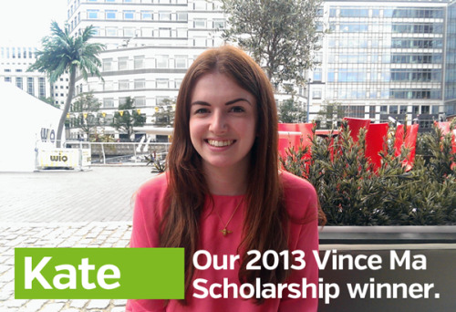
Vincent Ma winner 2013

Photo of Kate Goudsmit
Kate Goudsmit, Vincent Ma winner 2013

Kate Goudsmit, who as a Part 2 student was a winner in the Vincent Ma awards run by Design Portfolio Marketing Services, has been interviewed on their blog. Design Portfolio have been generously supporting students in the Department through prizes for achievement and opportunities for work experience in their busy London studios for several years, in memory of former employee and Reading alumnus Vincent Ma.

Wayne Hart is Golden

Wayne Hart letters

Wayne Hart, a Department alumnus and visiting instructor for letter cutting, has just been awarded Gold Award & Overall Winner and Maker of the Year Award in the annual Craft & Design competition. The specialist media judge, Medeia Cohan-Petrolino, summed up Wayne’s work:

Wayne Hart’s work offers a unique juxtaposition – upholding traditional letter-carving methods while simultaneously being contemporary and innovative. His passion for his craft and meticulous manner come across in every aspect of the work that he produces. Wayne’s craftsmanship and creativity are already at an impressive stage and his plans to continue pushing forward with his practice and technical development will surely make him one to watch.

Wayne has already been awarded a number of prestigious scholarships from the Queen Elizabeth Scholarship Trust, the Worshipful Company of Masons, the National Association of Decorative and Fine Arts Societies, the Finn Family Fund, the Bishop of Norwich and a number of smaller charities. His work is increasingly recognised, and can also be seen in the base of the clock tower in the University’s London Road campus.

Congratulations to John Morgan

To follow up on my earlier post:

We are delighted that the John Morgan Studio has won the graphics category in the Designs of the Year award.
 

image (crop)

Reading Typography graduate, John Morgan, has been nominated for the 2013 Designs of the year competition run by the Design Museum for his work on the visual identity for the 13th Architecture Biennale in Venice.

Read about his work on the Eye blog: Common ground: a designer’s letter from Venice.

John is currently teaching students on our MA Book Design course.