We’re excited to welcome Sammy Rudkin to our Baseline Shift session on 29 April 2026,
Feel free to check out his site here:
We’re excited to welcome Sammy Rudkin to our Baseline Shift session on 29 April 2026,
Feel free to check out his site here:
We’re excited to welcome Cj Cawley to our Baseline Shift session on 22 April 2026,
Feel free to check out his site here:
We’re excited to welcome Kieron Lewis to our Baseline Shift session on 25 March 2026,
Feel free to check out his site here:
For our penultimate Baseline Shift session of the year, we were joined by the talented Gavin Strange, Director and Designer for Bristol’s Aardman, and “a passion project pursuer under the alias, JamFactory”.
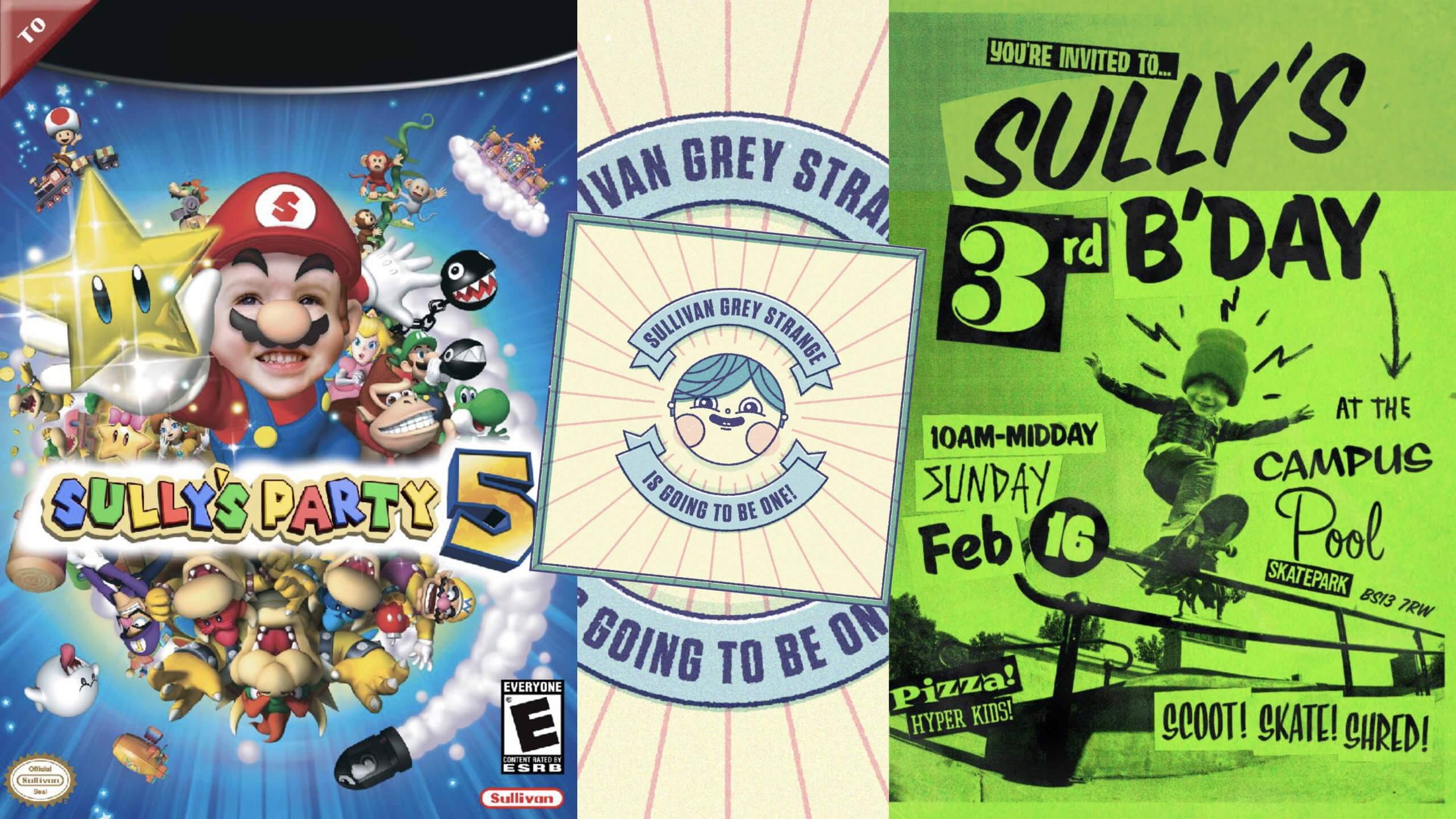
Gavin began by emphasising how important moving to Bristol 20 years ago was in his journey as a young creative, explaining how rich in art and culture the city is. Alongside Bristol being a pertinent source of inspiration, Gavin also highlighted how important his children are for keeping him motivated and creatively-engaged. Producing fantastically vibrant invites for their birthday parties and even creating them their own Duplo pinball machine, Gavin stresses that “the more you do, the easier it is to stay creative” even if it’s “for the sake of it”.
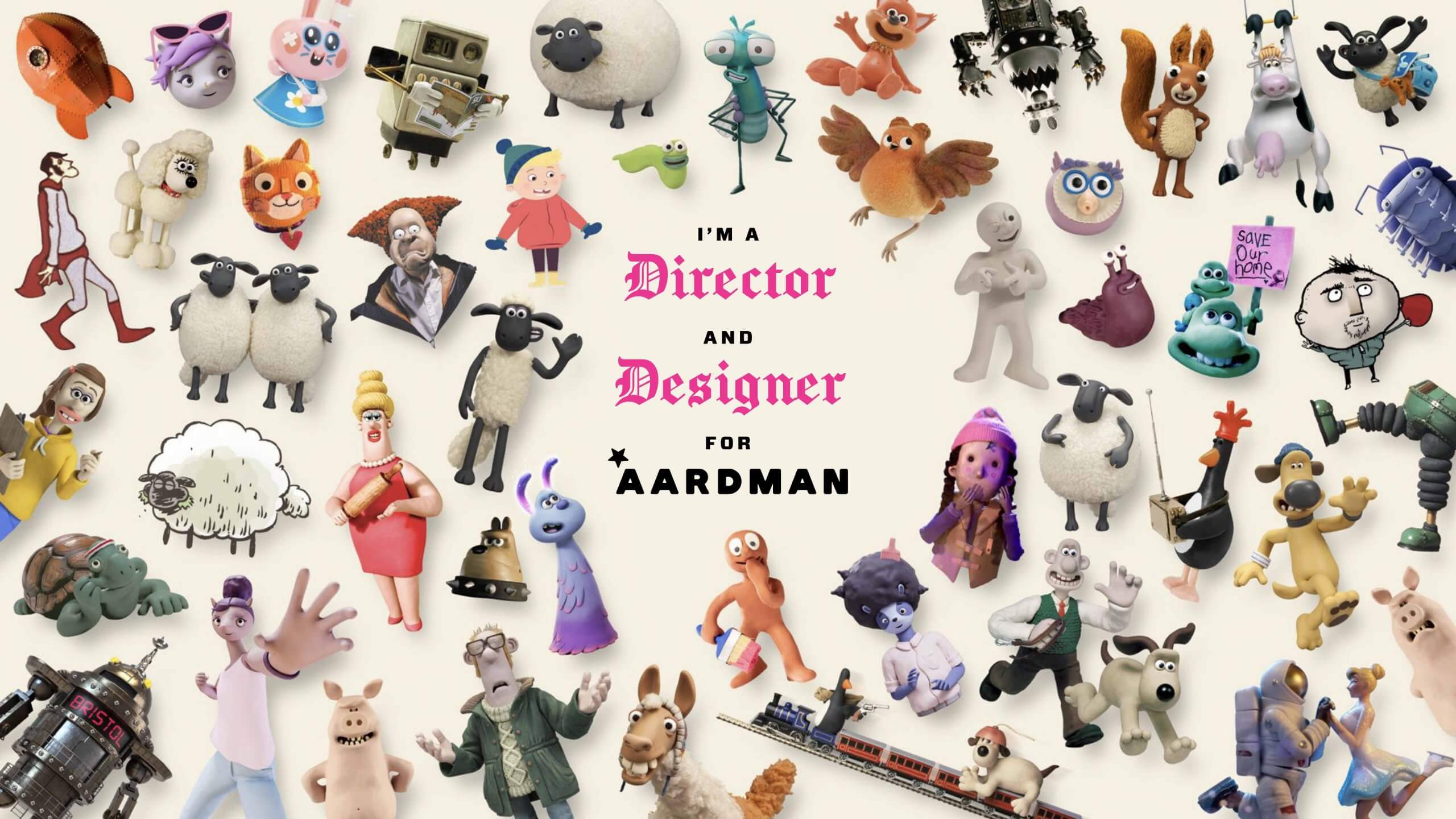
Aardman is a Bristol-based, stop-frame animation specialist studio that most notably animates productions such as Shaun the Sheep, Wallace and Gromit and Chicken Run. Gavin first joined the studio as a Senior Digital Designer while continuing to make passion project films and motion graphics under the alias, JamFactory. Eventually, Gavin’s love for filmmaking bled into his work at Aardman, leading to him officially becoming Director and Designer for the studio. Gavin resonates with the human-natured ethos of Aardman, finding value in working with other humans, opting for “human intelligence” as opposed to “the two letters” (referring to AI).
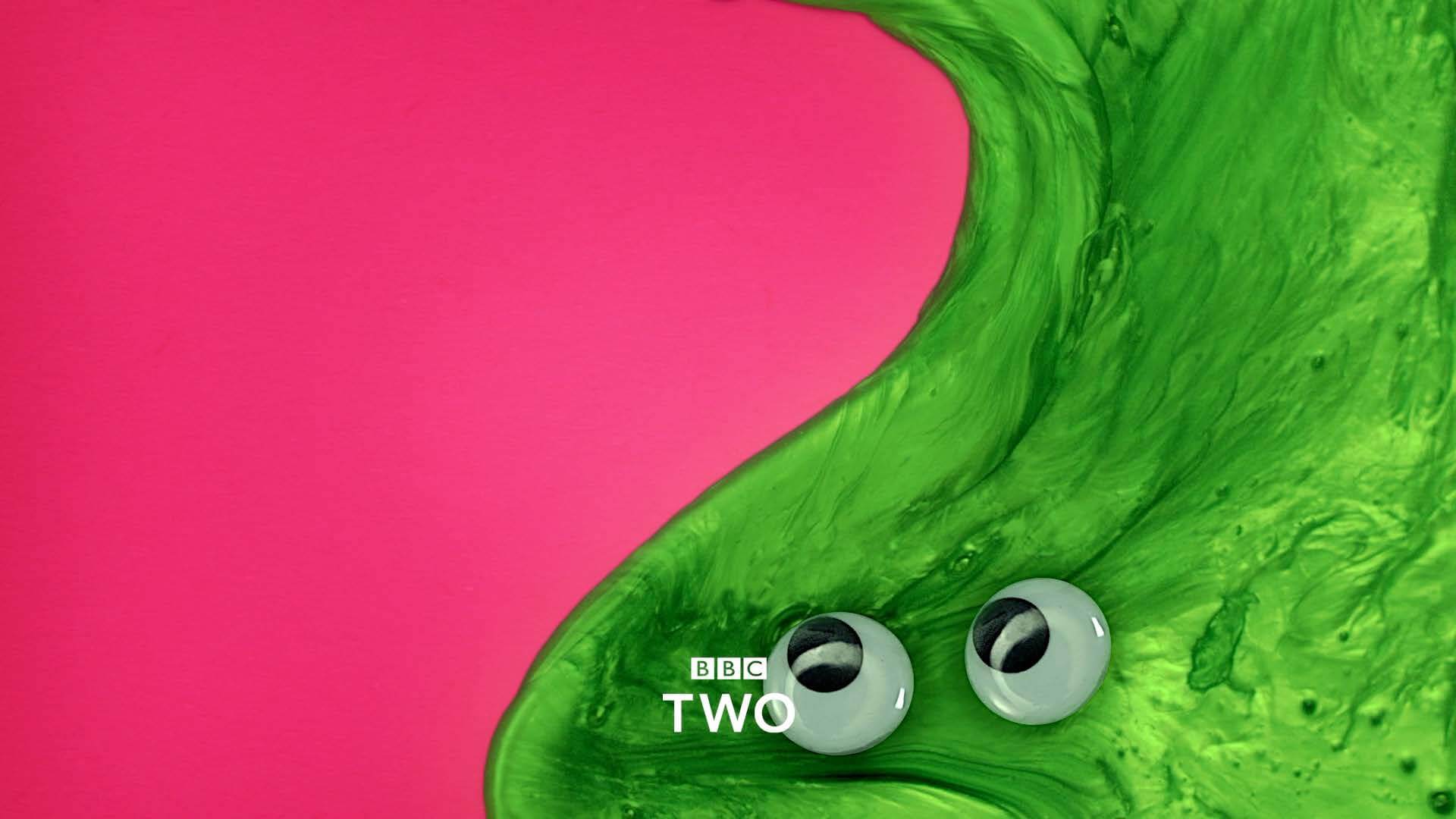
Gavin articulated how much he enjoys the variety that comes with working for Aardman, for example, in one project he might be making a “stop-frame, live-action, motion-graphic, rap video, title sequence” for the OFFF Festival in Barcelona, and in another, he’s working with “real-life slime and magnetically-puppeteered eyeballs” to produce programme transition cards for BBC Two. The dual role Gavin has at Aardman means that when he’s not directing, he’s designing, for instance, making motion graphics animation scenes featuring Wallce and Gromit’s smart gnome character ‘Norbot’ for their 2024 Christmas special, hiding jokes and gags in segments of the scenes. This way of working is great for Gavin as it allows him to contribute to both creative outlets.
Working at Aardman also means the scale of the brief can be large, specifically as large as Battersea Power Station, where Gavin and his team projected animations of Wallace and Gromit for a project titled ‘Wallace and Gromit, shot on iPhone‘ onto the front of the building. The animation was entirely shot on an iPhone 16 Pro Max and was in collaboration with Apple. The projection was a whopping 101 metres tall and was shown every night of December 2024. Gavin related all of these projects back to his philosophy of “never knowing where things will take you” and “keeping your tools sharp”, stating that while we all have responsibilities during the day, as creatives, we should allow these responsibilities to spawn seeds of ideas to expand upon at night – which is precisely what Gavin has done for the past 25 years with JamFactory.

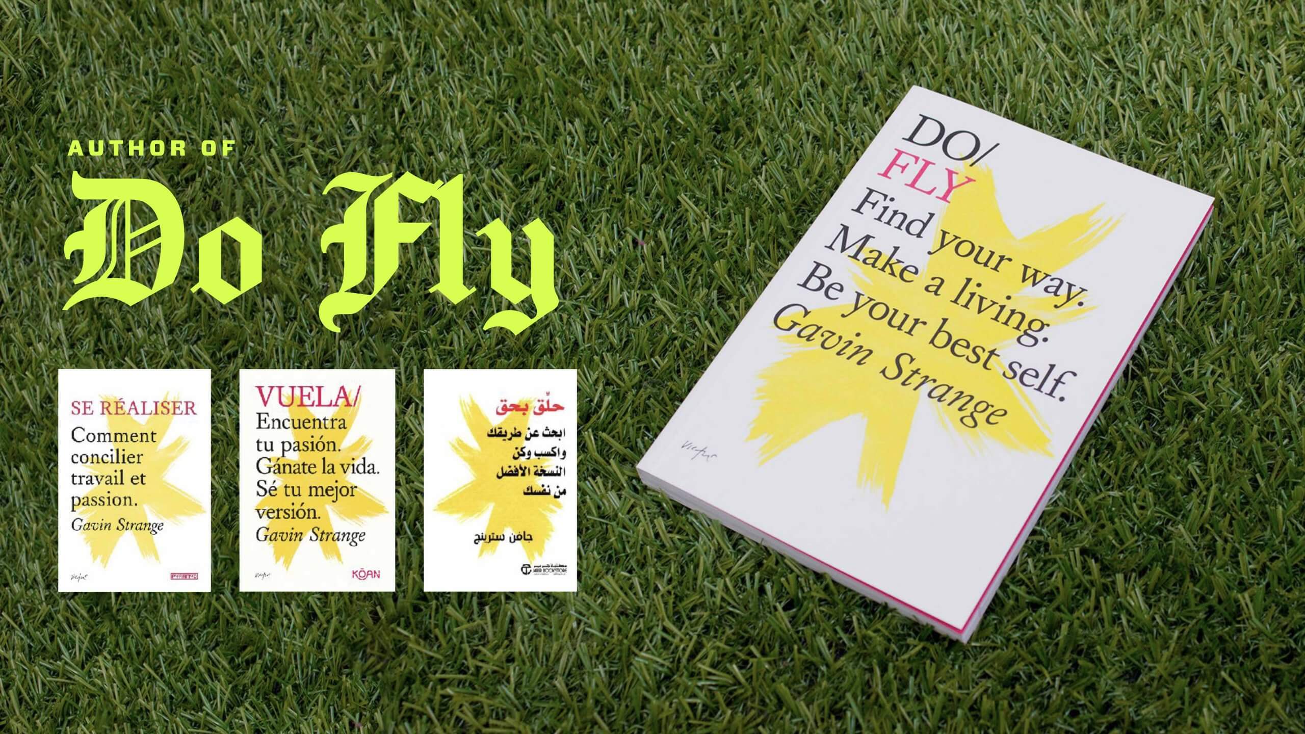
Outside of animating and designing, Gavin also has a vibrant passion for combining MIDI audio signals from his retro gaming gear into real-time visuals. Most recently, Gavin created a title-sequence for his friend in Dusseldorf, Germany and performed a “silly musical interlude” live at the event. Gavin mentioned that before pushing himself to expose his passion projects to an audience, he “was so preoccupied with worrying about what others were thinking, [he] was stopping [him]self from pushing forward”. Gavin has even written a motivational book ‘Do Fly‘ – something his English teacher would ‘never ever deem as being part of the plan’. This anecdote of believing in your own ability and pushing yourself to do the unexpected, is something that resonated with many of the students listening.
Gavin emphasised the importance of carving out and creating your own space as a creative to make things happen both physically and digitally. He offered students the valuable advice; “you won’t stand out unless you’ve told someone what you’re capable of”, and while it is important to display your primary skills (those that you’re most capable at), it is equally important to showcase your secondary and tertiary skills. Gavin highlighted his maximalist outlook of presenting work; advising that we choose a method of presenting that represents us as designers. Students were left with one last piece of advice; “if I find my voice, then my audience will find me”.
– Written by Oscar Dudley
This week, we welcomed back four Reading alumni to talk about their diverse experiences and insights from life after University.
Luke Carter started our alumni talks by focusing on the key reflections that graduating designers should be conscious of. Luke started as a junior digital designer, but then gradually moved into video editing before making the big shift to starting his own video editing company, BraveBrand. Freelancing wasn’t a smooth uphill journey, especially when he faced challenges bringing his business online during COVID-19. However, these challenges ultimately prompted a shift into a different area of branding: brand consultancy.
Choosing to be the right kind of creative is a point that left students reflecting after the talk. The debate centred around whether you are a creative who brings energy and attitude to your work to produce engaging outcomes, or someone stuck doing the same thing on a loop. It is important to note here that Luke refrains from becoming the second kind of creative but emphasises that if you do, it’s crucial to “recognise what part of the creative industry makes you light up with passion”. He also highlighted that “the difference between those who feel lost or creatively stiffed and those that feel a deep sense of joy in their work is driven by something deeper”.
A question posed by Richard Leider, which Luke often quotes to himself, is: “If you could live your life over again, what would you do differently?” This question inspires Luke to be courageous, ensuring he is living his life’s purpose without overthinking his decisions. He explains, “It’s about choosing any path and moving forward, instead of worrying what path you will take … pick one and commit fully. All roads lead home”. This message of courage and commitment is something students can take forward as they navigate their own journeys.
During her time at university, Jannah juggled a creative internship, a part-time job, running a business, and content creation, all while completing an intensive degree course. Jannah graduated in 2023, and not wanting to become complacent and reliant on the salary and structure of a nine-to-five, decided to instead jump straight into freelancing, expanding her existing business, knowing that she always had her degree to fall back on should she need it. Jannah now runs a brand design studio, Digitals by Jannah, specialising in strategy-led development and creation, working internationally with a range of businesses, offering core services such as logos and brand guidelines, to bigger productions such as physical displays, and web/app development.
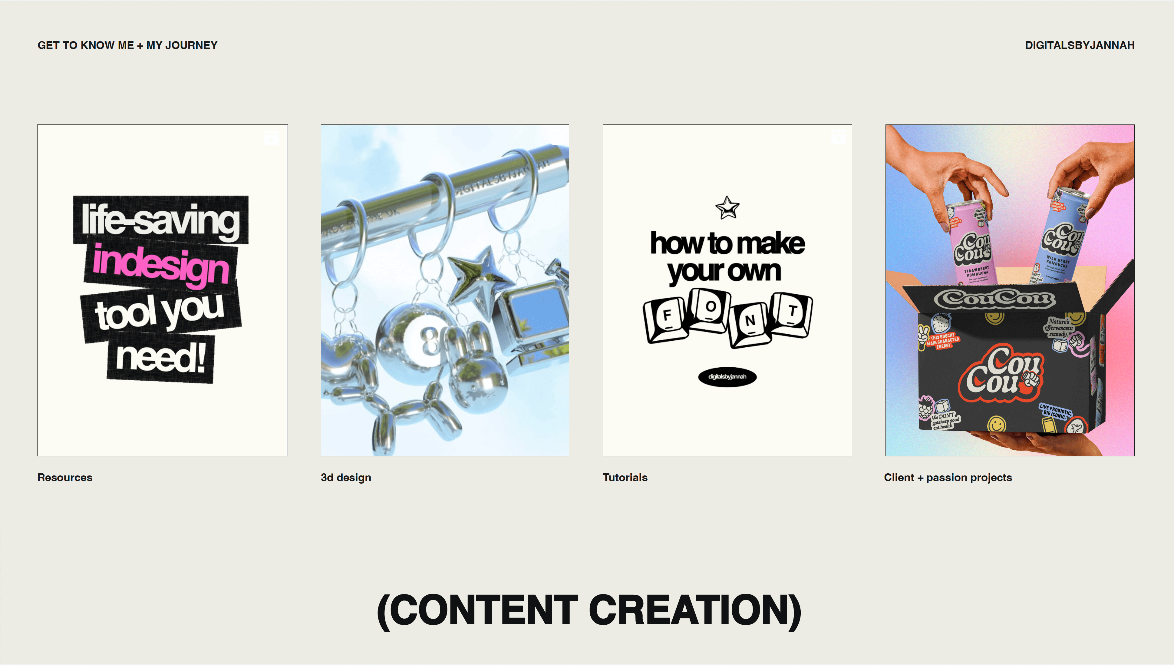
A client will often find Jannah through her website and reach out through the enquiry page. Every single client is vetted before agreeing to ensure that they align with her ethos. Jannah gave students some valuable advice, “do not take on every client that comes through, being a yes-man can work against you, as it has for me in the past”. This is not the only lesson that Jannah has passed on through her talk – another is the importance of forming long-lasting, professional relationships with clients especially when freelancing as these connections strengthen your security. Jannah explained that once you have worked with a brand, your name is tied to that work, so a clear strategy should always be considered rather than simply aiming for an aesthetic outcome. This supports the design thinking that is taught within the Department of Typography & Graphic Communication, with students required to submit rigorous research, and strategies alongside submitting a final designed outcome.
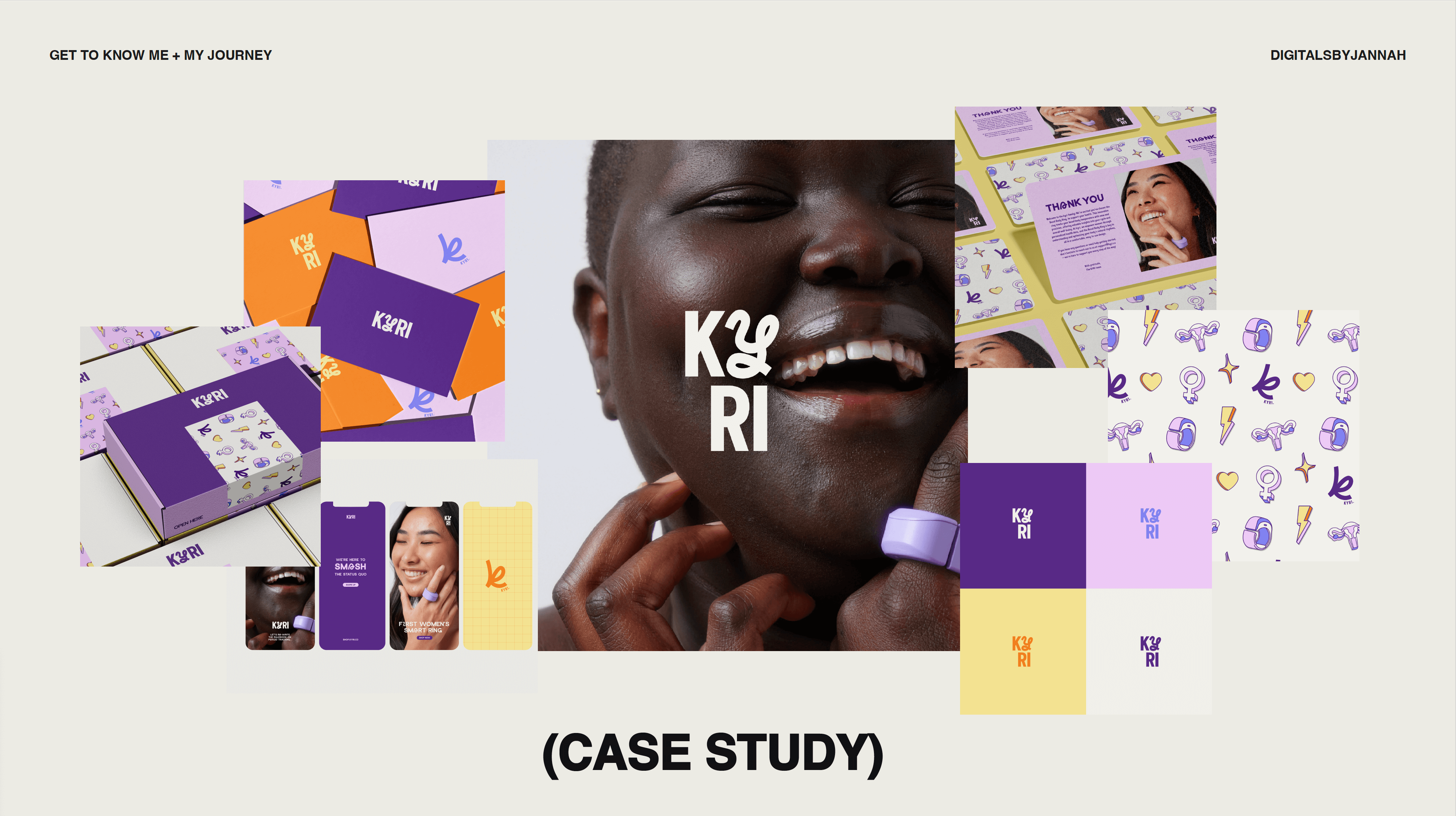
One of the highlights of the talk was the section on how you market your services and, importantly, yourself. Jannah made it clear that “learning doesn’t stop after university and education is what sets you apart from others”. Students were relieved to hear that learning about en-dashes, orphans or alignment of text can help them stand out from others. Understanding that the typographic knowledge we gain from the degree is valued by others and considered a unique selling point, is a fantastic takeaway for the students.
Sam opened his talk discussing how his dissertation research informed the branding design for the 2023 Degree show, Flux. This involved experimenting with and developing a modular system for scaling up type, which left him with a more open-minded view of what can be done with fonts. While Sam had mixed feelings about this project, it was great for the students to hear there is value in experimentation, and exploration. Sam made the most of the letterpress studio in the department to create a custom Monogram, that he now uses to identify himself across his socials. This inspired him to expand the font, designing a lowercase set to sit alongside the existing uppercase wood-type (even if he did later find that an existing lowercase sits somewhere in the department’s extensive collection).
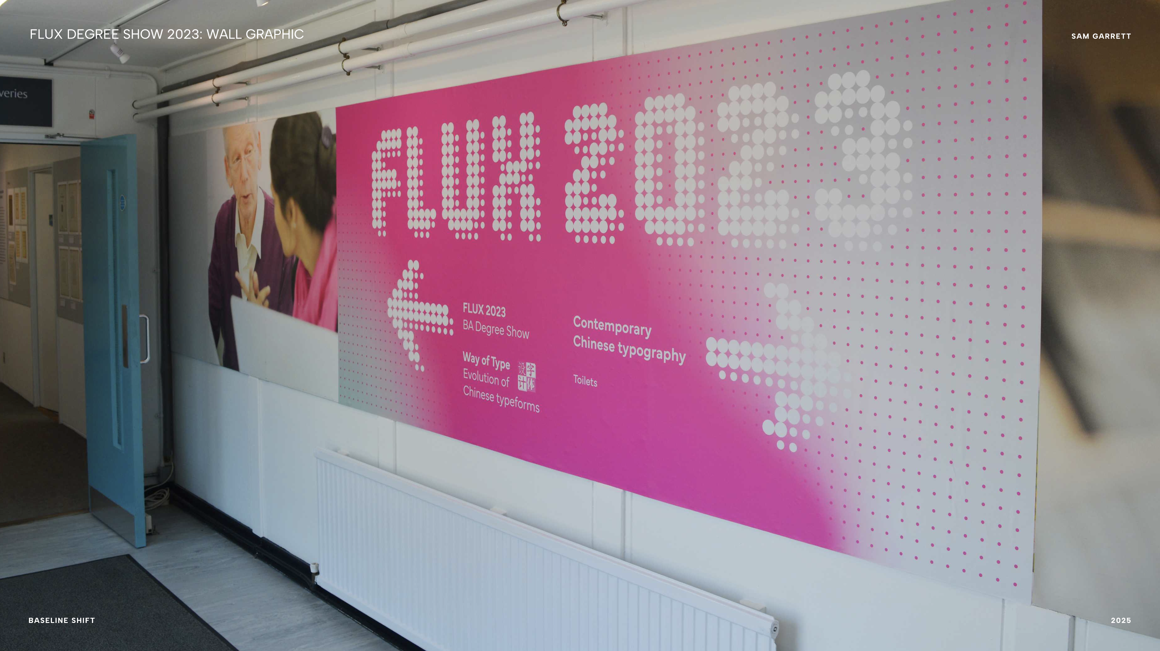
The importance of building your portfolio was highlighted by Sam, finding a way of showcasing your work in a format which is engaging and professional. Sam gave the students a great tip on how to find Design studios, which was to search for ‘studios’ under the following lists of large-scale corporate firms such as Pentagram. Once you have gained a list of studios and browsed through to find ones that would suit you, all that’s left to do is to reach out via email. Sam has sent around 300 emails to different studios, his advice is that sometimes you have to ‘take the hit and keep going’, because persistence will pay off eventually, as it has for Sam with his current role at Utile.

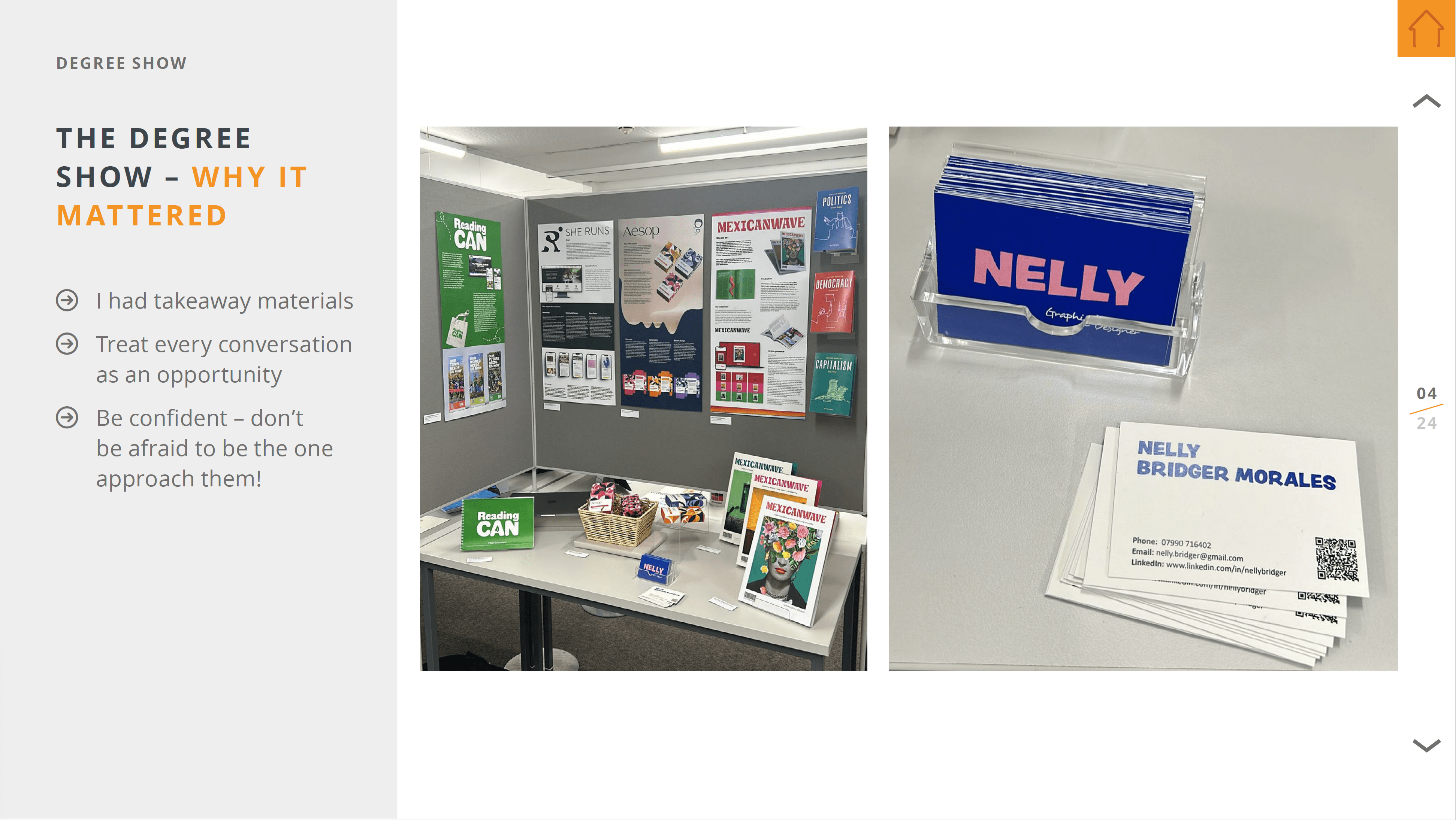
Nelly is a recent graduate coming back to inspire students through her talk, just a year after graduating. Nelly began by highlighting the importance of the degree show as this was where she connected with her current employer. Nelly made the point that visitors will only be spending a few moments at your stand during the degree show, so giving them something like a business card to take away with them can allow them more time to view your work, outside of the short time you have their initial attention. One of the main factors that Nelly attributes getting scouted to is her confidence, the way you choose to interact with others has a huge impact on how employers perceive you. Nelly had done her research prior to the degree show, with an idea of an employer she wanted to make an impact on, and that she did by jumping in on a conversation and asking her target employer to come and view her stand that he had previously missed.
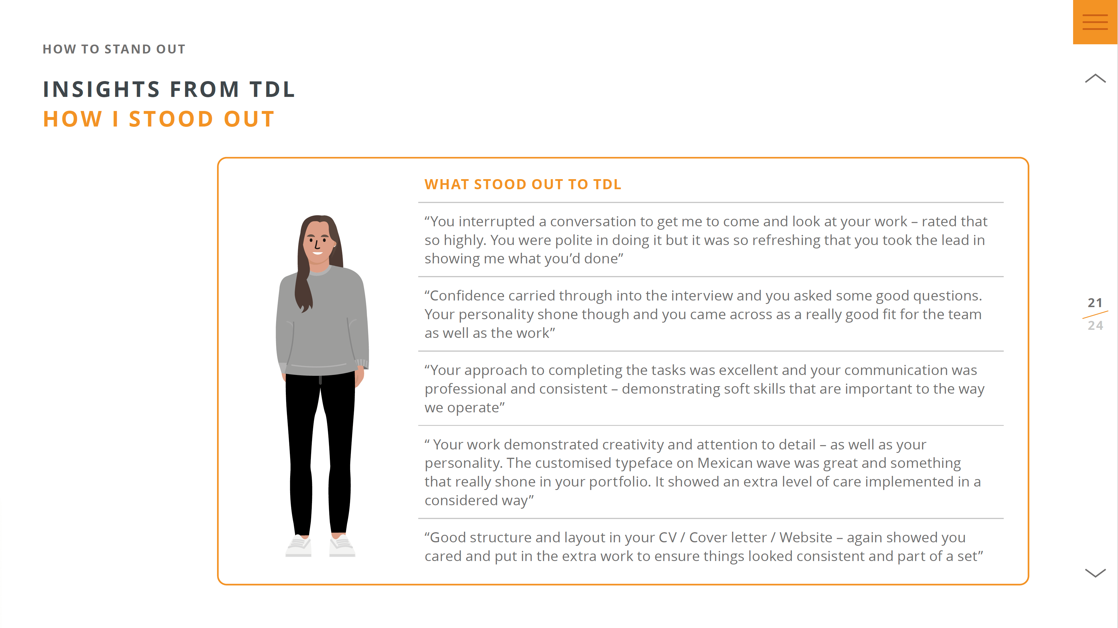
Nelly has started her journey at TDL-creative, an information design company based in London. One of their main focuses is ‘Bid design’, which is a proposal submitted by a company when trying to win a large project. Alongside collaborating with senior designers and leading smaller projects, Nelly is constantly learning new skills and finding opportunities to stand out. It was refreshing for students to hear that the first couple of months of employment were dedicated to training, to fill in the more niche skill gaps that are not covered on the course. The ability to stand out is vital and Nelly stated some skills that TDL look for when searching for talent. These include: a good attention to detail (whether this is looking at en-dashes or alignment), having strong software skills, being able to demonstrate your research and explain your work, having confidence in what you do, and lastly showing curiosity and an explorative attitude.
– Written by Tilly Dobson
This week, we were joined by Alex Hambis, Art director for Cosmopolitan magazine. Alex shared his experience in designing magazine covers for some of the biggest Editorial names in the UK.
Starting with studying publishing at Oxford Brookes university, Alex explained how he tailored his university course to be print/magazine leaning. Being pop culture obsessed, this allowed him the freedom to explore such topics in the way he enjoyed reading them, through magazines. After getting a taste for setting up a student magazine whilst at university, post-graduation, Alex started an online magazine, which covered culture and music. This not only allowed him to write about his interests but also gained him free entry to PR events.
Following his graduation from university, came the hunt for work experience. Alex gave students some valuable advice of being persistent, recommending cold emailing designers and art directors of companies that they would like experience at. Even if some emails end up bouncing back, some will go through, and opportunities could arise from just one reply. Alex hit the ground running by starting with work experience at ‘NME’, a small celebrity magazine. He then applied for a job at Closer magazine, and while he didn’t land that specific job, the company were impressed with his application and his name was passed on, securing him a design internship with a different magazine.
After completing a design internship, Alex set his sights on climbing the ladder through the stages of junior designer, mid-weight designer, senior designer, art editor, senior art director, and creative director. While climbing the ladder, Alex dabbled in other fields such as a UX role at Uniqlo, where he began to get involved with photoshoots. Ultimately, Alex missed magazine design, and returned to the world of print, applying for an art director role with little hope of achieving this (having not held this position previously). However, Alex proved himself wrong, and secured the role, propelling his career towards art direction for Attitude, Rolling Stone UK, and now Cosmopolitan.

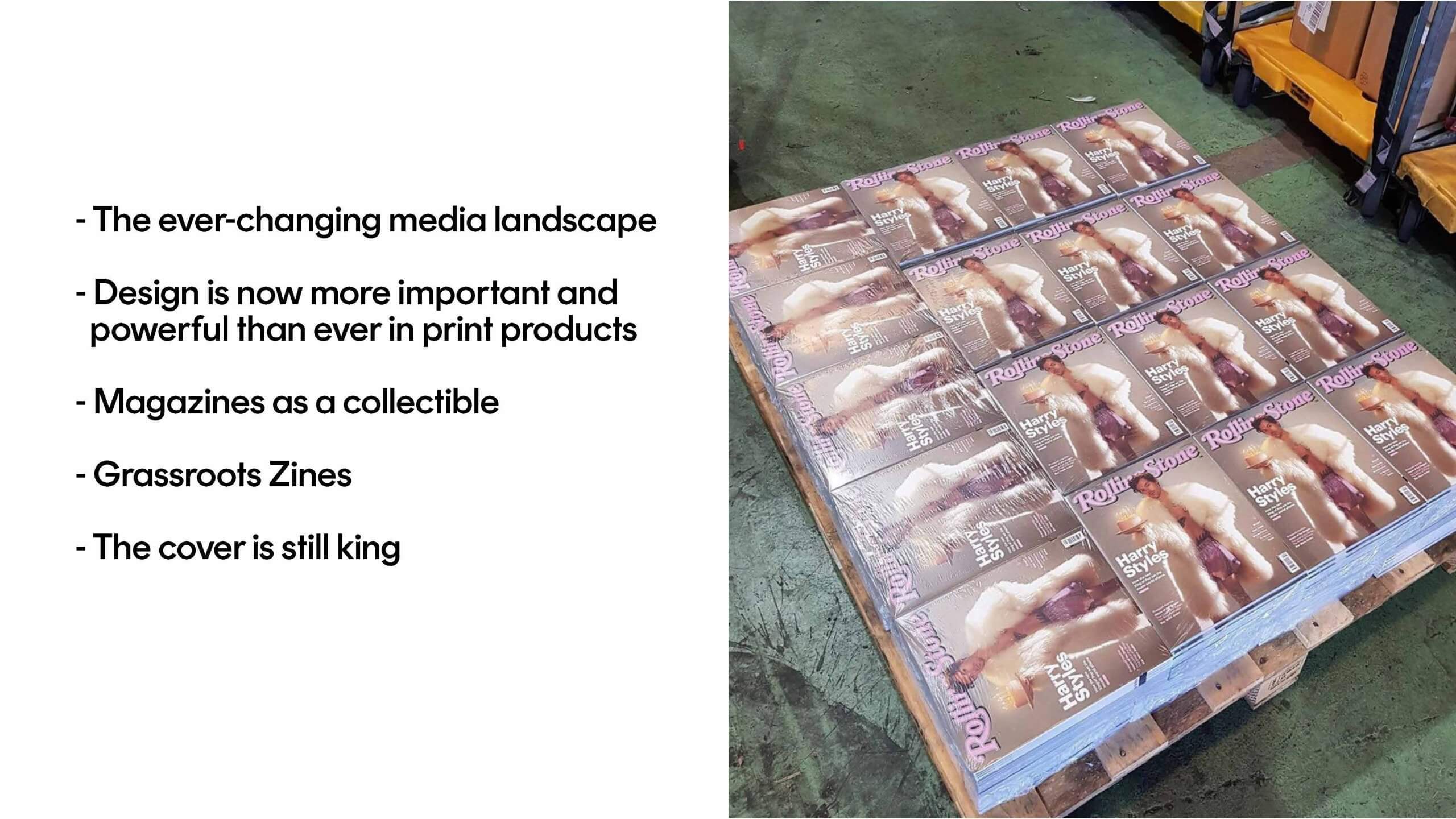
Alex described magazines to be among the ever-changing media landscape at the moment. Students were interested to hear that for the world of print, design is now more important and powerful than ever, with magazines acting as collectibles just as vinyls are to the world of music. Alex used the phrase ‘cover is king’ – not only do celebrities still want to appear on the front cover, but consumers still want to buy magazines featuring the faces of those they admire. Magazines are and will always be a tangible hero product that the consumer wants to physically hold in their hands.
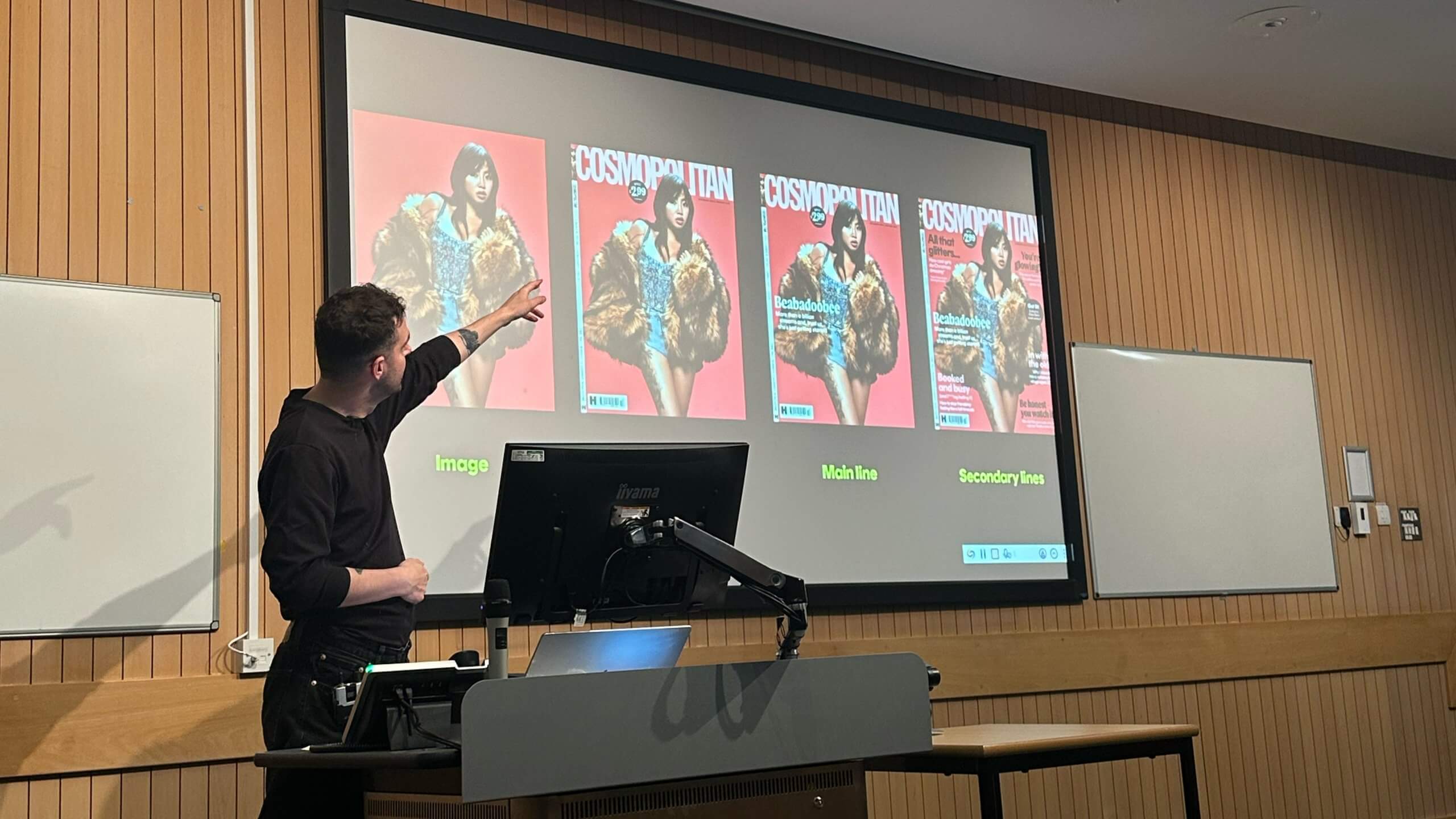
It is important to know your audience, and Alex gave students a few key questions to consider when designing the cover:
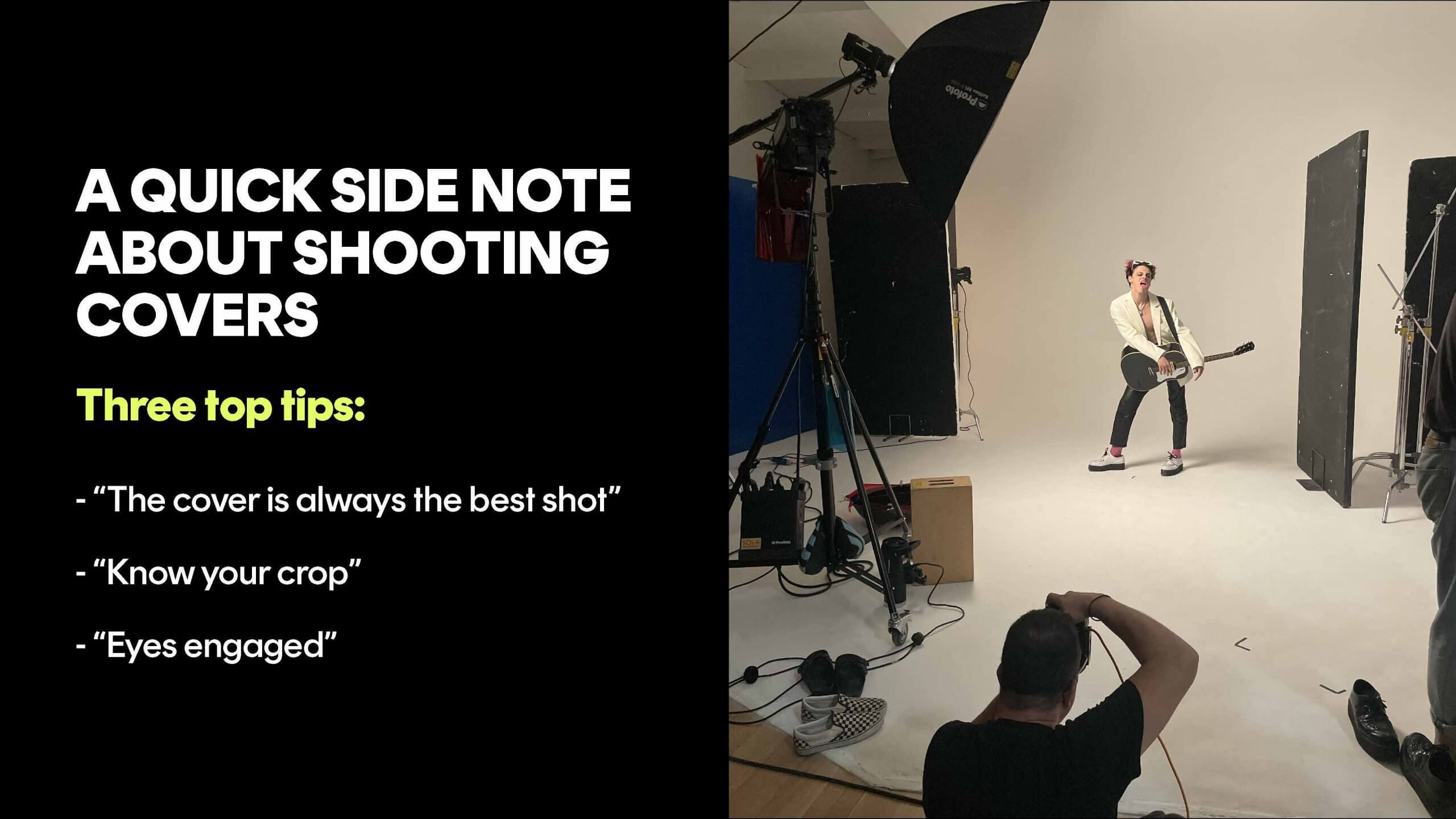
Alex explained that design needs to be considered right from the start, even as early as shooting the covers. “The cover is always the best shot” – at Cosmopolitan, the cover shoot is run with five or six looks, before being whittled down to the top three, followed by each set of photographs being evaluated for which shot is “the best shot”. Alex advised to “Know your crop” during the photoshoot, considering the future placement of mastheads, cover lines, and required copy.
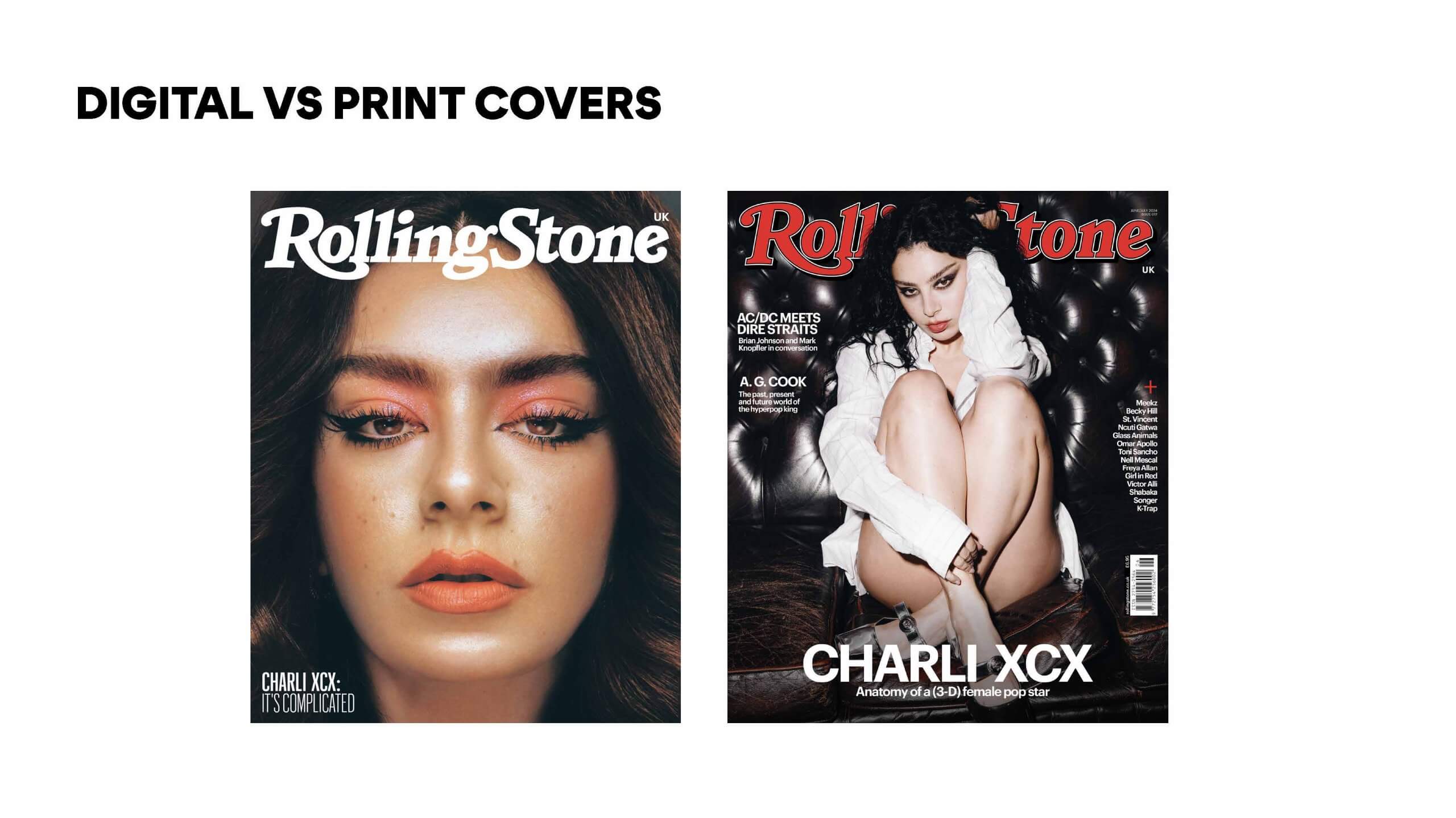
Digital-only covers can be a lot more experimental due to the demand for immediate attention while scrolling. This can be seen in the cover on the left featuring a close-up of Charli XCX that makes for an “arresting crop”. In contrast, a cover featuring the same artist that has been designed for print (shown on the right), requires a very different crop due to the inclusion of cover lines, barcodes, dates, and other required elements that are not present on digital-only covers.
– Written by Amirah Yasin
This week, we were joined by Miho Aishima, Design Director at Design Bridge and Partners, for an inspiring Baseline Shift session. Miho shared her expertise in branding and the creative process behind building visual identities, offering a deep dive into a few case studies.
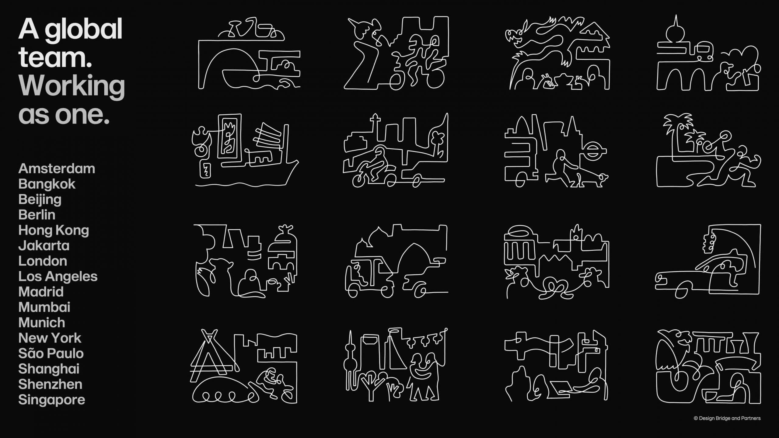
Miho has been at Design Bridge and Partners for around six years (previously working at Superunion before their merger) specialising in branding. The team is made up of 90 designers, split across three teams, and while this can appear overwhelming at first, Miho made it clear that there is a lot of inspiration to be found by working around and connecting with other designers.
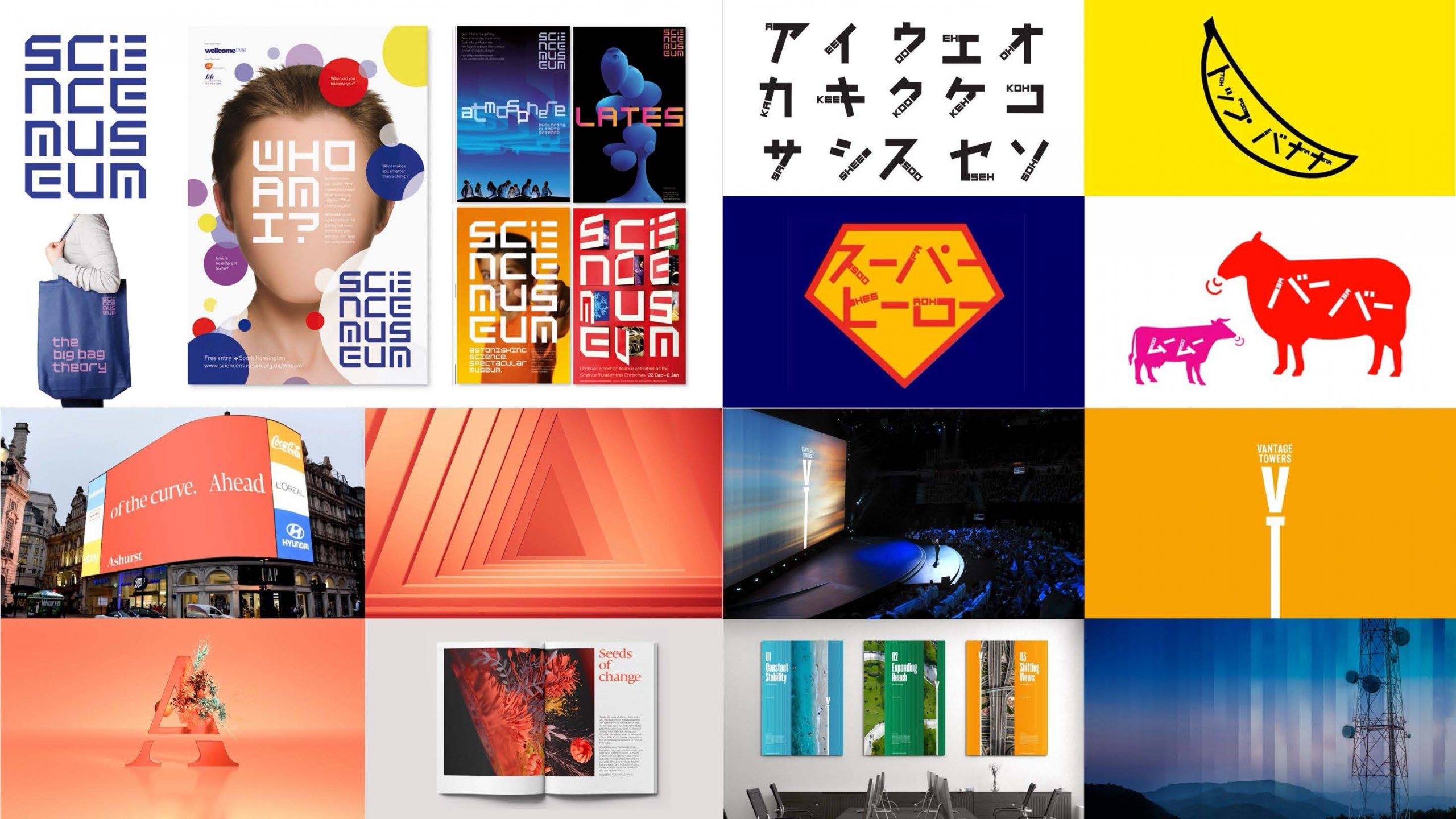
Not being restricted by a set house style, Design Bridge and Partners works with a range of clients, ranging from packaging for a Mondelez client, to a communications campaign for Heineken, and even to NASA.
After Miho had completed a degree in economics (despite this not being her passion), she sought a creative path and soon found herself graduating from Central Saint Martins with a BA (Honours) in Graphic Design. This was a time that allowed for a lot of creative exploration, before she began immediately looking for a job. Within a year of getting her first job after graduation, Miho was made redundant, which lead her to freelancing, landing a place at design studio, Johnson Banks.
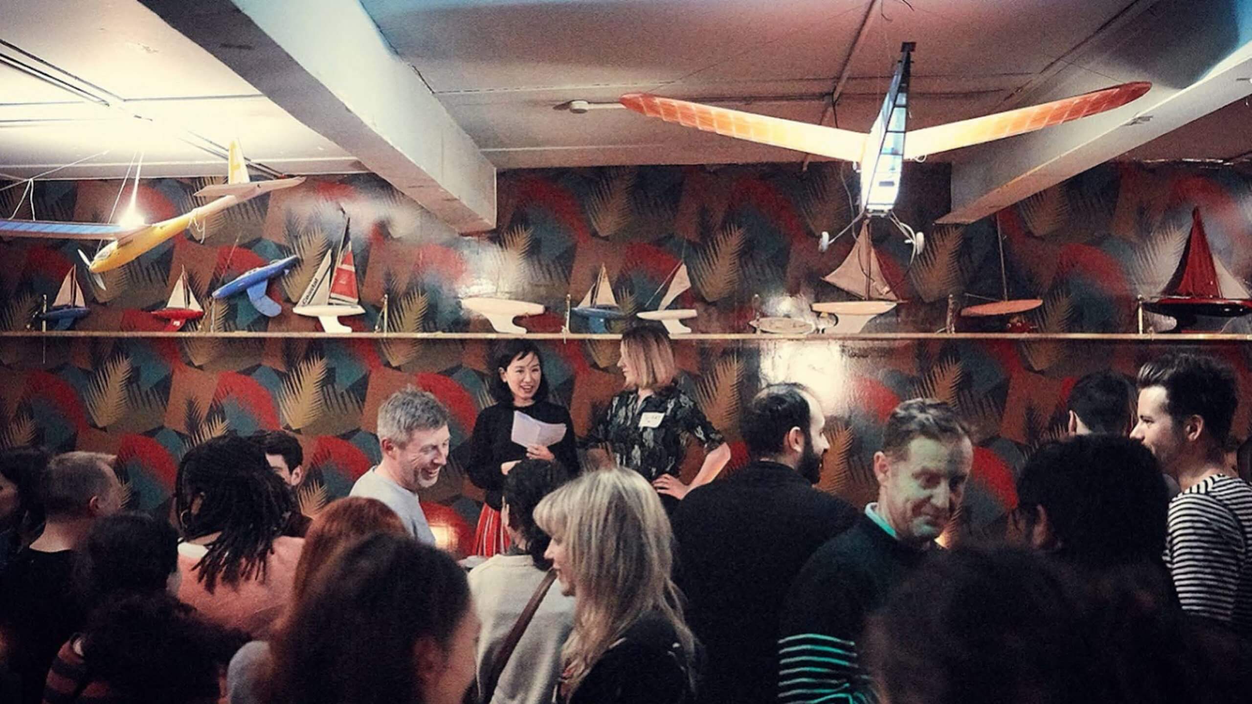
Miho’s immersion in the creative world does not end at the studio; she has also engaged in talks, judging for D&AD, and various events that go beyond the studio. One of these events is ‘Rye Here Rye Now’, a monthly networking group for creatives in Peckham that Miho and her friend Kat Garner created. This was an excellent lesson for the students – that design thinking can be applied outside of the studio, all that is needed is a problem area and you can propose a solution.
When Hermes had their sight on an ambitious business expansion, they approached Design Bridge and Partners for a rebrand with the aim of better reflecting and connecting with the consumers. It was quickly discovered that the beauty of Hermes was the diversity of their customer base and the coming together of different communities that this encouraged. This is where the name Evri derived from, and the idea to have over 194,481 variations of the logo, perfectly representing the idea behind this concept; ‘Every parcel, every person, everywhere’. It was valuable for students to see that branding can be dynamic and multifaceted, rather than confined to a single, static logo; especially when a more flexible approach better captures the essence of the brand.
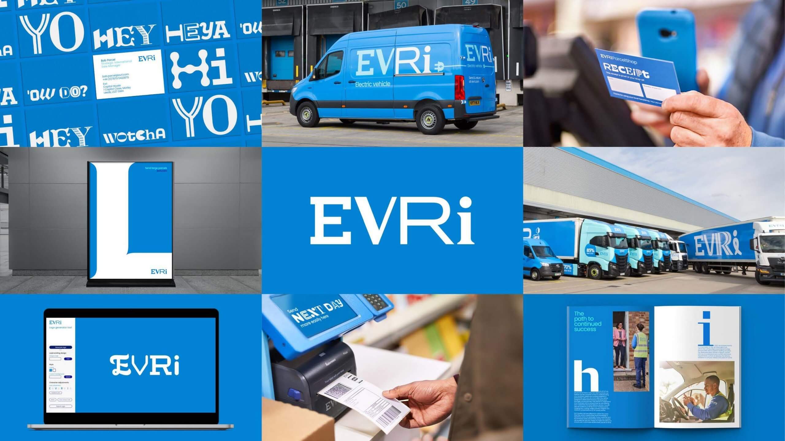
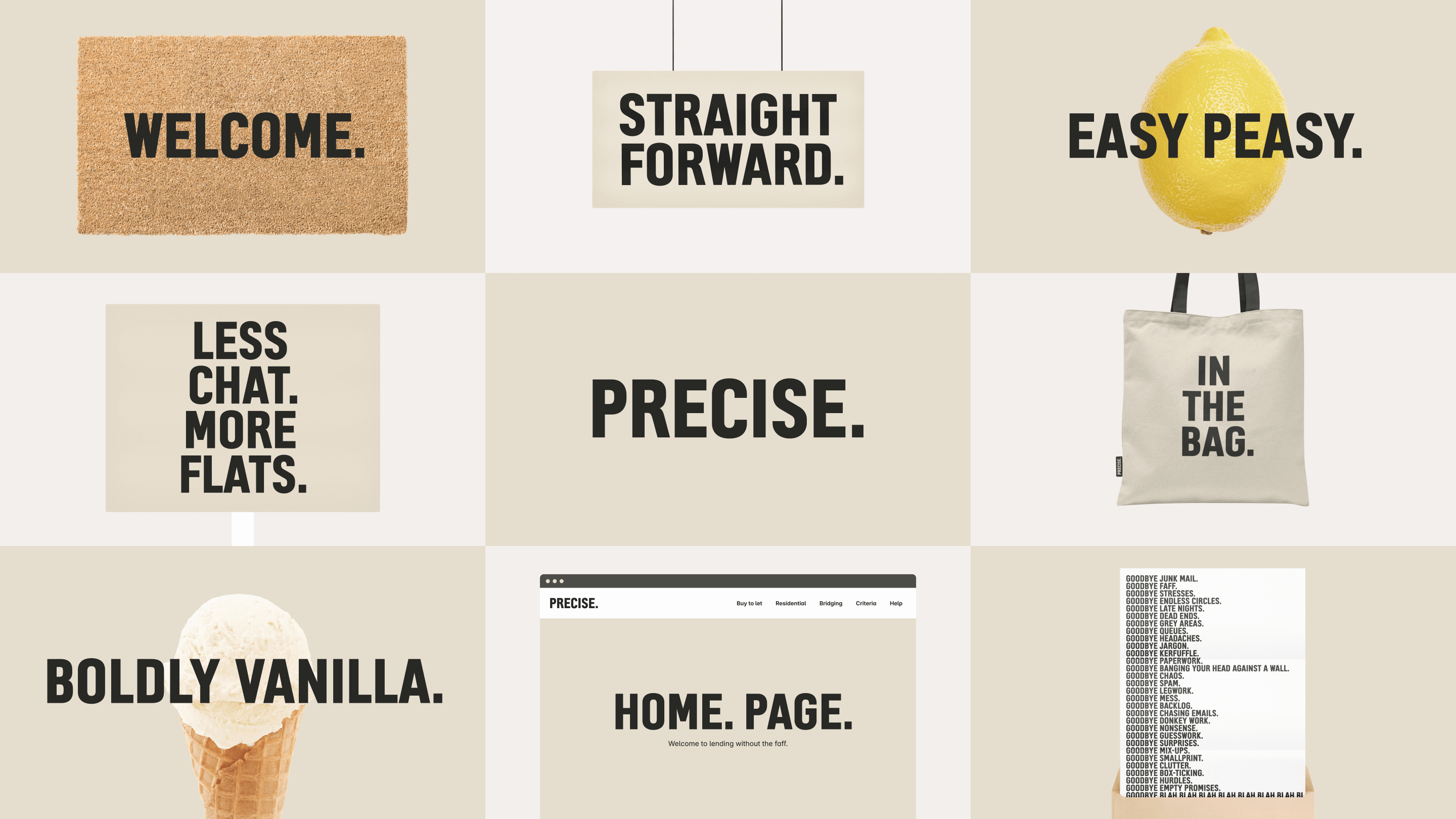
Miho moved on to speak about her and her team’s work with ‘Precise’, a specialist lending company, who were identified as the ‘plain and simple’ in a sea of over-complicated and unclear companies within that sector. It was important for the students to see how the brief was analysed with a fine-tooth comb, much like we are encouraged to do here on the Typography & Graphic Communication course. Extraordinarily, it was one highlighted word in the brief that went on to shape the entire vision of the brand – vanilla. This single word embodied the key feature of simplicity that gives Precise their individual identity.
Miho then showed the students some of the alternate routes that were explored for the Precise branding before the client selected one design concept. It was important to see how vastly different each route was from one another, displaying the breadth of solutions that designers can generate based on a single brief.
Finally, Miho spoke about a rebranding project that was centered in activism, protest, and advocacy for Shelter, a charity dedicated to tackling homelessness and unsafe housing. With the designer responsible for developing the original (beloved) branding for Shelter, being Miho’s previous boss, there was a lot of pressure to deliver on this project, and deliver they did. The branding that was shown was built on one simple shape, echoing the shape of a roof. As well as representing a roof or a shelter, the symbol can function as an arrow, a replacement for letterforms, and in various other contexts. The sheer versatility that was shown within this project was inspiring and perfectly illustrates the difference between designing a logo and designing a visual identity.

– Written by Tommy Molnar
– Photography by Oscar Dudley
This week, we were joined by Chris Margerison, a senior graphic designer at PlayStation Studios Creative, who shared his inspiring journey from student to professional, offering valuable advice on how to navigate the creative industry.
Chris explained that PlayStation Creative is the internal creative agency for the entire PlayStation brand. The team operates across the whole company, supporting game development and marketing with creative solutions. The studio is global, integrating many different aspects, from branding and UI to motion graphics and illustration.
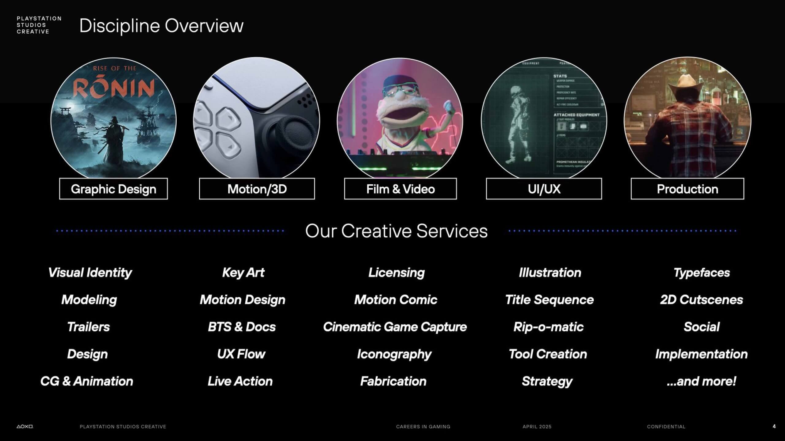
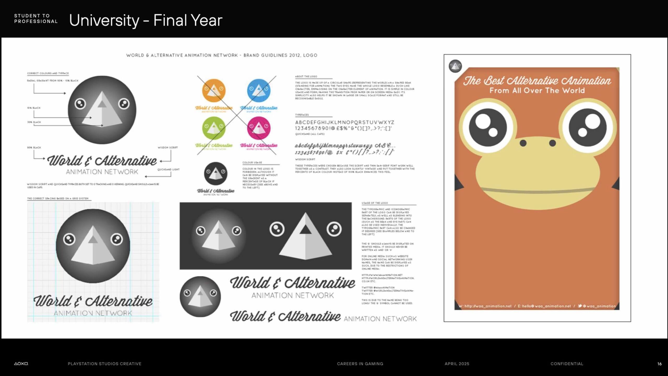
Chris always had a passion for illustration, initially aspiring to become an illustrator. However, while studying graphic design at university, he realised he could combine his love of illustration with branding and graphic work. His final year project, “World and Alternative” a brand and campaign around animation, allowed him to merge these interests.
At his graduate show, he approached someone viewing his work who later became his future manager at PlayStation. Although he didn’t land the job immediately (lacking UI experience at the time), this connection would later prove crucial.
After university, Chris experienced several highs and lows. Freelance attempts, working in low-paying event graphics jobs, and experiencing a UX/UI role that lacked creativity and motivation, all contributed to a difficult year. However, he acknowledges this period (particularly being made redundant) as a “blessing in disguise” that pushed him toward better opportunities.
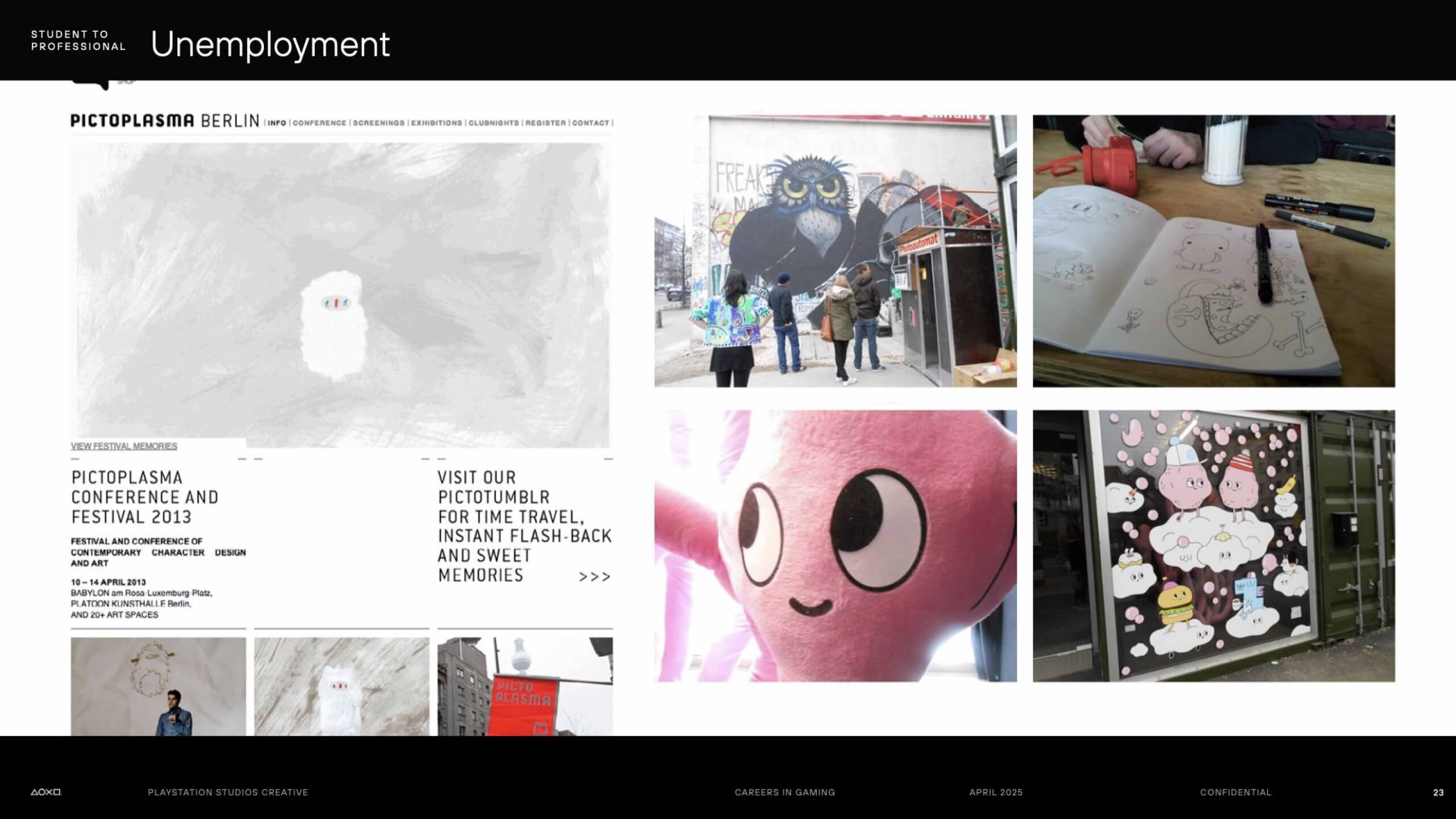
Following redundancy, in a search to reignite his passion for character design, Chris attended a trip to the Pictoplasma festival in Germany, which achieved just that. On returning home, he created a personal project around a music video app, specifically tailored to catch the eye of PlayStation’s creative team.
Making the most out of the PlayStation connection he made at his graduate degree show, he reached out with an email showcasing this work. This led to him securing a meeting that resulted in a 4-week placement, which grew into a full-time career. Chris emphasised that his attitude, rather than the polish of his work, helped open this door.
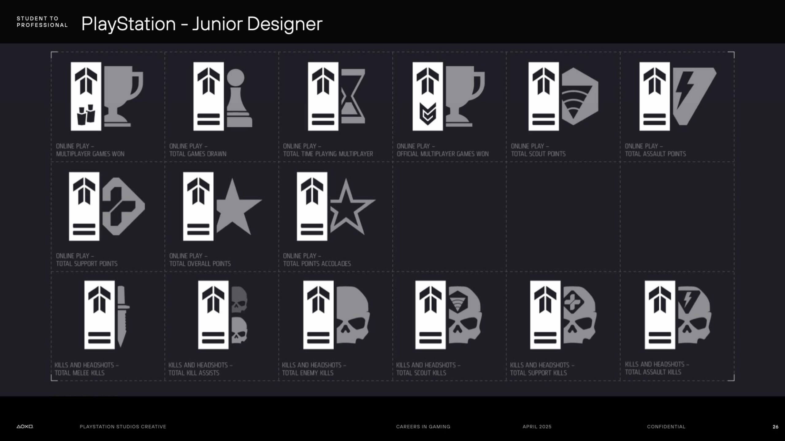
Starting as a junior designer at PlayStation, Chris’s early work included creating in-game icons (such as for Killzone on PS4) and producing posters for game launches and social media marketing. As his experience grew, he leaned more into branding projects.
Notably, he worked on the Champions League app for PS4 and was later promoted to middleweight designer, where he handled broader branding responsibilities, including logo designs and collaborations across different sectors.
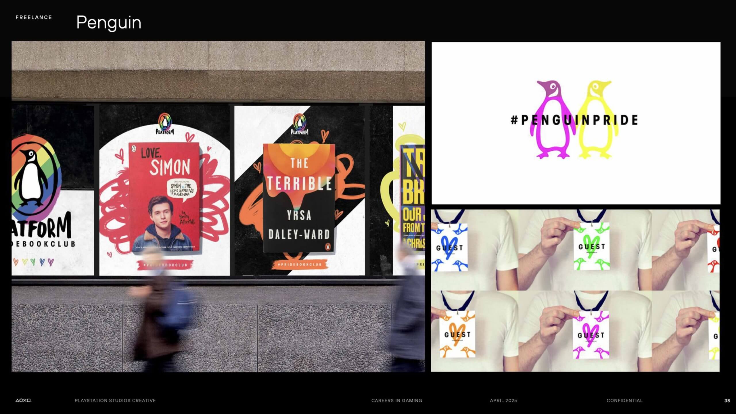
Seeking to broaden his skills outside gaming, Chris took on freelance roles at various organisations:
Chris highlighted that moving across different industries helped him evolve as a graphic designer, emphasising that “specific interests guide the work you do.”
Returning to PlayStation as a senior designer, Chris now focuses heavily on branding.
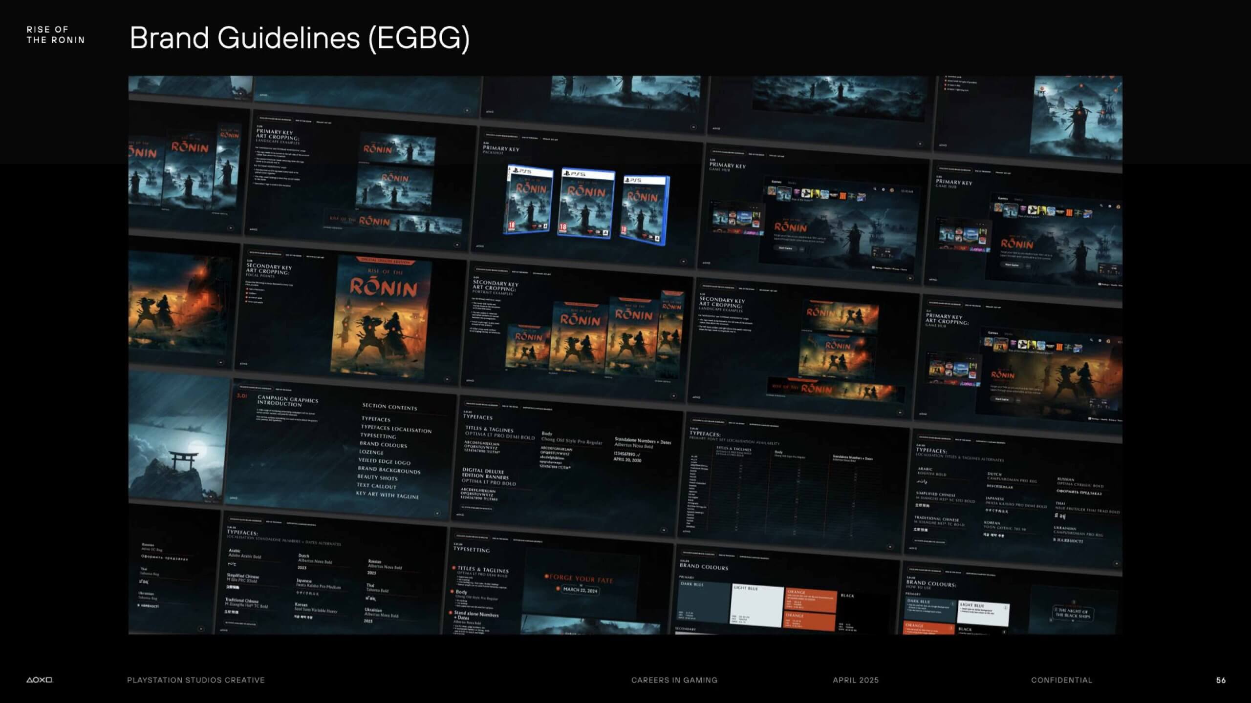
One key project was developing the brand identity for Rise of the Ronin, a 19th-century Japan-set action game by Team Ninja. Chris and his colleagues were tasked with creating a global brand identity that appealed to Western audiences while respecting the game’s cultural roots.
The project involved designing logos, brand guidelines, assets for launch trailers, and digital toolkits, ensuring consistency and flexibility across global markets.
Chris emphasised that building a brand is so much more than creating a logo, it’s about crafting a consistent visual identity that communicates the emotional and narrative experience of the game.
In his current role, Chris continues to embrace a wide range of creative opportunities. He had recently been working on licensed merchandise which has been sold around the world through retailers such as H&M. He was even able to experiment with photography, aiding in the promotion of this merchandise.
Chris left students with the advice: Stay curious, don’t box yourself in, and create your own opportunities.
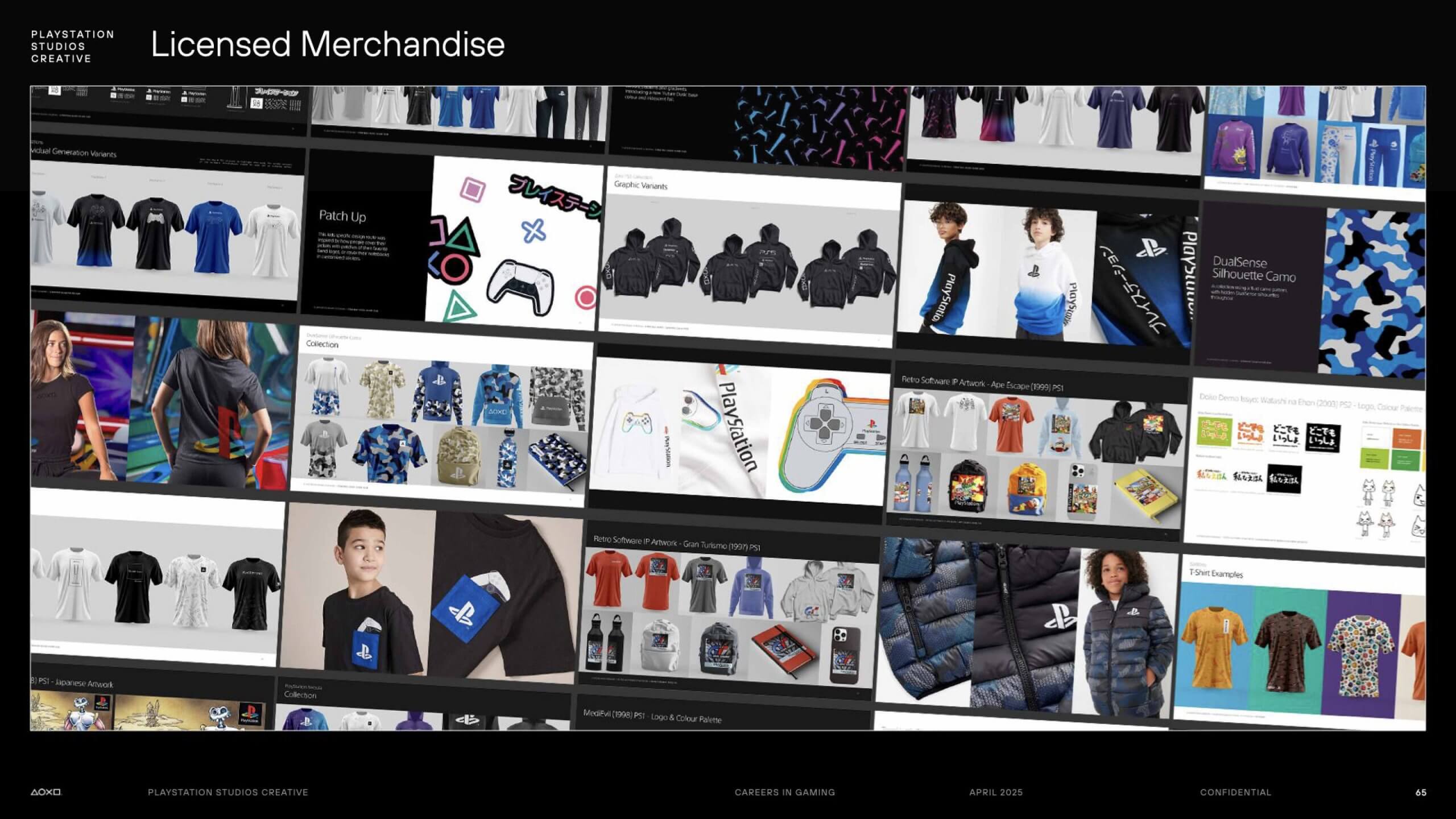
– Written by Amirah Yasin
– Photography by Oscar Dudley
This week we were joined by Niteesh Yadav, a pioneer in AR/VR typography who gave us an insight into typography and technology coming together to build on research and shape the future.
After deciding that the initial University course Niteesh was studying at the time was not for him, he left to follow his design dream. He began working on projects independently, teaching himself from YouTube and expanding his knowledge through real-life experiences. He later returned to his studies, completing a Bachelor of Design at a Design Institute in Delhi, while working with studios and startups on design projects alongside his academic work. This journey that led Niteesh to complete his postgraduate studies at Reading, after which his dissertation on AR typography was picked up by Meta.
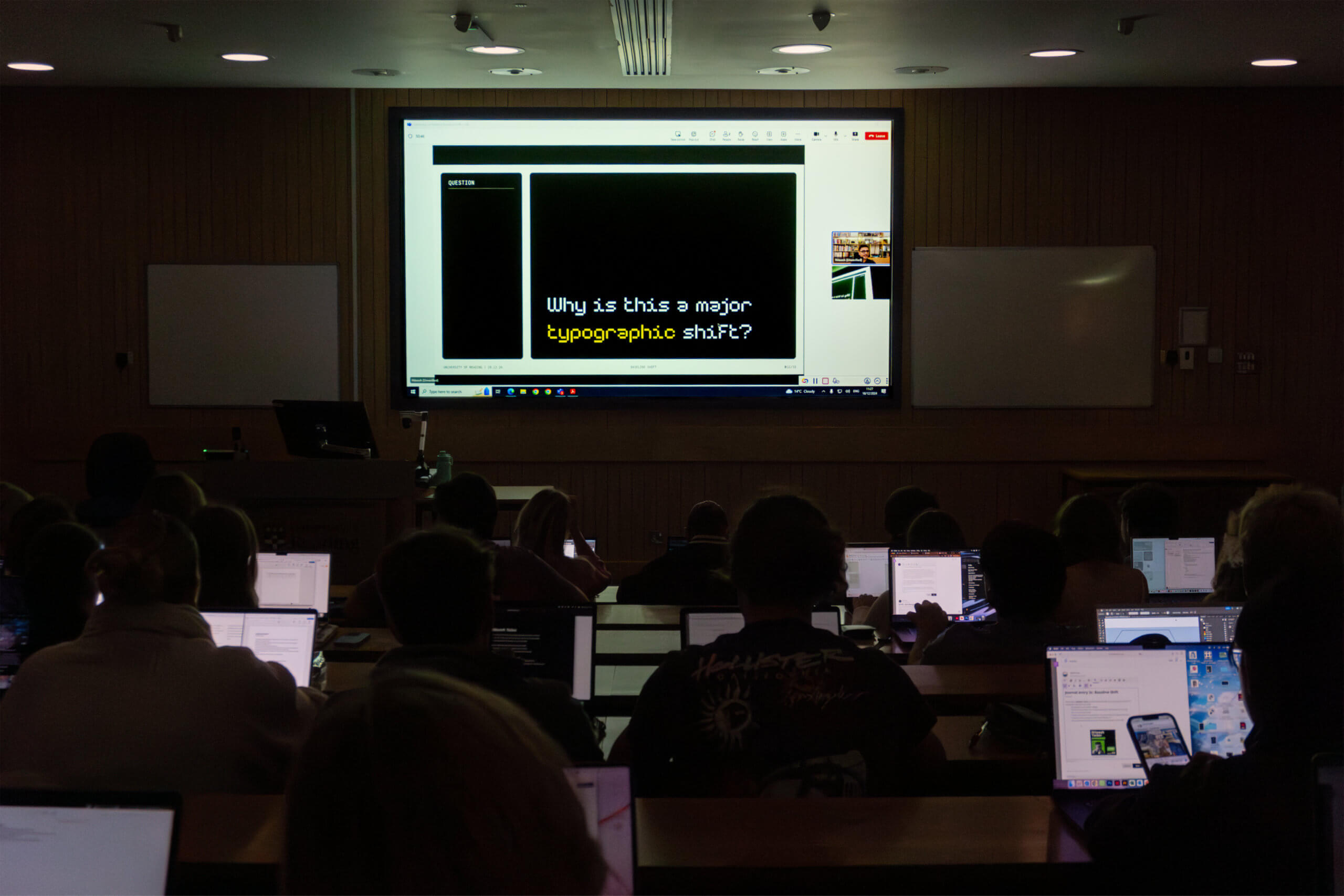
During his time at Reading, Niteesh decided that he wanted to explore how typography and technology intertwine, specifically in relation to augmented reality (AR) headsets. This proved difficult due to a lack of resources available at the time, and due to the topic of AR/VR typography being one that had not been explored in much depth. This was part of what of the appeal, as his personality is one that enjoys discovering new things, and seeing the influence that fresh research has on the world around us. This exploratory zeal resonated with many students, as we received several feedback responses that this topic was something they had “never even considered before” and that they found “incredibly eye-opening”.
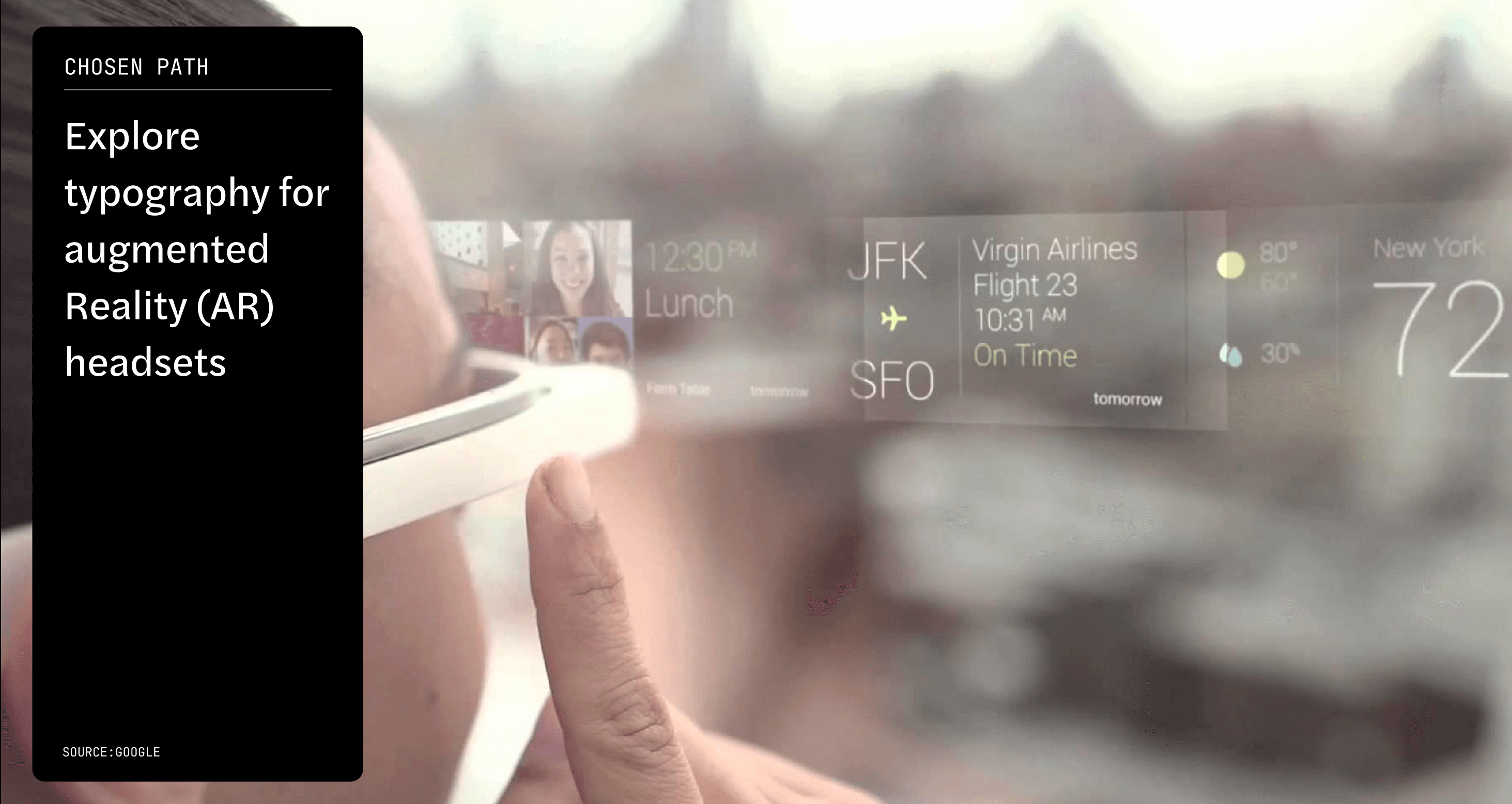
AR and VR often get confused with one another, and Niteesh made it clear that each come with their own challenges. Niteesh compared designing for VR to designing a book, as in both cases the designer has agency over exactly what is shown to the user – the content, the layout, but most importantly the material/surface that the design appears on. This makes it somewhat easy for a graphic designer to transition into VR design, however Niteesh makes it clear that designing for AR is very different and introduces new challenges. Instead of immersing the user in a virtual world like VR does, AR designers aim to augment elements within the surrounding environment that the user is already situated in. Niteesh emphasised the importance of considering how the technology effects the user in this environment, highlighting that “it is not just about being a typeface designer, but also an experience designer”.
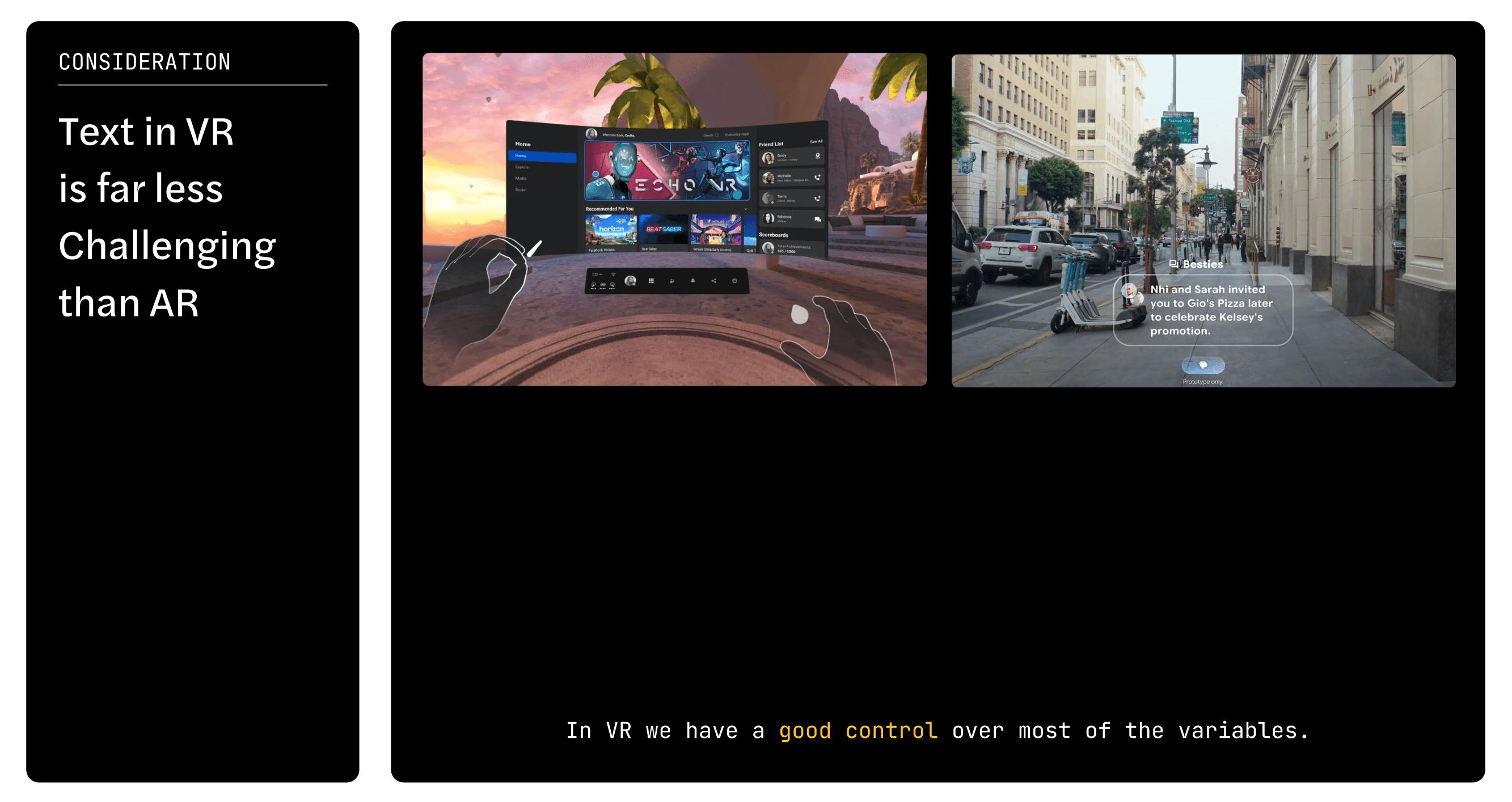
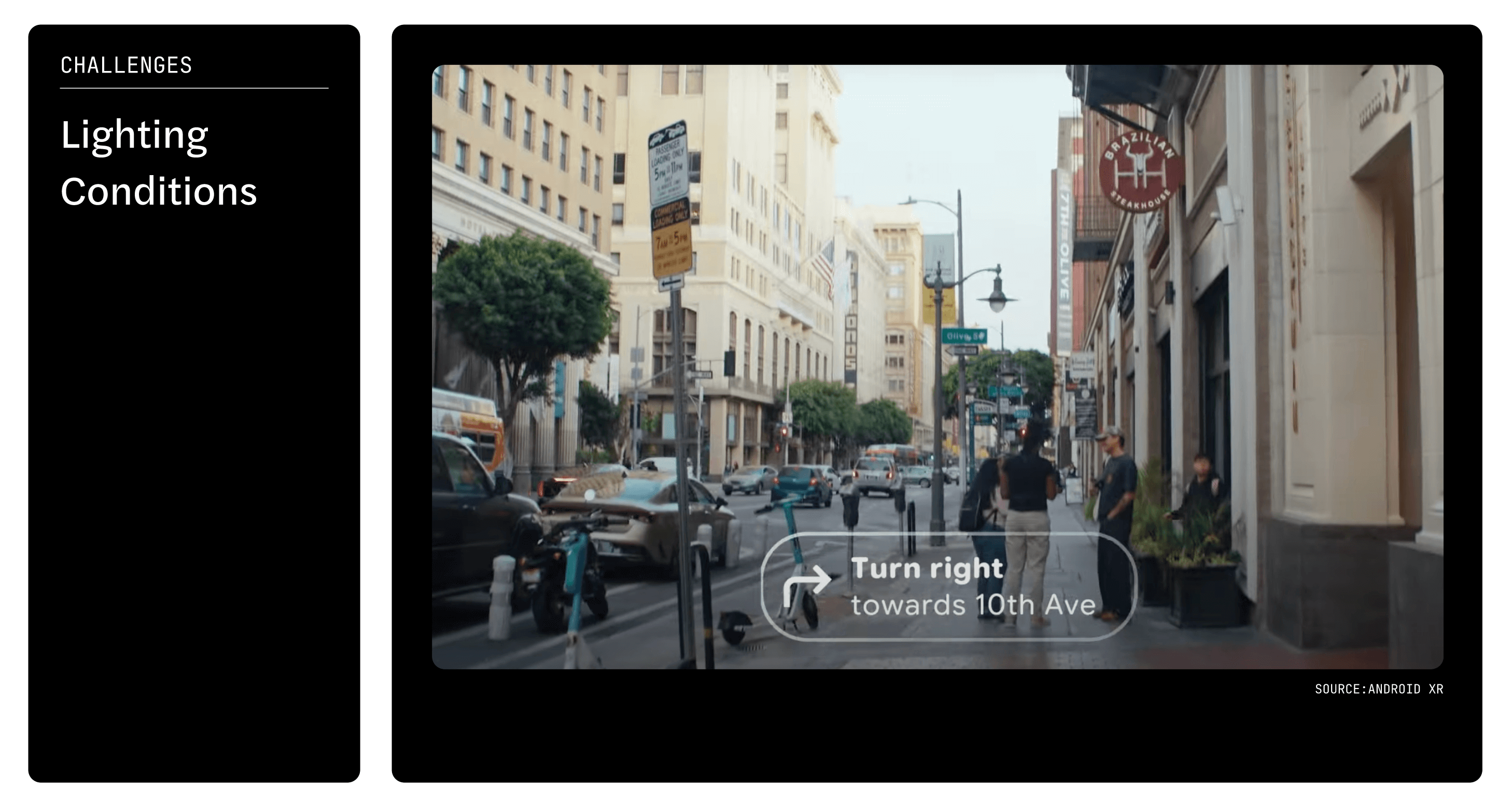
Niteesh highlighted several aggravating factors that force AR/VR designers to consider the design of the typefaces used. The background in an AR scenario is ever-changing and very rarely empty. Not only is this important for objects and movement that occur within the user’s field of view, but also the lighting conditions that can be affected by factors such as seasonal changes and geographic location. The consideration of lighting led Niteesh to discuss something that was a key takeaway for students, which was the reasoning behind most AR displays using white for type. Niteesh explained that this was because the highest intensity of contrast you can achieve is through whites. He helpfully compared it to something we are familiar with – if you want to achieve black on an LED screen, the LEDs are all switched off, however, if you were to directly apply this to AR displays it would leave a transparent area rather than black.
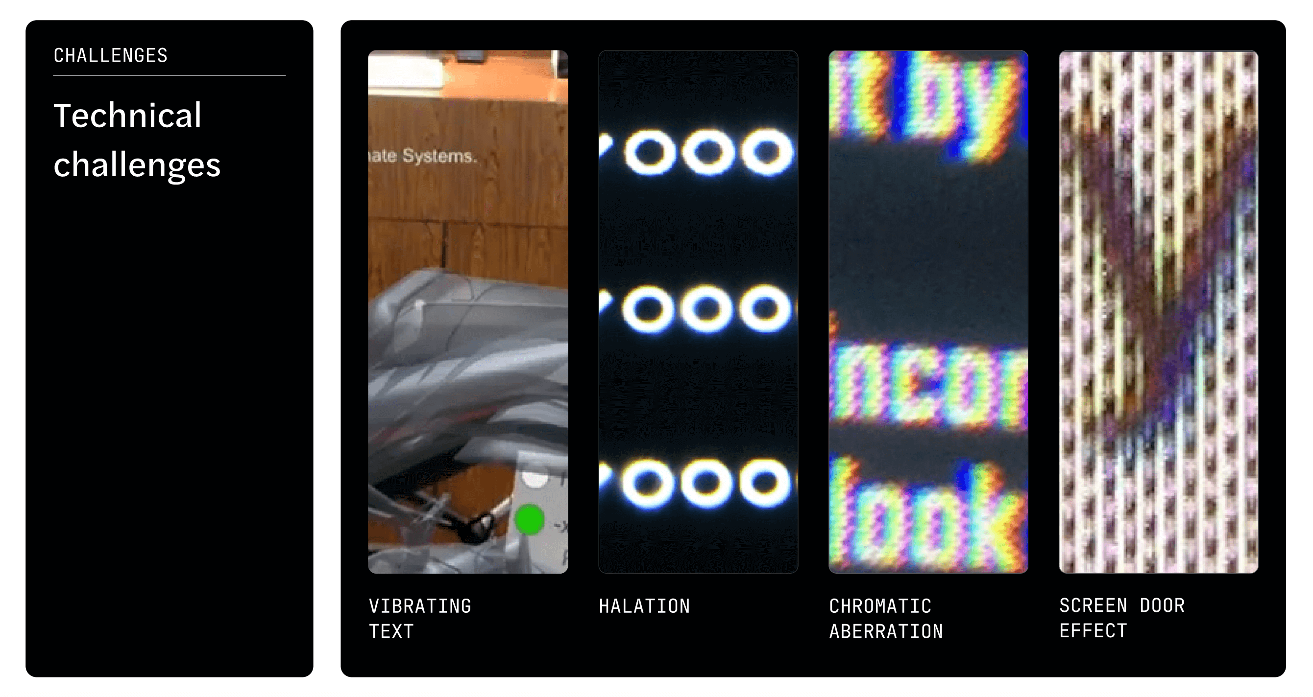
Niteesh brought some examples of technical challenges that come with AR/VR design to our attention. One of these challenges is ‘vibrating type’ – as our heads are constantly moving, the video that the headset is capturing is constantly being re-rendered. This requires a careful consideration of the choice in type-weight and type-size. Another challenge comes with ‘halation’ – when viewing typefaces on these retina displays, the letterforms can appear to glow around the edges. This can affect perception of letterspacing and require designers to consider both the design of typefaces used in this context and the kerning of the type. Niteesh suggests that to overcome these challenges as designers, we must use “a combination of industrial research, type history, and type research”.
Niteesh is an advocate for designers researching the past, making a point to say that “we must explore the past, in order to shape the future”. An excellent example of how the past has influenced Niteesh’s research and current work, is the design of typefaces in phone books. Due to the weight of the paper, the ink of the type often bled on the page, distorting the letterform – the letters were subsequently given extra space in their counters (by removing part of the letterform) to allow for this. Inspired by the experiences of past designers, Niteesh used a similar technique to alleviate the issue of halation in AR displays, noting that in this context “we are tracking light, rather than ink”. It is an excellent analogy to emphasise the importance of the academic and historical research that the Typography department at Reading focus on throughout all levels of study.
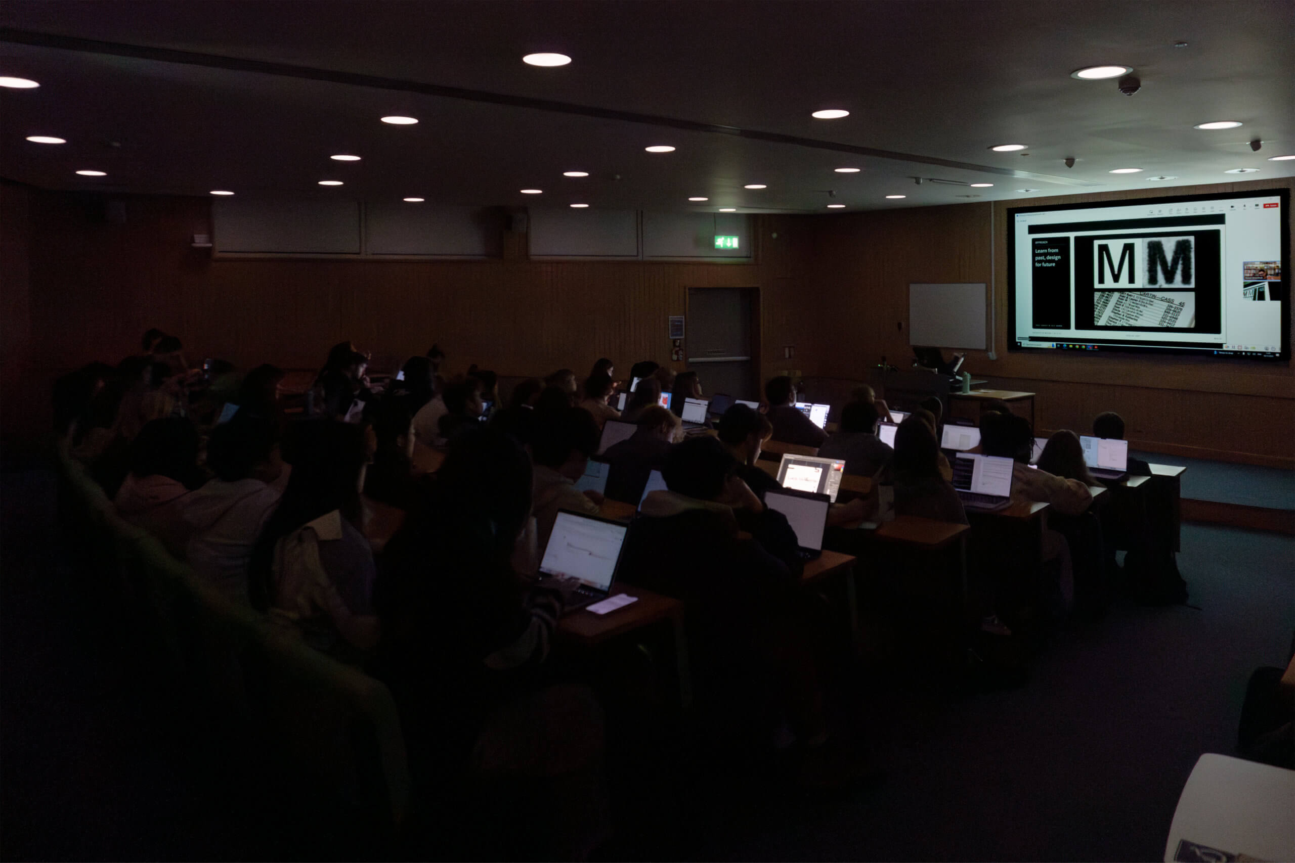
We are hugely grateful to Niteesh for giving an insightful talk and closing this semester of Baseline Shift sessions with such a fascinating topic! We look forward to what the next year of Baseline Shift will bring!
– Written by Tommy Molnar
– Photography by Oscar Dudley
This week, for our second Baseline Shift session, we had the privilege of welcoming the award-winning user experience designer, Nitya Thawani who gave her fantastic talk “A UXer’s guide to the galaxy”.
Nitya is an incredibly talented user experience designer at Google, currently working as part of the Google Ads team. Even though she’s only been at the company for three months, her background is nothing short of inspiring. With experience working for big names like Lush and Disney, winning D&AD awards, and collating an outstanding portfolio, it’s clear that Nitya’s been turning heads since graduating in 2023! After hearing her speak, it’s easy to see why so many of us are in awe of what she’s already accomplished, with the team receiving feedback such as “I feel so motivated by how much she’s achieved so soon after graduating”.
Having completed work experience at Lush, where she gained exposure to a variety of projects such as packaging, social media posts, and posters, Nitya then went on to a 13-month placement at Disney. There, she had the incredible opportunity to redesign the Lion King website! Nitya shared her views on the importance of work experience and why it’s so valuable. Through these experiences, she learned the realities of working a 9–5 job, with Disney also giving her a clearer vision for her career and how the industry works, explaining that UX is only actually half of the work.

Following her placement year at Disney, Nitya outlined her plan for her final year: to complete one UX project, one motion project, a D&AD project, and one industry project. With the flexibility of open, self-defined modules, Nitya wanted to strengthen her technical skills while considering how this plays a role in her future. In addition to her coursework, she managed to juggle being a course rep, playing tennis, hosting her radio show, plus more, showing us just how possible it is to manage all these activities at once!
Nitya discussed her first self-defined project, Thali, which tackled the lack of South Asian content for young people in the diaspora. She stressed to us the importance of understanding context and pain points, noting “You can’t solve it all”. Her process involved secondary research and speaking to users to gain insight and ensure that she’s considering user needs throughout. “Don’t design what looks the prettiest, but what solves the problem”. Nitya advised us to look at what’s already out there and make that work for you, such as through creating components or using existing design systems in Figma. Nitya also highlighted the value of detailed wire framing and key screens, showcasing this through her 30-page pitch deck discussing how this can effectively tell an app’s story.

Showcased next was “Bubble”, an app designed to help people with ADHD manage their finances, created as a proposal for Barclays. Building on the skills she developed in her previous projects, she was well prepared to tackle the problem at hand, so much so that she received D&AD’s 2023 pencil award! When discussing how to present an app, particularly in the context of a design competition, she expressed focus on designing the flow of the app with the phrase “show the flow”.

After completing her degree, Nitya shared the importance of networking while also taking time for yourself. Taking advice not to rush into work right away, she attended creative bootcamps following her D&AD win, where she collaborated with Coca-Cola, and joined networking events at Google and other design meet ups in London.
She also took time to travel, and during one trip, she even met Chris Martin! When she shared this, students joked, “Can you get us tickets to his concerts?”, this is nice a reminder that unique encounters don’t always come from traditional 9–5 jobs.

Nitya shared three standout examples of UX: the ‘good’ (Spotify), the ‘bad’ (Workday), and the ‘evil’ (Ticketmaster). Spotify’s great UX makes tasks effortless to complete by abiding to the laws of good UX design, while Workday frustrates users with inefficient processes like manually filling out job applications – a frustrating and time-consuming experience. Ticketmaster’s “evil UX”, intentionally designed to confuse and hinder users, drew laughs and relatable frustration among students.
Her insights shed light on an important takeaway: UX isn’t always about helping users. Sometimes, it’s deliberately designed to create barriers to serve a business’s hidden agenda.

Nitya shared valuable insights on how to approach the dreaded job hunt. She emphasised the importance of knowing your audience when applying for jobs and understanding which format is most appropriate, portfolio, CV, cover letter etc. She also encouraged students not to shy away from showing the messier work, stating that “the why and how is better than the what”, further explaining that UX isn’t about making things look pretty; it’s about solving problems. This was a reassuring point for many students, as it’s common to hesitate in showing work you deem to be ‘messy’.

We are incredibly grateful to Nitya for hosting this second talk. We look forward to seeing more of her inspiring work as she continues her journey as a remarkable designer!
ADPlist – An opportunity for students to receive free mentoring
Cofolios – Great space for finding portfolio inspiration
Laws of UX – UXers bookmark essential!
Google ux design certificate – Online course for designing mobile apps and responsive websites (available on Coursera or free on YouTube without certification)
– Written by Amirah Yasin
– Photography by Oscar Dudley