Author: Test User

Another contribution to the Venice Biennale

Adobe Thai, a typeface designed by Fiona Ross and Tim Holloway, features in this visual project by Zurich-based artist Dafi Kühne – 40 posters in 34 languages – presented at the Biennale in 2012. You can watch the production process on Vimeo:

You can read the artist’s documentation, where he thanks Fiona, research student Titus Nemeth, and MA graduate Toshi Omagari for the help with the non-Latin typeface layouts.

ICON print identification course

ICON print identification course

This week we were pleased to welcome members of the Institute of Conservation, for whom we ran a hands-on print identification course. To find out more about our short courses, including next week’s poster workshop in conjunction with the V&A and the Arts Council England Subject Specialist Network (Wednesday 24 April), contact Diane Bilbey (d.j.bilbey@reading.ac.uk)

We run regular two-day short courses explaining printing ­processes, specially tailored to the needs of librarians, archivists, ­curators, and social historians. Led by Martin Andrews, each day focuses on one of the three main processes – letterpress, lithography, and intaglio – and participants are able to examine original printing materials and prints from the Department’s extensive collections, and try out tools, materials, and techniques in hands-on sessions. By the end of the course you will be able to indentify a wide range of printing procesess, take prints yourself, and use the replica Gutenberg press featured in Stephen Fry’s ­television documentary.

¶ For more information on the Posters SSN, contact Catherine Flood (c.flood@vam.ac.uk) at the V&A

Congratulations to John Morgan

To follow up on my earlier post:

We are delighted that the John Morgan Studio has won the graphics category in the Designs of the Year award.
 

image (crop)

Reading Typography graduate, John Morgan, has been nominated for the 2013 Designs of the year competition run by the Design Museum for his work on the visual identity for the 13th Architecture Biennale in Venice.

Read about his work on the Eye blog: Common ground: a designer’s letter from Venice.

John is currently teaching students on our MA Book Design course.

Fabula – a typeface for children

abenteuer-schule-ABC

Fabula is gaining popularity for use in resources for children, both on paper and on screen.

The typeface was designed under Sue Walker’s direction by a team of staff and students at Reading, including Vincent Connare, José Scaglione and Gerry Leonidas, as part of an EU-funded project producing bilingual story books for children. Since then it has been available for free, along with advice if required, from the Typographic design for children web site.

Some examples of how Fabula has been used:

Jashanjit Kaur, a designer based in Hyderabad, India used Fabula for Amigo, described as ‘a socialising platform for school children that provides a medium for sharing their ideas and pursuing interests in a safe and secure environment’.

Cecelia Erlich used the letterforms in a Spanish television programme, La cucaracha.

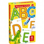
Dietmar Brühmüller used the font for the whole range of four young children’s games, including the one illustrated above.

Support for local people to do a PhD

The University is offering bursaries to cover the cost of home/EU fees for local people who wish to begin their PhD at the University on either a part-time or full-time basis.  Candidates must normally live within 25 miles of the University, and must satisfy normal entry requirements.

The deadline for applications is Wednesday 1 May 2013.  Please click here for further details.

Contact Mary Dyson if you would like to discuss your proposed research.

Design is not a matter of surface appearance

Typography supports the Design Commission’s launch on 13 March 2013 of Restarting Britain 2: Design and Public Services, and strongly endorses its opening statement: ‘Design is integral to the DNA of each and every public service. Design is not a matter of surface appearance.’

Prof Sue Walker, who contributed written evidence to the Commission, has also been invited to become a member of the Associate Parliamentary Design and Innovation Group (APDIG) to highlight existing work in the design research field that has not yet been exploited by policy makers and those in government, to point to design research as an untapped resource for policy makers. The group will report to a parliamentary seminar in June.

APDIG brings together colleagues from universities recognised for excellent and relevant design research. Information design research has much to offer government and public services through its user-centred and often collaborative methods, as well as through research outcomes that inform the presentation of complex material, in print and online.

An example of research-led information design is the Centre for Information Design Research’s work for the Behavioural Insights Team, a group of economists and psychologists working within the Cabinet Office, to help with a trial they are running to support unemployed people looking for work. Earlier this week the forms were shown in the Independent in a piece describing the impact made during testing.


News from Departmental alumna, Carla Spinillo

Carla Spinillo (pictured above) who carried out her PhD research, on the design of visual instructions, in the Department writes of the success of her work, with colleagues at the Federal University of Parana. Brazil, advising the Department of Health of the State of Parana on the design of patient information leaflets for homeopathic medicines. This has now resulted in legislation to regulate the content and design of the leaflets, which Carla describes as ‘an unprecedented achievement for information designers in Brazil where, for the first time, experts in the field participated in the decision-making process for regulatory documents in healthcare.’


Pencil to Pixel travels to NYC

PtPNYC

When the Pencil to Pixel exhibition opened in Wapping last November, visitors were treated to a rare selection of typeface design and type-making objects from the Monotype Archive. The inspiring exhibition was accompanied by a special issue of the Monotype Recorder celebrating the work of Robin Nicholas, and an exceptional special issue of Eye magazine.

Today the exhibition announced the dates and location for its New York City run, in May. The exhibition is supported by the Department (which also claims amongst its alumni the curators of the exhibition).

Colloquium upcoming: ‘Printed image and decorative print, 1500–1750’

On Friday March 22, Eric Kindel and James Mosley will contribute papers to the one-day colloquium ‘Printed image and decorative print, 1500–1750’ being convened by Reading’s Early Modern Research Centre. They will both present projects and artefacts associated with the Académie Royale des Sciences in Paris. Eric will discuss the invention of stencil duplicating by Christiaan Huygens, and James will explore a text and an unknown iconography of the making of books that were constituents of the Description des Arts et Métiers.

More information
Booking