Real Jobs: Angie, Eden and Ruth built the branding, literature and website for this year's Art Degree Show at @UniRdg_Art https://asbestosstreams.com
Author: Eden Sinclair
Émile Niveduab book design
Background
Michael Twyman is retired Professor of Typography at the University of Reading. The founder of the Department of Typography and Graphic Communication, Michael has written over a dozen books and many articles, as well as lecturing all over the world. He has dedicated a large portion of his professional career to studying lithographic history. Émile Niveduab, écrivain-lithographe à Bordeaux dans les années 1830, explores, for the first time ever, Émile Niveduab, a key lithographer in France (1796–1877).
Deliverables
The key deliverable for this project was the book itself, featuring over 90 illustrations. The client felt that it was important that the book retained a French look and feel, as the text itself was in French. The supporting deliverable for the project was a promotional leaflet that was sent to the Musée de l’ Imprimerie et de la Communication graphique de Lyon, who displayed the final book.
Research
Researching was key to the success of this project, as I had no idea how to design something that looked French or adhered to French typographic conventions. The initial research stage consisted of an in-depth exploration of similar subject matter, both in French and English. A range of different texts were studied to analyse the typographic considerations, and several surprising points were noted:
- French writers do not use quotation marks, instead, they opt for ‘guillemets’, which require spacing either side
- There is always additional spacing around French colons and semi-colons
- Some French readers hate an accent on a capital letter (É), whereas some require it
- The target audience for Émile Nivedaub was a key focus throughout the research phase of the project. People who would buy this book would not only be interested in Lithography, but design as a whole, which meant that the typography (and typical ‘French’ typographic norms) had to be perfect.
Design development
The inner pages
After researching thoroughly, it was time to begin setting the inner pages of the book. With a specific page size required by the client (224 x 303mm), I quickly developed a grid (fig. 1) to maximise flexibility within the design and allow for multiple interesting combinations of text and image.
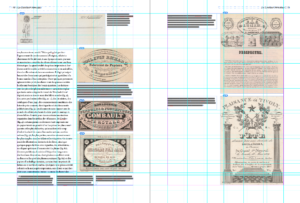
Figure 1: The grid, filled with images, footnotes and text.
With the grid completed, thework on the inner pages began. A sample of text was used to plan out the combination of typefaces that were appropriately ‘French looking’, but still legible and a pleasure to read. This was discussed at length with the client, but eventually it was decided that a French-style sans serif for headings and a legible serif for body text would be most agreeable, in combination with a legible sans serif for the footnotes and captions (Fig. 2, 3).

Figure 2: Typefaces used in the text
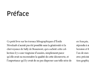
Figure 3: Text set in Minion Pro, headings in Parisine
To start with, I decided to copy the text for the book directly from Microsoft Word into the inDesign file and begin matching images and footnotes to it, but quickly ran into trouble when 10 pages had been completed and none of the italics were showing up. Four tries and several settings changes later, italics were successfully input, in an import straight from Word. After two chapters of sizing images, creating page layouts and matching up footnotes to link with the text, I met with the client to discuss changes. However, alterations caused issues within the inDesign file, as when I would change the layout of one page, all subsequent pages would shift, and the text would not link correctly with the images on said page. To fix this issue, I divided the book into chapters and ended the run-on of text for each section, so only one chapter at a time was affected by changes, not the entire book.
Near the end of the project, it was discovered that spacing between the apostrophes and letters was incorrect, which was catastrophic, as this spacing affected the layout on every page, in every chapter. The fundamental flaw was that the chosen body typeface (Minion pro) had been designed by an American typeface designer, which meant that he had not considered how French words (l’ecriture, l’anglaise, c’est) might need additional spacing between letters and the apostrophe. This was disappointing, as I had initially tested Minion pro with a sample from the text, with no complications. The trouble was, only certain combinations of apostrophe and letter were affected. This was a challenging problem to solve, as any attempt to modify the spacing of the words with the affected apostrophe either resulted in large layout changes throughout the book, or mis-spaced words. In the end, I developed a complicated GREP find and replace search to add a hair space after each apostrophe, but only when it was surrounded by a pair of letters, which solved the problem perfectly.
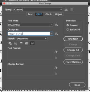
Figure 4: Using GREP to add spacing
The index was the last, and perhaps most challenging, part of the entire book. With three different levels of indentation, and sub-indentations within that, managing both the horizontal and vertical spacing was difficult. There was much design iteration to ensure the correct leading and indentation, as the index needed to have an indented second line when the text ran over (fig. 5). This was problematic as there were already multiple layers of indenting, but through careful experimentation, I was able to adjust the spacing accordingly to work incrementally (fig. 6).
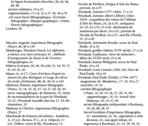
Figure 5: Three levels of indentation
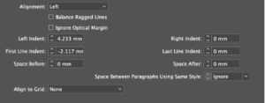
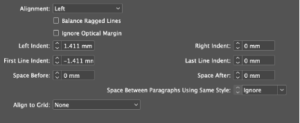
Figure 6: Indentation spacing
The cover
The cover was the most exciting part of the project, as the client had given me complete free reign over how it would look. From sketches, to developed ideas, it was always important that the cover fit the traditional style of the book (fig 7–10).
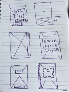
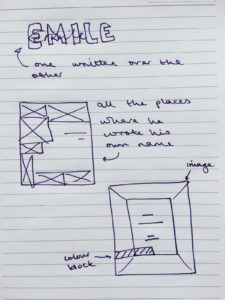
Figure 7: Initial sketches
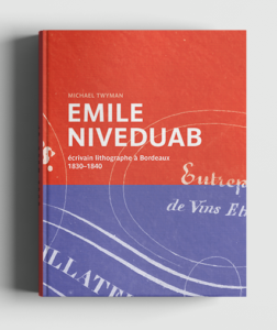
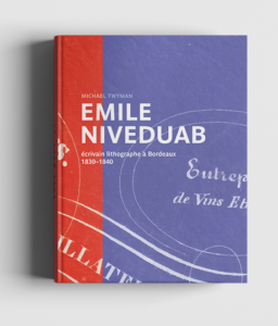
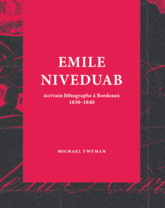
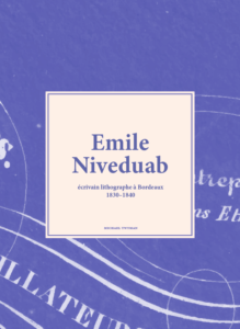
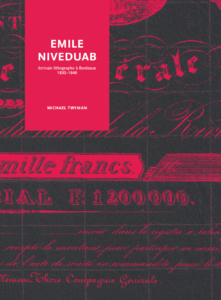
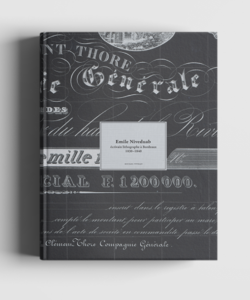
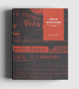
Figure 8: Ideation
Throughout the iterative design process, different techniques were tried to give a more authentic feel to the cover. I tried printing white ink with letterpress onto coloured paper, and entertained the idea of getting a special printing plate made for Émile Niveduab (fig. 9). However, it was decided the book was to be printed in France, so I was unable to letterpress the labels.
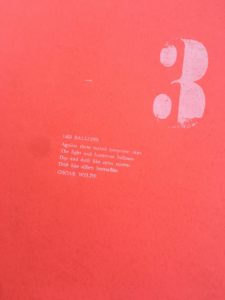
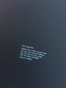
Figure 9: Examples of letterpress printing for the cover
The cover initially featured a zoomed-in detail from one of Niveduab’s pieces of ephemera, but it quickly became apparent that the detail was not high resolution enough. Unfortunately, the image looked correct on-screen but when printed it was fuzzy. In retrospect, the cover should have been printed out at an earlier stage within the developmental process, but this error led the design to feature a large lithographic piece, which was stunningly detailed and high res enough to work at the required size.
The final design showcases the lithographic piece backwards, as Émile Niveduab himself would have seen the work as he created it, backwards, on a lithographic stone. This detail is aimed at the specific target audience of the book, almost a ‘secret message’, as those without lithographic knowledge will not be aware of this. The subtle turquoise was chosen as a calm and refined tone that contrasts well with the dark grey of the background.
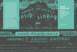
Figure 10: Final cover design
The leaflet
After the book had been completed, the client requested a promotional leaflet to sell the text to potential stockists. It was imperative that the leaflet encompassed the look and feel of the book, as well as highlighting some of the most visually effective pages.
The client and I worked together to select four spreads that we thought would give the appropriate flavour of the book. From there, it was simple to replicate the style of the book (both the cover and the inner pages) to produce an effective leaflet, by carrying over key colours and typeface choices (fig. 11).
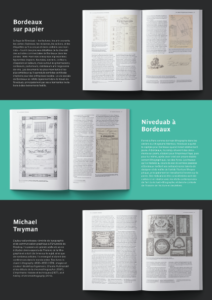
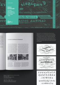
Figure 11: The final proposed leaflet
The leaflet gives a snapshot of what the reader might come to expect when they delve into Niveduab, with key important details from the book highlighted.
Reflection
Working so closely with a client was a new experience for me and an excellent learning opportunity. Michael Twyman is a genius with typography and having him critique my designs was in equal parts terrifying and rewarding. I have learnt to be far more detail-oriented throughout the course of the project, needing to be able to pick out the incorrect en-dash in 100 pages, or notice the stray widow after a layout change.
The key thing that I learned throughout the process was how to communicate effectively with a client. When I initially began meeting with Michael Twyman, I described to him my ideas verbally and he struggled to give feedback. However, as the project progressed, I learned to provide him with multiple drawn or rendered ideas, even if they were just rough sketches. This helped both the client and me to better understand the direction and allowed far more effective feedback to be given.
