David Pearson: Book design as a language

In week 8 of Autumn term, we were joined by Penguin book cover designer David Pearson. In this session, David exhibited a wide range of exciting book covers, along with many tips for students in brainstorming ideas for designing book covers.

Designing a cover

David emphasised how typography and book covers should be experimented with, and that rejected concepts can often lead to more successful ideas in future. Furthermore, researching past designs can generate inspiration to produce more radical concepts, enriching our options for how we create different moods that suggest the content of books. David’s book cover for George Orwell’s 1984 is a perfect example of this, as he researched previous classic Penguin designs and noticed redacted words. His cover personifies ‘less is more’ with the title being hidden, which summarises the theme of secrecy in the book and gives readers intrigue into the contents.

‘Find a job or goal that works with the way you work’ – David Pearson

David Pearson’s 1984 cover design, which shows the redacted information of the title and the author

Source: https://designgallery.tumblr.com/post/47617395995/david-pearsons-1984-book-cover

‘You should always question your work; you need to constantly feel like your work could be improved’ – David Pearson

David’s lecture was particularly useful for first years, who are just getting into typography, as well as for Masters students, who gained knowledge from David’s years of experience. He encouraged students to follow design trends as well as understand design history, so that readers can recognise the book’s genre, as well as visually digest the content. David also emphasised the importance of working with a diverse group of people, as it introduces different insights and opportunities to experiment with styles, which an individual designer may not have considered exploring. Collaboration is a vital professional skill, as a designer will always be working with other people.


David sharing his thoughts on the Dracula book cover evolution and the personality that can be bought into designs. As well as addressing his personal preference for the older traditional Penguin covers due to their consistent (but subtley evolving) colours and layout.

Conclusion

David’s talk showed students the potential of developing and displaying characteristics in book cover designs for audiences to digest and construct people’s view of the content included.

‘Very good speaker, very engaging, really inspiring and made me think, the images were captivating and the way he thinks outside the box was totally genius’ – Amy North

‘An interesting and engaging presentation, the designs shown were very inspiring.’ – Part 2 student

Nick Sexton: UX and a user’s journey

Profile photo of Nick Sexton

In week 7 of Autumn term, we were joined by Nick Sexton, a Reading graduate whose design career includes working as a freelancer, digital designer at Dyson, and an experience design lead at Jaguar Land Rover. In this session, Nick gave his interpretation of user experience design (UX) and how considering the needs of users is important in the design industry.

Jaguar Land Rover and Dyson

Nick loved recreating websites and designing simplistic movie posters while studying at Reading, as well as ‘starting that old-age dream of being a freelancer’, which he began in order to gain experience in designing for clients. Nick’s talk explained his progress from graduate, to freelancer, to ‘grad scheme’ intern and finally to the senior roles he now occupies. His focus on working in-house, rather than agency-side gave us an insight into how design processes work within two brands with very specific design identities within their industries.

Nick’s experience with UX design for Dyson and JLR is a great example of what companies need to consider when engineering products for their users

‘In the world of work, everything’s collaborative’ – Nick Sexton

The importance of experience

Nick emphasised that in order to succeed in designing for users one must discover, define, develop and deliver; which involves looking at the start-to-finish journey along with the experience. Looking at these details erases problems before someone buys a product, increasing satisfaction. When it comes to designing for screens or pieces of machinery, Nick learned a lot directly from James Dyson: ‘Aesthetics are important, but if it doesn’t work it’s fundamentally not very good’. Focusing on the functionality and purpose is of a higher importance than of appearance, as those who would use a product would simply want to achieve their goal without frustration.

The purpose of ux design is to ensure the journey of users has no problems and achieves what is desired

‘If something is ugly people will get over it. If it doesn’t work, that’s where frustration comes in’ – Nick Sexton

Conclusion

The importance of UX design and the journey that users take to achieve their goal with a product was a driving message behind Nick’s presentation. Students who have projects involving UX found the session especially helpful in understanding what needs to be considered when producing work that would be used by an audience.

‘I thought this was one of the most interesting Baseline shifts I’ve ever been to, I especially liked how it linked to the UX project us part 2s are working on at the moment.’ – Part 2 student

‘Very interesting insight into a huge industry, would never have considered this [the motor industry]as a significant industry for graphic design.’ – Matt Perks

James Hunter: Boardgames are beautiful

James Hunter


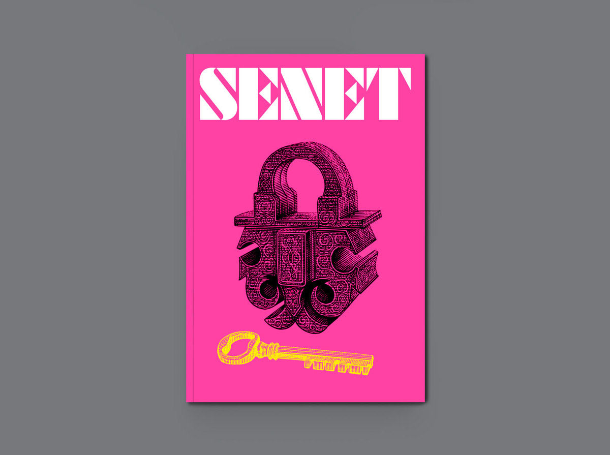
In week 3 of Autumn term, we were joined by editorial designer and co-founder of Senet magazine James Hunter. In this session, James talked about his editorial design industry experience as well as his decision to co-found Senet magazine, based off of his passion for boardgames and fantasy games.

Graduation and Early Career

After graduating from Falmouth University in 2010 with a degree in Graphic Design James was adamant on not wanting to work for a traditional branding agency. James worked at the Guardian newspaper where he loved the “buzz of the newsroom”, which led to his work as an editorial designer for the Times newspaper, where the majority of James’ work revolved around early prototypes of the Times app, editorial design of the daily newspaper and their magazine. The daily deadlines of work to be completed was exciting for James, as it reminded him of university with the deadlines set for him as a student, a work ethic that all University of Reading students could use!

James guided students through more of his career, ranging from the Sunday Times to Frettabladid (Iceland’s most popular newspaper). However, James felt much more drawn to designing magazines and decided to become a freelance designer. Learning about the potential flexibility you have as a designer to pursue a freelance career from originally working as a corporate designer was an enlightening detail to learn about for students.

‘I was kind of being defined as a newspaper designer but I really wanted to design magazines’ – James Hunter

SENET Magazine

The highlight of James’ lecture were his 40 thoughts behind making a magazine and the genre of SENET revolving around his passion for boardgames. There were many important points within the selection, but there were a few that stood out for students. Point 20 emphasised reading the copy, as an editorial designer we are serving the reader so by reading the copy constantly will help designers in linking their work to the copy. Point 31 stated that “you are only as good as your last issue”, which taught students that as soon as one piece of work has been completed, it’s more important to focus on the next big project.

Issue 1 of SENET magazine

Source: https://senetmagazine.com/collections/back-issues/products/issue-1

SENET is a collaborative project made by James and his other colleagues who help to produce, design and sell the magazine. It is focused on boardgames and the fantasy genre, the aim of the magazine is to appeal to those who already have a passion for boardgames, while also inviting a new audience by producing appealing magazine designs.


Issue 5 of SENET magazine 

Source: https://senetmagazine.com/products/issue-5-summer-2021

‘I’ve always loved magazines and always read them’ James Hunter

Conclusion

The key points James regarded as essential for editorial/magazine design aided students in understanding what is important about designing for a specific audience, as well as how to be a successful freelance designer. James showed students that one’s passions can be pursued in their future careers and how working with a team of designers helps strive towards achieving tasks for deadlines.

‘James’ insight into the world of magazine design and detailed, linear description gave an engaging look into his experiences starting up a successful, regular document in printed media.’ – Part 2 student

‘Was very informative and particularly relevant for the TY3DP3 which we’re doing at the minute. Also super insightful about how to go about setting up a magazine.’ – Part 3 student

Malcolm Garrett: Anatomy of album covers

In week 2 of Autumn term, we were joined by Creative Director of Images&Co and well-known album cover designer Malcolm Garrett. In this session, Malcolm provided insight from his successful design career and shared valuable knowledge from his experiences to inspire Reading graduates in what could lie ahead for their future careers.

Student and early years

Enthusiastically explaining his late teenage years, Malcolm elaborated on how his year at Reading’s Department of Typography & Graphic Communication shaped him as a designer and the valuable lessons he was taught. Malcolm spent a year in the Department before transferring to Manchester in 1975, where he reconnected with friends from his A level years whom he was able to work again throughout the rest of his career, especially in the music industry. Malcolm’s interest in design originated from his love for music and pop culture. The specific culture behind his favourite bands inspired him to pursue graphic design as a path. With a particular adoration for the cover of Hawkwind’s second album, In Search of Space, Malcolm spoke about how bands such as Hawkwind, The Sex Pistols, Siouxsie and the Banshees drove his passion for wanting to express the visual aspect of music.

The album cover for Hawkwind’s “In search of space” that inspired Malcolm greatly

Source: Progarchives.com

The counter-culture surrounding the music genre of punk and post punk music influenced Malcolm, as he was obsessed with the overall power of the influence that the music culture had. Furthermore, Malcolm expressed his view of the role of the graphic designer was to act as a “middle-man” to communicate and present people’s thoughts to an audience and bring people together to understand. Students were engaged with Malcolm’s passion towards wanting to design for the public and the punk genre.

‘Album covers should be a vehicle of an esoteric image’ – Malcolm Garrett

The music industry

One of the highlights of Malcolm’s career were his massive contributions towards the Buzzcocks, ranging from the band’s logo to all the promotional material. Malcolm’s reasoning behind why he believes his Buzzcocks design work was as relevant and effective as it was, was because he was the target audience for the band. The music industry needed to tailor its promotional material to the correct audience, so Malcolm designed everything that would suit the punk culture of the Buzzcocks. As a student, it is valuable knowledge that all work should be tailored for users and be created to satisfy the needs of the audience, which Malcolm emphasised throughout.

The album cover for the Buzzcock’s Orgasm Addict

Source: https://www.discogs.com/master/13278-Buzzcocks-Orgasm-Addict

‘I was the target audience for the Buzzcocks’ – Malcolm Garrett


Malcolm has also made iconic and pivotal contributions to Duran Duran’s album covers, especially his most iconic cover for Rio. A theme constantly referenced throughout was the culture and trends surrounding the content is just as important as the design itself. As well as design not having to be limited to digital or only design by hand, which is very insightful for the students as it is helpful to communicate to young designers that there are no limits to constructing design.


The album cover for Duran Duran’s Rio

Source: https://www.discogs.com/release/2040033-Duran-Duran-Rio


Conclusion

Malcolm describing his life as a designer helped students recognise that having to internalise the thoughts and personalities of audiences for design should be considered for all design work, to help tailor the experience to the correct users. Furthermore, Malcolm’s inspiration from pop culture and music was a very relevant and relatable context behind someone’s inspiration, that the undergraduates could relate to.

‘A really high calibre designer with really inspiring work. We got to see some really fun work with historical and cultural value.’ – Part 3 student

‘I valued Malcom’s clear experience and engaging presentation, showing an array of his own life and his design career. Garrett’s passion for his work and clear skill was inspiring to hear about and learn from his expansive career in the industry.’ – Part 2 student 

Typeface drawing

Following the Thursday interactive session from Gerry Leonidas, I have come to recognise and acknowledge the details in typography as well as overall design.

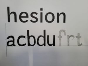
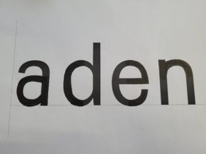
The session had us draw letters of a particular typeface that was only in small parts that were pre-drawn; and from that reference we had to draw the rest of what remained of the text. I believed this exercise was to test our knowledge of not just typefaces, but to see if we could guess the following style through little information.

The picture on the right of the page illustrates an example of my drawn work that shows how I continued with the pre-drawn typeface. Compared to the original, it was fairly accurate, however the “a” and “e” required more curvature, after being given 4 words, the task moved onto doing more without a starting reference on what we had to draw. Very similar to the first example I had drawn, they were mostly accurate other than the curvature of the lines on certain letters. In future projects, I will need to improve my skills of refining and recognising fine details, especially when it is related to text or fonts. These drawing skills will help reintroduce me into sketching for future assignments as well as improving my confidence in refinement.

To conclude, the session helped me understand the foundations of what future analysis of designs/typefaces will require. Additionally, as I have not drawn for a while, it was always helpful to regain my confidence into drawing more again.

Cinema Listings Development

The Reading Film Theatre brief involved having to produce a pamphlet for the Reading Film Theatre Autumn 2017 Programme, presenting 10 films along with information about them on the page. It had to only include 2 colours (white does not count as a colour in this circumstance), 2 fonts, and possess 2 columns to present the information. Additionally, our design had to cater to a particular audience, such as a parent with 2 children and an elderly couple.

For my first draft, I included a gold gradient background along with black text to present the information. My initial ideas were to reference the “golden age” of Hollywood cinema, like the 1950s an 1960s; leading to me adding the gold background. My design was supposed to appeal to the older audiences, or connotate that it was of a classic cinema style, but I had not realised that I had already failed one of the briefs of having only 2 colours. Also, due to the text being the same colour and similar point size, it was fairly complicated to read upon first glance.  Furthermore, my inclusion of paragraph rules were not very helpful as they were the same colour as the text. Cinema Listing 1

With my second design I decided to only include a light blue colour and black text as I did not want my design to be as needlessly complicated to look at. However, in light of focusing on minimising my design I had forgotten about my chosen audience, which resulted with me becoming confused on what to do next. This, along with my lack of current Adobe InDesign knowledge, made me want to learn about how I could improve my design by seeking feedback from the Friday lesson. Cinema Listing 2

After, the feedback lesson I decided to simplify my design as well as not overcomplicate the visuals, along with editing general mistakes such as errors within the text. I decided to focus on the colours of the University logo that is usually depicted as red and white, to fit the colour scheme. The pdf file does not allow the font that I had chosen for the title, but for reference I had initially used a font called “Showtime”. This font had a Hollywood inspired text along with old film tape acting as borders above and below the title. I wanted my design to focus on being intended for the use of the elderly, as it was a simple design that became easier to read compared to my last concepts. The minimal use of red for the title as well as the titles for the films enhances the importance of the films and associates with the hierarchy of information, conveyed in Lonsdale and Twyman’s journals of typography. RFT Actual Design

Francis, Day & Hunter Ltd Collection

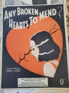
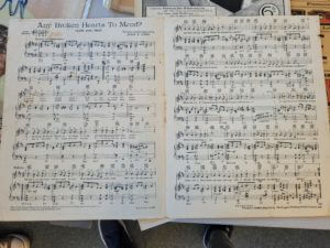
Following the Thursday interactive session from Emma about the introductions to the collections that the Typography department have relating to Typography and how it was created/used over time; I took an interest in evaluating and researching the music sheets and covers of Francis, Day & Hunter Ltd.

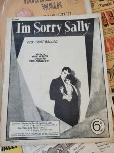
The origin of these particular music sheets originate from 1938 (Any broken hearts to mend?) and 1928 (I’m sorry Sally) and were published by Francis, Day & Hunter Ltd. From first glance the covers conveyed a sense of nostalgia, as the old minimalistic style as well as colours fit the interwar era of design as it was a rather depressing/lonesome era (as the vast majority of men were fighting at war). The purpose of these music sheets were for families to purchase to be able to play the most recent songs at home on the piano, as most households owned a piano for entertainment. Additionally, Orchestras and bands that would play at venues, would also purchase these music sheets as playing the most recent music of the time was there occupation.

The front covers of the designs connotate a sense of melancholy and intense sadness relating to love, which clearly relate to the historical context of lost love/missing a lover due to the war. The cover for “Any broken hearts to mend?” has the female character possess the same colour scheme as the background itself, to possibly minimise the printing cost as well as having the correct blend of colours for the tone of music. The layout of the title suggests a sense of optimism as the flowing/rhythmic text suits the curiosity of the question if there are “any broken hearts to mend”. Whereas “I’m Sorry Sally” has only used black and white to present the cover, possibly due to the fact that this cover was 10 years older than the other cover, showing the development of the publishing company. But more interestingly, the typeface included possesses serifs compared to the other cover, to potentially emphasise that the music included is of a more serious or somewhat “classier” fashion as the typeface has more visual flair. The age of the music sheets clearly show, due to the fact that the price that is present on both covers is “6d”, or is more commonly referred to as a sixpence; thus the historical context suggests that these are older published music sheets.

To conclude, observing the vast examples of the collections within the typography department has aided me in recognising how old style of print was developed/conceived for particular genres or styles; as well as understanding the potential ideas that were intended when publishing designs and other forms of media.


The Boy in the Striped Pajamas

Following the tutorial of copying The Great Gatsby book cover on Adobe InDesign, I decided to develop my own version of this with my personal choice of book, The Boy in the Striped Pajamas. This book is important to me because, I read this when I was younger and it really helped me to put into perspective the true horrors that prisoners during World War two had to endure. Because the main setting of the book is set around the border between the Jewish Camp and the countryside; I decided to create my own barbed wire fence using the line tool. I made irregularities with the coiling of the fence as it allowed the title as well as the rest of the text to be read easier than having objects that would obstruct the view. Fitting the theme, the blue and faded white stripes symbolize the uniforms that prisoners had to wear, adding to the meaning behind the book. Here I had to add further leading to my design as I wanted all of my information clearly conveyed within each stripe of colour from the background. The cover is supposed to communicate a simple message through the simplicity of what is being conveyed (the barbed wire fence and background).

Brown Design

After selecting the theme “90s Urban Style” prior to the session on Thursday, I decided to create a brief mood board to quickly illustrate the instant ideas I had about my theme. 90s Urban

The 90s style made me instantly think of The Fresh Prince of Bel-Air (the famous TV series from the 90s), as the main character and the introduction to the show presents a typical “street themed” aesthetic. I noticed throughout the images I observed that there was a consistent theme of graffiti and vibrant (but minimalist) colour schemes. Taking inspiration from this, I pursued the graffiti style, as it perfectly fit the theme of noticeable and eye-catching logos.

Graffiti Design Experimentation Through using Adobe Illustrator, I wrote my name in many different fonts until I found the font “The Blacklist”, this font had joined letters and had varying thickness to the lines, which was a common graffiti style back in the 90s. Additionally, I made my own gradient to use for my lettering, as I wanted to adopt the vibrant hues that were present in the 90s street art. After adding the lines underneath the main text to accentuate the words as well as the overall theme I included a black drop shadow as this was commonly used to add to the 3D element of street art. I believe I have done well in producing a 90s inspired logo for myself with the software that I was provided, but if I was to improve my work I maybe would have experimented further with different gradients or extra layers on top of my text for a better effect.