Background
As a continuation of the long-standing Real Job between the University’s Department of Film, Theatre and Television and Typography & Graphic Communication, we were tasked to bring the twelfth issue of Movie: A Journal of Film Criticism to life. In addition to this, we also had the opportunity to design a new eBook that focuses upon Weimar Cinema, as well as a logo for The Cine-Files and Movie merge.
Movie: A Journal of Film Criticism is a digital film journal that originates from its printed predecessor Movie, a physical publication that was run by the late Ian A. Cameron between 1962 and 2000. It has since been designed digitally as a rolling issue, meaning that articles are added throughout the year. For Issue 12, the academic articles respond to a variety of themes in movies such as David Cronenberg’s Rabid (1977), to the modern day Drive My Car (2021). The journal primarily touches upon aesthetics, theory, and analysis of film and television from all genres.
The Cine-Files is a scholarly film and cinema journal, much like Movie: A Journal of Film Criticism, that has since been acquired and incorporated into the twelfth issue at hand, following a period of inactiveness on their website: https://www.thecine-files.com/
Restated brief
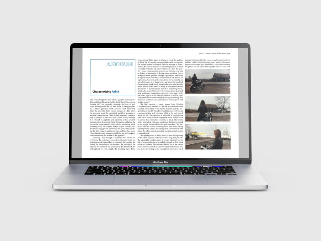
The primary objective was to design the twelfth issue of Movie, building on the previous issues that follow the same justified three-column structure. After talking with the client, we were told that the placement of images is extremely important, and stills should work alongside the corresponding text so that the viewer can visualise what is being analysed. From our first meeting in June 2024, we spoke about a flexible deadline to complete all given deliverables by February 2025. This date was primarily stuck to, but given the nature of the rolling issue and different authors sending through articles at different times, it was difficult to maintain this throughout the duration of the Real Job.
It is also important to mention that our first restated brief considers the design of two eBooks. This was the case, until we spoke to the client about acquiring the copy that needed to be designed. Unfortunately, due to circumstances beyond anyone’s control, the writers were delayed and the text couldn’t be completed on time to fulfil the rest of this Real Job. This meant that we needed to alter individual workload, since the original plan was for Emma to work on Issue 12 of Movie, and Zaynab to work on the two eBooks.
Research
As for initial research, we looked at and read previous issues of Movie. This allowed us to familiarise ourselves with the traditional three-column A4 format of the journal, but also helped us to appreciate how the placement of type and image proves significant in bringing the movie stills to life. It also allowed us to understand the design differentiation between the deliverables, with the eBook instead following a two-column format on a square document.
Editorial design process
Due to the rolling nature of Movie, articles were designed when text had been approved and shared with us by our client. A useful tool that smoothed this process was a shared Google Drive between the Real Job team and the client, allowing the client to upload copy and images as and when they were available. This was organised into folders for each article, with text and images also organised for easy navigation and download. This was particularly helpful since additional authors outside of the university could also access the shared space since it was not limited to Reading staff and students only.
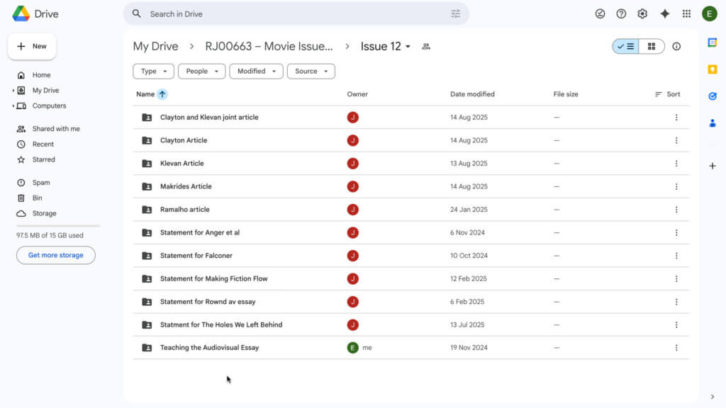
Once the copy was uploaded to the Google Drive, the design process took several days to perfect. This process includes the following steps, which are broadly applied to most of the articles within Issue 12 and the eBook:
- Import the text from Word into InDesign (Command + D).
- Apply appropriate paragraph styles – primarily differentiating between body and indented body stylesheets.
- Begin to place images in conjunction with where they are mentioned within the text. Interesting images usually take up two columns, where smaller images may only span the width of one column.
- Once complete, get peer to oversee the design, giving feedback where necessary.
- If approved by both members on the team, the article is handed over to the client for further feedback and suggestions.
- Depending on the client’s response, the design is handed back over to the team, or is sent for further approval from the writer, who knows more precisely where text and image should line up.
Although this process would sometimes span a longer-than-anticipated timeframe, it was a useful experience to have been a part of – almost mimicking what design sign-offs are like in a professional setting.
Logo design process
The Cine-Files logo was a collaborative effort, with both members of the Real Job team creating logo ideas. A lot of our initial concepts played into stereotypical film and cinema conventions such as clapperboards and film reel. In addition to these visual tropes, we also experimented using Minion Pro within the logo, since this is used for the logo of Movie: A Journal of Film Criticism.
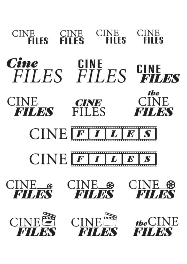
Before showing these to our client, we spoke with our supervisor about our ideas. We had a great discussion that prompted us to steer away from the stereotypical imagery in the attempt to provide a range ideas that go beyond this. Therefore, our logo ideas felt more refined and played on less obvious tropes such as cinema screens and tickets. We even had some ideas play on desktop folders as an obvious nod to the ‘Files’ in The Cine-Files name!


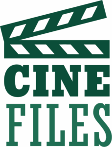
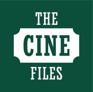
After discussing again with our supervisor, we collated a small selection of our best concepts to send to the client. These were brought together on a PDF with codes, allowing us to directly reference options back-and-fourth via email.
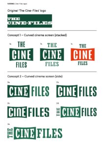
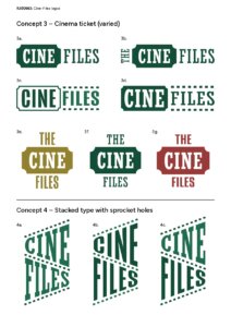
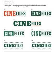
After hearing back from the client, they stated a preference for the first two concepts that utilise the curved cinema screen, with the stacked variant of this logo being approved almost immediately. We both agreed that the slab serif variant was the strongest, since it echoes the logo’s original design.
With the stacked variant of the logo confirmed, we needed to experiment with a horizontal version that could also be used. Collaboratively, we worked on different ways of presenting ‘The’ next to the rest of the logo, ensuring its design didn’t steer too far away from the stacked version. Following this experimentation, we had eight versions to show to our client in a similar document as the initial logos were sent.
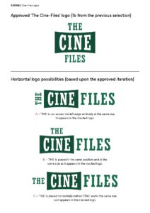
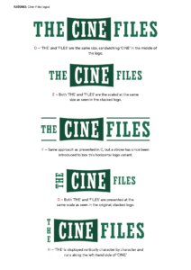
From these send-off sheets, both ourselves and the client agreed that the option with the stroke was the most suitable, since the typography felt just as grouped together as it did on the stacked variant.
With the logos finalised, we then discussed with our client in regards to an ‘incorporating’ logo to let readers know that the merge between Movie and The Cine-Files had been actioned.
Experimenting with different ideas, we mocked up the ‘incorporating’ logo independently and on the Movie website – its eventual home once signed off.
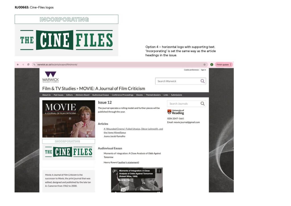
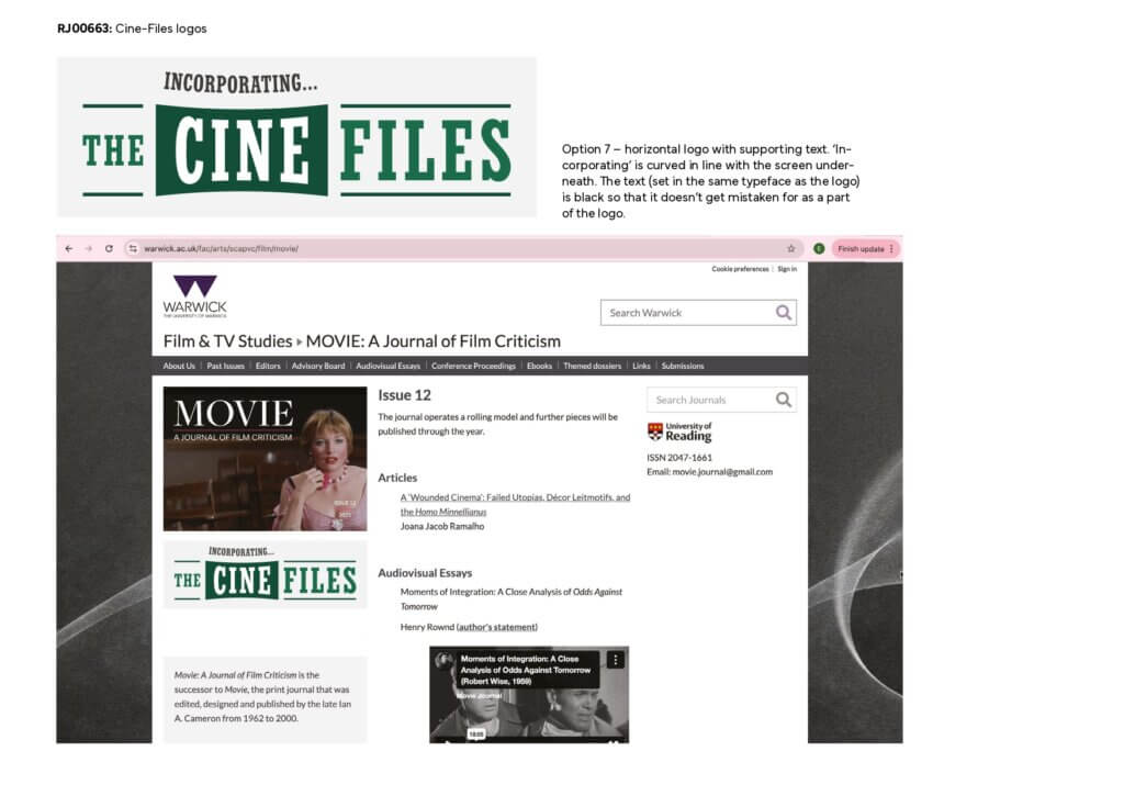
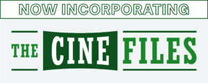
Following this send-off, it was agreed between us and the client that the fourth option, with ‘incorporating’ in the same outline that is used to start articles in Movie, was the most suitable, and was shortly published on the website after this approval.
Final products
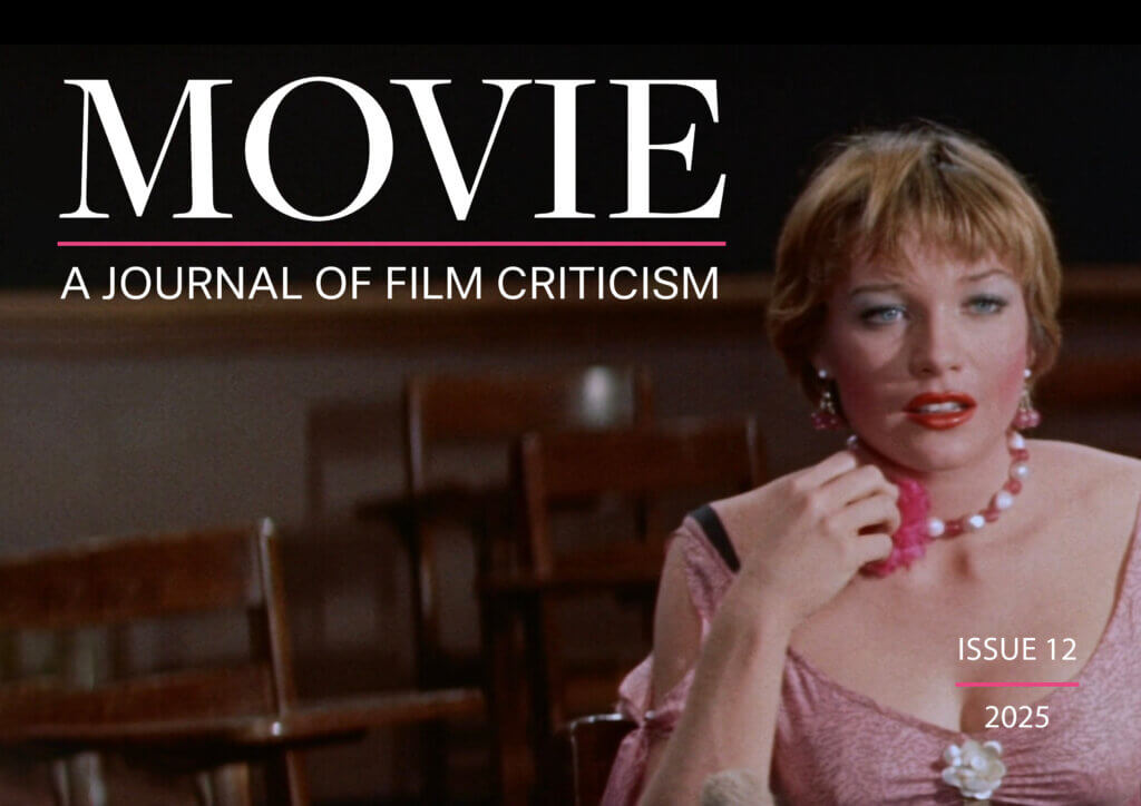
Issue 12 of Movie: A Journal of Film Criticism ended up being 78 pages long and features 16 different articles from a range of writers. The issue colour naturally adapted to pink in order to match the clothing seen on the front-page image; a dress worn by Shirley MacLaine’s character Ginny Moorhead in the Some Came Running (1958), which is heavily referenced in the first article of the issue. The PDF is interactive, allowing readers to navigate the contents with ease, but to also access audiovisual essays, should they be relevant with the article being read.
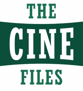
The Cine-Files logo was supplied in horizontal and vertically stacked formats – allowing versatility depending on its contextual use. The logo purposefully stays loyal to the previous identity of this logo – utilising a dark green slab serif. It has already been used to highlight the merge of The Cine-Files with Movie on their website, as well as within the contents of Issue 12.

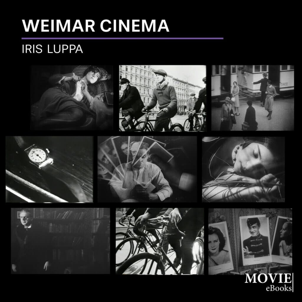
The eBook consists of 63 pages, including a title page featuring multiple stills from the discussed films, a notes page, and a bibliography. A mix of images featuring both scenery and characters from each film are used as to not make the cover look too repetitive or uninteresting. Like Issue 12, this is an interactive PDF, guiding the reader to the website for Movie by clicking the link in the top right hand corner.
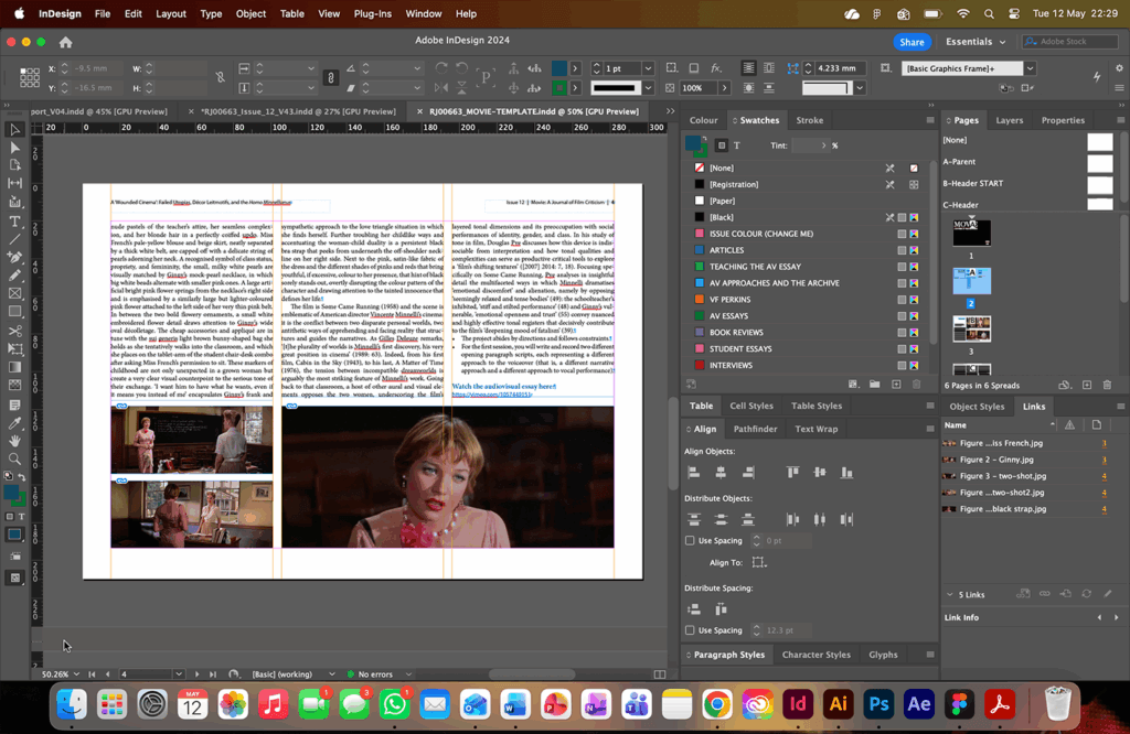
To support the future of this reoccurring Real Job, we created an InDesign template for the Movie journal. This template features the commonly used paragraph and character styles – including the colours that are used to categorise each of the different sections (articles, audiovisual essays, student essays etc.) In addition to the stylesheets, the template also provides a traditional starting article page, with the boxed heading in the left-hand column. Although this is not section specific, it allows for easy copy-and-paste editing for future students working on this Real Job.
Reflection
Emma
As someone who has a strong passion for film and editorial design, it has been a pleasure to work on the twelfth issue of Movie. In completing this Real Job, I feel as if I have expanded my InDesign skillset beyond what I have learnt in compulsory modules, especially since the project lasted longer than anticipated.
Zaynab
Working on the eBook and issue 12 for Movie has been an interesting experience due to my interest in both film and editorial design. It has helped me develop my skills in InDesign and made me much more confident with editorial design as a whole. Being involved in this Real Job allowed me to refine my approach to layout and typography, along with managing style sheets efficiently and responding to client feedback effectively.