
Overview and Context
Cianna’s Smile is a charity that offers support and education to families impacted by Sickle Cell Anaemia in the UK. The charity, based in Reading, aims to raise awareness of Sickle Cell and blood donation through public speaking events, therapy workshops and training days.
We received all of our copy text from the client, as well as some of the icons that they used within their branding. Our client wanted us to use these icons within the book to maintain consistency across their brand. The charity used the typeface Montserrat for body text and Kollektif for their headings.
Restated brief
Aims
Our aim for this project was to design and illustrate three publications for the Sickle Cell awareness charity, Cianna’s Smile. The aim of each of these publications was to help and empower people and families affected by this cell disorder and to support them whilst giving them a sense of having more control.
Deliverables
Initially, we were proposed to make three deliverables, each with a separate time frame. After a discussion with our client, we discussed a small fourth deliverable of a poster:
- Illustrated poster– an illustrated pattern that can be used across social media and on stalls at in-person events.
- A nutrition guide/ recipe book – an illustrated recipe book that promotes the importance of diet and nutrition in preventing and managing symptoms associated with Sickle Cell.
- Transition Journal – Aimed at young people living with Sickle Cell, to help them with the change from paediatric to adult care.
- An interactive children’s book – an interactive children’s book that informs children about Sickle Cell.
As a group, we split the deliverables between us.
- Holly – Nutrition guide and illustrated design
- Izzy – Transition Journal
- Lovell – Interactive children’s book
Deliverable 1: Illustrated poster
Overview
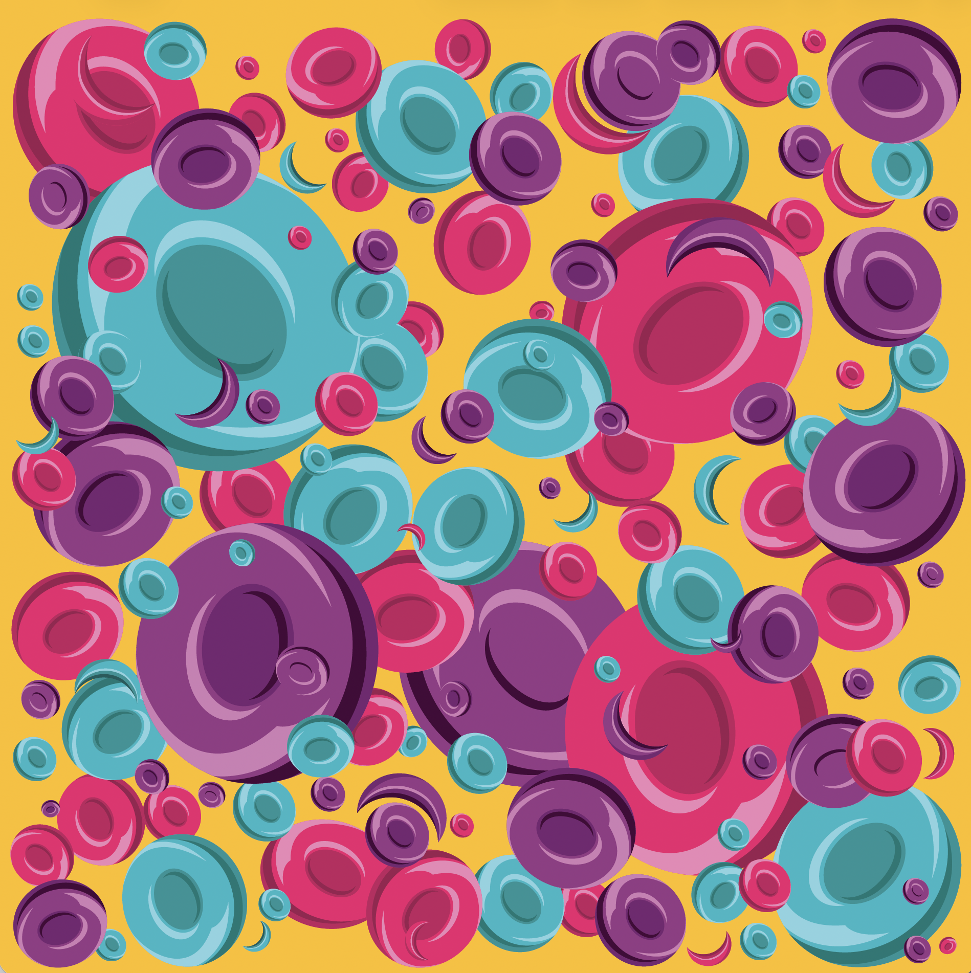
Our client requested a square, patterned poster that they could use decoratively on the charity’s social platforms and for events. The aim was to hide the sickle cells amongst normal red blood cells so that the poster could also act as a searching game for younger audiences.
Sketch
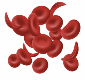
I developed a number of sketches of sickle cells and sent them for review to our client. We were concerned that they would look too much llike moons or sweets, so we continued to develop them until our client was happy.
Development
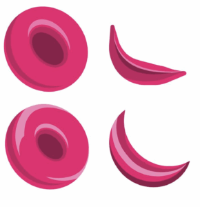
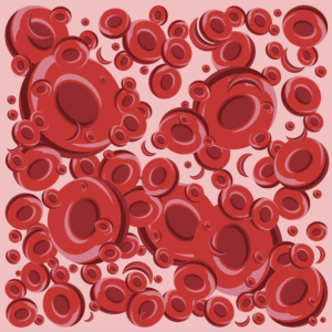
After finalising the sketches, I began to make variations of the poster in different colours.
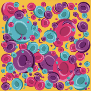
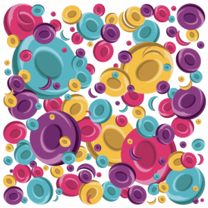
Final
In the end, the client chose the more colourful poster, including the brand’s colours.
In use
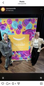
Here are some examples of the pattern in use across the charity’s social media.
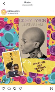
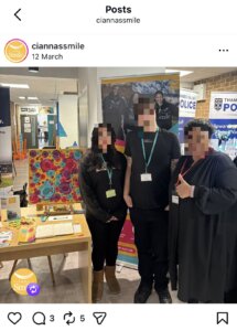
Deliverable 2: Nutritional Recipe Book
Overview
For the recipe book, our client wanted us to include a handwritten style typeface for the ingredient lists and to use their typefaces for the rest of the typography. They wanted the book to be very illustration heavy (with an emphasis on feeling ‘doodly) and to cater to both children and young adults. The first section of the book contains information on Sickle Cell and how to manage symptoms, before jumping into the recipes. Therefore, graphs and diagrams needed to be illustrated in addition to the ingredients. We were given the dimensions of 210x210mm for the book. and were asked to design it for PDF and for a hard copy.
Ideation
We received a mood board of ideas from our client, and after discussion, we narrowed down what they liked from each design and took this into the sketching stage.
Sketches
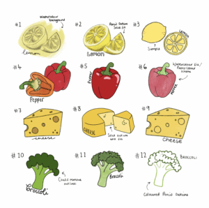
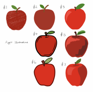
From our ideation, I developed a series of illustrations in different styles, paired with different variations of handwritten typography. From here, our client selected numbers 3, 5, 8, and 10, and we decided to find a typeface rather than handwriting the text. After further development, the client chose design 4 as the style to progress with for the book.
Developed Illustrations
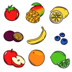
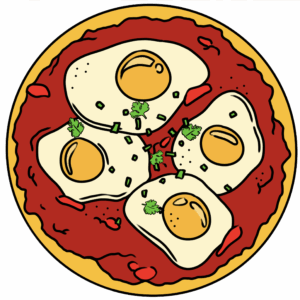
Over the summer, I developed the sketches further, making an illustration for each ingredient within the book. Then I created a full illustration of the final dish for every other recipe within the guide. This resulted in a total of 112 illustrations.
Layout
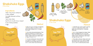
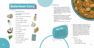
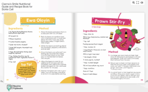
After finalising all of the illustrations, we moved on to discussing the layout. We provided the client with a few examples of how we could present the information, and we developed the grid and layout from this. We finalised the layout and began to develop each of the pages, receiving client feedback throughout.
Covers
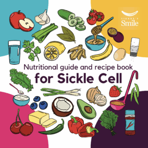
We also began to work on the front and back cover design at this time. Variations were created, and then the client selected their favourites, and we made adjustments.
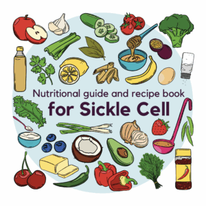
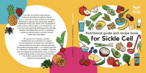
Final
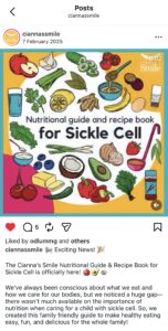
Once the pages were approved, we sent the PDF to our client, who then sent it to print through a third party and uploaded it to their website as an interactive document.
Deliverable 3: Transition Journal
Overview
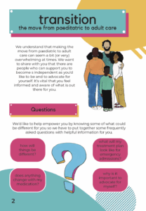
For the Transition Journal, our client wanted us to include the handwritten style typeface for the illustration captions and to use their typefaces for the rest of the typography. Following on from the recipe book, they wanted the journal to be illustration heavy, but with space for user to write their own thoughts and feelings in response to their transition through Sickle Cell. The journal began with explanations of the move from paediatric to adult care, as well as common questions that will be answered throughout the rest of the journal.
Development
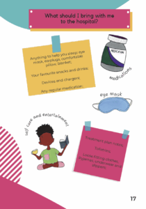
Following on from the recipe book, the illustration style stayed consistent with sickle cell illustrations being used throughout. The colour scheme stayed the same, with the bright colours and drawings staying in the background of the journal. Due to the progress made in deliverable 1, deliverable was able to progress at a quicker rate. All pages of the transition journal followed the layout below, focusing on ensuring the user felt comfortable when transitioning through care.
Final
After going through minor development stages, the final pdf was sent to the client.
Reflection
We maintained close contact with the client throughout the design process, updating Hayley after each update. Due to the conflicting views from the client, the design process was longer than usual causing the time deadline to keep being pushed back. Overall, we learnt a lot about editorial work and illustration.