
Context
Formally known as the DMT-DRSG (Dog Meat Trade Dachshund Rescue & Support Group, The Long Road Foundation is a Scottish-based charity who rescue dachshunds from kill shelters in South Korea and China, bringing them to the UK to be adopted. They wish to re-position themselves to appeal to more donors and need a new identity which will resonate with their current supporters and new corporate and high-net value donors.
Restated brief
Aim of the project
The aim of the project is to create a fresh, new brand image to broaden the network of donors whilst maintaining the relationship with current trustees. The clients want a brand manual to communicate their values, showing urgency but not guilt. The range of deliverables will give the charity an approachable and profound feel.
Objectives
- To take the next step to appeal to a wider range of supporters
- Very important to not isolate current supporters and keep the human and dog element to the brand at the forefront
- Communicate their promise to transport the dachshunds ‘from harm to home’
- Create a sense of urgency to communicate opportunity instead of guilt
- Enforce a sense of calm but in a firm way by using colour psychology
- Their creative vision is: Directional. Grounded. Enduring. Human
- Needs to be durable and visuals need to reflect passage and continuity
- A quieter brand which does not need to shout
Deliverables
A design toolkit including:
- Logo (static and maybe dynamic)
- Colour palette
- Typography
- Illustrative elements
- Usage rules
- Examples for different applications (social media, printed mater, merch, event materials)
Roles and responsibilities
Designers: Designing all deliverables, taking on the client’s feedback and refining accordingly, creating a cohesive set of deliverables, work within agreed time frames
Mya: Keeping in contact with project supervisor
Jemima: Keeping In contact with client.
Client: Work within agreed time frames, provide feedback at each phase of the project
Qualities of deliverables
Deliverables in detail:
- Focusing on human-to-human connection and the space between harm and home
- Create a sense of urgency to communicate opportunity instead of guilt
- Enforce a sense of calm but in a firm way by using colour psychology
- Presenting a range of different approaches such as illustrative, typographic and iconographic
Notes from initial client meeting:
- The core idea is that the brand is the journey, expressed as the space between harm and home
- The tagline: “from harm to home” is a direction of travel, not a slogan
- Our Promise to Dachshunds. If you are in harm and we can reach you, we will come. And we will bring you safely home
- Emotional Posture: When harm is present, inaction is still a decision. The path can stop or continue. We choose to carry it forward
- Tone and Character: Directional, grounded, enduring, and human. Calm, credible, and built for distance
Research
Right from the beginning the clients provided a clear vision of what they wanted the brand to be, with a clear backstory presented, vision for the future regarding visuals and tone of voice, and 5 separate sets of image references to work with as a base. These were colourful, playful illustrations and visual styles which had quite a retro feel.
The 5 concepts they presented to us included: human-to-dog connection, the space between harm and home, roads and roads with dachshunds. We created mood boards ourselves and found that our ideas aligned with the clients.
Stakeholders
Regarding the stakeholders of the charity, their donors are currently regular people who donate and adopt, and with this rebrand they want to appeal to higher net-worth stakeholders. This means that they want a brand which would appeal to a more serious audience, which is why they have identified quite simplistic illustration styles and general imagery which we continued to develop in the design phase.
Comparators
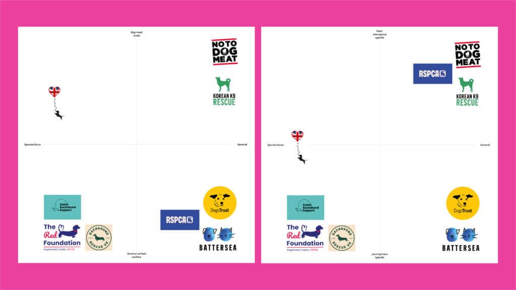
When conducting research, we found that most of the animal or dog charities we looked at utilised animal imagery within their logos, normally explicit illustrations (figure 1).
The common themes found in these brands were block colours, bright and energetic colour palettes, simple imagery and illustrations of dogs within the logos. The typography appears to often be sans-serif, taking on a more modern feel to appeal to a wide range of stakeholders. It is clear that despite the normally sad backgrounds of the charities, almost all of them presented a positive demeanour and shifted focus onto happier animal imagery and illustrations.
Moodboards
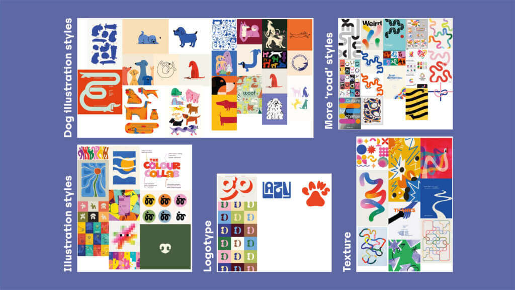
The mood boards we created worked off the initial ones we were provided, leaning into more playful imagery and illustration styles which are less constructed, and more flowing (figure 2). For the illustration styles, we liked block colours with overlayed thin lined, or textured illustrations which felt more tangible and human. We also began to look at typography, and how type could become the logo itself, such as through the ‘paws’ image.
Challenges
We faced challenges during research when we presented our research/initial ideas. Feedback claimed our ideas were too playful and we should lean to something more corporate in order to reach the high net-worth clients. However, we felt as though this contradicted the initial mood board we received. They wanted to suggest movement and the road, as well as dachshunds, whilst representing the space between harm and home, the human-to-dog connection, and symbolising home. This felt like a lot to consider, which meant that we had a a great deal of ideation to complete before reaching the right result.
Initial Logo sketches
Our initial sketches explored typography and illustration concepts (figure 3). We had logotype reminiscent of road illustrations, portraying long continuous roads which end with the foundation. We also had a logotype using the letters ‘LRF’ which represents the long road to safety and dachshunds in one, and spiral dog also represents the long journey to safety.
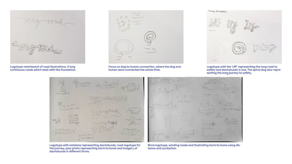
Our illustration sketches consisted of emblems representing dachshunds, road logotype for journey, paw prints representing harm-to-home and imagery of dachshunds in different forms.
Logo refinement
Concept 1
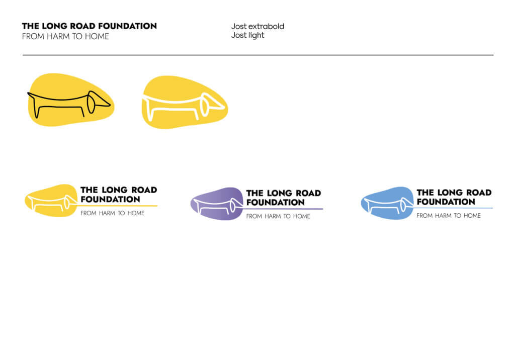
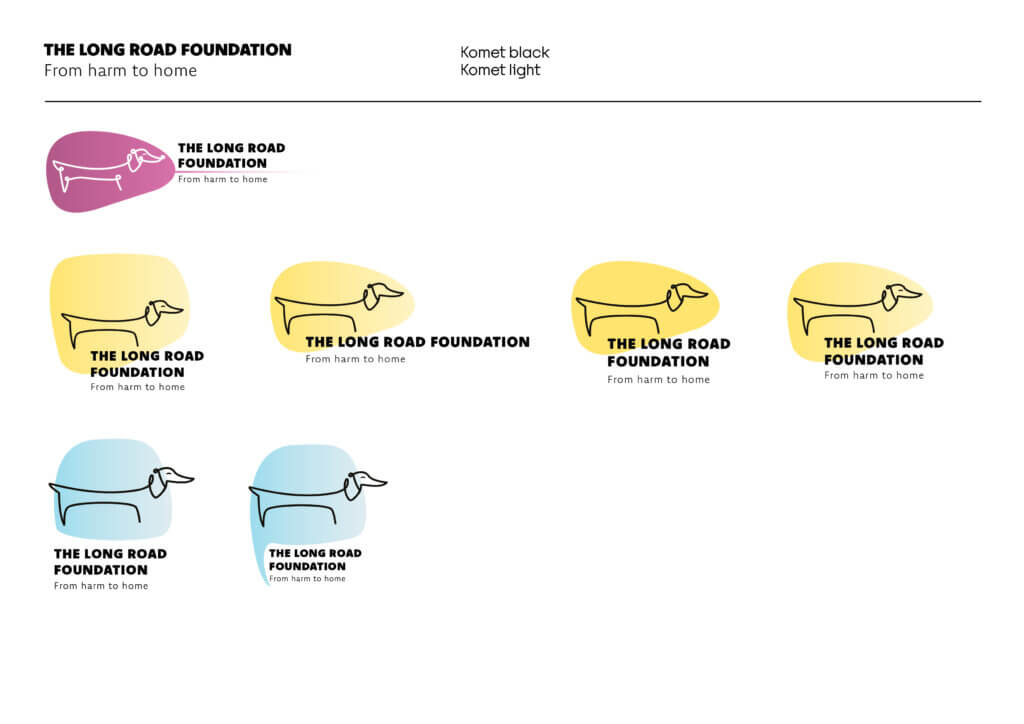
For the first set of designs, we explored long, winding illustrations of dachshund dogs, to represent the ‘long road’ (figure 4–5). We also experimented with colour and gradient, looking at a red/warm toned dog to represent harm, and a blue/cool toned arm to represent being safe at home (figure 5). Our first set of concepts did not the use of type, as we wanted to focus on the illustration aspect of the logo at this stage, but we still loosely explored typography (figure 6).
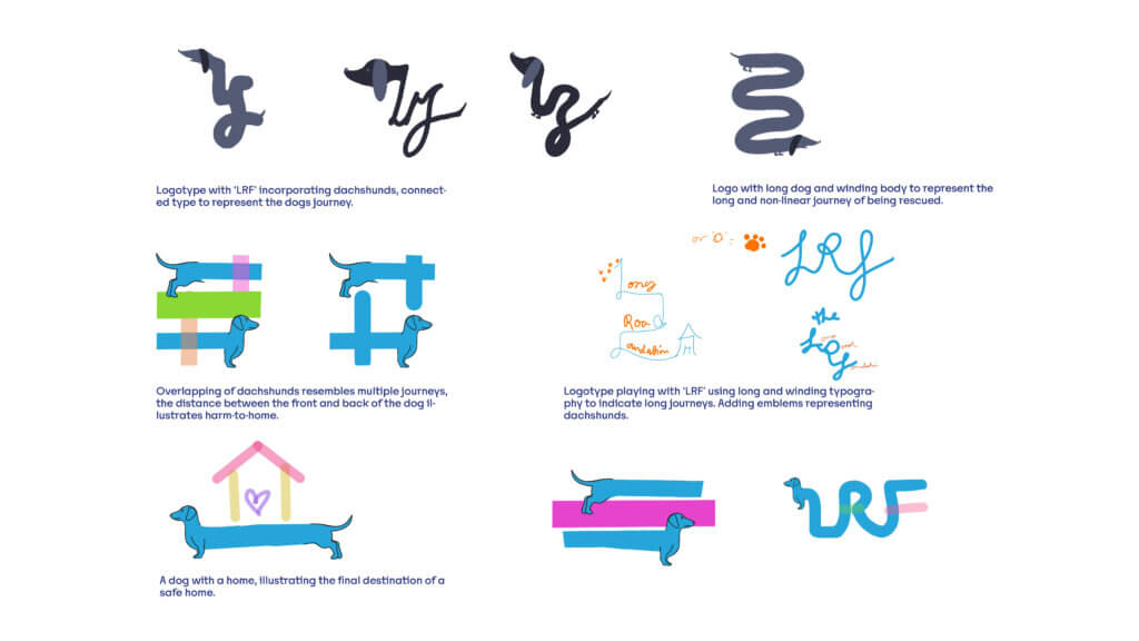
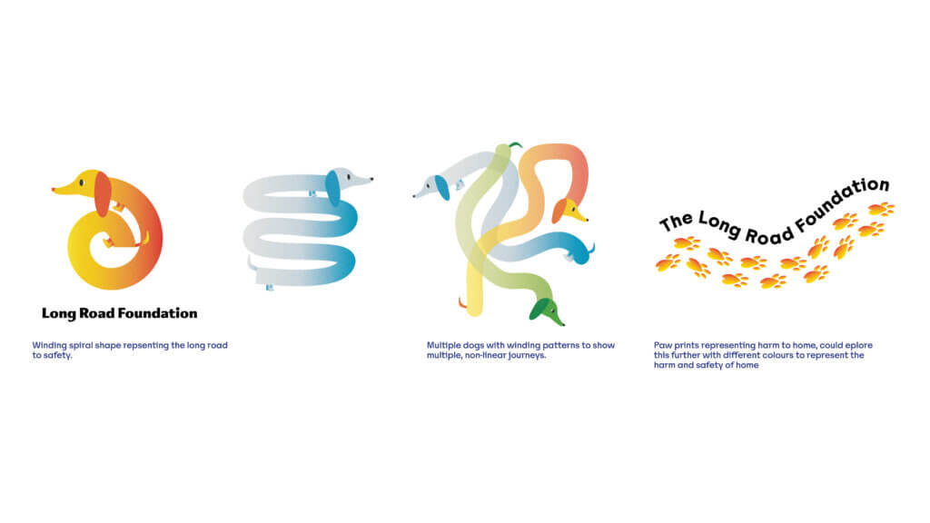
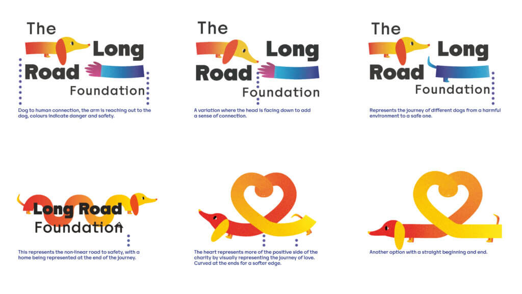
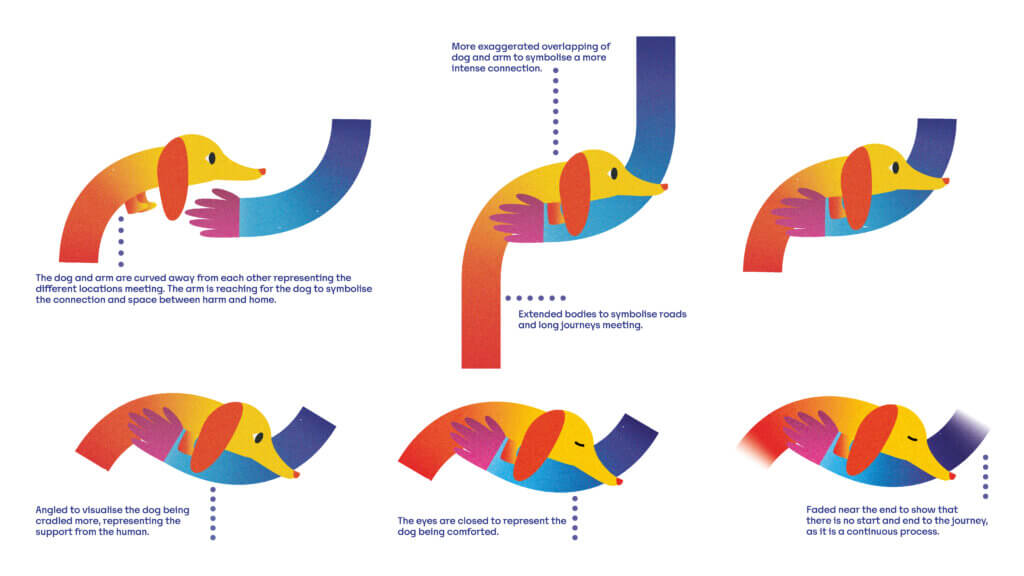
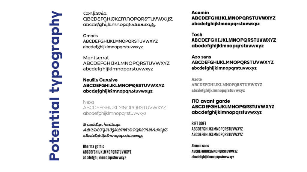
The feedback we received from these concepts were that they were too ‘playful’, but the colour psychology was thoughtful. The client also wanted us to be more conceptual and less literal, with a less cartoonish style. We were advised to illustrate with shaper rather than softer lines. We were also suggested to try a more muted, refined colour palette whilst still retaining the existing colour logic.
Concept 2
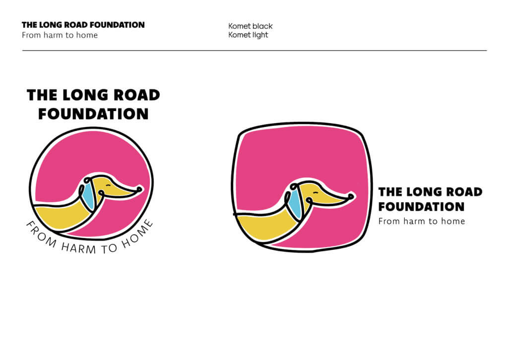
Our second set of concepts stripped back the playful, cartoonish style and explored a more geometric, conceptual approach (figure 7). We developed the dog head in hands concept with round shapes, geometric triangular shapes and a more delicate style with accurate features. We also started to incorporate typography, looking at circular typography and type under the illustration. There was also another head in hand concept we developed by muting the bright colours and looking at illustration styles.
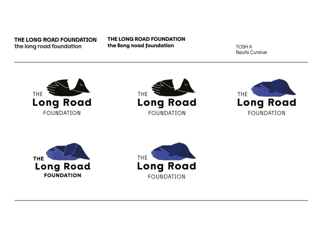
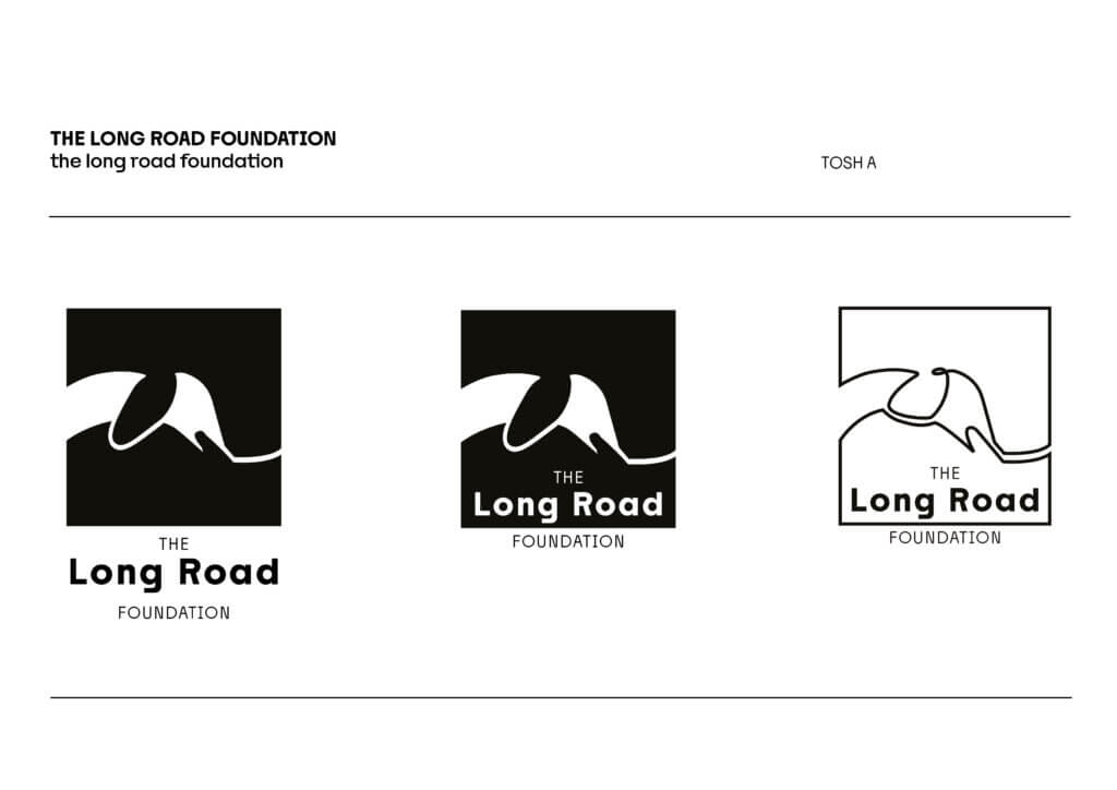
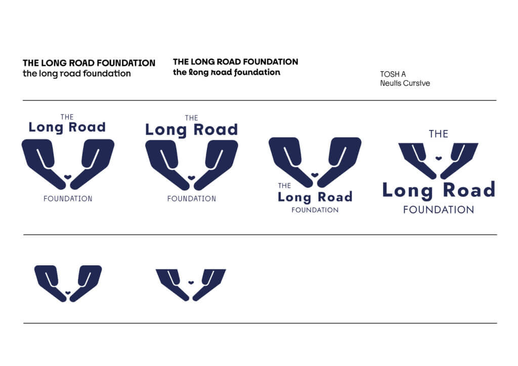
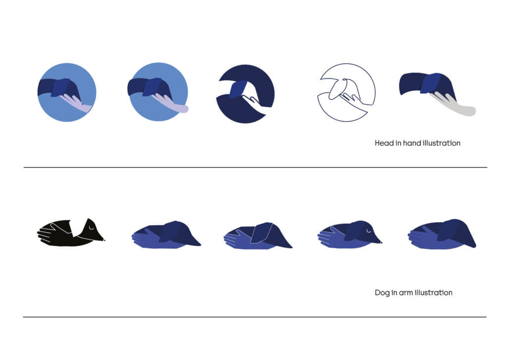
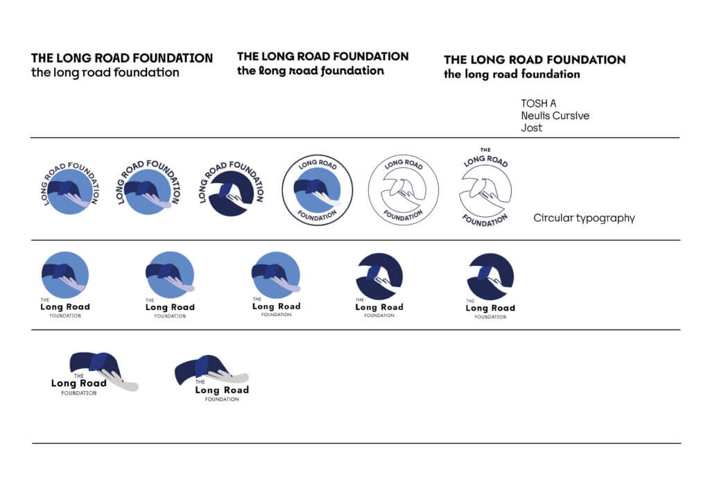
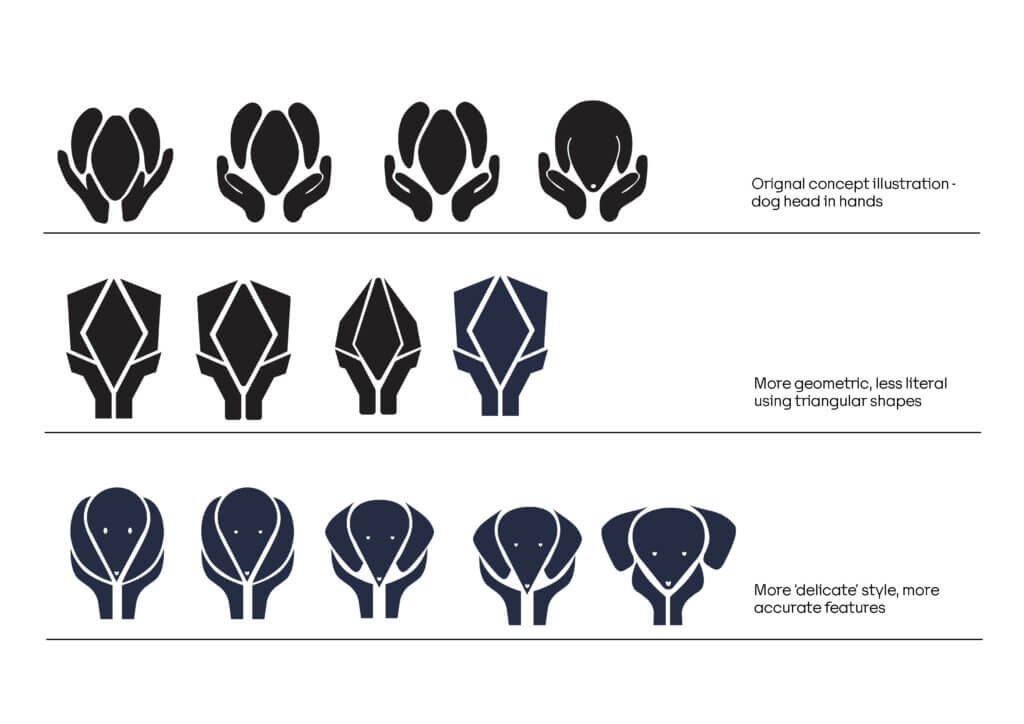
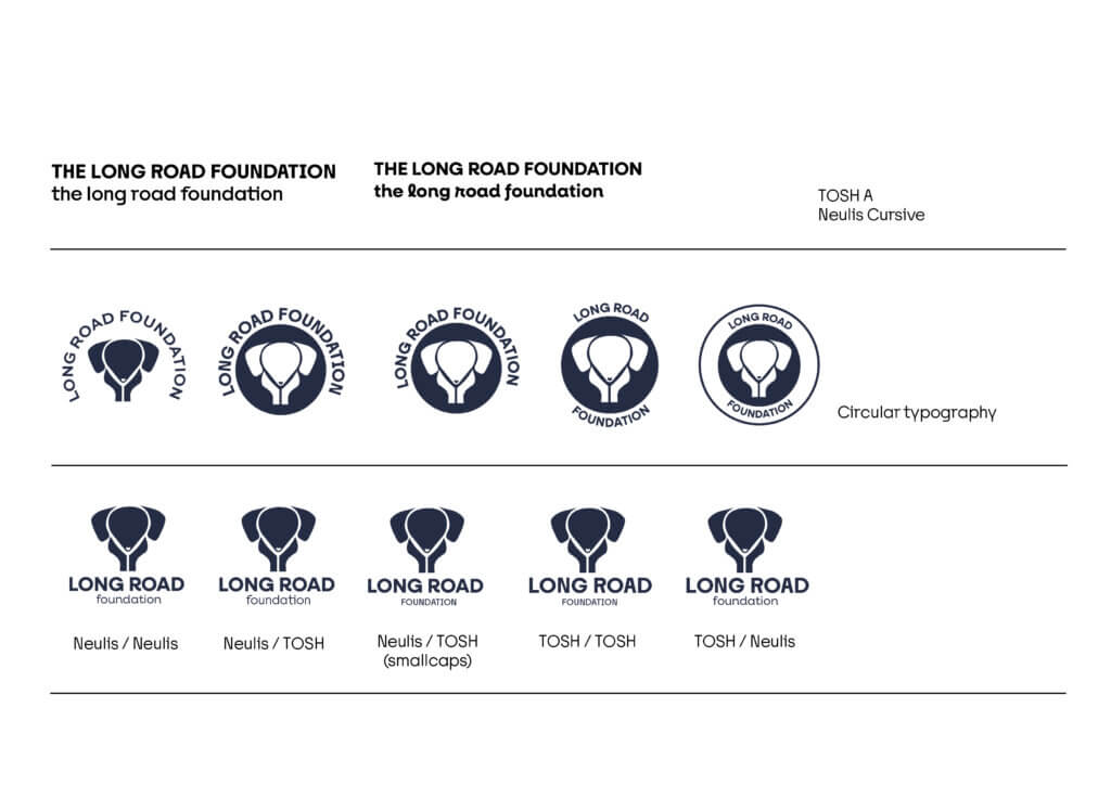
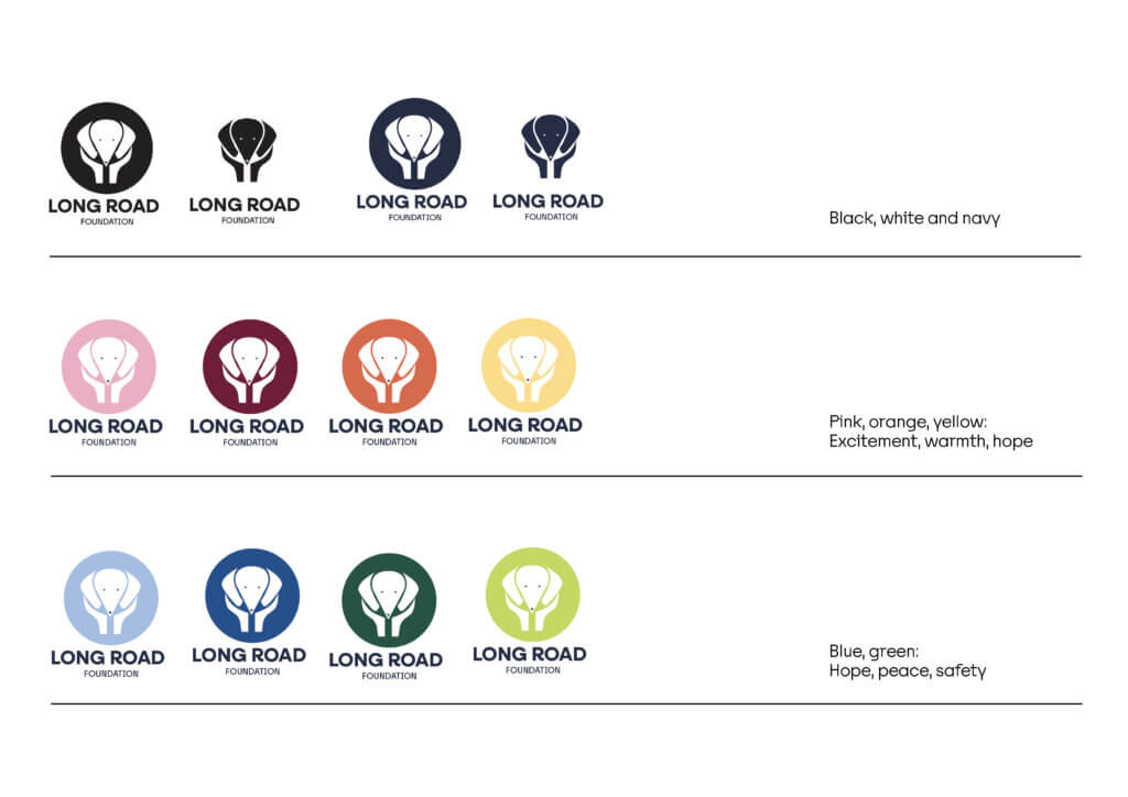
From feedback for these concepts, the clients explained that these were now a little too clinical with just a navy and black colour palette. On a positive note, this helped the client clarify where they would like to go in terms of playfulness and simplicity. We were advised to develop the head in hand lined drawing but not to be “overly playful or cutesy”. With the colour palette, the navy blue was too ‘vet-like’ so we should revisit the pink, orange and yellow pastel hues.
Concept 3
For our next set of concepts, we created a few variations of the line drawing, using a single line to communicate the continuous road and connection between the dog and their new home (figure 8). Steering away from the head in hands concept as this was too similar to another charity. So, we looked at the dog walking on a ‘long road’ and a line illustration with a pastel threshold background which takes form as a subtle abstract gradient shape.
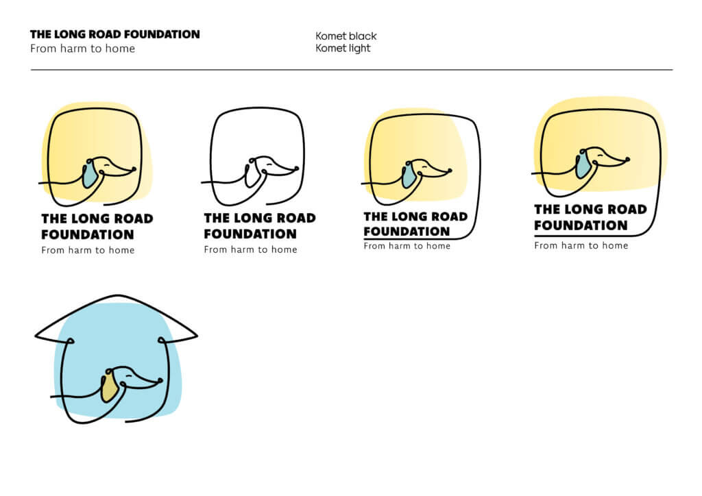
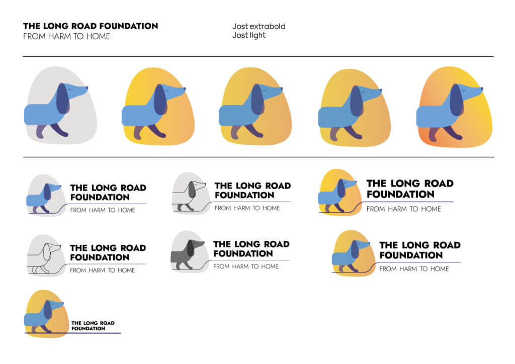
Feedback from this concept was to include a house drawing to represent the dog coming home. The dog also needs to have dachshund features, as this charity only focuses on this breed of dog.
Concept 4
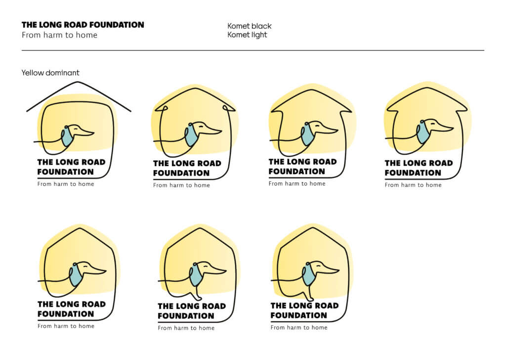
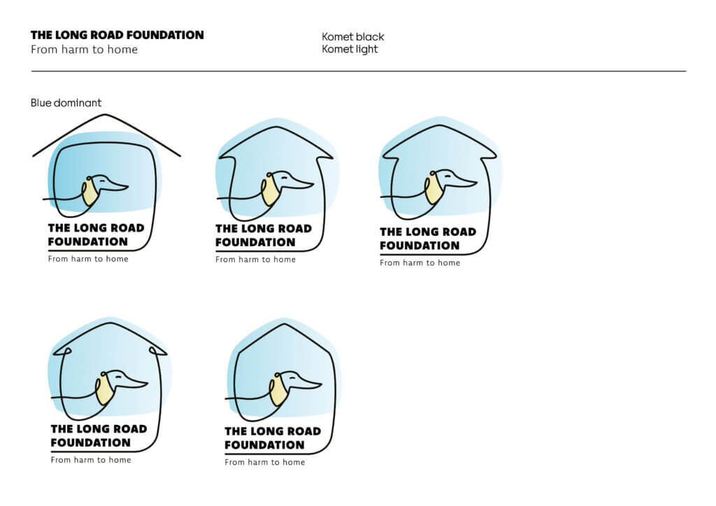
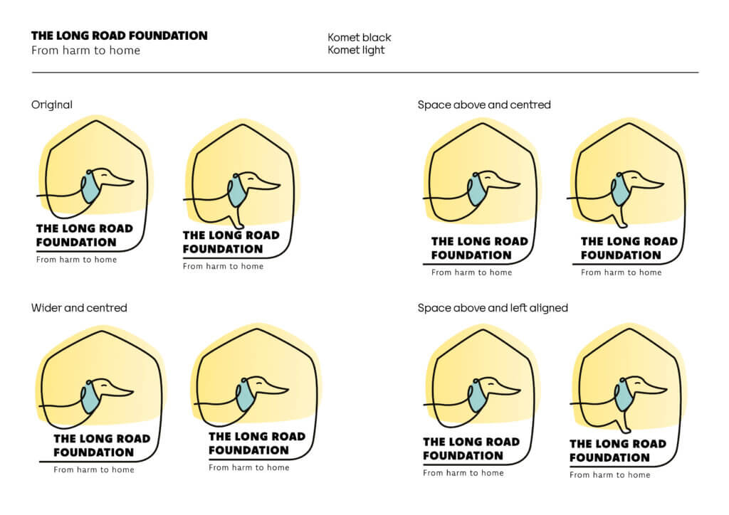
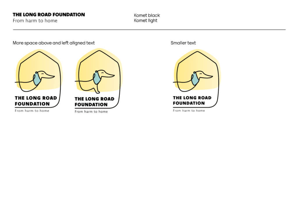
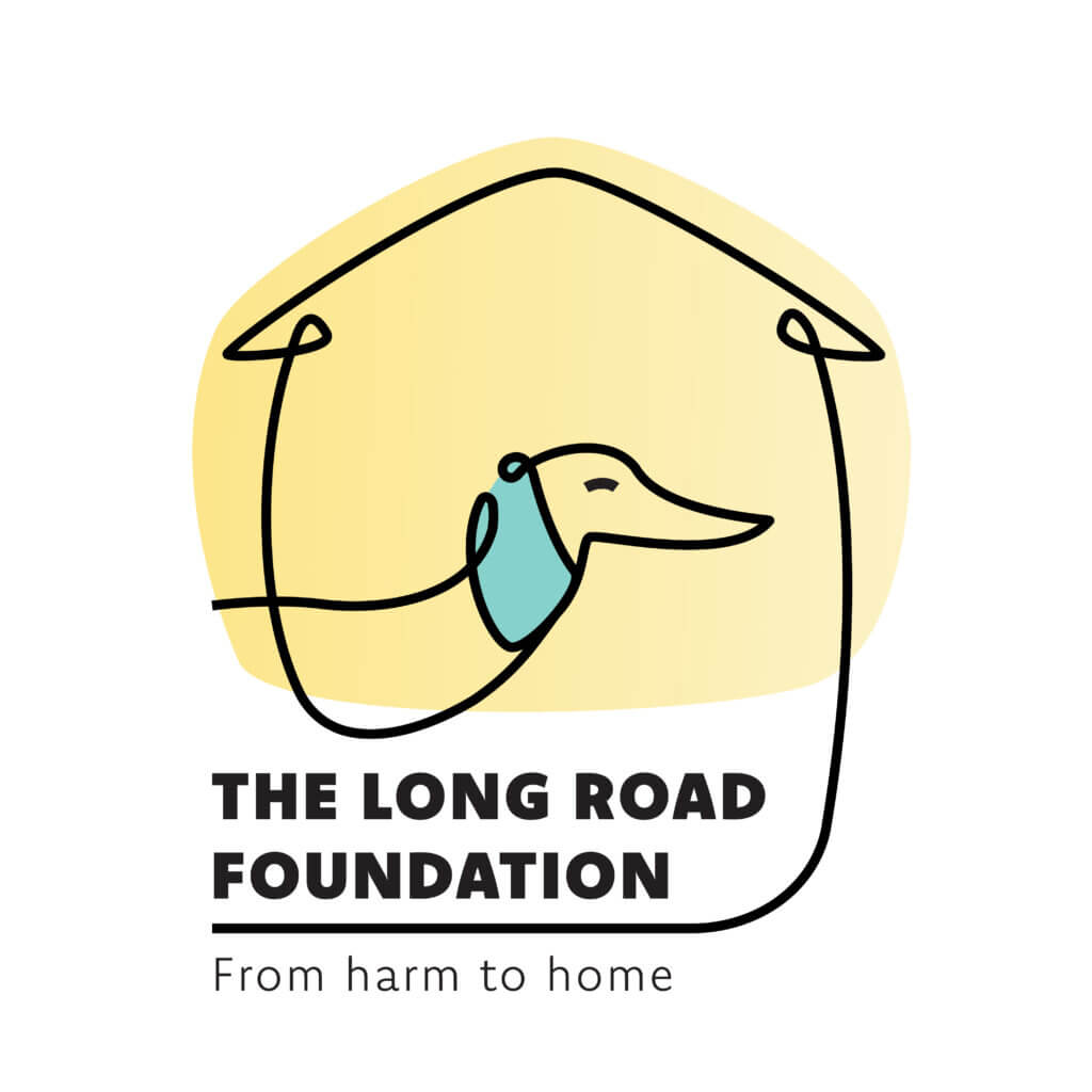
For our most updated concept designs, we developed a singular line drawing of a dog (figure 9). Looking at different backgrounds and different ways to illustrate the roof of a home, developing the house overhang in the line illustration. The typography and spacing have been made more purposeful, allowing more breathing room. The addition of the dog’s foot was to imply the dog walking, pushing the concept of the ‘long road’. We continued to develop the pastel colour palette of blue and yellow to represent hope and calmness. There are minimal adjustments to be done before the logo is finalised (figure 10).
Continuation
To finalise this real job, we plan on creating a set of brand guidelines for the client which will include the logo, colour palette, typography, illustrative elements, and usage rules.
We will also create templates for different applications such as social media posts and content.
Reflection
This project has been an interesting challenge due to the feedback we received requiring us to begin ideation again with completely new ideas after each round of concept development. It has been rewarding in that the initial brief served as an interesting challenge, and all the rounds of ideation has led us to a logo, which we believe reflects the values of the brand and all the elements the client wanted.
If we were to do this project again, we would make sure that our communication is effective and ensure that we are meeting our timeline, as we struggled to stay on schedule due to the number of ideation rounds and the time taken to receive feedback and implement it.
This project relied heavily on collaboration and being able to share ideas and develop each others illustrations and concepts, in doing this we were able to work effectively with each new design challenge, assigning work based off our strengths. We are excited to continue this project, developing the brand guidelines and social media further to a well-rounded identity which resonates with the donors, volunteers and anyone who wants to connect with The Long Road Foundation.