
Real Job: Lydia Hall designed the branding for the Reading School of Art Degree Show, which included an art catalogue and website.
The brief for this project was to design the branding for the Reading School of Art Degree Show, which included an art catalogue and website. This project was completed through the Real Job’s scheme at the Typography and Graphic Communication department.
Background:
Each year the Reading School of Art host a degree show to showcase the final year’s artwork; to go alongside this they asked for a publication and a website. This project was later extended to more of an event branding project and included a poster, postcard and email banner. A committee of art students oversaw the organising of the degree show, along with the assistance of the art tutors.
Deliverables:
Following the initial meeting with the student committee and art tutors, these were the deliverables that were decided upon
- Publication: A large editorial catalogue that would showcase the artwork produced by the students
- Website: A digital place where all the artists and their work are displayed
- Promotional material: Posters and digital media to advertise the degree show itself
Audience
The brochure would be given to everyone attending the degree show. It may also be handed out at open events to prospective students. It is something that will likely be kept long-term by the students and could be used as part of their professional portfolios. The website will be geared to visitors of the event, these may be people who know the students personally or industry professionals who are looking for talent in the art community.
Responsibilities:
In our team we splitout the responsibilities, I was to design the publication, another team member was to design the website, and the other team member was to be the project manager. I had expressed an interest in designing the publication, since I have dreams of working as an editorial designer.
Brief and timeplan:
Following the initial meeting, we drafted the brief, including the time plan, which the client signed off. The time plan was especially helpful since it helped me to organise my time, and meant that the client was on the same page as me. I was especially glad that I built in plenty of time around sending the publication to print, since this took a lot longer than I had hoped it would.

At this stage in the project the project manager unfortunately had to take a step down, due to an injury, as so I took on their responsibility as client liaison and project manager. From this point onward I began to attend the meeting which happened weekly with the student committee, and occasionally the tutors. These weekly meetings helped me to keep on top of the project, and to set weekly tasks.
Research:

The student committee had a range of ideas about this project. They had found an old photo album found in the department with images of the art students from the 1980s. They want this degree show to pay homage the department over the years, since the art building is being torn down this summer. Some key themes included, archival, retro, vintage and nostalgic.
At this stage they voiced some issues with previous publications from other degree shows. In one such catalogue ‘designerly elements’ which were overlapping with the art work, creating confusion about what was an image of a student’s art and what was decoration. The students expressed a desire for the images to really sing, and take entre stage with no distractions from the work itself.
I worked alongside a committee of art students to brainstorm their ideas around the branding of their degree show. The title ‘The Epilogue’ was decided to reflect the end of an era.

Content:
The art students were to upload up to five images of their art work to a Padlet, along with the caption of their work. Due to the scale of the content, I set up a spreadsheet for the captions and a naming system for the art work, which made it easier to keep track of all the images.

Design:
The size of the art catalogue was to be the same as last year’s (an American narrow) so that there is some constancy across the catalogues.
The students didn’t want each to have their own double-page spread, nor to be grouped by media (paintings, sculptures, or drawings) and so I have grouped by colour and mood. There were over 60 students, with other 170 pieces of art, so this was a huge undertaking!


The MA students chose to to have a dedicated double page spread for each student, and since there were only seven students they had their own section. They expressed a preference not to just be stuck on the end, and so I have created a middle section on black paper to differentiate from the BA students.

Since the publication was to reflect on the student’s experience, the art students took a whole range of photos of themselves and the studios. The photo pages are placed throughout the publication, and are designed to look like photos spread out on a table.

Captions:
The publication is mostly images, the main text challenge was the captions due to the levels of information. The artist’s full name in bold comes first, followed by the title (in italics) and the year of creation, the media follows this, and lastly the dimensions. The caption would either go below the art work, or adjacent to it, occasionally the captions for the page would come together in a block and arrows would be used to indicate which piece of art. This was a lot more user friendly than using phrases like going ‘clockwise from the top’ or ‘bottom left’.

Grid:
The publication’s aim was to really showcase the art work and so each student’s first ranked piece had a full page (sometimes full bleed). The grid was spilt into two horizontally, and then into halves, thirds, and quarters. Since each piece of art had different dimensions (and art work should have the same ratio when printed) I made sure that each image hit at least one alignment point (e.g. taking up half the horizontal page).

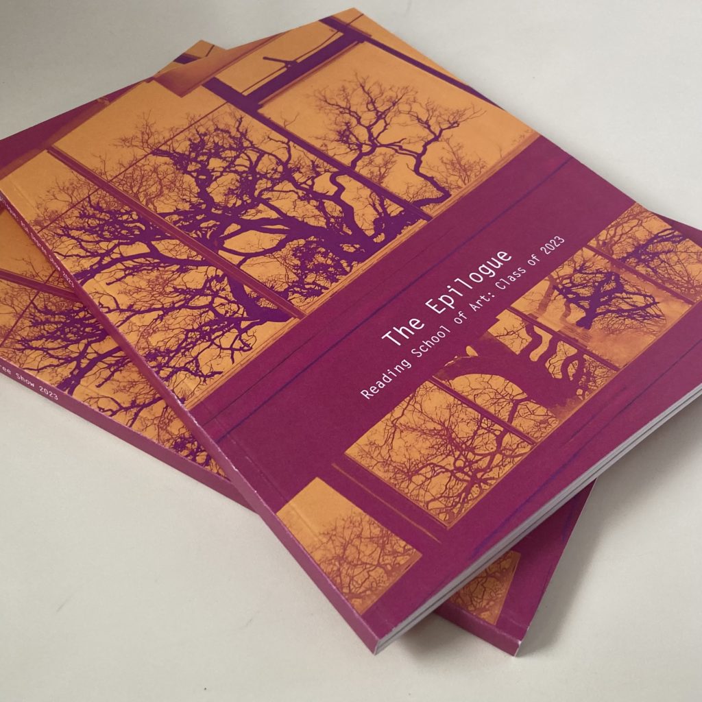
Cover:
The art committee were keen to have an image of the art department on the cover, to pay homage the department over the years. I really enjoyed working with other creatives and brainstorming cover ideas. One student who was a keen photographer took servals angles of their studio roof which I then took into Photoshop and played around with the two tone colour effect. From the initial ideas, Figure 3, the orange and pink were a favourite colour combination so I used them. I kept the same typeface of Letter Gothic for the front cover, to tie the inside pages and the cover together.

Feedback:
Along with the weekly meetings with the committee and the Real Jobs team, towards the end of the project there was a large proof read. The student committee and art tutors read the entire publication and checked that all the captions matched, that everyone’s art work was included. This really helped in the final stages, and having serval more sets of eyes checking that all the information was correct.

Production:
After the client had approved the publication I created the press ready pdfs, which took a bit longer than than anticipated. Geoff, our in house print technician, was incredibly helpful in this. It was amazing to see the accumulation of months of hard work come together in the printed publication.


Website:
The Epilogue Degree Show Website
Last minute, I was asked by the Real Jobs team to oversee the website design, which wasn’t making as much progress as it should have been. l oversaw the design of the website, which was created using WordPress, it was a lot easier than I anticipated and I quickly learnt how to use it. Rather than trying to do the whole website myself, I implemented a system for one art student and then showed the other team member how to do the other 50 pages.


Promotion:
The student committee asked for a adaptions of the front cover to be used as promotional material. This included an Instagram post (Figure 14), a poster (Figure 15), a postcard and email signature. I was able to reuse elements to best suit that media and purpose.


The degree show:
I was invited along to the degree show open evening, and it was amazing to see everything come together to create a coherent brand, such as the posters round the department, the publications being handed out, and even the the captions using Roboto Mono!


Reflection:
I thoroughly enjoyed this project, not only was it amazing design experience, but I learnt about who I am as a designer and how to work alongside other people.
In this project I discovered that I enjoyed going to the weekly meeting with the client and the group of students. Having these regular meetings helped to keep the project going, and motivated me to prepare work to show each week. I developed my communication skills especially when collaborating with my client, I was able to empathise and understand things for a different perspective.
This by far has been the largest project I have worked on so far, in terms of page numbers (100) and copies that were produced (500). I create systems for myself that helped me to manage the scale of the project. This included a thorough image and file naming method, order for the captions, style sheets, and parent pages.
This experience has highlighted to me that book design is where my passions lie. While the process of creating a website is similar in some ways to creating a book; I much preferred the satisfaction of designing a physical object.
“Thank you so much for your hard work Lydia! You’re an absolute star, can’t thank you enough for all of your help with this”
– Maddy Chelmis, student committee
