Introduction
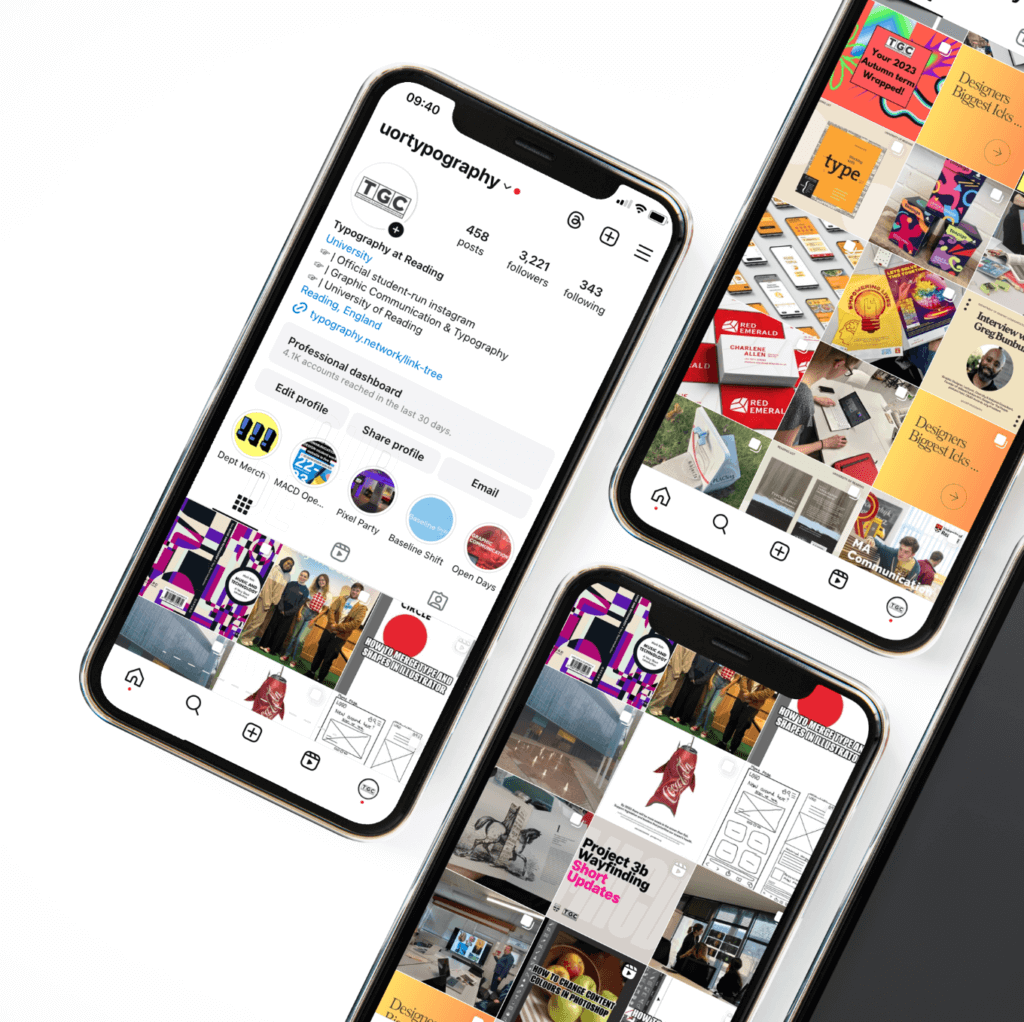
This real job involved creating weekly posts of the departments events and students’ projects throughout the year. This year we wanted to change the perception and aim of the Instagram, by broadening the design content for prospective, current and alumni students. Previously, the account has focused on events and design-based posts, however this year we wanted to boost engagement through trending posts, such as; Spotify and Barbie, as well as informative posts, such as; tutorial reels and Adobe shortcuts.
Our goals
The main goal we wanted to achieve when taking over the department’s Instagram was to create a broader design community. We felt it was important to broaden our online community, as it would help boost our engagement and further the creativity of account. Additionally, we also wanted to showcase the department to prospective students by creating a more engaging feed. To do this, we created a wider variety of content ranging from informative posts and current Instagram trends.
Updating the account
Rebrand
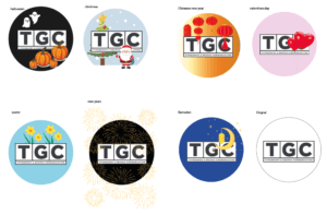
We decided that the Instagram would benefit from a small rebrand. This is because we felt this would help the feed look more consistent and part of one identity, as we had a varied number of design posts. We also changed the profile picture to the TGC logo, adapting it to each season or holiday e.g. Christmas, Halloween, Easter theme. This is because we felt this better represented the department than the previous profile picture of the yellow doors that no longer exist, and would be potentially confusing to prospective students.
Profile picture
Within this rebrand we were able to improve our feed layout, as our feed looked very one dimensional due to only showed design-based posts and the occasional photos of the department. As a team, we wanted a more varied and personal feed and to achieve this, we began to post more ‘in class’ posts of student’s progress work and final deliverables, to help the account feel more connected to the people in the department. We also introduced posts that gave tips such as the Adobe shortcuts series as we wanted to create the sense of community, as well as posting digital mockups of final work. The improvement of these posts has helped increased our engagement.
Posting schedule
One of our goals was to continue posting consistently and to post more varied content. To do this, we created a schedule each month on an excel spreadsheet which allocated a post to each team member. We found this strategy was successful as it helped us be organized and make sure that we weren’t posting similar types of content. One problem we faced with this strategy was that sometimes team members would forget to post their allocated content. A solution we found to this, was to schedule the posts earlier on Instagram so that the post would still go up in time.
New content
To increase our post insights and better our follower engagement, we researched into current Instagram trends and related them to typography and graphic design. Examples of this include; creating a yearly ‘Spotify Wrapped post’, a ‘Barbie post’ and conducting interviews with our lecturers to find out ‘designers icks’. Out of these three posts, the post that was the most successful was Spotify Wrapped which earned over 130 likes, reached 1,351 accounts, 188 non-follower accounts and 3 comments.
We also introduced more informational posts to our feed. This is because in our research we found that informational posts help followers feel like they are part of a community. We felt that these posts would be helpful for current students, designers and people who are interested in graphic design and typography.
The informational posts we introduced are:
- Tutorial reels
Tutorial reels were one of our posts with the highest level of engagement, as it reached over 1000 non-followers, with a total watch time of 5 hours and 18 minutes. These posts consisted of quick design demonstrations on different Adobe software’s that can benefit our followers’ future projects. The tutorials were aimed at current student followers, and aspiring designers.
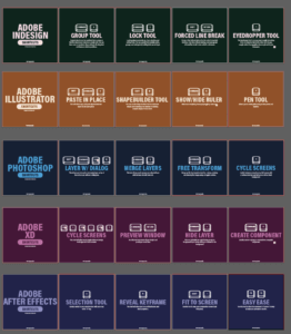
- Adobe shortcuts
This is a post that showcased some basic shortcuts for Adobe software’s. This post had a high level of engagement as it reached 89% of non-followers to our account and had many impressions, meaning it was accessed through home, profile and hashtags 2086 times. The reach is the number of accounts that have seen the post. These posts were aimed at current students as well as designers within the industry.
Reading list
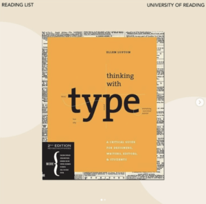
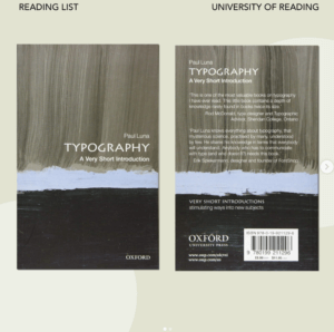
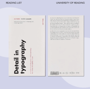
The idea behind this post was to share what we felt were important design books that all designers should have a look at. This post also had a high level of engagement, with 198 account interactions through likes, saves and shares.
Q&A stories
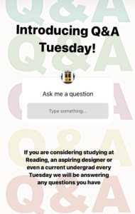
These posts on our story brought a sense of community as it allowed us to talk to people. Although these posts did not have the highest level of engagement, it was still rewarding to be able to talk to people and answer their questions about design, the department and our course.

Engagement and following
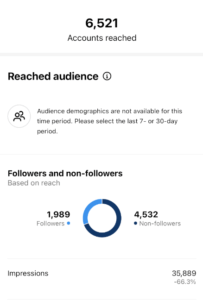
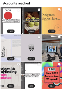
The most successful posts have been the reels we introduced, providing the audience with short, informative illustrator tutorials, with the ‘how to merge type and shapes in illustrator’ reaching nearly 2,000 accounts. This shows that reels were incredibly successful in boosting the Instagram accounts engagement, due to the wider accessibility Instagram gives to reels throughout the platform. This accessibility has enabled the Instagram account to reach 69% of non-followers, helping to boost the accounts audience reach. Further to this, since December 2023, the reels have boosted the interactions by 320%. Further to this, the following has grown by 70% over the last 3 months.
Our thoughts
Being part of the department’s Instagram team has enabled us to get experience with understanding what makes a post engaging. We learnt that reels were the most engaging type of posts for non-followers due to Instagrams pre-existing algorithm. Whereas, the most engaging post for the current followers were the regular posts. By creating a consistent balance between the two types of posts, we were able to boost the accounts interactions and engagement levels.
As well as this, we consistently posted and maintained a monthly posting schedule which allowed us to introduce new types of posts. We felt this was important as before we took over, the posts were mostly submission/process posts and we felt it was important to offer informational posts that would help designers and students. Including informational posts has helped create a more varied feed and increased engagement with our followers.
What we learnt
This experience of running the department’s Instagram account has taught us how to effectively work together to run a design team, the importance of group collaborations on new design ideas and problem solving, and lastly it improved our time management skills as we created a posting schedule for when the account would gain the most follower interaction.

