Background
Our client, Dr Patrick White, received a PhD in Social Sciences from Cardiff University. Since then, Patrick has written various books and journals for The Statistics Education Research Journal, started a YouTube channel, and lectured at the University of Leicester in Media Communication and Sociology.
Patrick’s previous books, 3 individually and 1 in conjunction with other academics have not had good covers in his eyes. Patrick told us in conversations that publishers usually take the cover designs out of his hands, something he feels strongly against. With the book being personal to him and his work, the cover design should embody this, bringing together the themes and ideas of the book into a single visual image.
Looking at beginner’s statistics books, which is what this book intends to be, they are often minimal, featuring just colour blocks and text. They often seem very unwelcoming, clinical and academic. Patrick told us that he wants to make his book seem accessible and welcoming to beginning undergraduates, seeming less intimidating than other competitors.
Brief
The brief was to essentially create a book cover design for a new textbook called ‘Straightforward Statistics’, a stand-alone academic asset. The design should be simple and approachable, using negative space to achieve this. The design should be more abstract, less of a conventional portrayal of a subject, and more visually engaging, being sold predominantly online. It would be aimed at undergraduates and those learning about statistics for the first time. While having an interest in reading about this subject, this is more of a beginner’s guide, so it should be directed towards those who may be sceptical of the topic. This should act as a gateway into the topic, with the jacket’s design reflecting the welcoming nature.
Deliverables
- A single, complete cover for the academic textbook ready for use by the publishers and in-line with the publisher’s requirements. This will feature the front, spine, and back cover.
- An ebook variation, showing just the cover with an appropriate file setup.
Research and ideation
Before meeting with Patrick, our client, my partner and I did some research on our clients’ previous books and other books related to the topic to get a general idea of the structure and layout of the cover. After meeting with Patrick, he provided us with an image that we were very keen on using as the book’s cover and a quick draft he put together on Word to present his vision to us.


Design development
My partner and I then created a few different designs on Indesign to bring his vision to life more meaningfully. We experimented with typography, alignment, layout, and colour.
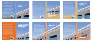
After showing these to the client, he preferred the first design because of the “blue space about the main image” and he liked “the fact that the photo continues to the back page”. He also liked the typeface of the first, fourth and fifth designs. He was less keen on the beige-coloured spines and the image being too zoomed in. Therefore, we reflected on his feedback and came up with a few more designs. He also raised some issues about image quality and whether we could redraw the image using Illustrator or using AI to enhance the quality.
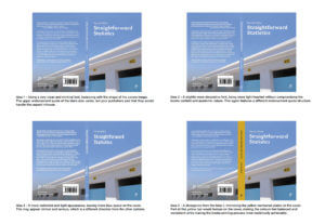
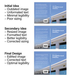
Image quality
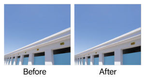
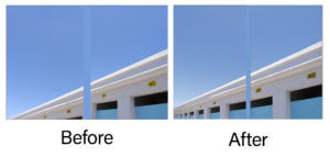
As the image was taken on a phone camera, upscaling the image became an issue. My partner and I tried tackling this issue in various ways, such as importing it into Illustrator and auto-tracing the image to transform it into a vector shape. However, this made the image grainy and unrealistic. Eventually, after exploring different software and speaking with the department’s in-house printing experts, my partner used a new software to upscale the original image to achieve 350 ppi. From our own testing, this new resolution image was the most appropriate but it was ultimately determined by the publishers and printers as there were many factors that could alter its success. This worked effectively and the client was very happy with these results.

Final stages
After receiving feedback from our supervisor, we decided to tackle the legibility of the back cover elements (‘Book subject area’, and the Policy Press logo) by adding a darker gradient and slightly moving the text to ensure it does not sit across both a light and dark part of the image. It was recommended to remove the ‘Book subject area’ as this element was a point of difference across the two formatting examples sent by the publishers, but the most recently sent one did not use this so we removed it entirely. We then created more box space around the sides of the barcode to appear less tight. Additionally, although the front and back cover would not be viewed together, it was still important to align the doors on both sides in order to create a neat line. Our supervisor reminded us to include hinges to help the printers line elements up without it looking “broken”; however, from research, we found that our client’s previous books had no hinge, assuming the printers are reasonably accurate. Therefore, we decided to not include a hinge. Last of all, we changed the spine to have capital letters to follow the conventions of a typical book spine.
After these further adjustments, we sent the final version to our client which received praise from him.
“I’m pleased to tell you that the publishers have agreed to use your cover! I’m very pleased about this and will send you both a copy of the book when it’s published (which should be about September). Thank you so much for all your hard work on this project. I’m delighted with the final design and can’t wait to hold a copy in my hands.”
–Patrick White

Straightforward Statistics Book Jacket

Reflection
Overall, this project was a fun and practical experience that was completed within a short period. The image already being decided as the cover photo enabled me to explore various typographic and layout options in depth. This, however, limited the options of my partner’s and my own interpretation of the cover, which could have had a greater impact on the audience. Despite this, our client was very eager to use this photo as he had personal connections to it, which we respected. By using this low-resolution photo, we had a chance to explore different software and talk to experts about solutions to increasing this which we eventually did successfully. We regularly sent over ideas to our client and he was mostly quick to respond to our emails. However, receiving information from an external printing and publishing company was a little slow and the unexpected problems faced due to tackling the image quality resulted in a few weeks delay of sending the final design to the client.
We received lots of positive feedback from our client and useful guidance from our supervisor and Real Job meetings. This range of feedback ensured we covered every detail on the cover, which led to a successful design, which the client was very pleased about.

