Greg Bunbury, Josefina Bravo and James Lloyd joined together for Week 9 of Spring term provide their feedback and tips on students current projects, Real Jobs and personal work, offering advice on how to improve and enhance designs for upcoming deadlines and submissions.
American Revolution, Legal History and Politics
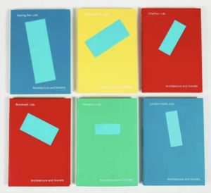
Matt from Part 2 shared his current project for the Design Practice module where he is designing a ‘collection’ of books taken from The Oxford University Press’ A Very Short Introduction. With 700 titles to choose from, Matt selected American Revolution, American Legal History and American Politics. His very distinctive focal points, connected all books together with the torn documents treated in the same way in terms of placements and size. He received feedback on this link and tutors questioned whether they need to be handled in the same way or if they can still be impactful with slight differences so that they are all not so uniform. James then showed examples of existing book covers with visually similar designs that are also different. He was advised of the potential ethical issues of ‘tearing up’ historical documents – however this was counter argued for the visually aesthetic look of the piece which was made more of a statement than a solid document and was therefore offered a variety of ways to still hold this effect, such as rolled up or folded paper. Matt was praised for his strong ‘American’ colour scheme and legibility of all three sleeves but was warned of an odd title placement which is quite close to the margin.

Film, World and Early Music
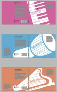
Also preparing for the submission of the same project, Jasmine showed her book jackets for her selection of Film music, World Music and Early Music. Tutors and students enjoyed the connection between the elements of Jasmines designs, however Greg offered a suggestion to standardise angles of the instruments to create uniformity between the set and so text can sit in the same yet legible way. James suggested that the piano works best and advised Jasmine to consider different instruments which work in the same way as the piano and designed with the same dimensions and the design for World Music appears more realistic than the others. Josefina commented on how the client details were positioned well, such as the barcode and how each page works well when stood alone.
Planets, Stars and the Black Hole
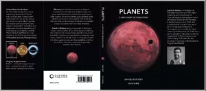
Again, with the same project, Tristan showed his book sleeves for Planets, Stars and the Black Hole to create his collection. Josefina stated how there was good visual impact in the three and how it was interesting to add all three on the inside flap. Greg offered advice to separate the authors name from the publisher as it could appear as misleading being too close to each other and James suggested editing methods within Photoshop to create further definition.
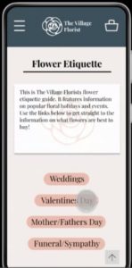
The Village Florist
Next was Part 1, Jony who showed his mobile web design for the Integrated Design module which required two working features using a prototype for an existing website that needs upgrading. Jony chose the The Village Florist and went through the pages of his file explaining how the features would work. Tutors enjoyed the way there was many ways to navigate to one place from a variety of different points such as the burger menu, links and actual clickable images but suggested how the website needs to look more like a website rather than an app in terms of placements and layout. Jony learnt how to connect an element to a certain part of the page instead of just to the top.
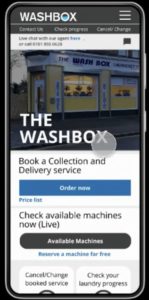
The Washbox
Similarly, Mathew showed his website prototype, for The Washbox, a laundry service in Reading, and had features of collection and delivery as well as a walk in facility. Mathew explained the navigation of a user on his website well and was advised by Josefina of the cluttering of elements on his homepage and how to prioritise entry points for different pages with methods such as colour. James suggested the use of alternative imagery to grab the users attention instead of the existing one.
Conclusion
Drawing the session to a close, students expressed their gratitude for tutors who offered advice on ways to improve their current work.
‘I liked seeing other students work to gain inspiration!’
‘Feedback from different people with different experiences; a chance to show the tutors the work I wanted feedback on but might not have shown otherwise.’
‘Greg, Josefina and James’ advice was really helpful as they’re not all tutors I would usually see.’
‘It is very valuable getting feedback on my word as well as hearing feedback on others!’
Feedback Jam is a great way to gain different perspectives on both professional and personal work and is extremely valuable to being open to constructive criticism and and considering tips on how to progress.

