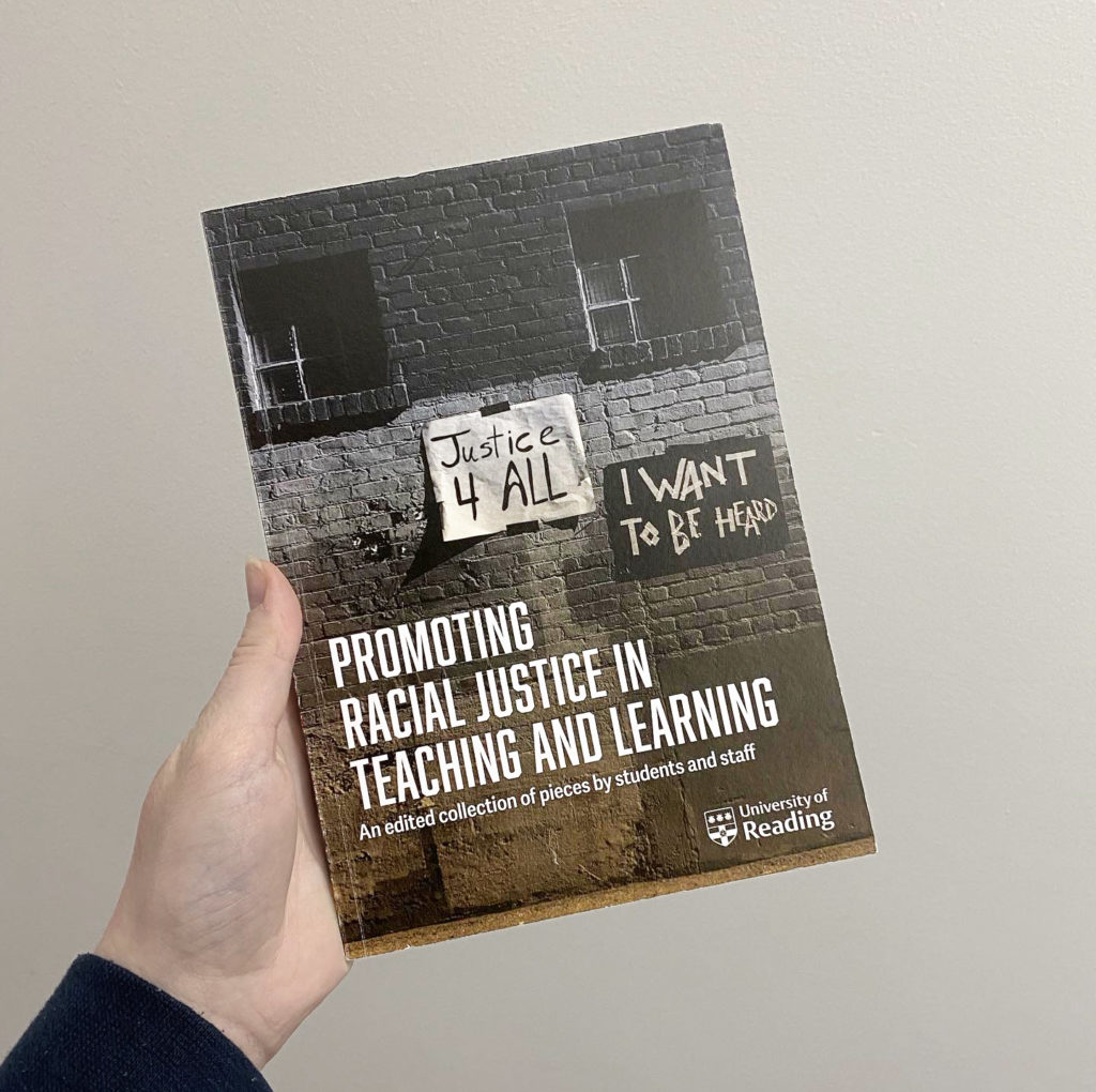
Overview
The brief was to create an Academic journal, funded by the Diversity Fund for a collection on ‘Promoting Racial Justice in Teaching and Learning’. The collection has around 20 pieces of around 600 words each, plus a Foreword from the Vice-Chancellor, another from the Deputy Vice-Chancellor and Dean for Diversity, and an editorial that was written by the clients Anne-Marie Henderson and Dr Eileen Hyder.
This is a digital publication, with contributions from both students and staff, ranging from academic pieces to personal reflections and poetry. Preferably taking inspiration from the Department of Typography’s ‘Different by Design’ zine. The timing has turned out to be very significant as the University’s Race Equality Review was being published.
Goals
Below are some goals agreed upon with the clients for the journal:
- Not to look like an academic journal, make it more personal and alive.
- There are multiple pieces such as academic pieces, personal stories and poems. The journal should not have an academic look and feel.
- Every contributor sends a picture, most are headshot photographs. Something visual to show what they’re about.
- The journal is about people, these images give the people writing a face for a personal experience.
- Giving people a voice, representative of how each individual wants to speak and be heard. Amplifying people’s experiences.
Deliverables
- A Digital journal. Size to be determined.
- A section about our design contribution. Including an image of Georgia and Bethan, as well as a small piece of writing explaining our design choices.
- *Potential for a printed version of the journal. This was later to be discussed in the project.
*After discussions during the designing phase the clients decided on a printed journal too.
Design Process
Research
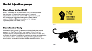
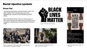
The research stage began by exploring media and designs of racial injustice, this was to get a wider understanding of the current representation of the topic and what designs are associated with it. This really helped me, particularly with the tone and style of the pieces. Much of this content used strong, bold, and sharp typefaces, such as the BLM website. It was also useful to discover images and colours that are represented with certain movements, such as the power first and the use of black and yellow for BLM.
When presenting the initial ideas, I also provided a summary of this research, to give reasoning behind the design choices so far.
Ideation
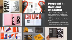
After discussing with my supervisor, we decided to show two ideas with a few roughly designed spreads, showing the two aspects they pushed during the first meeting with us. These were the importance/urgency of the topic and the other being the community and personal aspect of people’s stories. This is how we came up with the two concepts. After the meeting the feedback was:
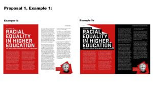
- Proposal 1:
Likes demanding action, urgency, boldness
Likes the jagged-edged author photos.
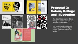
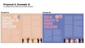
- Proposal 2:
Likes the difference between all the spreads, using different typefaces and colour combinations.
- Overall:
Likes a combination of both proposal ideas.
Want the design to reflect the individual’s feelings and experiences.
/two or three main colours with some secondary colours to add-in. An extensive colour palette. Some to be just black and white.
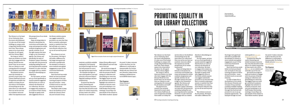
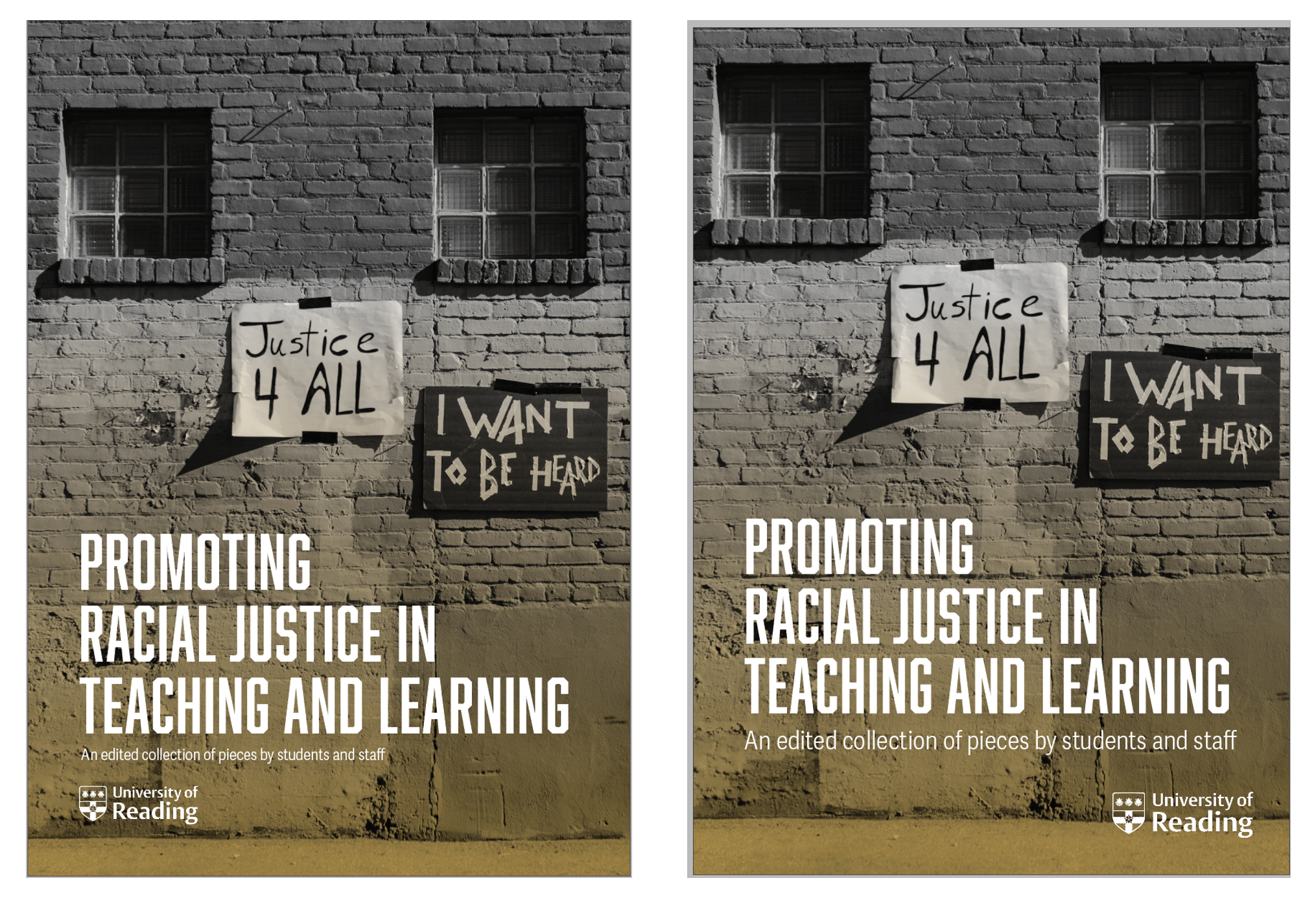
We all agreed pretty early on that a design that highlights the urgency and steps being taken for racial justice in teaching and learning would be best suited for the journal. Because of this, the first proposal was the one we went forward with the visual elements. Some ways I created this feel was through the use of an all cap, bold, san serif typeface. This gave that shouting, urgency and strength in the words being written. As well as the colour palette, which is similar to Black Lives Matter, giving positive connotations to the cause.
Content
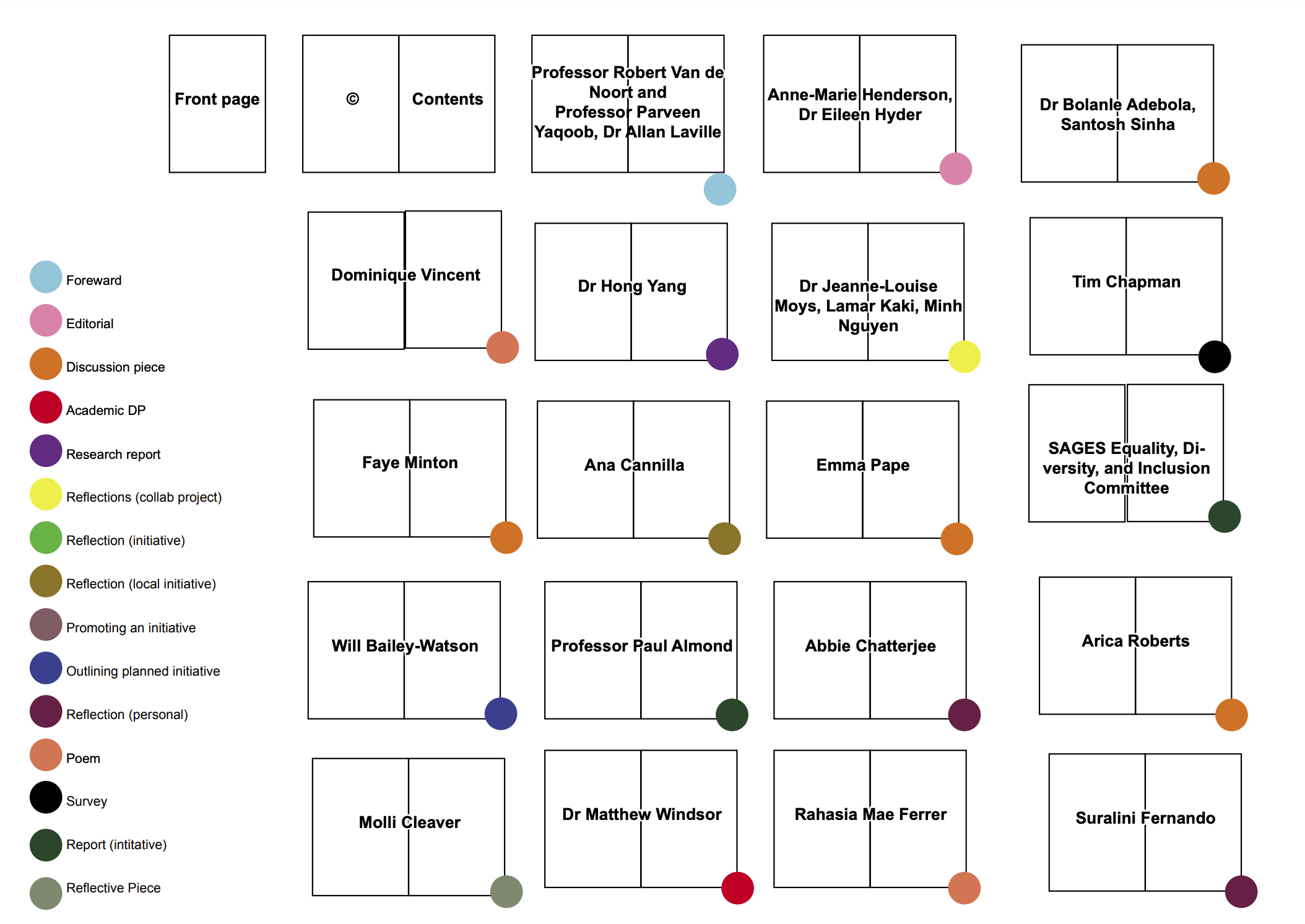
A list of all the content, along with the article type, was given to us by the client. They specified that they wanted the content to be a mixture of academic and creative entries, this is so the journal is not overwhelmed by academic entries, this being one of our goals.
After reading each entry, we began creating pagination to create a steady pace of different content, colour coded with the type of article. This was to ensure that the content of the same kind was rarely placed together and those creative and academic entries were able to flow together. This also allowed me to get a better estimate for the number of pages for the print specification and allow me to begin making a realistic schedule.
Grid
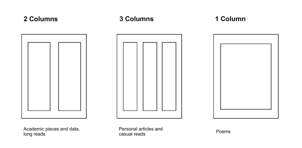
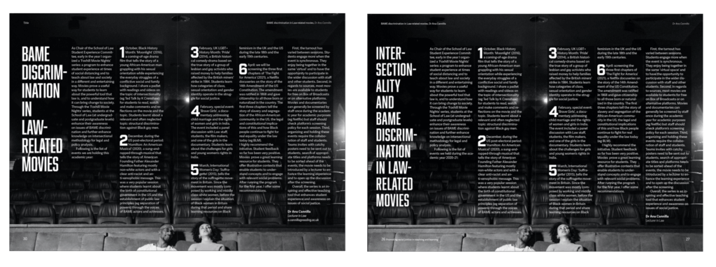
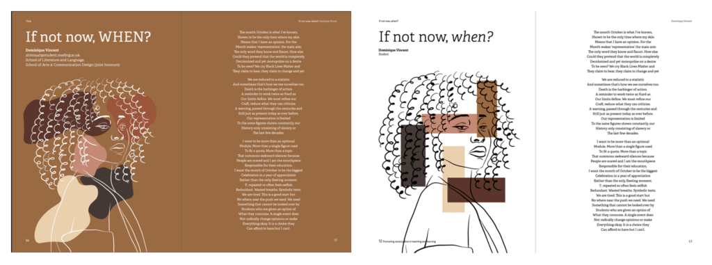
One of the challenges was to create a design structure that compensated for the very different content. The journal is culminated of many authors writing different content on the topics of race, equality and inclusion. This was a challenge in itself by creating a grid system that worked with personal reflections, poems, academic pieces and more. Each author wrote a piece that was personal to them, some of it was more casual and others more academic. To enable this a multi-useful 12 column grid was used to distinguish the type of the written piece for the readers. Two columns (2 x 6) were used for formal/academic/data in-depth reads, this makes it easier for the readers to read. Three columns (3 x 4) is more personal, casual reads because this is more like a magazine layout. One column is used for poems as the line length is left to how the author intended it to be, also most poems consist of one column, this creates instant recognition and distinguishes them from the other pieces.
Design development
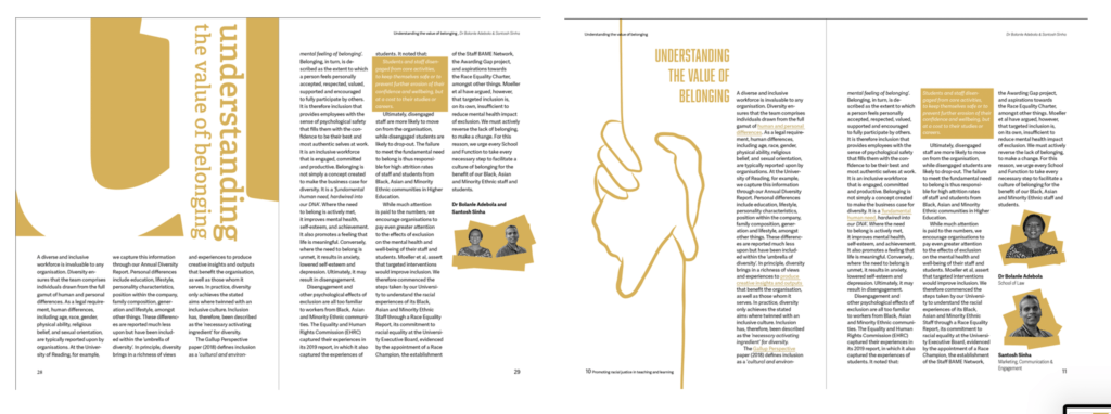
Below are some of the developed spreads, from the first version to the final product.
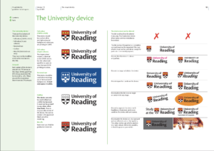
University of Reading brand guidelines
Coming towards the end of the project, the client mentioned that there might be certain University visual guidelines with the placement, size and colour of the logo for the front cover of the journal. I search online and found the whole document. Pages 10-11 (See figure 10) were particularly useful for the colour and placement of the logo. Here is what needed to be changed:
- Colour
The white inverted logo that was have used was ok, as long as it is on a dark background and is fully white, which had already been done. - Size
For an A5 document, the logo had to be 35mm in width with a top and left margin of 9mm. Before, the logo in the journal is 29mm with 6mm clear space, I had to change this accordingly. - Placement
“When the University is not the primary publisher of a document, you should place the device in the bottom right of the page. If this is not possible, please position it anywhere other than the top right of the page, as this position is reserved for official University documents.” (University of Reading Designer Guidelines, p11). I originally placed the logo at the bottom left, but then now placed it in the bottom right.
Having this experience quite later on in the project, rather than doing the research into it or having the initiative to assume there are guidelines is a lesson I will take onto my next projects.
Link to guidelines:
http://www.reading.ac.uk/web/files/branding/brandguidelines-staff.pdf
Production
Specification
- A5 portrait
- 4pp cover prints 4/4 on 300gsm Edixion
- 64pp text prints 4/4 on 120gsm Edixion
- Perfect bound
- Quantity: 100
The A5 design fits well as a printed booklet that is easily able to be picked up from a display, stored in a bag and placed in a house/office. A5 also seemed a good size for the amount of text from each article as it seemed to have an amount of text that would be easily displayed onto a spread per article. Any small text had images or illustrations to make it a spread, while text that was too long had two spreads. This meant that each new authors content is clear.
Originally we estimated to have around 56 pages, then it increased to 60 due to some authors having double spreads with to capacitate the amount of content. A few items were added during the last fazes of design, causing the page number to go up to 62, which was not applicable for a booklet print, since it not a multiple of 4. I increased the pages number to 64, suggesting to the client to add a ‘Special thanks’/ ‘What next?’ page since they kept adding more content to the journal, particularly thank you’s. They also wanted to add our images, along with placing their own with more space. Adding more pages was slightly inconvenient at the time, since it meant more rushed work toward the deadline, but overall was actually very useful to meet the client’s last-minute additions in a way that wouldn’t disrupt the rest of the design.
Final deliverables
Printed journal
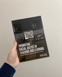
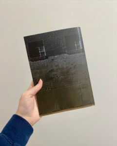
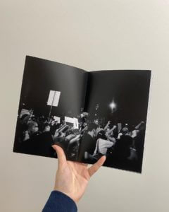
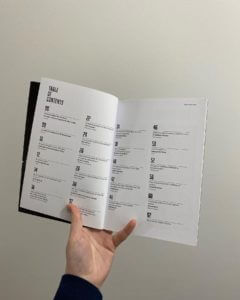
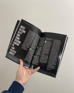
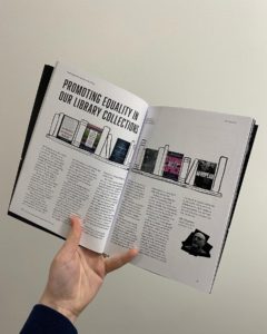
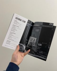
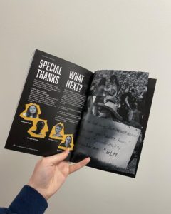
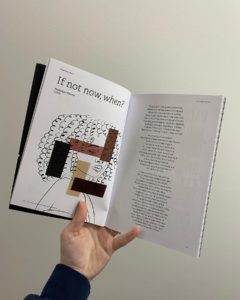
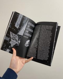
Upon receiving a copy of the journal, along with confirmation from the client that they also received their copies, initially I did not see any issues with it. Neither had the client or supervisors, which is great news.
A critical comment is the yellow gradient on the front cover, as it is not very noticeable since the image was printed very dark, but everything is still legible so it has not become an issue. I know for next time to lighten black and white images since they do come out darker than expected.
The downloadable PDF:
https://drive.google.com/file/d/1d3oIRFPOL2ScO8ZKLt4NhZY1G92azzVe/view
Reflection
It was a new experience designing over 60 pages from scratch for a digital PDF that is also adaptable for print. I had to tap into a lot of design skills, along with some new ones, it really surprised me how many different aspects of design goes in to designing a journal, such as typography, illustrations, photography, data visualisation, image treatment, professional printing skills and more. Working on the largest project I have ever designed on a tight deadline has taught me many skills in time management, client communications, responsibility in my weekly tasks and more.
University of Reading library exhibition / Teaching and Learning (T+L) Showcase
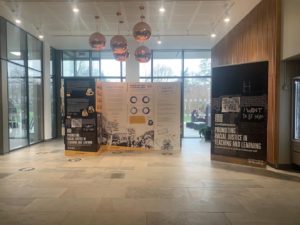
The journal was exhibited in the University of Reading library. It was great seeing the work on display for people to interact with and read. It was great to see how the work I had done had created a recognisable brand for the journal.
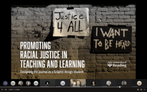
I was also asked by the client to present at the Teaching and Learning (T+L) showcase about the process and reasoning for the journal’s designs. Some of the points the client asked were to talk about how I developed the design and a way to promote the Real Jobs scheme. This was a great opportunity to develop my communication and presentation skills, while articulating my design choices to non-designers. Overall this project has helped my employability skills, design skills and I have created something I am proud of as a designer.
“We really appreciate all your hard work. We’ve been blown away by your creativity and determination to make this such a high-quality piece of work”
– Dr Eileen Hyder (client)

