
Initial Ideas
Whenever I start a new project I like to look at ways that other people have gone about similar projects so i started off by looking on sites like pinterest to see how other people had designed stickers. However when I looked there wasn’t any stickers that were advertising anything similar to what i wanted so i had to experiment quite a bit by myself. I brainstormed a few ideas and the ones that I ended up going with follow,
Idea One

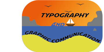
This was my initial idea for the sticker design. I’m not too sure what gave me the idea to make a sticker of a sunset at the beach for a typography and graphic design podcast but i dont think that it works as well as a sticker as either of the other designs do. I think there is too much going on in this design to be at such a small scale too. these are both things that i keep in mind for my future designs and I think that those ones the mistakes that I made in this designs are less apparent.
Idea Two

For this design I decided to go with a very generic image for the middle with circular text going around the outside. I think that this design looks a lot more like a sticker than the original design does and it is a lot better scaled for its use. I also used a lot less colours in this design, limiting myself to just two colours. I also decided to use a very boring sans serif font to make sure that it was legible because I knew that I was going to be putting it along a circular path.
Idea Three

For this design I decided to use a more abstract shape for the outline that I think would work well as a sticker as it is all composed of smooth curves. I was initially going to put the text filling out the whole sticker but I then decided on having a few more layers around the outside that I used a gradient to colour. For this design I decided to use a few more colours than i did for the last design but they all look quite similar because they are all different brightness of the same colour.
Software tutorials
I am going to explain the process to making the wavy text effect i used for my last sticker design idea. To begin i make a curvy shape using the pen tool that vaguely resembles the words that i want to fit into it. In this case i had a smaller word between two much longer words so i was going to end up with white space anyway. Once you have created your shape you then need to write out your text. I find the effect to look better when you use text that is too big for the space that you are trying to fill, like in this image.

This means that when you use the effect the space will be filled in much better. You then need to make sure that the shape is above the text so that the effect works. Finally to make your text fit into the shape that you want it to you need to select all of your text layers and the shape that you are trying to put the text in and then select Object > Envelope Distort > Make With Top Object. Then your text should fit itself into whatever shape you had selected. You can then edit the shape using the Direct Selection tool if there are any changes that you want to make to the shape.