Design Ideas and Process
When previously using Photoshop/Indesign/Illustrator I tended to stick to what I knew producing simple and sometimes boring outcomes. I found these tasks challenging as I knew I wanted to push myself to learn new tools in the software however it was sometimes hard to not give up when something was going wrong.

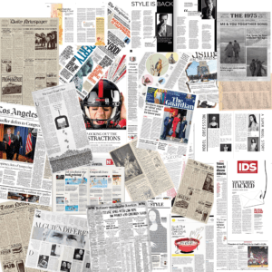
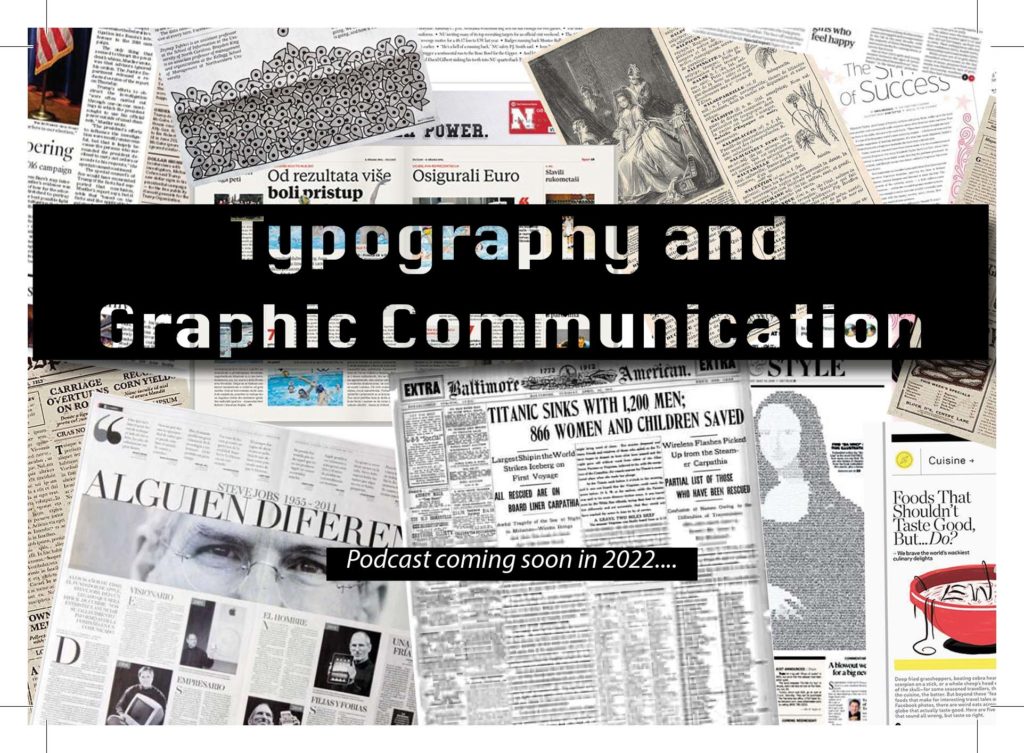
My first design I wanted to try using the clipping mask to create this see through text effect. I layered this onto of lots of images of newspapers as I thought this would show the themes of printing and typography talked about on the podcast (see screenshot 2). It took bit of playing around with to get the perfect balance between the background and the text so that it would still be eligible to read and meant I had to transform and crop the original photoshopped background to make this work.
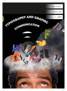
Before starting my second design I knew I wanted to try cutting out from different photos on photoshop.
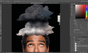
By composing this idea with different typography and graphic design elements coming out of a head (as if this is what he is thinking about) would allow me to practice this skill multiple times. I found the smoke in this podcast cover the most challenging. I originally
started by trying to draw the smoke with different colours and blurring this together however after watching some tutorials, I found the most realistic way was to use images of clouds placed into the file (shown in screenshot 1).
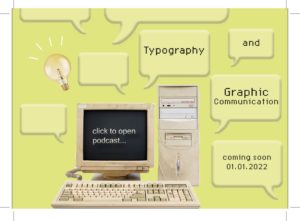
My final design started on the inspiration of using an old computer. Originally I wanted things to be coming out of the computer almost as new tabs opening before I chose to incorporate the speech bubbles. I believe this was my least affective design as they are only basic components and mainly used skills that I had developed on my last two covers
Software Tutorials
A helpful tutorial I watched on YouTube explained how to create smoke on photoshop. I found this particular video useful as it talked through three different ways to do this, all of which I tried before deciding which one worked best for me. I chose to import an image of a cloud and use the lasso tool to clip this. I didn’t think about this way before as I wouldn’t have thought to change the levels of the image to create white smoke on a black back compared to a cloud on a blue sky. The tutorial can be found here https://www.youtube.com/watch?v=FIBXXglbYtQ&t=361s
I knew before starting the sticker tasks that illustrator was the one software that I felt the least confident in so before I began I watched different videos on the basics of illustrator, this also helped me understand the terminology such as anchor points for when I watched more specific tutorials. When I first started drawing the microphone on the postcard cover 1, I was struggling with getting the curve of the line smooth so I watched this tutorial (https://www.youtube.com/watch?v=ViKQgIDblr8) which allowed me to realise I was using the wrong anchor points for what I wanted to achieve and I could easily fix this by using the covert tool.
Design Resources and Articles
Before all of my tasks, I would start by looking on Pinterest at other podcast covers or stickers etc to give me a general starting point. This is where I first saw the concept of objects flying out of someones head like in my second podcast cover.
The website https://dribbble.com/stories/2019/08/06/30-creative-examples-of-podcast-cover-art-and-branding was also interesting to me as I could see how the use of colour affected the design. Most of the covers on here were very colourful and eye-catching which inspired me to use more varied colours when design my own such as the use of purple and yellow in my third sticker.
For my first podcast cover, the idea included a lot of emphasis on the typography of the design. I used skills I had already developed from other modules on the course as to how to efficiently alter a type face to produce the best outcome. However designing this cover showed me that there were gaps in my knowledge such as the kerning of the writing which is why I found this article useful to read. https://99designs.co.uk/blog/tips/11-kerning-tips/

