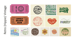
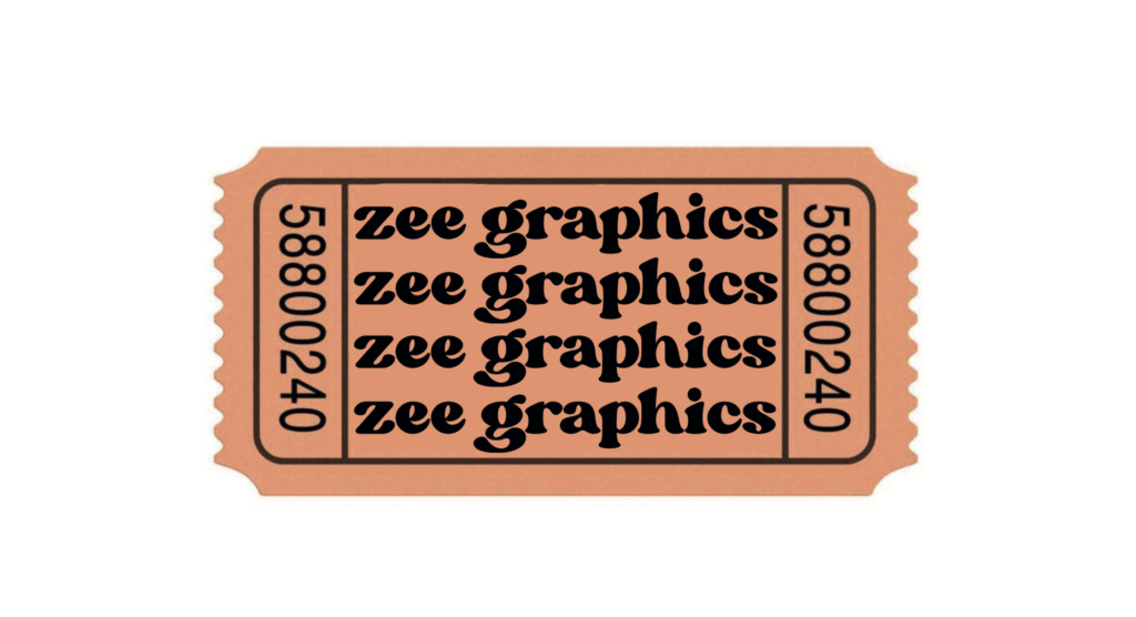
For this mini-project we had to brand ourselves and create a logo, with research from a particular theme. I was struggling with my own theme at first as I chose 90’s. It was a lot harder than it looked. There were so many different themes and colours, styles and fashion so I decided to choose something a little more simple.
 I was going for a “groovy” or “hippie” kind of aesthetic where the fonts are a little loose and wavy. The theme, as a whole, is very colourful and I loved how the words are distorted to fit into or create different shapes.
I found these movie tickets while researching my theme, and I thought I could use them as part of my final outcome for my logo. They matched the theme in my opinion as they shared similar aesthetics, colours and typefaces.

