

Project Brief
Design the programme flyer for Reading Film Theatre, listing their Autumn programme of films. Design TWO variants, based on some kind of underlying different approach (eg different users)
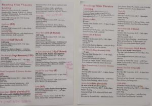
For this project, we were asked to design the Autumn 2017 cinema listings. We were given a document with all the information with typos and we had to correct them and then order and design the information so that it would be easy to understand. We also had to choose two types of users to design our cinema listings.
I chose:
- Parent with two children under 10
- Retired doctor and her husband, both of them who have a passion for old Hollywood
Sketches
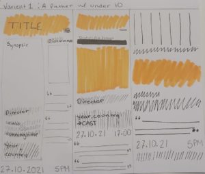
I started off by sketching out ideas on how each listing might look, keeping in mind which features of the listings would be more important for each user.I began with the design for the parent with two children under 10. For this design I thought that the title, age rating and the running time would be the most important for the parent as it would be key for them to know the age rating of the movie to see if the movie would be appropriate for their children and the running time as a parent might not want to sit through a long childrens movie. Due to this, I chose the middle sketch to base my cinema listings on as it had the title and age rating at the top and the running time directly under it.
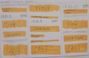
For the retired doctor and her husband who have a passion for old Hollywood, I thought the key features for them was year of films, country the movie was made in, as well as being able to know which movies had extras such as subtitles or audio description. This is because old Hollywood is specific genre and to be able to see the year and country of the movie would be useful for the couple to find the movies they like the most. Therefore, I chose the last sketch to base my design on as it has the country and year of the movie towards the top of the listing.
Process
I began by reading through the document and edited the text so that all necessary information was there such as the running time for every movie and correcting any typos in the movie informations. I decided to use the RTF’s logo colors for my color theme. As the logo had multiple colors and we were only allowed two, I used red and black as my colors, red as the accent color and black for the main body. I had originally planned to put the synopsis of each movie into my listings but I did not have any space to do this as we only had little space and already quite a lot of information to organise into the space. The two typefaces I chose was Gill Sans and Rockwell for both designs as they looked appropriate and has quite a lot of styles within the font such as italics, bold etc, and this was very useful in differentiating and highlighting certain information even without a range of fonts or colors.
First Draft and Feedback
In the feedback session, it was suggested to check that our listing have the correct hyphens and to have a full name on one line or movie title on one line as well as having correct spacing between hyphens, check spaces between numbers e.g., 8, 4 etc. I also decided to change the position of the title and information to make it more prominent.
Reflection
This project really helped me understand to know the importance of knowing how the finished project will be viewed as looking as the printed version of my listings helped me see some of the issues I could not see on screen such as the size of the body text. As well as this, this project showed me how important of using paragraph styles as with so much information, anytime I wanted to make a change to a section such as the running time, I didn’t have to individually go through every bit.