
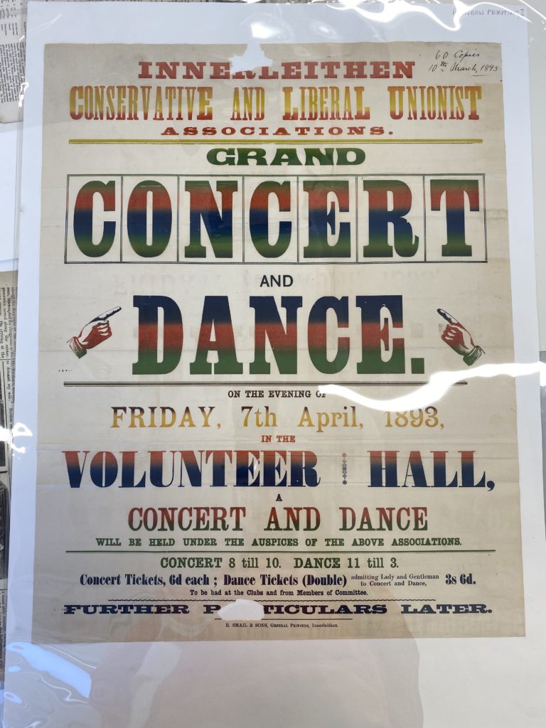
Grand Concert and Dance
This piece interested me for a couple reasons, firstly the colours of it were very different to a lot of other things in the collections, I found the gradient interesting because when you look closer at it you notice that it’s possible that it was one gradient across the whole piece and each of the separate sections of information all use the sections of the same gradient that will have been applied just once.
Secondly, the choice of fonts for this poster, more particularly the amount of fonts used on the piece, from a quick glance you can notice more than 10 different typefaces on this piece, which is absurd compared to now where we’re advised that 3/4 is the absolute maximum.