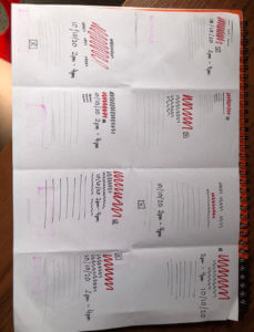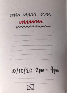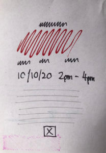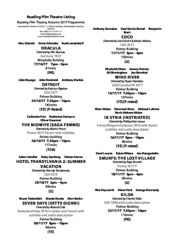


My original sketches were designed based on varying users, but the two final sketches I landed on were based on working for teenagers, couples and young adults. I chose to achieve this by having the actors, titles and times of the highest hierarchy as these are the things which appeal most to these categories without the presence of a trailer, poster or synopsis due to the familiarity of names or attention grabbing titles. I decided to highlight these elements through the use of all caps, italics, weight and varying colours. I also chose two different text alignments to style the information.
I decided to have the age rating at the bottom of each listing, but in solid black as it would not likely be as relevant for my chosen users than, say, a family or someone looking to avoid adult themes. In one of my listings (Title emphasis) , I have used grey text across the actors and directors as well as the additional contexts of the films, to further emphasise the details in black (the title, length, age rating and location and time) which are left solid black. I made this decision to help separate the listings further from one another in addition to the breaks between, but I feel that the placement above the title leaves the actors still high in the hierarchy. In this example, the title is also italic unlike the other of my layouts again to further emphasise this and put them higher in the hierarchy of information.
In the second of my layouts (Actors and title emphasis), I used black for the actors and kept them above the title but smaller in size, to have these two details similar in hierarchy. I also kept the time and date of similar style to the actors as this is likely the next most relevant piece of information for my targeted users.
Overall, I found formatting these details fairly challenging which surprised me since there are so many different combinations which achieve a multitude of effects. However, this task has taught me the impact of such tiny details such as the difference a pt size can make to the whole page. Going forward i will apply my knowledge of these details into my work in varying contexts to achieve the desired effects.

