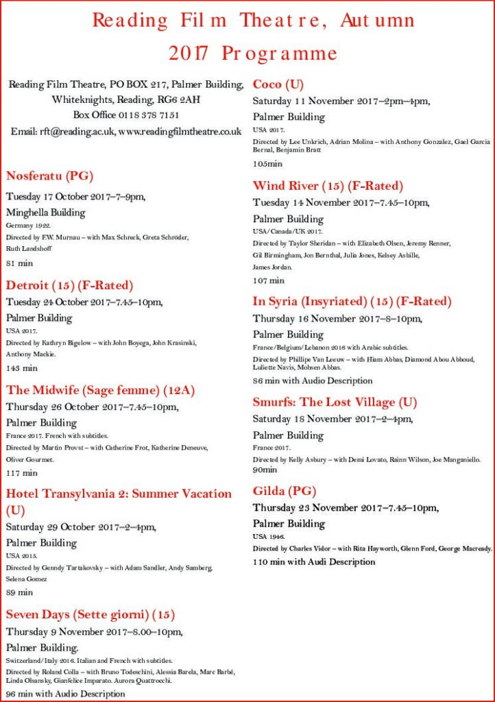
The Reading Film Theatre brief involved having to produce a pamphlet for the Reading Film Theatre Autumn 2017 Programme, presenting 10 films along with information about them on the page. It had to only include 2 colours (white does not count as a colour in this circumstance), 2 fonts, and possess 2 columns to present the information. Additionally, our design had to cater to a particular audience, such as a parent with 2 children and an elderly couple.
For my first draft, I included a gold gradient background along with black text to present the information. My initial ideas were to reference the “golden age” of Hollywood cinema, like the 1950s an 1960s; leading to me adding the gold background. My design was supposed to appeal to the older audiences, or connotate that it was of a classic cinema style, but I had not realised that I had already failed one of the briefs of having only 2 colours. Also, due to the text being the same colour and similar point size, it was fairly complicated to read upon first glance. Furthermore, my inclusion of paragraph rules were not very helpful as they were the same colour as the text. Cinema Listing 1
With my second design I decided to only include a light blue colour and black text as I did not want my design to be as needlessly complicated to look at. However, in light of focusing on minimising my design I had forgotten about my chosen audience, which resulted with me becoming confused on what to do next. This, along with my lack of current Adobe InDesign knowledge, made me want to learn about how I could improve my design by seeking feedback from the Friday lesson. Cinema Listing 2
After, the feedback lesson I decided to simplify my design as well as not overcomplicate the visuals, along with editing general mistakes such as errors within the text. I decided to focus on the colours of the University logo that is usually depicted as red and white, to fit the colour scheme. The pdf file does not allow the font that I had chosen for the title, but for reference I had initially used a font called “Showtime”. This font had a Hollywood inspired text along with old film tape acting as borders above and below the title. I wanted my design to focus on being intended for the use of the elderly, as it was a simple design that became easier to read compared to my last concepts. The minimal use of red for the title as well as the titles for the films enhances the importance of the films and associates with the hierarchy of information, conveyed in Lonsdale and Twyman’s journals of typography. RFT Actual Design

