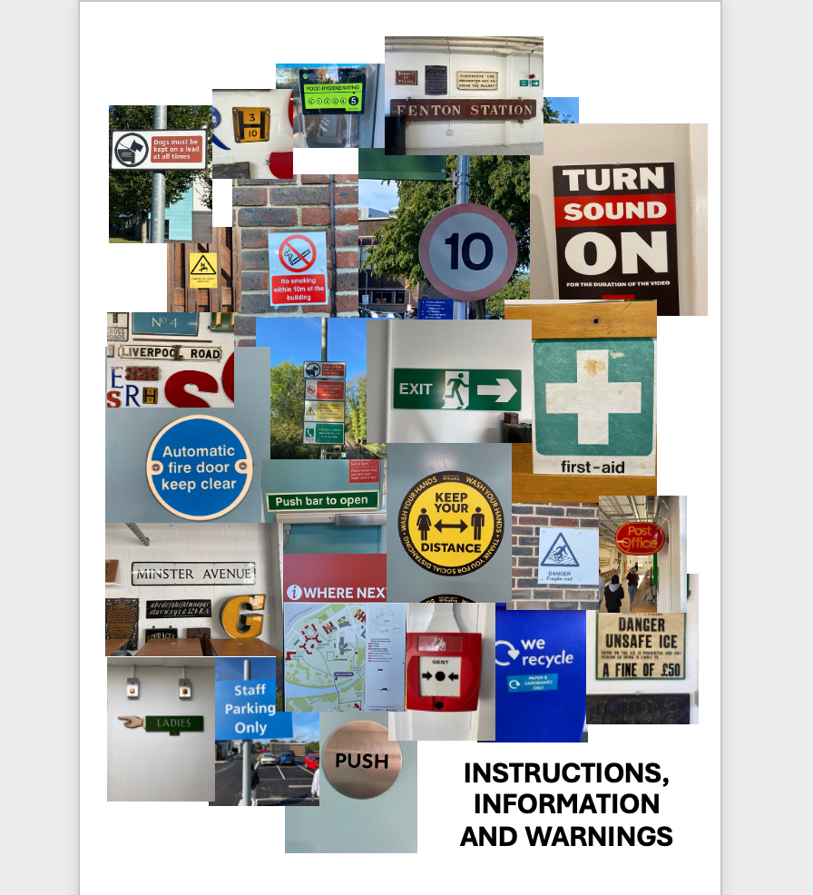
Instructions, Information and Warnings
Looking around the environment, I chose to obtain pictures of information signs and compare and contrast to one another to see their significance. I noticed how the signs were mainly made using the primary colours; red, blue or yellow, as well as green in regular shapes such as circles to give orders and triangles to give warnings. The text upon them were in a sans serif font in either black and white which enabled them to stand out and portray a clear message effectively to the audience.

