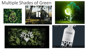

For Sophia’s logo trends project I was instantly drawn to the ‘Multiple shades of green’ theme. I chose this theme as it best resembles me as a person, being quite reserved, relaxed and very chilled. I wanted to show a sense of purity/naturalness in my logo and going off of the images that I had collated for my mood board it felt right to choose nature. I felt that choosing a more natural themed logo would be fitting as it fits with the green scheme and there is also a surge of a more ‘green’ approach to the way we live as people. It started off with a simple idea, by using photoshop tools I was able to duplicate a pattern of leaves which parts of it were then blurred. I then added a font that I found on DaFont, which I used my initials and name in design.

