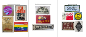
I didn’t solidify a theme for my investigation into the presentation of letters in our environment, instead I focused on signs that we see on everyday and don’t realise how the use of typography effects us.
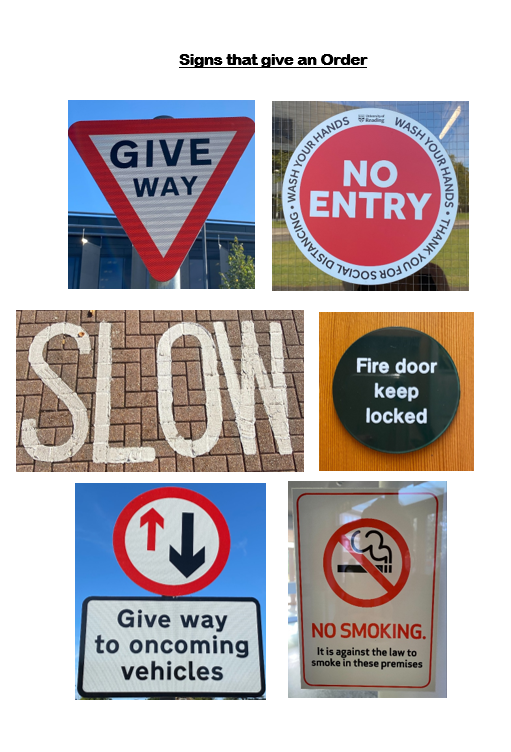
I initially focused on the letters presented on signs that raise awareness for charities or a protest. I noticed that they mainly used sans serif fonts to be eye-catching, clear and to present their urgency for change. I then used the resources already in the typography building, looking at the old signs for businesses and compared their traditional branding identity with Serif fonts, with modern day branding. The first theme that came to my head when reading the brief was road signs, as they are some of the most important pieces of information and orders citizens are presented with, so the lettering has to be clear and simple. I found that the road signs only used sans-serif fonts to portray this and uses simplistic colours such as black, white, red and sometimes yellow to get peoples attention.


